
How to Build a KPI Dashboard in Excel? [Here is the Easiest Way in 2025]
Sep 6, 2022

Fictionally, Excel has been the godfather since the era of old-age computers; there's no doubt about it.

When it comes to dashboards, you can create them in Excel to track KPIs and drill-down on data.
Being the oldest data management system, it's always a wise choice for creating KPI dashboards.
In this article, we'll learn how to build a KPI dashboard in Excel in five easy steps. We'll also drill down the drawbacks of Excel for dashboard creation and explore its next-best alternative.
So let’s take it from the top!
What Is a KPI Dashboard in Excel?
Excel KPI dashboard is where metrics and KPIs are stored and visualized under a spreadsheet. Dashboards are used to keep crucial data under one hub for easy tracking
Dashboards created in Excel are single page (mostly, but not always). They help you track your business progress via in-built charts, tables, and views that are backed by data.
But creating a KPI dashboard in Excel comes with unwanted challenges and requires a steady eye for long hours. However, we've tried to drill down the dashboard creation process in five simple steps.
How to Create a KPI Dashboard in Excel - Step-by-Step Guide
Creating interactive dashboards in Excel can be tiring, and there are a few steps to take before finally stepping up on the boat.
Here’s a tutorial on how to do it:

Pro Tip: Use conditional formatting to improve readability of raw data.
Step 3: Start With Data Cleansing and Filtering
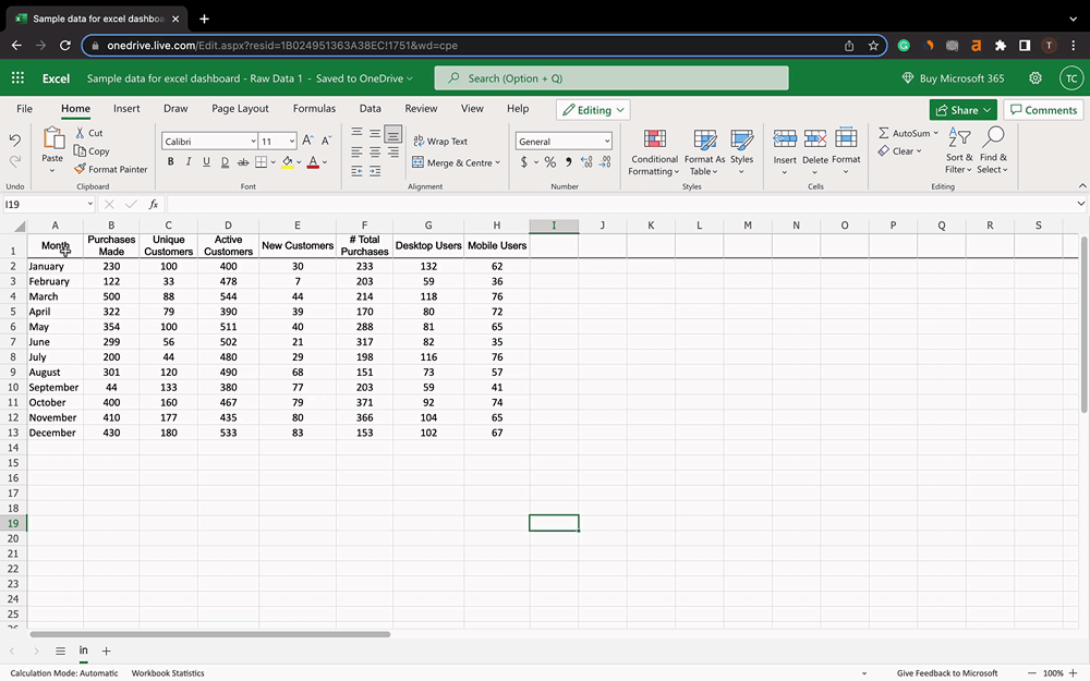
The data you imported in the previous step is called raw data. For creating a reliable dashboard, raw data is something you would hate to put in.
Fortunately, Excel comes with tools to ease your data cleansing process. For example, we have manually put a data set representing monthly sales.
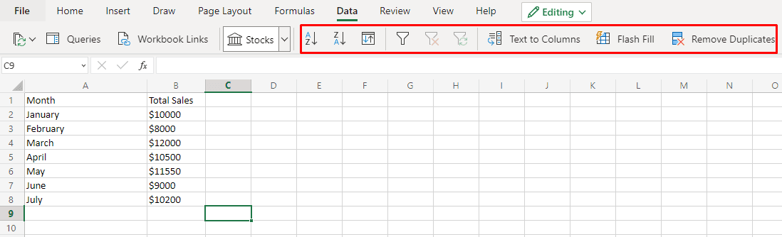
To polish data, Excel can help you with:
Alignment: Align your data in ascending or descending order
Custom Sorting: Sort data by column, value, color, font color, and order
Data Filtering: Add an advanced filtering widget to each column
Remove Duplicates: Removes any duplicate data
Step 4: Visualize Your Data
Now that we've factual data with us. Let's get started with the next big step, which is - data visualizations.
For this, simply select the cells you want to add in the graph and click on Insert to present your data via charts and diagrams.
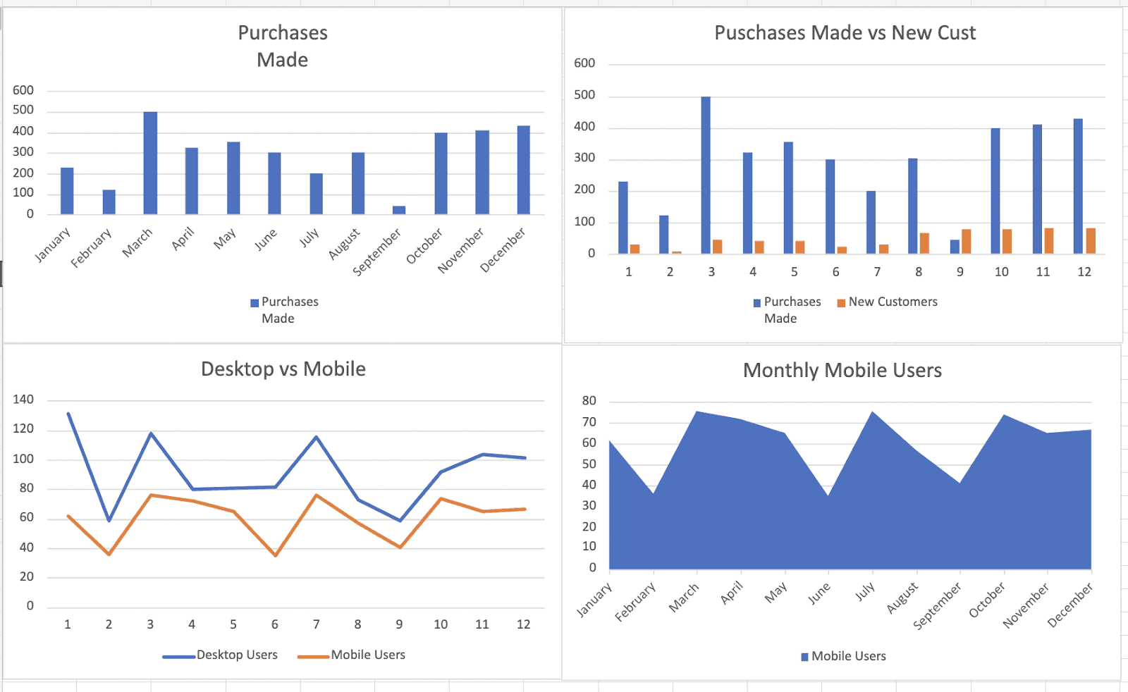
Excel gives you multiple chart choices to select from; bar graphs, pie charts, line graphs, and other visualizations. While assigning charts for your data, keep these things in mind:
Use combination charts to compare values and draw meaningful insights
Use dynamic charts if you want to make selections and want the chart to update with it
Use sparklines when you want to show a trend over time and, at the same time, save space on your dashboard
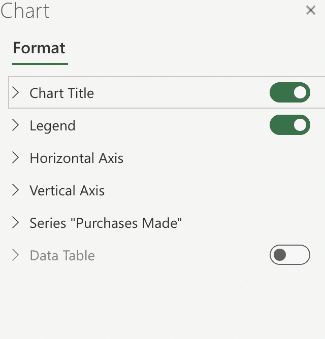
Next, easily customize the chart/axes titles, data labels, colors, and data table via the chart formatting option.
Once you’re done with the customization, it's time to prepare a full-fledged dashboard.
Note: You can also use pivot tables in your dashboard if you need them.
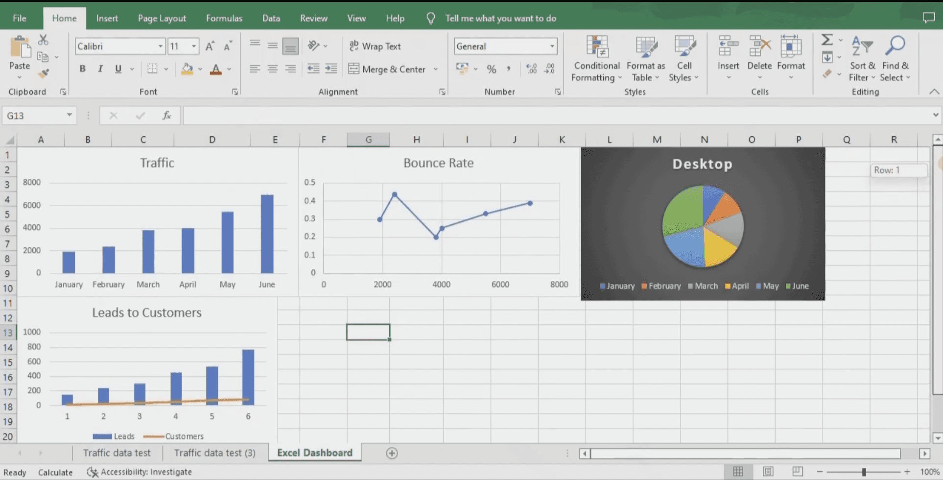
Step 5: Create a Full Fledged Dashboard
Although you have already worked on visualizing your data, keeping raw data and visuals on the same sheet can be confusing.
Do you remember we mentioned how to create a sub sheet in Excel? 🤔
In the same way, create another sub sheet in the same workbook and name it something as "KPI Dashboard."
You can copy and paste all the graphs on the new sub sheet and track them there.
Note: Copy-pasting charts from one sub sheet to another is a manual process, which will take time. If you want to track KPIs via excel, there’s no way around it.
You and your team can use this sheet as a major KPI dashboard. Doing this helps you in three ways:
You get a whole screen for displaying multiple data visualizations
You can choose who can access/view/edit the raw data sheet
If you make changes or edit the raw data, it will automatically be updated in the key performance indicator dashboard sheet
That's it, you have successfully created your first KPI dashboard in Excel.
However, to ease your burden, we have curated a list of some free excel dashboard templates. Let's have a look at them.
5 Free KPI Templates in Excel You can Download Now
Here are some Excel dashboard examples that will help you in decision making by tracking KPIs the right way. Below we included our favourite our favourite five kpi templates in excel.
#1. Simple KPI Dashboard Template
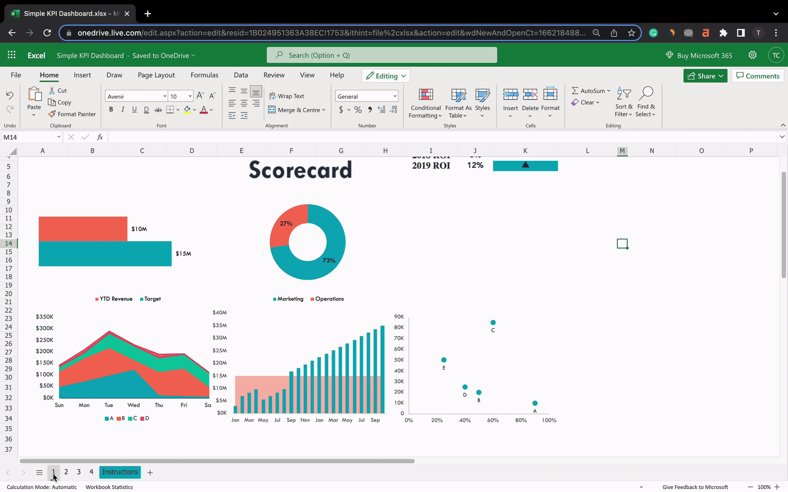
The simple KPI dashboard template is a delight for non-technical users. You can download the Excel file and use this template to gauge your progress against performance indicators.
The template allows you to visualize your business data points via easy-to-understand bar graphs, pie charts, and trend lines. Plus, it lets you quickly gauge your past and present performance against your goals.
The best part is that you just need to change data in the instruction sub sheet to make it your own.
KPI You Can Track
Net Revenue Earned: Total revenue earned after deducting marketing and operations costs
Profit Margin Per Product: Profit margin with respect to quantity sold per product
Region-Wise Sales: Involves region or state-wise sales data
YTD Revenue: Refers to the amount of profit made by an investment since the first day of the current year
The simple KPI dashboard is best for investors, stakeholders, and business owners to measure their revenue trajectory over time.
#2. Production KPI Dashboard Excel Template
Being accountable for a production unit, you should be aware of the number of factors you need to keep account of so that your production process runs smoothly.
Production KPI dashboard is an easy-to-use template that gives you peace of mind to track and monitor manufacturing or production-related KPIs, quantify any changes, and present them proficiently.
The template provides you with:
Major Manufacturing KPIs & Descriptions
Trend Graphs/Charts
PY (Previous Year) and TC (Target Values) comparisons
Periodic and Cumulative Analysis
Besides these, the template has an in-built set of manufacturing KPIs. Although you can always add your own KPIs, here's what the template offers.
KPIs You Can Track
Responsiveness: Measures on-time delivery, manufacturing cycle time, and time to make changeovers
Quality: To analyze the yield, supplier's quality, and percentage of customer returns
Efficiency: To analyze overall equipment effectiveness (OEE) and optimum utilization of resources
Reducing Inventory: To measure the inventory turnover ratio
Ensuring Compliance: To monitor the health and safety of workers and production equipment
Reducing Maintenance: Helps you compare downtime in proportion to operating time
Flexibility & Innovation: New product introduction and engineering order change cycle time
Costs and Profitability: Measure the manufacturing cost and profitability per unit
A Production KPI dashboard is typically for industry owners and production unit managers to track all quality-related metrics to deliver optimum quality standards to customers.
#3. Human Resources (HR) KPI Dashboard Excel Template
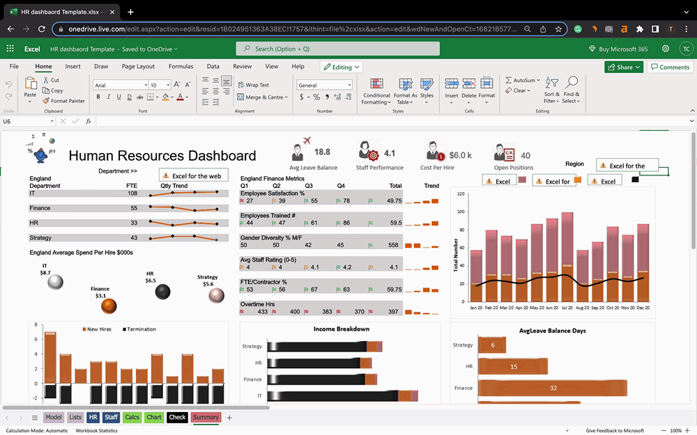
The HR KPI dashboard is yet another comprehensive masterpiece that provides detailed insight into your recruitment schemes and employee satisfaction.
Like other Excel dashboards, you can segment your data based on models, lists, HRs, and staff and present it under a unified dashboard.
KPIs You Can Track
Cost Per Hire: The amount of cost incurred (from marketing to interviews) to hire an employee
Staff Performance: Monitor individual or department-wise performance of your employees
Average Leave Balance: Leaves taken by employees on a weekly or monthly basis
Employee Satisfaction: Measure employee satisfaction percentage for every quarter and via trends
Promotion Rate: Rate at which employees are being promoted to higher positions
Speed of Hiring: Time taken to onboard an employee to the organization
Gender Diversity %: Number of male, female, and other employees working in every department of the organization (for equitable or fair representation of all genders)
HR KPI dashboards are beneficial for recruiters and large organizations.
#4. Sales KPI Dashboard Template Excel
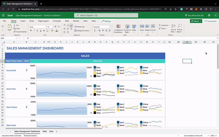
When measuring your overall sales, both inbound and outbound efforts need to be considered. For instance, this sales dashboard template helps you measure and analyze your sales team performance and region-wise sales of your product.
We find this dashboard unique because it not only depicts your grand sales but also correlates it with sales made per employee to give you the overall sales performance of individual employees.
Moreover, you can also drill down your data by region, product, and customer type.
KPIs You Can Track
Monthly Sales Growth: Easily measure region-wise sales growth month over month
Sales Per Person: Monitor sales made by individual employees to identify leading and lagging employees
Sales Mix: Use a mix of sales by region, product, outlet, and individual to get a comprehensive sales report
Sources of Sale: Identify the top sources of sales per employee, region, or product
The template is super-easy to customize and can be used by dedicated sales teams to measure team and business performances.
#5. Marketing KPI Dashboard Template Excel
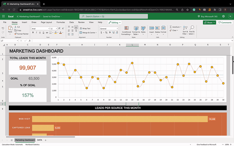
A marketing KPI dashboard is a marketing analytic tool for marketing and sales teams. It allows you and your team to track and report online marketing performance, which in turn helps you devise the right go-to-market strategy and make data-driven business decisions.
KPIs You Can Track
Total Leads Generated: Presents the number of leads generated in a month
% of Goal Achieved: Comparison between planned and actual lead generated (numbers and percentage)
Leads Per Source: Segment leads based on web visits, captured leads, actionable leads, sales accepted leads, and OPP month over month
Traffic Per Source: Identify your monthly traffic source (Direct/Search/Referral) for the whole year
Apart from tracking KPIs, a marketing KPI dashboard lets you showcase your marketing efforts and build good relationships with clients.
This marketing dashboard template is best suited for small to medium-sized marketing teams as it doesn't depict key metrics such as CPA (Cost Per Acquisition), Bounce Rate, and other crucial KPIs.
However, the template is highly customizable, and you can always fit your own KPIs into the dashboard.
Drawbacks of Building KPI Dashboards in Excel
Despite the free kpi templates in excel, it becomes overwhelming to create dashboards in Excel. Here're a few good reasons why people switch to Datapad from Excel.
#1. No Mobile Access
You can't access your dashboard from your mobile. Yes, you can definitely view your dashboard via the XLCubed mobile app, but the flexibility and responsiveness you enjoy in its web application aren't the same elsewhere.
#2. Hard to Maintain
Excel provides next to no automation. It requires manual effort to import and clean your data, which sometimes might take hours. Plus, manual work increases the possibility of human errors.
In fact, there’s no space for human error because you might just compromise your dashboard's integrity even if you unintentionally fudge a number.
So when your company grows, so does your data, and with a lot of manual data cleaning and validation work, it might not be feasible to use Excel to track KPIs via dashboards.
#3. No Real-time Access to Data
Excel limits you from accessing your data in real-time. It doesn't update your data automatically, even if it's linked to a data source. Hence, the data you view in the Excel workbook is always outdated.
Again, automation is something that you'll miss if you choose to create a KPI dashboard on Excel.
#4. Lacks in Terms of Collaboration
A collaborative KPI dashboard is always better than just a Dashboard.
What's the difference?
Although a KPI dashboard lets you present data via stunning visualizations, a collaborative dashboard allows you and your team to analyze, monitor, and share feedback simultaneously.
Let's be honest here. You're not near to success if you think of your business as a one-man show. Therefore, keeping your team aligned with the company goals and performance in real-time becomes really important.
#5. Higher-Learning Curve
Excel is a vast ocean that's tough to be explored in a day. Even with customizations, its chart wizard is pretty complicated for new users.
You may encounter formatting limitations and end up spending hours customizing charts.
For the most part, customizations in Excel are far away from just drag-and-drop.
Keeping Track of Your KPIs from Excel is Time-Consuming: Here’s How You Can Do it Better for Free with Datapad
Until now, it's crystal clear why most people prefer using KPI dashboarding software instead of creating a dashboard on Excel.
Hence, we've built a dashboarding tool that puts an end to your manual efforts.
Datapad is designed to make data analysis easier, especially for those using Google Sheets. Whether you're creating a dashboard to track sales or a graph to visualize trends, Datapad integrates seamlessly with your Sheets to provide powerful insights.
The beauty of Datapad lies in its simplicity and ease of use. With our tool, anyone in your team with zero technical knowledge can start building reports in mere seconds.
#1. Google Sheets Integration:
Tired of copying and pasting data from your spreadsheets into visualization tools? Or worse, rebuilding your charts every time your data updates? Datapad solves this headache by connecting directly to your Google Sheets, transforming your data into stunning visualizations without the technical complexity.
With Datapad's Google Sheets integration, you can:
Connect any Google Sheet with just a few clicks—no coding required
Watch as your dashboards update automatically when your spreadsheet changes
Visualize complex data in ways Google Sheets alone simply can't handle
Create beautiful, presentation-ready charts without fighting with formatting
Say goodbye to spreadsheet limitations and hello to data that works for you, not the other way around.
#2: AI-Driven Analysis
Ever wished you had a data analyst on call 24/7? With Datapad, you basically do. Skip the complex Excel formulas and simply ask questions in plain English like "What's our best-performing ad channel?" or "Show me last quarter's conversion trends." Datapad's AI instantly generates the perfect visualization to answer your question.
With Datapad's AI-powered analysis, you can:
Ask questions in everyday language and get immediate visual insights
Uncover hidden patterns and relationships in your data automatically
Focus on making decisions instead of fighting with chart settings
Transform complex data into clear, actionable intelligence in seconds
Your data has stories to tell—Datapad helps you hear them through simple conversation.
#3. Scheduled Reporting
End the monthly reporting grind forever. Datapad automatically delivers fresh insights straight to your inbox or Slack channel on your schedule. Set up your dashboard once and let automation take over—whether you need daily metrics, weekly performance snapshots, or monthly executive summaries. Choose from our library of ready-made templates to get started even faster with industry-specific KPIs and visualizations. Your team stays informed with zero manual effort, while you focus on acting on insights instead of creating reports. Perfect for agencies managing multiple clients or busy teams that need consistent data without the hassle.
Collaboration and KPI dashboards must go hand in hand, that’s how a company excels in KPIs tracking and setting strategic goals.
💭Food For Thought: We wanted to be innovative with our collaboration feature and thus spent hours brainstorming about how to make collaborations easy yet real-time.
So, here we are!
#4. Downloadable Reports
Sharing insights with your team or stakeholders should be straightforward. With Datapad, you can download your reports in PDF or HTML format, making it easy to distribute them. Whether you need to attach a report to an email, share it on a project management tool, or print it for a meeting, Datapad has you covered. No more scrambling to capture screenshots or manually compiling data. Your reports are ready to be shared in a professional format at the click of a button.
#5. Web Search Feature
Sometimes, understanding your data requires context from the wider world. Datapad's Web Search feature allows you to pull in external data for sector benchmarks and trends, enriching your analysis. Whether you're comparing your sales figures to industry averages or looking for the latest market trends, Datapad can help you find the information you need. This feature ensures that your analysis is not just based on internal data but also informed by external factors, giving you a more comprehensive view of your performance.Make Your Excel Dashboards Look Stunning with Datapad.
Table of Key Features and Benefits
Feature | Description | Benefit |
Google Sheets Integration | Connects directly to Google Sheets for data analysis. | Seamless workflow, leverages existing data. |
AI-Powered Analysis | Allows plain English queries, generates graphs and dashboards. | Reduces technical barriers, fast insights. |
Dashboard and Report Creation | Supports bar graphs, line charts, pie charts, Gantt charts, etc. | Visualizes data effectively for decision-making. |
Scheduling Reports | Delivers reports via email or Slack at scheduled intervals. | Keeps users informed without manual effort. |
Download Options | Reports available in PDF or HTML format. | Easy sharing with stakeholders or teams. |
Web Search Feature | Pulls external data for benchmarks and trends. | Enhances analysis with industry context. |
Datapad is a free kpi dashboard tool that allows you to connect data sources and keep track of all your metrics in one place. We claim that Datapad is the easiest kpi tool out there.
If you are keeping your dashboards on excel or sheets, you can use our integration to take all your data from spreadsheets and build stunning dashboards on Datapad.
Must-read Posts:
KPIs vs. OKRs: What is the Difference and How to Use Both Correctly: Find out the difference between two metrics with clear examples
How to Make a Pie Chart in Google Sheets? [Secret of Creating Stunning Charts]: Learn about how to make a stunning pie chart on sheets and also discover a better alternative for it
How to Make a Chart in Google Sheets: Easiest Method Explained Here: Find out about the easiest method of creating stunning charts on sheets.
