
How to Make a Line Chart in Google Sheets: Step-by-Step Guide
Jan 18, 2023

Of over 2 Billion Google Sheets users most struggle to create a line chart on the Sheets. While the rest stare at Google asking - how do I make a line chart in google sheets?
But if you haven’t found your answers yet, you’re at the right place.
In this article, we’ll help you discover the various types of line charts and their best use cases. Moving forward, you’ll also learn how to do a line chart on Google Sheets and uncover a powerful tool to create line charts 5x faster and easier than Sheets.
But before you get into the guide, here’s a TLDR if you’re short on time:
A line chart is a graphical representation showcasing changes in asset value over a specific time frame.
Google Sheets gives you an option of creating three types of line charts: Regular, Smooth, and Combo.
The process of creating line charts in Google Sheets is simple and short, however there’s a lot of manual process involved that make it time consuming.
Making a line chart in Google Sheets has a few drawbacks - it’s hard to create a chart on your mobile, tough to onboard and work with your team, might slow down when you lead a heavy dataset, etc.
Instead of dealing with all these drawbacks, try Datapad to create stunning line charts in no time.
What Is a Line Chart in Google Sheets?
A line chart is a graphical representation showcasing changes in asset value over a specific time frame.
Simply put, this chart uses a series of dots connected via a singular line. Once these dots are connected, they become perfect for illustrating variations and determining trends of a series of data.
We emphasize the term 'Individual' here because these charts are typically used for comparative analysis. For example, to identify change in sales or profit margins each month, quarter, or year.
Here’s how a line chart in Google Sheet look like:

Besides, line charts help resolve a crucial debate between you and your stakeholders regarding differences.

It may occur that the difference in sales numbers are minimal enough to go unnoticed through the naked eye. Here’s when Line Charts play a significant role.
These charts help you showcase even the tiniest variations happening in your daily or monthly sales numbers. That too in an easy-to-understand format.
What’s more, Gsheets help you compare large datasets using a variety of line charts.
Let's see the different line charts available and how to use chart in google sheets.
What Are the Types of Line Charts in Google Sheets?
You can find three types of Line Graphs in Sheets: Regular Line Chart, Smooth Line Chart, and Combine Line Chart.
#1. Regular Line Chart
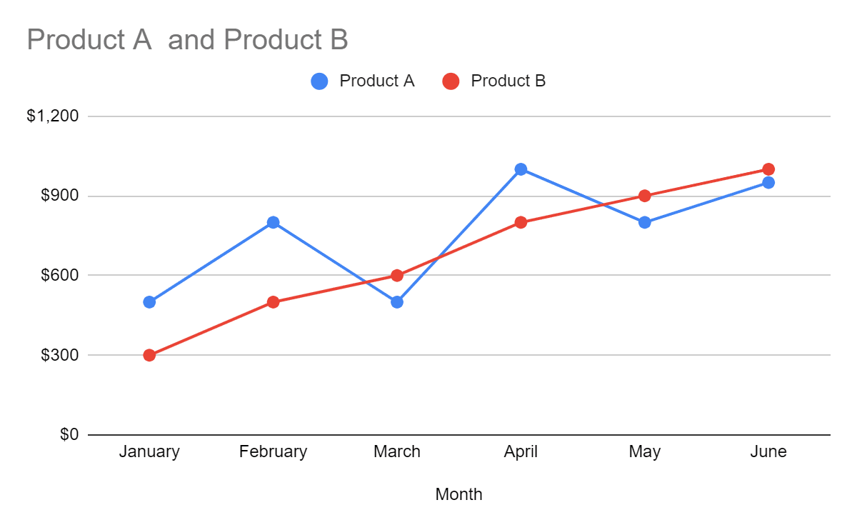
A regular line chart is the most basic of all line charts. It displays information as a series of dots and then connects them with a single line to help notice trends without stressing the eyes.
Regular Line Charts Best Use Case
These charts are a popular choice among data analysts to visualize the comparison between two or more datasets of similar categories.
Some of its best use cases include:
Comparing monthly device sales (mobiles, tablets, laptops)
Monitoring securities or stock market trends (day-to-day variations)
Analyzing project progress
#2. Smooth Line Chart
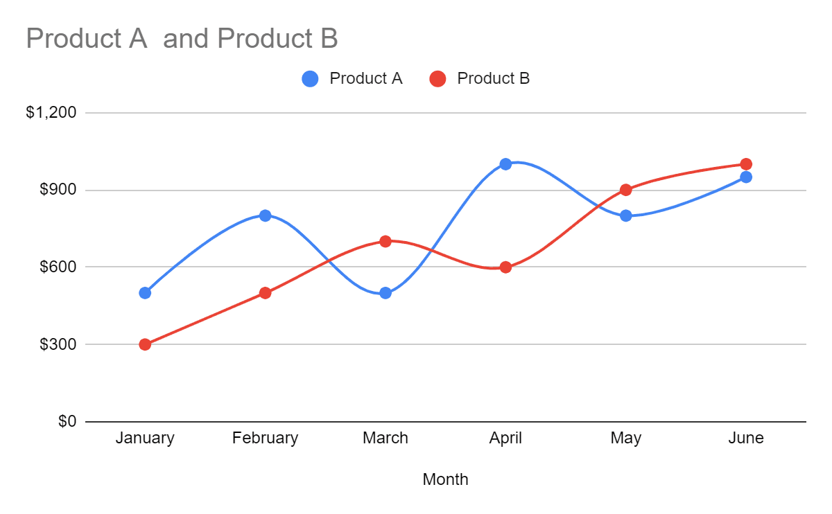
These charts are similar to regular line charts; it's just they don't exhibit pin-pointed curves. Instead, they use curvy lines to connect dots allowing free movement of your eyeballs while analyzing the graph.
This, however, has called for a boycott of the chart.

Why?
Most marketers feel it's unconventional to use curved lines to visualize data.
At some level, they're right – curved lines have a larger diameter on the pivots causing misinterpretation of accurate data values.
But there are some typical use cases where smooth line charts can be of use.
Smooth Line Chart Best Use Case
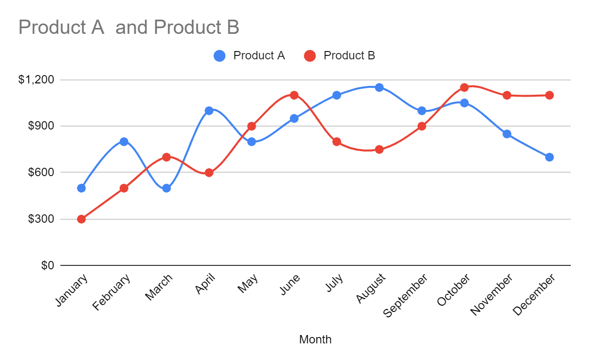
A smooth Line Chart is suitable for representing long-term data.
Like below, we've presented a 12-months product sales report via Smooth Line Chart. A regular line chart here won’t be as soothing to the eyes as a smooth line chart is.
You can also use it for comparing financial trends or showing changes in the price of two similar stocks over the year.
Industry Advice: Avoid using smooth line charts for visualizing smaller datasets as it causes more confusion than providing insights.
#3. Combo Line Chart
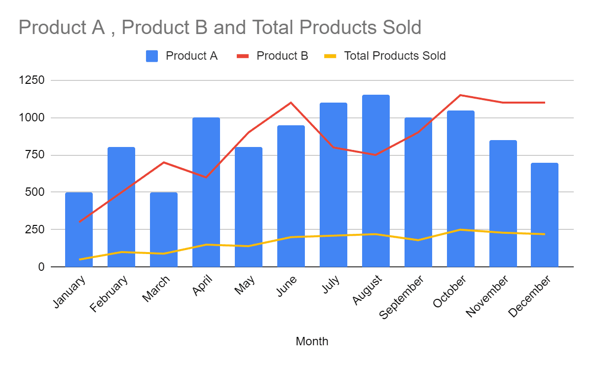
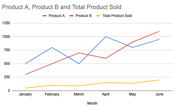
Combo line charts use a combination of two charts, line charts and bar charts, to display two or more different datasets under one roof. The line is used like a trend line that shows if the overall graph is increasing or decreasing.
In the above image, we presented three datasets using a combo chart: Sales from product A, Sales from product B, and the total number of products sold every month.
Combo Line Charts Best Use Case
Combo line charts are of best use when you want to display your research and set of data in a single chart. For example, traders and stock analysts use combo line charts to compare the historical and present performance of stocks.
💭Food for Thought: How easy is it to view monthly sales from products and the total number of products sold under the same graph instead of juggling through two different chart types on two separate sheets?
But the question which remains unan11swered is, "how do you make a line chart in Google sheets?” 🤔
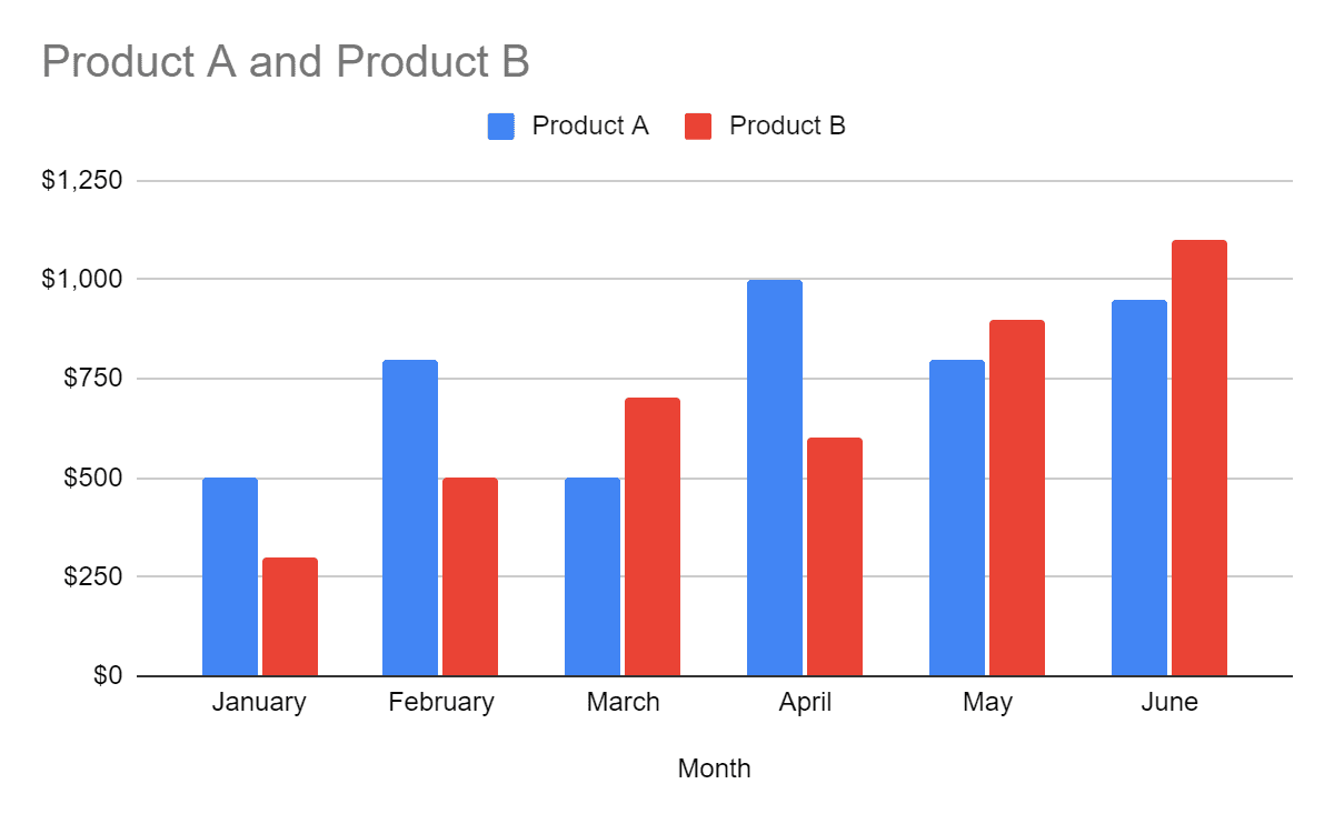
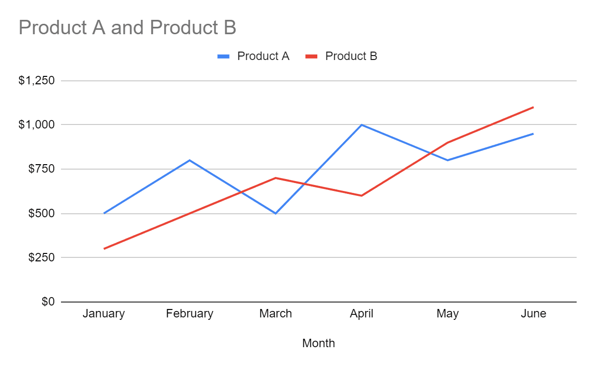
Pro Tip: You can even have multiple lines in the line chart and get a comparison graph such as the image below.
In the next section, we've curated an easy-to-follow step-by-step guide to help you create line charts in minutes.
How to Make a Line Chart in Google Sheets?
Step 1: Prepare a Dataset
Ask yourself - What numbers do you want to visualize through the line chart? Is it monthly or quarterly, or annually?
You need to feed data into the system to present it. And sometimes, a lot of it. 🤯
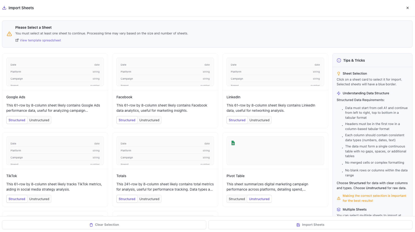
So, if you've got an existing dataset saved in your system, you can easily import it to Sheets and escape from the double work.
Here's how you can do it.
Note: The steps are from after opening Sheets on your system.
Click on File > Import, and select the file consisting of the dataset.

Or if you've a smaller dataset, you can manually enter it too. It won't take much longer.
In fact, we manually entered a dummy dataset of our monthly sales database for Q1 and Q2 of 2022👇🏻
In this, each column represents different values of the same category - Product.
Column A: Associate values with specific time frames
Column B: Sales from Product A
Column C: Sales from Product B
Column D: Total products sold in a month
Moving forward, we'll use this dataset to learn how to create line charts in Google sheets.
Step 2: Select the Dataset You Want to Visualize
Visualizing every data column you have in your sheet isn't necessary.
So if the dataset has extra columns that you don't want to visualize at this time, then this step is for you.
From our dataset, we wanted to visualize columns A, B, and C for the moment. So we selected just that part.

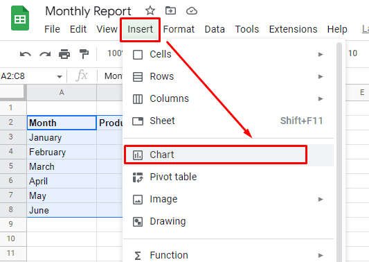
Step 3: Insert a Line Chart
After selecting the columns, click on the Insert option in the top menu bar, then click on the Chart option in the drop-down menu.
Gsheets will present the data in a default chart type (this is what Google thinks is the best way to visualize the available data).
For our dataset, Sheets automatically visualized our data using a bar chart.
However, we'll anyway convert it to a line chart, because this guide is all about that!
To do so, double-click on your chart to open Chart Editor on the right sidebar.
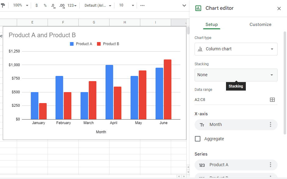
From here, click on the Chart Type drop-down to open doors to various data visualization elements provided by Sheets.
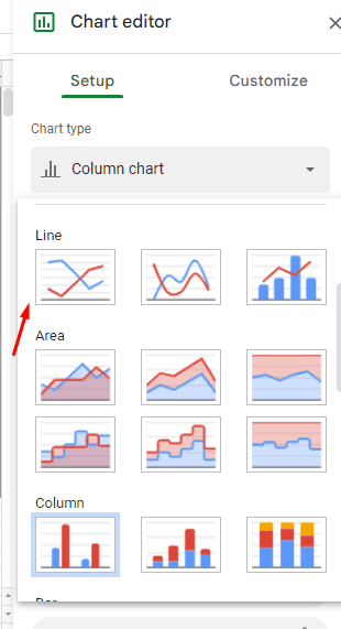
Luckily, Line Charts are the first type of charts visible on the list. There are three options in the "line charts'' section that you can choose from:
Regular Line Chart
Smooth Line Chart
Combo Line Chart
We've described the use cases of each of these sets above, so choose accordingly.
Once you've made a choice, click on the chart icon, and your chosen line chart will replace your default chart in real-time.
Before you google how to set up a line chart in Google Sheets, hop into the next section.
Step 4: Setting Up Your Line Chart
You can set up the chart from the same section you changed the chart type in the previous step.
Below the chart type option, you can choose to change the data range, x-axis (horizontal axis) and y-axis (vertical axis) title, series, or switch rows and columns.
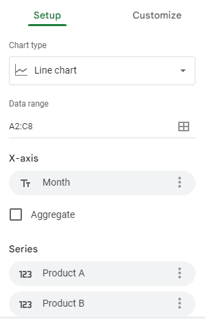
And that’s not just it, you can even change the font size and style of the axis titles. To customize your line charts, click on Customize in the chart editor.

In the customize tab, you can find options to customize background colors, style, labels, and colors.
Once you're done with customizations (if any), your line chart is ready to be presented.
So, now that you have a better understanding of how to create a line chart in Google Sheets. It's time to share our creativity with teams and stakeholders.
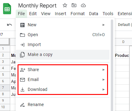
Bonus Step: Export or Share Charts
Instead of keeping the line chart you make to yourself, share it with your team, investors, and execs. To begin with, click on File in the top menu bar, you'll see three ways to share your chart:
👨👦👦 Share: Enter the email addresses of people you want to allow access to your sheet
📩 Email: Directly email the sheet to teammates and stakeholders
⬇Download: Make an offline copy of the sheet (doc, pdf, or .csv formats) to use later on
Drawbacks of Creating Charts with Sheets
#1. Limited Number of Integrations
Unlike most chart creation software or tools, Sheets offer next to no integration options.
You see, there are at most two ways to import data:
By importing a pre-built datasheet from the drive/system
By manually entering data in cells
This also means there's a high chance that the data you use for creating charts is outdated. And there's no quick solution to visualize real-time data until and unless you enter and update it manually every time.
Sounds like you need to hire someone to do this regularly! 😥
#2. Might Get Slow When Handling Complex Datasets
Another drawback of Sheets is its inability to process big datasets.
Yes, despite being among Google's core services, the application needs to catch up in processing complex and lengthy data.
Sheets provide over 10,000,000 cells to collect and organize data. However, long before you hit rock bottom, you'll encounter lags and glitches in your worksheet. 🐌
Some users even cite frequent unresponsive pages when dealing with large datasets in Sheets. And this becomes problematic for large companies that generally deal with terabytes of user data.
When such companies use Gsheets, they are constantly under threat of data security and integrity.
#3. Mobile App Is Not Up to the Mark
Using the software to create charts on your mobile is a big NO. And here's why:
Even though Gsheets offer a dedicated mobile app for mobile users, it hasn't worked smartly to optimize the app for small-screen devices.
Or we could say it has no such feature to be counted as well-optimized for mobile users.
You might end up in one or the other situation listed below:
Difficult to scroll through the sheet
Bugged/incomplete graphs
Complications in managing and visualizing data
#4. Limited Customization Options
Compared to Datapad (our tool), Google Sheets offers a limited range of data visualization elements.
Although Sheets provide a pre-built set of charts, tables, graphs, and widgets to visualize data, these elements are limited in numbers and are not aesthetically pleasing to the eyes.
Of course, you can edit and customize the charts, but then again, options are scarce, and ultimately the result won't make you go WOW.
So, what's a better way to create charts?
Looks like we got an answer for you. 🤩👇🏻
Create Stunning Line Charts with Datapad!
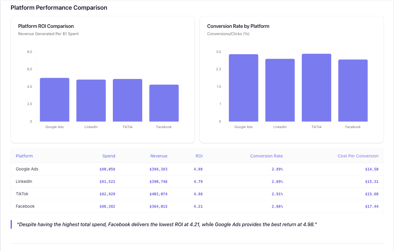
Datapad is designed to make data analysis easier, especially for those using Google Sheets. Whether you're creating a dashboard to track sales or a graph to visualize trends, Datapad integrates seamlessly with your Sheets to provide powerful insights.
The beauty of Datapad lies in its simplicity and ease of use. With our tool, anyone in your team with zero technical knowledge can start building reports in mere seconds.
#1. Google Sheets Integration:
Tired of copying and pasting data from your spreadsheets into visualization tools? Or worse, rebuilding your charts every time your data updates? Datapad solves this headache by connecting directly to your Google Sheets, transforming your data into stunning visualizations without the technical complexity.
With Datapad's Google Sheets integration, you can:
Connect any Google Sheet with just a few clicks—no coding required
Watch as your dashboards update automatically when your spreadsheet changes
Visualize complex data in ways Google Sheets alone simply can't handle
Create beautiful, presentation-ready charts without fighting with formatting
Say goodbye to spreadsheet limitations and hello to data that works for you, not the other way around.
#2: AI-Driven Analysis
Ever wished you had a data analyst on call 24/7? With Datapad, you basically do. Skip the complex Excel formulas and simply ask questions in plain English like "What's our best-performing ad channel?" or "Show me last quarter's conversion trends." Datapad's AI instantly generates the perfect visualization to answer your question.
With Datapad's AI-powered analysis, you can:
Ask questions in everyday language and get immediate visual insights
Uncover hidden patterns and relationships in your data automatically
Focus on making decisions instead of fighting with chart settings
Transform complex data into clear, actionable intelligence in seconds
Your data has stories to tell—Datapad helps you hear them through simple conversation.
#3. Scheduled Reporting
End the monthly reporting grind forever. Datapad automatically delivers fresh insights straight to your inbox or Slack channel on your schedule. Set up your dashboard once and let automation take over—whether you need daily metrics, weekly performance snapshots, or monthly executive summaries. Choose from our library of ready-made templates to get started even faster with industry-specific KPIs and visualizations. Your team stays informed with zero manual effort, while you focus on acting on insights instead of creating reports. Perfect for agencies managing multiple clients or busy teams that need consistent data without the hassle.
Collaboration and KPI dashboards must go hand in hand, that’s how a company excels in KPIs tracking and setting strategic goals.
💭Food For Thought: We wanted to be innovative with our collaboration feature and thus spent hours brainstorming about how to make collaborations easy yet real-time.
So, here we are!
#4. Downloadable Reports
Sharing insights with your team or stakeholders should be straightforward. With Datapad, you can download your reports in PDF or HTML format, making it easy to distribute them. Whether you need to attach a report to an email, share it on a project management tool, or print it for a meeting, Datapad has you covered. No more scrambling to capture screenshots or manually compiling data. Your reports are ready to be shared in a professional format at the click of a button.
#5. Web Search Feature
Sometimes, understanding your data requires context from the wider world. Datapad's Web Search feature allows you to pull in external data for sector benchmarks and trends, enriching your analysis. Whether you're comparing your sales figures to industry averages or looking for the latest market trends, Datapad can help you find the information you need. This feature ensures that your analysis is not just based on internal data but also informed by external factors, giving you a more comprehensive view of your performance.Make Your Excel Dashboards Look Stunning with Datapad.
Table of Key Features and Benefits
Feature | Description | Benefit |
Google Sheets Integration | Connects directly to Google Sheets for data analysis. | Seamless workflow, leverages existing data. |
AI-Powered Analysis | Allows plain English queries, generates graphs and dashboards. | Reduces technical barriers, fast insights. |
Dashboard and Report Creation | Supports bar graphs, line charts, pie charts, Gantt charts, etc. | Visualizes data effectively for decision-making. |
Scheduling Reports | Delivers reports via email or Slack at scheduled intervals. | Keeps users informed without manual effort. |
Download Options | Reports available in PDF or HTML format. | Easy sharing with stakeholders or teams. |
Web Search Feature | Pulls external data for benchmarks and trends. | Enhances analysis with industry context. |
Datapad is a free kpi dashboard tool that allows you to connect data sources and keep track of all your metrics in one place. We claim that Datapad is the easiest kpi tool out there.
If you are keeping your dashboards on excel or sheets, you can use our integration to take all your data from spreadsheets and build stunning dashboards on Datapad.
