Even with multiple features, visualizations, and speed, a dashboard can become a headache.
No matter how much quantifiable data or content you put into your dashboard, a poor dashboard design can annoy viewers at times (including you).
#Giveaway: We’re giving you a 1000 bhp sports car that looks like a pick-up truck.
See, your excitement just dropped after reading the last phrase.🥱
In a similar context, a great dashboard design immensely affects its viewership and the desire of your team to work on it.
In this article, we’ll walk you through the key principles of designing a great dashboard. We will also share some tips and tricks to implement these principles into your dashboard creation process seamlessly.
And lastly, we have some great dashboard examples to inspire your thoughts.
Whenever you’re ready! 🏁
What Are the Key Design Principles of Great Dashboards?
To design stunning dashboards, you should take into account the Gestalt Principles. It tells you a great deal about visual perception and colors to use in a dashboard.
Gestalt Principles are a set of rules that describe how the human eye groups similar elements, recognize patterns and simplify complex images when we perceive objects. These principles are a crucial part of any design concept.
To sum up, a great dashboard is a blend of five fundamental design principles.
#1. Enclosure
If you put a series of elements or objects inside an enclosed section, they are considered a group. Our brain subconsciously fills in gaps between elements to perceive them as a complete image.
Suppose we say you placed a scatter diagram with reference lines surrounding the objects.
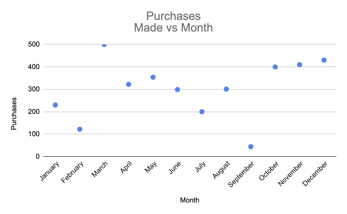
Now, you might have included several elements into it, but the user will view it as a complete image because it's enclosed under a boundary (our brain interprets the axes of the graph as its boundaries).
You can use graph enclosures in creative ways to win users' trust when they recognize complete images from cleverly placed elements.
#2. Proximity
It's the tendency to visualize multiple elements as a group when we put close-together elements, separating them from those farther apart.
For example, when you cluster multiple elements into one area on your dashboard, the user's mind will visualize it as one group distinct from everything else on the screen.
#3. Similarity
A great dashboard tells the data story by itself. And it’s not what viewers have to search through.
To do the same for your dashboard, include similar objects and elements in the same closed area.
This helps your brain identify such elements easily and keeps you engaged and focused.
Facebook, for example, uses this principle for its interaction design, where likes, comments, and other interactions appear within the boundaries of one post and so stand apart from others.

#4. Continuation
We perceive several objects aligned closely as a continuous body, and our brain coordinates with our eyes to follow the continuation because it just feels right!
This is because we as humans hate uncertainty and preach for things that have stability.
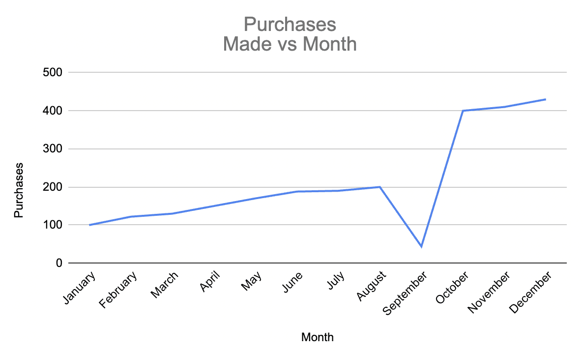
Imagine you’re looking at a linear graph. No, when you look at an upward trend, you will continue to do so until there’s something that breaks the continuity.
Don’t believe us? Time to test the waters in:
3…2…1
What Makes a Great Dashboard?
Now that you know how to structure your dashboard to make it appealing to the user's mind let's walk you through the qualities or features of a great dashboard.
#1. Easy Access for Everyone
First and foremost, a great dashboard comes with great accessibility. Imagine creating a dashboard that your team finds hard to access. After some time, users might not even care to open the dashboard as it's so hectic and time-consuming.
To escape this phase, ensure that accessing the dashboard doesn't require more than a click - no multiple logins, no delays in loading, and quick onboarding.
Moreover, your dashboard should be easily shareable (via links) so a team member sitting even at the remotest location can access it on the go.
#2. Clear Visuals
Another vital component of a great dashboard is its visuals. The diagrams, colors, and fonts - everything should align in a unified format to present your data in an easy-to-understand manner.
For the most part, you can avoid using too many data visualization elements.
Datapad’s Tip: A great dashboard is always simple, clean, and pleasant to the eyes.
#3. Gives You a Holistic View
If someone asks you about the purpose of the dashboard you build for your business, you should know it.
Here are some purposes you might give to a KPI dashboard:
-
Tracking monthly sales of a product
-
Tracking supply chain KPIs
-
The dashboard tracks all e-commerce KPIs
Ensure that the dashboard you create gives a bird-eye view of your business. It must contain all the information to serve its purpose. Any leaks or missing data can unintentionally manipulate your decisions.
How to Have a Great Dashboard Design?
Apart from the theoretical principles and the critical features, here're a few of our well-researched tips for creating a stunning dashboard.
Tip #1. Be Clear of Your Dashboard’s Purpose

To begin with, you must be clear about what you are trying to achieve from the dashboard (usability). Is it the company's financial health? Or your store's traffic?
Try to answer questions like:
-
What do you want to achieve from the dashboard?
-
Who is it for?
-
What do you want them to do differently because of it?
It's actually the most crucial step because if you get this wrong, the whole concept of building a dashboard goes down the drain. Whether your dashboard is for a bigger picture or finding and resolving a problem quickly, there has to be a purpose!
Tip #2. Avoid Putting in Everything You See

We know you have a plate full of content and data, but your dashboard doesn't need a high-quantity diet. Instead, it seeks something minimal in quantity and more in value.
It helps improve the UX design of the dashboard and the white space in the dashboard soothes the eyes be it a web design or mobile.
You've already defined your goals and KPIs; adding those is a great starting point. Just make sure everything circles the purpose of your board.
The screen presenting your dashboard is limited. Therefore, you must utilize every inch of it. Adding not-so-important information can confuse viewers right from the start.
So, here's how to filter your dashboard KPIs and elements:
-
Put-in elements and metrics that match the sole purpose of your dashboard
-
Check if the KPIs can easily be understood and influenced by your team
-
Prioritize those metrics which are highly volatile and need regular tracking
Tip #3. Don't Forget to Use a Grid Layout In Your Dashboard UI

Although this sounds boring, consider a grid format when placing objects on a dashboard (views, filters, titles, etc.).
You may ask why?
In designer's terms, a grid layout is a structure made up of a series of intersections of vertical and horizontal lines serving as a framework to structure your content.
It not only shapes your content but also enhances content readability. The grid framework helps you organize your graphic elements in a rational and easy-to-understand format.
Tip #4. Keep An Eye on Data Ink Ratio
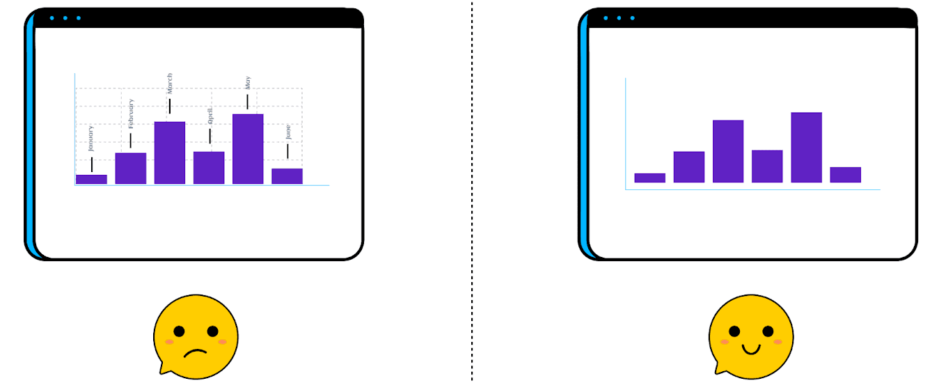
The concept of Data Ink Ratio was first introduced by Edward R. Tufte, an information visualization expert at Yale University.
According to the concept, data-ink is a non-erasable core of the graphic. It's important enough to have a formula dedicated to calculating the ratio.

Here,
'Ink' represents the proportion of graphics used.
In simpler terms, Tufte suggests erasing that extra ink that doesn't add new information to the graphic, i.e., using less ink (chart elements), is more effective and attractive from the user's perspective.
Note: The term 'Ink' is used because the concept has been around since the pre-digital age.
Well-designed dashboards aim to use as little non-data ink as possible – in Tufte's words, they have an excellent data-ink ratio.
That means removing unnecessary data-ink used by colorful backgrounds, quirky Illustrations, gridlines, icons, and labels - merely anything that doesn't communicate any data can significantly improve your dashboard.
Maintaining a low-data ink ratio is great because it prevents dashboard viewers from getting distracted due to unnecessary elements.
Tip #5. Choose the Right Data Visualization
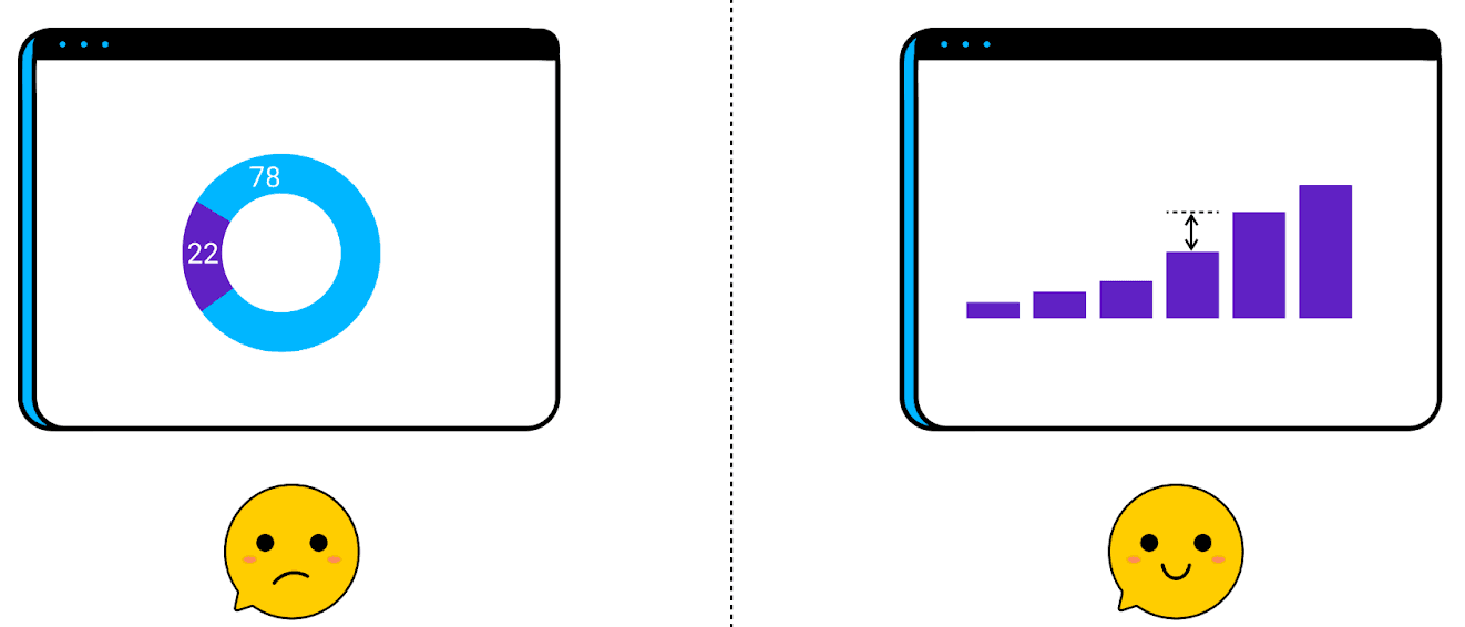
Fancy visualization elements are great for other design purposes, but not when designing a dashboard.
When creating dashboards, always choose the visualization elements that clearly communicate what you want to say with your data.
For example, sometimes it’s tough to read a pie chart for a specific dataset. Use bar charts or line charts instead.
Some elements like pie charts and area graphs are hard to understand at a glance, and so they are not a popular choice among dashboard designers.
However, a combination of bars, numbers, lines, and tables would do enough for you. Also, if a specific visualization element is perfect for every data set, there's no harm in using it again and again (just be creative with it, don't make it look monotonous).
Tip #6. Keep UI Design Simple: Less Is More

Again, a simple design template can be more attractive and effective than a clustered design (remember the data-ink ratio?).
Try keeping your dashboard clean, filtering out unnecessary information, finding ways to combine multiple small blocks, and eliminating unwanted elements as soon as possible.
This is the right way to create an effective dashboard for you and your team.
Take a minimalistic approach to dashboard creation; the simpler the design, the more data-focused your dashboard will be.
Tip #7. Create a Hierarchy or Streamlined Flow of Information
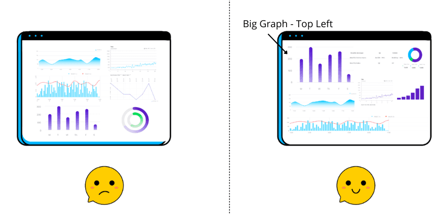
We mentioned how important it’s to create an easy-to-understand dashboard, and building a hierarchy in your dashboard design process adds a ton to the process.
When left with limited data and content, it isn't easy to provide users with a streamlined flow of information on the dashboard.
But here's the thing; you can use custom size and position to emphasize the metrics that matter most and downsize metrics that need less attention.
For example, suppose we say if you want viewers to notice a metric instantly, the top left corner of your dashboard is the best location as that's where your eyes are naturally drawn to first.
Hierarchy also helps you keep the most important information on top.
Tip #8. Round Your Numbers and Give Them Context
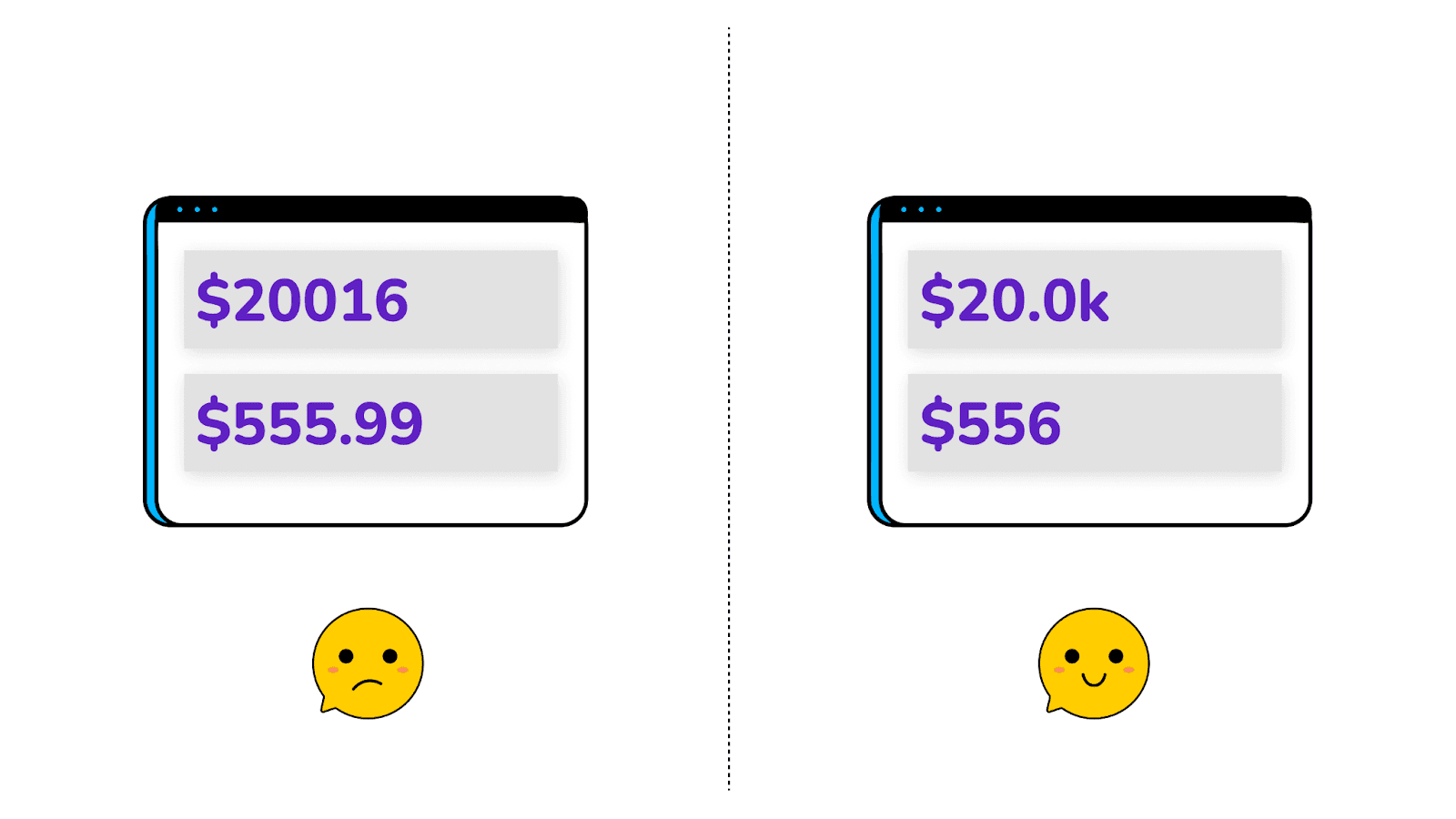
Decimals have been a nightmare for many since school. And honestly, you don't need to be very precise with numbers. A simple figure is more convincing to the eyes than a number with three decimals attached to it.
In addition, just displaying numbers won't help the viewers better understand your analysis. Try adding context to the numbers by comparing past performances and showing growth trajectories, including averages, current progress rates, and more.
Basically, anything that builds a story around the number. Similarly, add context to every KPI or metric to make them self-explanatory; at the same time, use compact and small-sized fonts to avoid cluttering.
Tip #9. Don't Hesitate to Be Consistent
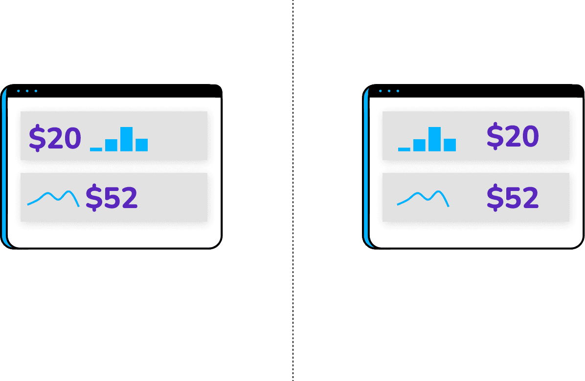
People generally have a solid photogenic memory of what they see. And so, playing around with too much visualization might confuse them.
Instead, it's always wise to use repetitive or consistent graphs, colors, and fonts for dashboards.
Pro Tip: Don't try adding anything that's hard for the viewers to absorb. Not a wise choice, indeed.
Tip #10. Collaborate and Iterate

Lastly, work towards building a dynamic dashboard - you can A/B test such dashboards easily and share them across the team with a single click.
Ensure that your dashboard is easily workable by your team members and provides real-time collaboration to support team building and unified decision-making.
The best way to test your dashboard is to ask for feedback from your team and other administrators. Use that feedback to update your dashboards with necessary changes.
Pro Tip: Take these 10 tips as dashboard design best practices and go through the list wherever creating a dashboard.
7 Types of Dashboard Design Examples We Loved
Our team at Datapad reviewed several dashboard designs this year, and here're 7 dashboard design examples we loved and had a great user experience.
#1. Agency Dashboard
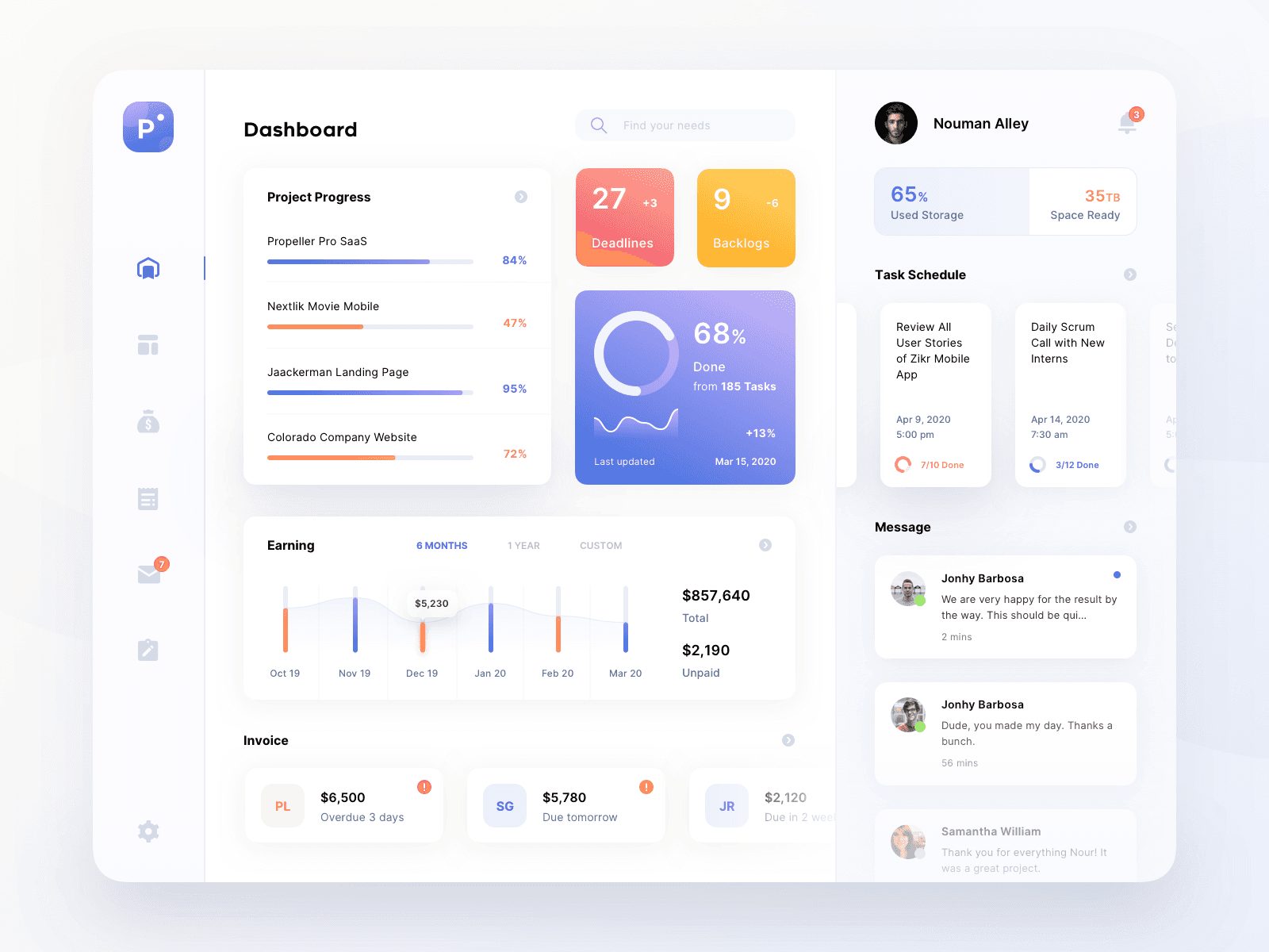
The agency dashboard gives a comprehensive view of the real-time KPI performance in your organization to help management make better data-driven decisions.
What We Loved About the Agency Dashboard?
-
Gives a holistic view of everything going on in the organization under one roof
-
A simple and clean interface that clearly emphasizes every KPI
-
Lets you talk to your teammates inside the dashboard
-
Use of non-decimal and context-based numbers throughout the dashboard
-
Has all the important KPIs like project progress, deadlines, backlogs, earnings, tasks, schedule, and more; a no-fluff dashboard
Most importantly, the dashboard maintains consistent and attractive color combinations, making it easy to visualize for everyone.
#2. Supplier Dashboard
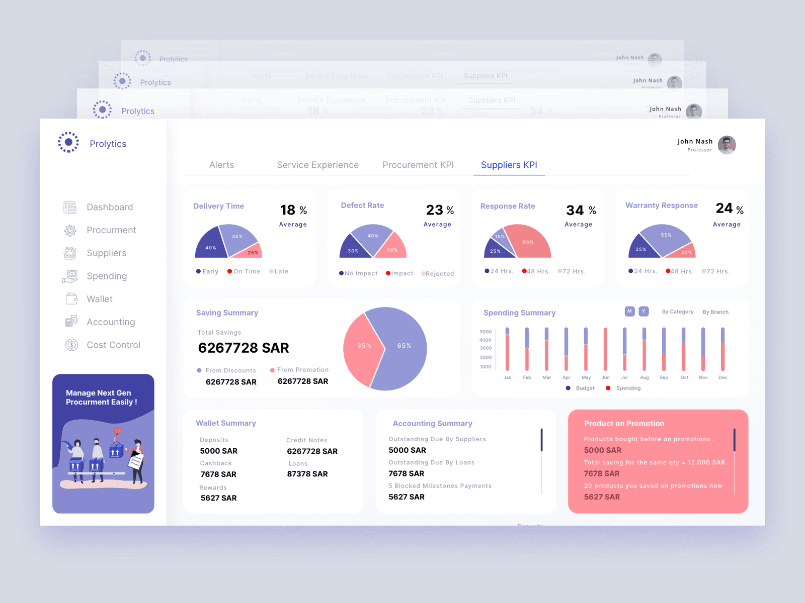
The supplier KPI dashboard depicts the true picture of the supplier's procurement process. It helps businesses understand suppliers' overall performance, from quotation receiving and approval to advanced payment made and goods received.
What We Loved About the Supplier Dashboard?
-
A streamlined flow of information showing advancements over time
-
Use of consistent visualization (graphs/colors) throughout the dashboard
-
Not the most popular way of data visualization (pie-charts) but being consistent with the visualization choice makes the dashboard easy-to-scan
-
Context-based numbers and percentages all over the dashboard
-
First-level metrics show Average Delivery Time, Defect Rate, Response Rate, and Warranty response rate
-
Emphasis on metrics such as Saving summary from Promotion and Discounts
The supplier dashboard is a well-versed performance measurement dashboard showcasing fine details of suppliers and procurement KPIs, from delivery time to warranty response.
It also displays a summary of crucial KPIs in the second half of the dashboard.
#3. Operational Dashboards

The operational dashboard is typically designed for the ease of Shopify store owners managing their tasks and store performance simultaneously.
What We Loved About the Operational Dashboard?
-
The KPIs are structured using a pixel-perfect grid layout; easy to scan and pleasant to the eyes
-
Context-based numbering with growth trajectory and comparison to past performances
-
Minimal use of graphics leads to a higher data-ink ratio
-
Despite having plenty of content, the information is well enclosed under distinct groups
-
The dashboard is self-explanatory and easily navigational
Again, the dashboard acts as a control center for Shopify store owners to track their project status, measure conversion rates, and calculate the commission earned weekly, monthly, or yearly.
#4. Sales Dashboard
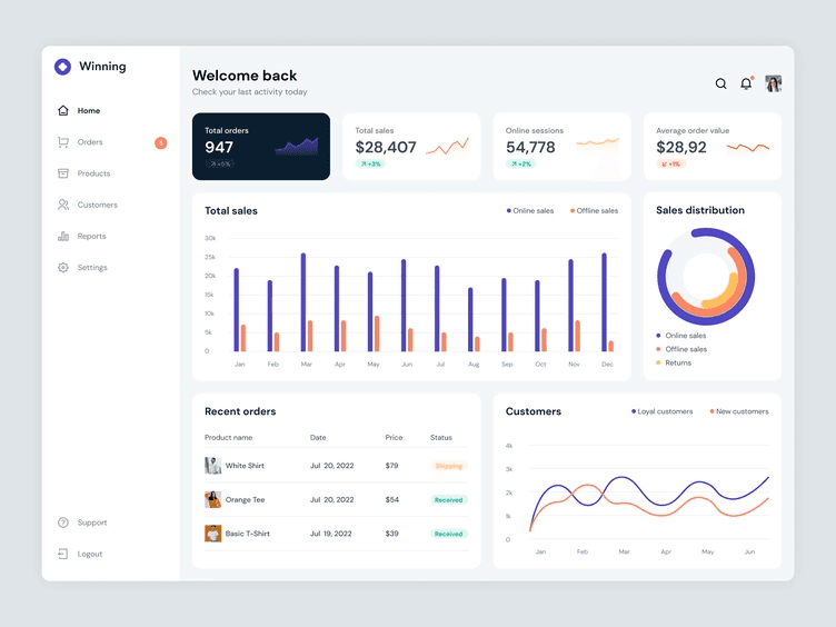
The sales dashboard enables C-suite executives and data-driven sales teams to efficiently track, monitor, and analyze all the sales-related KPIs under one unified dashboard.
What We Loved About the Sales Dashboard?
-
Has a simple and minimalistic design introducing a sense of hierarchy
-
Use of consistent or repetitive color schemes for describing similar KPIs
-
Easy-to-understand user interface pertaining to the law of proximity
-
Context-based numbers with trend lines and growth trajectory
-
A neat dashboard with over three different visualizations, yet easy to scan because of reasonable spacing between KPI cards
The sales dashboard has everything ranging from total and average sales, order value, sales distribution, and customer lifetime value.
#5. Performance Dashboard
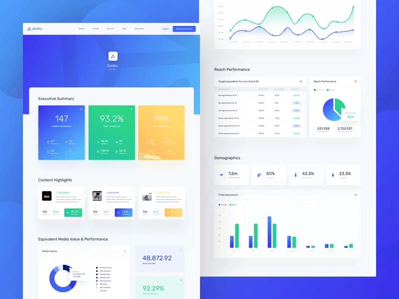
The performance dashboard provides an overview of numerous metrics such as the - Executive summary, content highlights, executive's media value, and performance across Facebook.
What We Loved About the Performance Dashboard?
-
Provides a ton of consumable information at a glance across your core KPIs
-
Has a fairly decent data-ink ratio across multiple components of the dashboard
-
Excellent choice of data visualization elements to distinctively showcase multiple KPIs
-
The numbers are well-furnished with the context of answering the whys and hows of a dashboard
Undoubtedly, the performance dashboard provides a holistic view of the overall business performance with a lot of data and content put into it, yet contextual enough to enhance the dashboard's readability.
#6. E-Commerce Dashboard

As the name suggests, an e-commerce dashboard is a curated set of metrics and KPIs designed to highlight trends, anomalies, and information related to an online store that regularly warrants attention.
What We Loved About the E-Commerce Dashboard?
-
The use of a grid layout adds structure to the dashboard and enhances content readability
-
Has the concept of similarity and continuation spread across the dashboard
-
Emphasizes top-level metrics like total earnings, visitors, and orders; downplays less important metrics like visitors and daily earnings to create a hierarchy
-
Contextual numbering showing percentage increase and decrease from past performances
-
The minimalistic design and enclosed KPIs present information in an easy-to-understand manner
Evidently, the E-commerce dashboard is easily scannable by anyone. You can learn all the information and trends you need to know within minutes of opening the dashboard.
#7. Investment KPI Dashboard
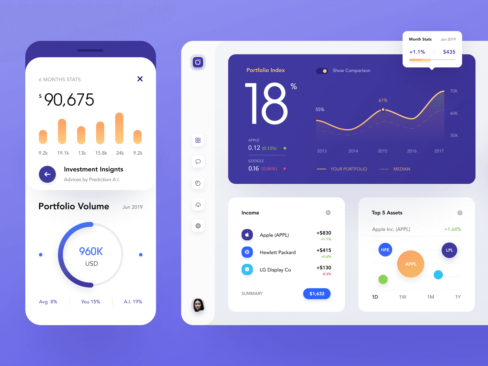
If we consider the recent market trends, an investment dashboard is the next most popular dashboard among millennials. It gives you in-depth insights into the portfolio and investments and recommends suggestions on enhancing your earnings over time.
What We Loved About the Investment KPI Dashboard?
-
Enclosed KPI cards and several widgets depicting every insight and measurement distinctively
-
Right choice of chart types to represent portfolio volume, index, income, and more
-
Numbers and percentages present in the dashboard are contextualized, leaving no space for guess-work
-
Have elements grouped together, making it easy to understand the trends and changes
-
Uses a sense of continuation to quickly analyze the flow of investments and the returns generated per investment
The investment KPI dashboard is a standalone dashboard that lets you take care of all your investments under one unified dashboard, thereby helping you make better investment decisions over time.
Create Great Looking Dashboards With Datapad
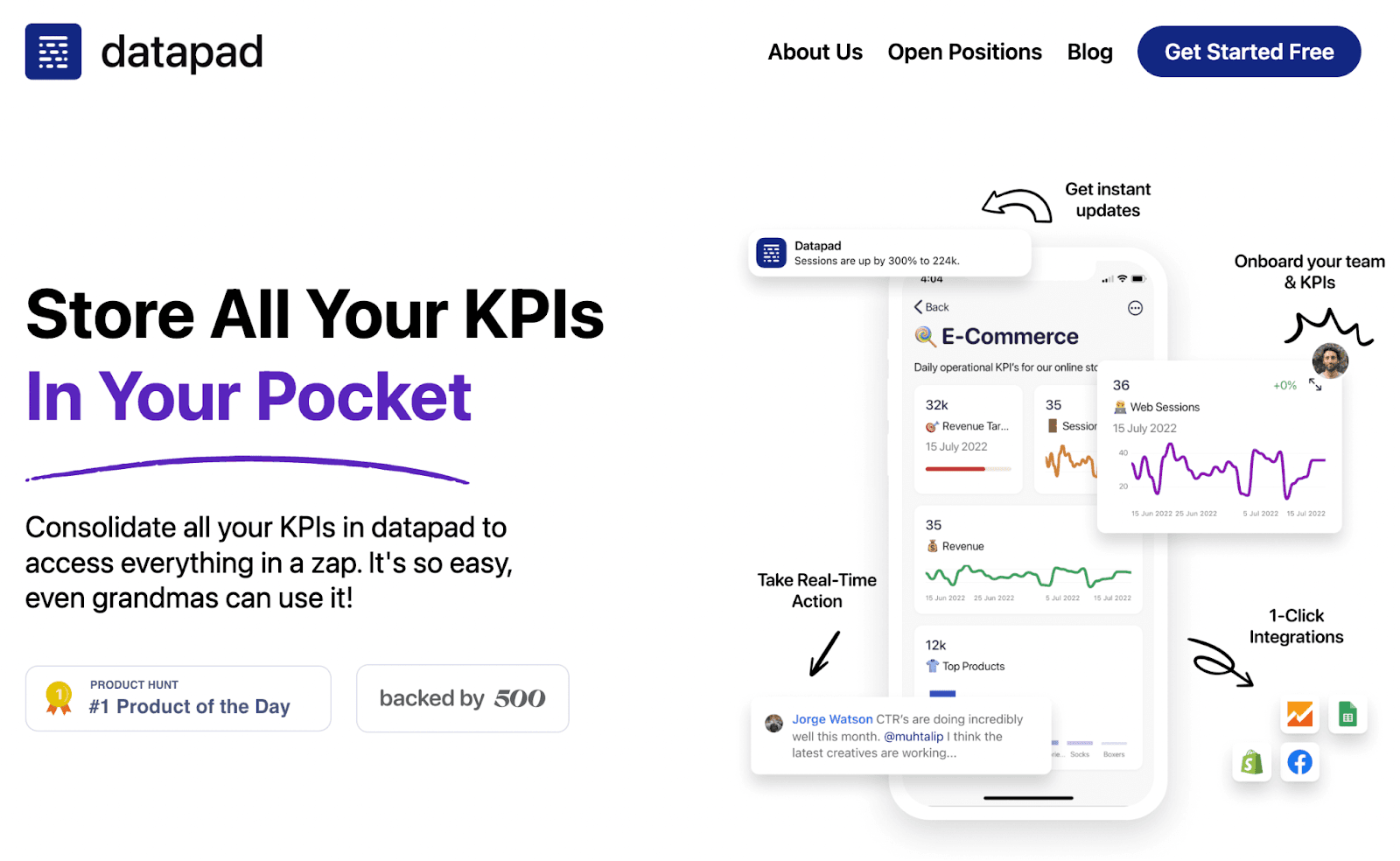
Datapad is a mobile-first KPI dashboard creation app (web app coming soon) that lets you create stunning dashboard designs on the go.
It just takes minutes to create a dashboard, import data, and populate the dashboard with KPIs.
Let's see how to do it step-by-step.
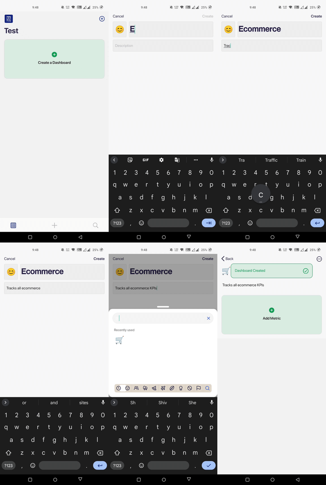
Step 1: Creating a Dashboard
Open Datapad’s app (available for both iOS and Android) and sign in to the platform. Once you’re in, tap the ‘Create a dashboard’ button you see on the top right corner.
Give your dashboard a suitable title, emoji, and description, and click on ‘Create.’
Step 2: Data Import
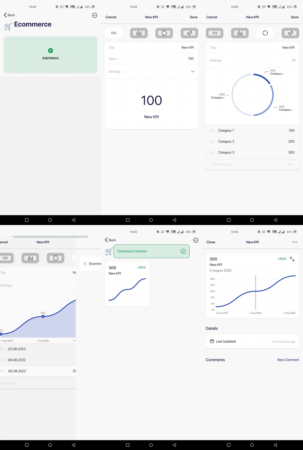
With Datapad, you can import data manually or automatically. If you have a small dataset, you can import it manually.
But if you have a huge dataset, Datapad has several one-click integrations with platforms like Google Sheets, Shopify, Airtable, and many more.
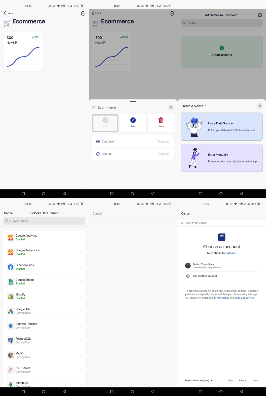
So go ahead and import data to Datapad the way you want.
Step 3: Dashboard Design
Start adding metrics from the data you imported. Datapad lets you personalize these KPIs by setting individual goals and changing the color and text. Use your brand's color scheme to make things engaging.
And there it is…

A stunning dashboard design that you can create with Datapad in minutes (this is from our upcoming web version)
Apart from this, you can also onboard your team, assign them individual KPIs, and talk to them in real time about the KPIs via the comment section.

What more can you ask from a free dashboard creation tool, right?
So sign up to our free mobile app, and create a dashboard design for your end-users.
![Dashboard Design: How to Design a Great KPI Dashboard in 2023 [Examples & Best Practices Included]](/_next/image?url=https%3A%2F%2Fframerusercontent.com%2Fimages%2Fc4rWtc09gZ2KlOAu0Ykxq4eNny8.png&w=3840&q=75)