Let’s be honest, we all agree Excel is an old-school talk!
Yet, with over 1.1 Billion users globally, it still holds the ground when it comes to data management and visualizations. 🤯. In this guide, you’ll discover:
1. Why interactive dashboards supercharge your reporting
2. Exactly how to build one from raw data to live visuals
3. 5 free templates to kickstart your own dashboard
4. Pro tips to overcome Excel’s limitations
Can’t wait for that long? Here’s a quick summary of the article:
-
An interactive dashboard in Excel is a type of dashboard where you can track KPIs and metrics with your team, change data as per your business KPIs fluctuate, and track changes in real-time.
-
To create an interactive dashboard in Excel, you first need to create interactive charts. To do so, you first have to convert your data into a Pivot table.
-
These pivot tables will then be used to create interactive charts which will then go on the Excel dashboard.
-
Creating an interactive dashboard in Excel is tough and has limitations. It’s not scalable, has limited data visualization, and doesn’t have a high level of security. To overcome all these challenges, we built Datapad.
-
Datapad is a dashboarding solution to create interactive dashboards, bring your team onboard, and track KPIs from anywhere in the world from your mobile device.
Let’s transform your spreadsheets into dynamic, interactive reports!
What Is an Interactive Dashboard in Excel?
An interactive dashboard in Microsoft Excel is a one-pager (mostly, but not always) report that allows business teams to track and measure crucial business KPIs and metrics under one roof.
It consists of a combination of charts, figures, and tables that visualize complex and hard-to-understand data in an easy-to-read format.
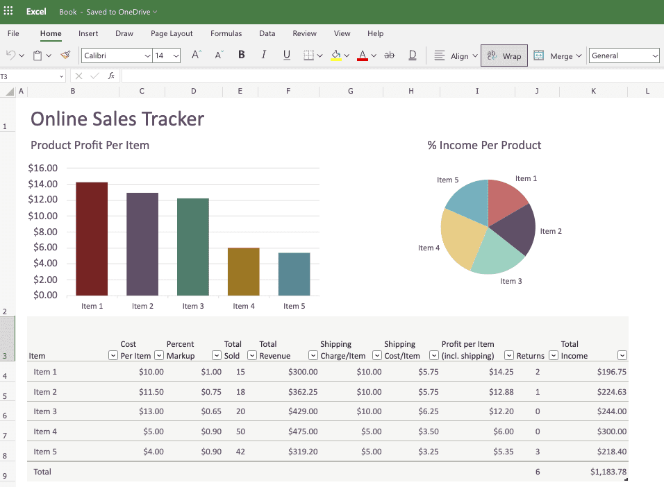
Besides, creating an interactive dashboard in Excel is fun. You get to learn most of the Excel functionalities and meanwhile have an opportunity to create something stunning, which would make your stakeholders go wow for the job! 😮

So, are you ready?
Let’s rightaway jump to the section where we’ll see how to make an interactive dashboard in Excel.
How to Create an Interactive Dashboard in Excel? A Step-By-Step Tutorial
Steps #1. Define the Purpose of Your Dashboard
Before starting the process, let us ask: Why are you creating this dashboard and for whom?
Different stakeholders or departments within the organization would want to analyze different facts and figures.
For instance, a Chief Financial Officer (CFO) would prefer looking at key financial metrics, while an investor would want a summarized dashboard of all the departments.
Keeping this in mind, try to attach a purpose to your dashboard and then collect data around it for accurate and effective decision-making.
Step #2: Source In Data and Create a Pivot Table
Here’s a raw data set we will be using to create an interactive dashboard in Excel.
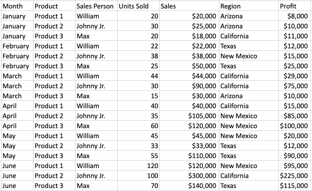
Let’s first convert this dataset into a table (you can skip this if you already have a table).
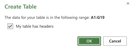
Select your data, go to Insert > Table. In the pop-up that opens, tick the box - ‘My table has headers,’ and click OK.
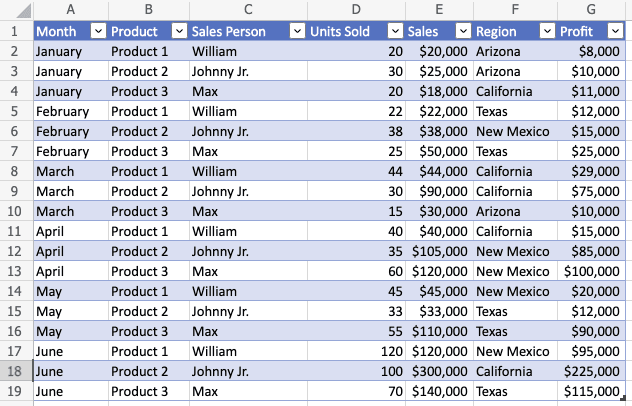
Your table will look something like this:
Next, convert the table into Pivot table; this will help you create interactive charts to put in your dashboard in Excel. Select the table, go to Insert Tab > Pivot Table. Click on OK and you will have a new sheet with Pivot Table.
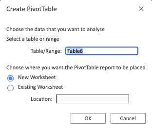
For our interactive Excel dashboard we want 3 charts, meaning we need 3 pivot tables. To do so, we will just duplicate the pivot table sheet in the Excel workbook.
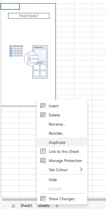
And just like that you have 3 pivot tables ready. Let’s move on to the next step to create charts for our interactive dashboard.
Step #3: Create Charts with Pivot Table
So our first chart would represent every product’s monthly-wise sale.
For that we need 3 data entries - Sales, Product, and Month.
In the Pivot table sheet, drag and drop the Month data in the rows area, product in the columns area, and Sales in the values area.
Here’s a GIF to explain it to you clearly:

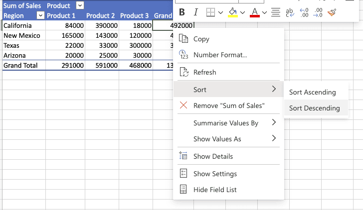
If you want, arrange the values in decreasing or increasing order.
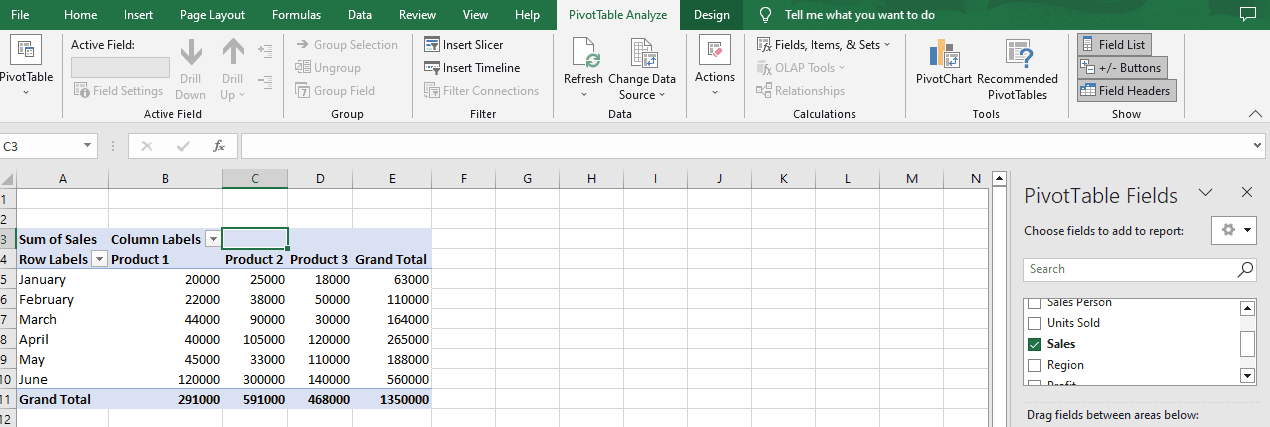
Next, click anywhere on the Pivot Table as soon as you do that, you will see a tab - PivotTable Analyze appears in the top menu.
Next, click on PivotChart inside the PivotTable Analyze menu and choose the chart you want to represent your data. In our case, we’re choosing Stacked columns from the chart drop-down.
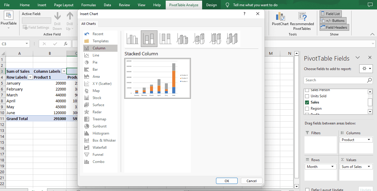
The moment you press OK, a pivot chart will appear in front of you.
Volia! You have made your first chart.
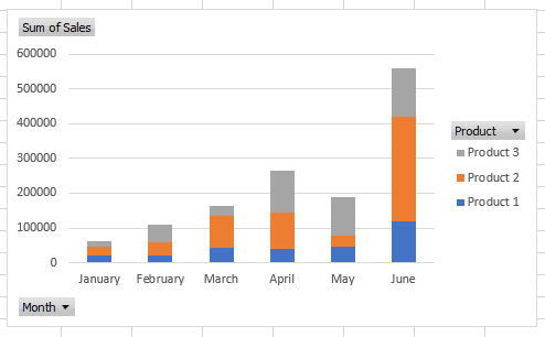
Now, it’s time to style the chart via formatting options in Excel.
Let’s start by giving the chart a title:
Click on the + sign that you see besides the chart you just created, tick the ‘Chart Title’ box, and give your chart a suitable title.
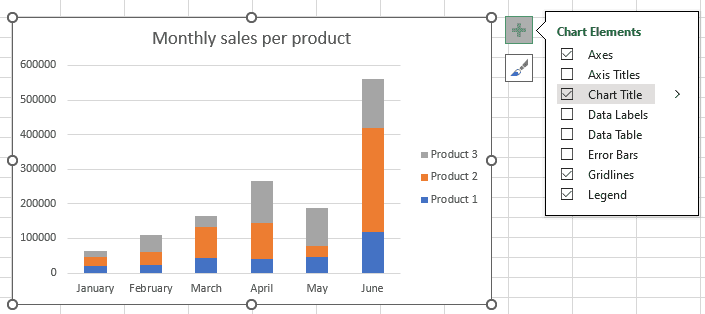
Excel has some basic formatting options that you can use to make your chart look better:
-
Chart Title: Change the title of your chart
-
Legend: Enable, disable, and edit legend as needed
-
Axes: Edit horizontal axis and vertical axis of your chart
-
Data Table: Insert a table that represents all values in a data table
Try them out and see how you want your pivot chart.
After you’re done formatting, you can then move your chart to the Interactive dashboard sheet.
Repeat the procedure to create such pivot table charts for your interactive dashboard, once you’re done, we’d start formatting and customizing our interactive dashboard.
When it comes to creating charts, Excel gives you a boatload of options:
-
Bar charts or column charts
-
Pie charts
-
Line charts
-
Area charts
And many more…
Here’s how our dashboard looks after creating 3 charts.
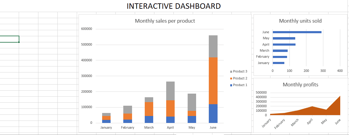
Step #4. Add Interactive Features to Your Dashboard Design
Select any chart you want on your interactive dashboard and click on PivotChart Analyze. Go ahead and click on Insert Timeline.
Note: For inserting a timeline to any pivot chart, you MUST have the Date column in your data.
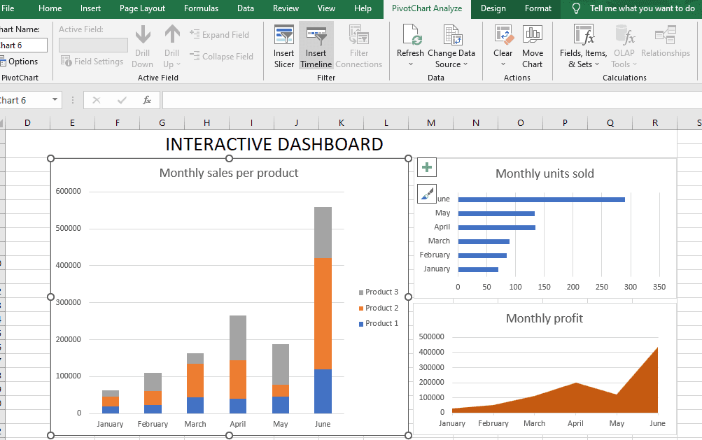
Tick the Date checkbox and press OK.
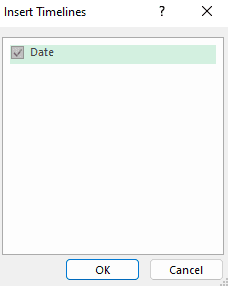
This will give you a timeline of the chart.
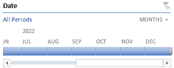
In a similar fashion you can add slicer for all the charts you want to on the interactive dashboard.
Here’s the snapshot of our final interactive dashboard in Excel:
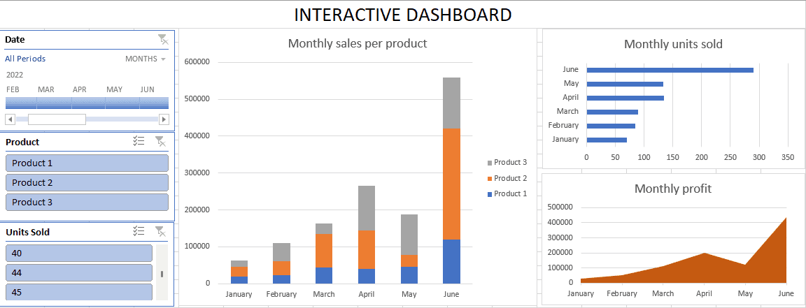
Doesn’t it look pretty?
Now that you’ve seen how to create an interactive dashboard in Excel, it’s time to explore some templates that you can use directly.
5 Free Excel Interactive Dashboard Templates
#1. Financial Dashboard
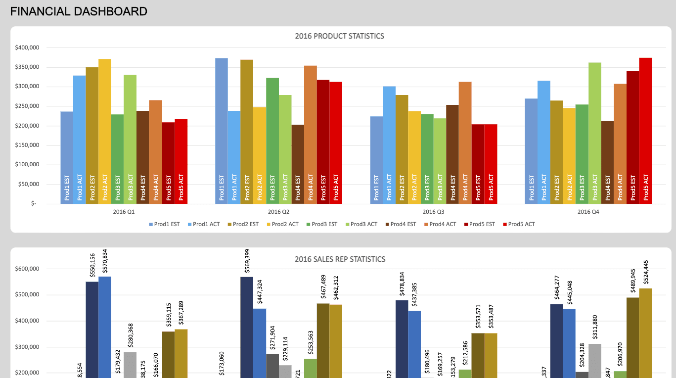
A financial dashboard lets you monitor the financial performance of an organization. It consists of key financial KPIs such as net profit, working capital, accounts receivable, and more.
In simple terms, these dashboards are meant for executives or business owners who aren’t aware of financial jargon but would like to have an overview of all the financial operations in theri business.
CFOs and finance teams use these dashboards to demonstrate the business's financial health to stakeholders and other relevant parties.
Download Link: Financial Dashboard
-
Product Revenue: Compares the estimated and actual revenue generated from individual products over the year
-
Regional Sales: Monitors the region-wise sales of the company for the year
-
Sales Rep Performance: Estimated and actual revenue generated by each sales rep every quarter
-
Product Statistics: Visualizes the estimated and actual sales generated from each product on a quarterly basis
#2. Marketing Performance Dashboard
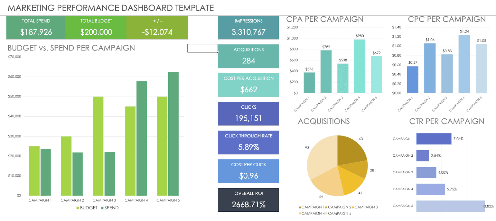
A marketing performance dashboard is generally a one-pager report in Excel that visualizes key marketing metrics to gauge progress toward marketing objectives and goals.
Modern-day marketing performance dashboards cover two aspects: Offline and online marketing metrics.
They allow you to collect relevant insights from your digital and physical marketing efforts. Thereby, helping you to target marketing campaigns to relevant audience groups.
Download Link: Marketing Performance Dashboard
This particular marketing performance dashboard has the following metrics:
-
Budget vs. Spend Per Campaign: Compares the budgeted expenses and the actual expenses incurred on individual marketing campaigns
-
Profit and Loss Statement: Depicts whether your marketing efforts are generating profit or loss over the year
-
Total Impressions: Total number of times an ad or post was shown in the user feed
-
Cost Per Acquisition: Total cost incurred on acquiring a new customer
-
Click-Through-Rate: Measures the number of clicks an ad receives by the total number of times it was viewed
-
Revenue Growth: Measures the percentage growth in revenue over time
-
ROI from Campaigns: Calculates the monetary value of an investment vs. its cost
#3. Social Media Dashboard
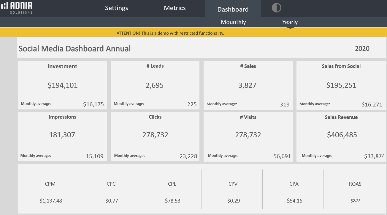
A social media dashboard allows you to monitor all the activities going around your social media accounts under one dashboard. The dashboard typically includes metrics like engagement, traffic, leads, subscriber or follower count, and audience insights.
Download Link: Social Media Dashboard
-
Increase in Followers: Measures the increase in the number of followers on social profiles over time
-
Total Subscribers: Accounts for the number of users who subscribed to blogs, newsletters, or YouTube channel
-
Sales From Social: Measures the total revenue generated from social media marketing activities
-
Cost-Per-Click: Evaluates the amount liable to pay for each click on your ad to the advertiser
-
Return on Ad Spend (ROAS): Calculates from earnings generated from running paid social media ads and campaigns
#4. Sales Management Dashboard
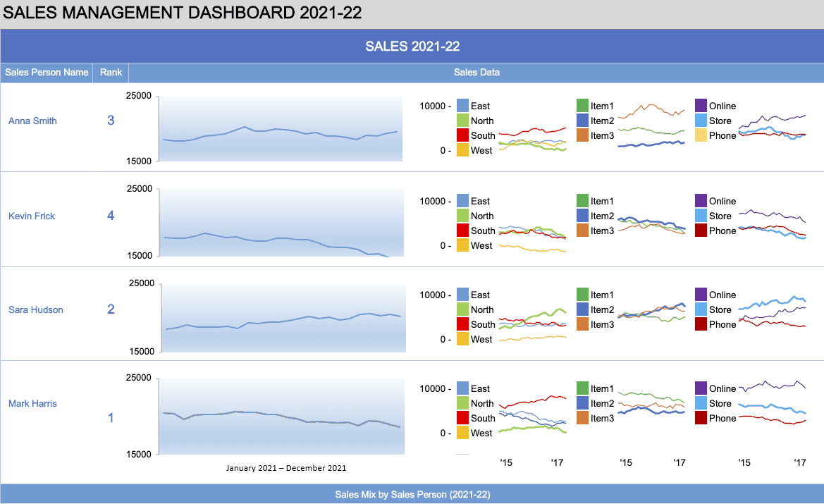
The dashboard provides an overview of the key sales metrics C-level executives and managers are keen about. It includes annual sales, product-wise sales, region-wise sales, and more.
Besides, the dashboard provides granular insights into the performance of your sales team. Like how your sales representatives are performing, whether they are meeting their targets, and more.
Download Link: Sales Management Dashboard
This particular sales management dashboard focuses on the following:
-
Region-Wise Sales: Evaluate the sales made from specific regions by individual sales reps
-
Outlet-Wise Sales: Evaluates sales from different outlets (store/online/phone) made individually by sales rep
-
Item-Wise Sales: Calculates revenue generated from the total number of items sold by individual sales rep
-
Sales Person Rank: Tracks your sales team performance and ranks sale rep based on their overall performance like target achieved, sales generated, and more
-
Product-Region-Outlet Mix: Compiles and presents a mix of data from product, region, and outlet-wise sales by your sales team
#5. Project Management Dashboard Template
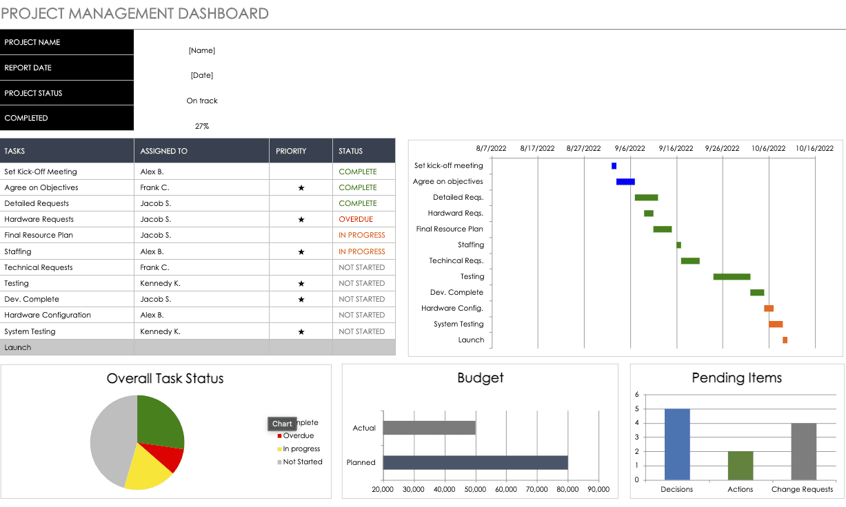
A comprehensive dashboard template that streamlines all your project-related operations. It tracks your timeline, budget, task status, and more.
Having this data readily available under one roof can allow project managers to manage productivity as a whole efficiently.
Download Link: Project Management Dashboard
Which Key Performance Indicators can you track using this template?
-
Streamline Daily Operations: Use a Gantt chart to easily streamline operations and visualize progress regularly
-
Task Status: Display the status of each task by assigning them indicators such as completed, overdue, in progress, or not started.
-
Budget: Compare actual and planned budgets time-to-time to drive cost-effective strategies
-
Pending Items: Curate a list of items or processes that are pending approvals from the lead and visualize them based on decisions, actions, or change requests
Drawbacks of Creating Dashboards in Excel
#1. Limited Scalability
Excel struggles with large amounts of data and may become slow and unresponsive. In some cases, you can encounter downtime when multiple users try to access a spreadsheet simultaneously.
Both ways, Excel is not the first choice for organizations willing to scale their operations from time to time.
Besides, Excel is a stand-alone application. It does not integrate with other platforms or data sources easily. This makes it challenging for companies with data spread across multiple social and analytical platforms to centralize them under an Excel sheet.
#2. Limited Data Visualization Options
With Excel, you are limited to using a set of pre-built data visualization elements.
Yes, the platform does offer customization options, but that too is shrunk to basic editing of charts. 📊
Suppose we compare Excel's gallery of data visualization elements to Datapad (our tool) or any modern-day dashboard software. The other is more advanced in creating visually appealing and informative dashboards.
#3. Lack of Collaboration Features
Excel doesn't have built-in collaboration features like Datapad. Meaning you cannot communicate on the go. You have to use a third-party app for real-time communication.
P.S. Datapad helps you eliminate this bottleneck. How? We'll talk about this feature in a later section.
For now, Excel has no control over what version of the application users work upon – 2013, 2016, or 2019. This makes it difficult for users using a different version to experience the exact same dashboard which others are using.
And when a team uses different versions to access the same dashboard, what they view entirely depends on what their version supports.
Our POV: You can’t do anything except circulating a disclaimer to your team asking them to use the same version.
#4. Limited Security Options
Excel does not have built-in security options, making it easy for unauthorized users to access and modify data. This can often lead to data manipulation and inaccurate results.
#5. Limited Automation
Being from a 90's background, Excel comes with next-to-no automation. In fact, its users spend most of their time preparing data and double-checking it manually.
Simply put, Excel does not have the ability to automate the process of data collection and updating. This leads to a lot of manual work, thereby increasing the chances of human errors or unintentional data manipulation.
Create Stunning Interactive Dashboards with Datapad

Build from question → dashboard in minutes
- Connect your data. Plug in GA4, Google Ads, Search Console, PostgreSQL, MongoDB, SQL Server, Metabase, and more.
- Ask in natural language. “Show MQL→SQL→Closed Won by channel, last 90 days, QoQ trend.” Datapad generates the chart and the underlying SQL/Python.
- Customize & brand. Tweak visuals, reorder tiles, add filters, and save as a reusable report or dashboard.
- Schedule delivery. Send PDF/HTML reports or live dashboard links to email or Slack on exact schedules (weekly, monthly, or custom).
- Collaborate & share. Use secure links, role-based access, and Slack to keep everyone aligned in the same source of truth.
Why teams graduate from Excel to Datapad
- No more manual pivots. AI builds the first version of your dashboard in seconds, then you fine-tune.
- Blend sources natively. Join marketing, product, and finance data without brittle spreadsheets.
- Explain the “why.” Drill into anomalies and trends directly in the analysis, not across tabs.
- Ship on schedule. Keep stakeholders updated with hands-off, scheduled email/Slack reports.
- Share responsibly. Use shareable links for clients and execs.
Moving forward, we'll show how our tool can help you create a stunning dashboard in easy-to-do steps. And then, as we said earlier, we'll discover some cool features of Datapad, like built-in chat features.
Step #1. Register on Datapad
Get your hands on our mobile app. You can easily download it from the app store or play store.
Once into the app, signup with your preferred email address.
Note: Please provide an active email to receive verification mail and other updates from our team.
Soon after, you'll be prompted to create your personal workspace.
A workplace is your personal office where you can store all your data and dashboards, create new dashboards, and have complete control over access.
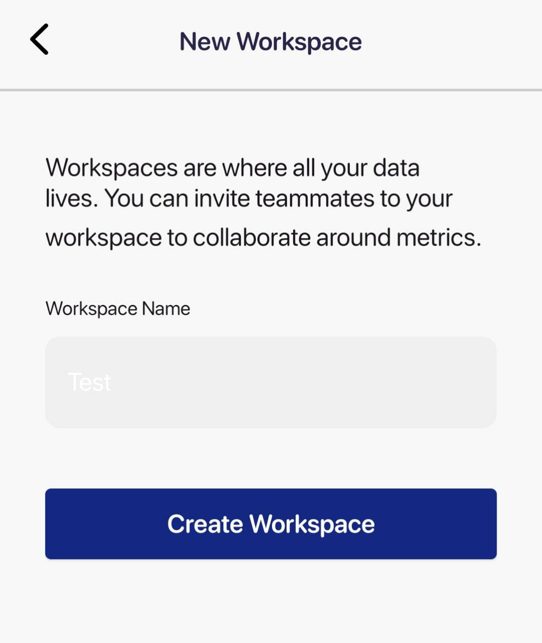
So, give a name to your space and press Create Workspace.
Step #2. Create a Dashboard
Next, click on the (+) sign in the top right corner to create a new dashboard. In this dashboard, you'll have all your charts under one roof.
Give your dashboard – name, description, and an emoji (optional) and hit the create button on the top right corner.

Step #3. Import Data
To import data to the dashboard, tap on Options at the top right corner.
Then click on Add Metric. You can manually enter data or import it automatically using our one-click integrations to popular marketing platforms.
To automatically import data:
-
Click on Use Data Source
-
Choose from our existing list of integrations
-
Press Add and your data is automatically imported into your chart.
Here's the process in action.

Step #4. Invite Team Members
From your workplace, click on the Datapad icon > Manage Users.
Next, click on (+) in the top right corner.

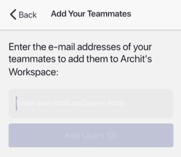
Enter email addresses to send invite emails to as many people as you want onboard.
Step #5. Customize the Dashboard
And finally, you're all set to change the look and feel of your dashboard.
Datapad offers plenty of customization options. You have a choice to set your chart type, change colors, font styles and size, and more.
Besides, our intuitive drag-and-drop feature allows you to perform granular customizations hassle-free.
And when you're happy with the look, you know you have the dashboard ready to be shared.
For the most part, we cherish these key features of our tool.
Key Feature #1. Direct Uploading and Google Sheets Integration:
You can upload your Excel, CSV file or
With Datapad's Google Sheets integration, you can:
Connect any Google Sheet with just a few clicks—no coding required.
Watch as your dashboards update automatically when your spreadsheet changes
Visualize complex data in ways Google Sheets alone simply can't handle
Create beautiful, presentation-ready charts without fighting with formatting
Say goodbye to spreadsheet limitations and hello to data that works for you, not the other way around.
Key Feature #2. AI-Driven Analysis
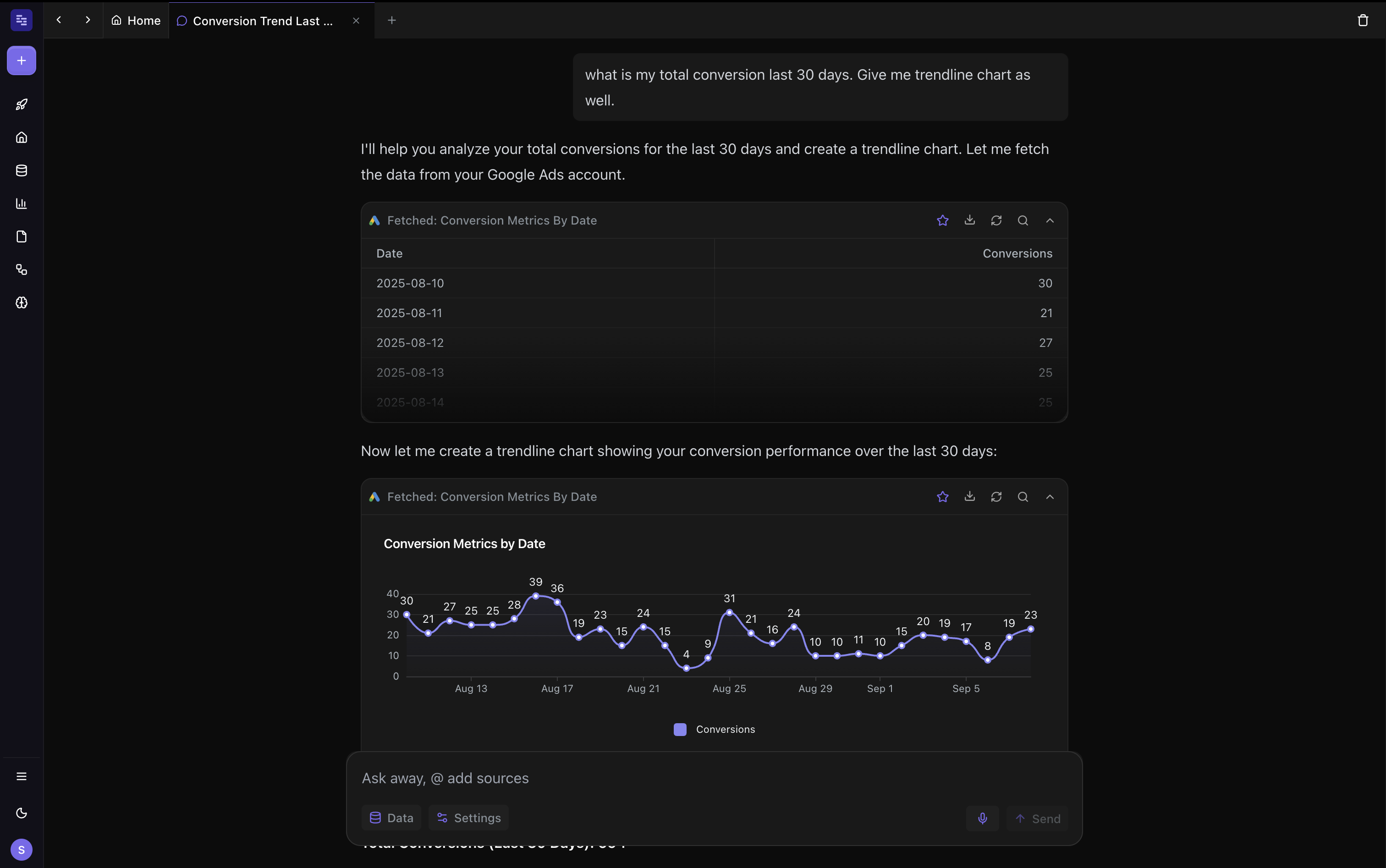
Ever wished you had a data analyst on call 24/7? With Datapad, you basically do. Skip the complex Excel formulas and simply ask questions in plain English like "What's our best-performing ad channel?" or "Show me last quarter's conversion trends." Datapad's AI instantly generates the perfect visualization to answer your question.
With Datapad's AI-powered analysis, you can:
Ask questions in everyday language and get immediate visual insights
Uncover hidden patterns and relationships in your data automatically
Focus on making decisions instead of fighting with chart settings
Transform complex data into clear, actionable intelligence in seconds
Your data has stories to tell—Datapad helps you hear them through simple conversation.
Key Feature #3. Schedule to Email/Slack
Datapad lets you schedule dashboards and reports to arrive in your team’s email or Slack—so everyone sees fresh numbers on time, without opening a workbook. Choose the audience, set the cadence (e.g., every month’s first Monday at 10:00 AM), pick the time zone, and add a short note. (Recipients don’t need Datapad accounts.)
In Datapad, here’s how scheduling works:
👇🏻 Select the dashboard/report you want to send, then open Schedule
👇🏻 Choose Email or Slack, add recipients or a channel/DM
👇🏻 Set frequency, day, and time (weekly, monthly, or custom)
👇🏻 (Optional) Add a subject/message and include a live link or PDF export
👇🏻 Save—and your stakeholders will receive it automatically, like clockwork
Simply put, it works like a recurring calendar for your data—delivered where your team already works.
Here's the feature in action

Key Feature #4. Data Security
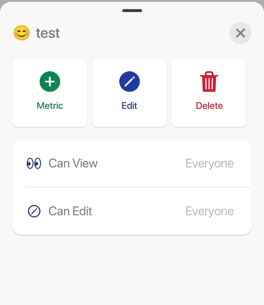
Unlike Excel, you can enable role-based management in Datapad. It will allow you to control who can view/access/edit the dashboard.
Ready to see your Excel dashboards—without the Excel drag?
Experience Datapad’s web app today—no installation required. Start your free 7-day trial instantly, or book a personalized demo to see it in action!
