![How to Make a Pie Chart in Google Sheets? [Secret of Creating Stunning Charts]](/_next/image?url=https%3A%2F%2Fframerusercontent.com%2Fimages%2FP1TwDyEpx34XYdXKWoNpraDs9U.png&w=3840&q=75)
Google Sheets are extensively used by companies and marketing teams to collect, track, and visualize customer and business data.
However, despite being popular, users aren’t generally familiar with the platform. 🧐
Our team brought this up when they saw an excess of users googling ‘how do I make a pie chart in Google Sheets.’
So, we thought of bringing up a detailed and effective guide on how to make a pie chart on Google Sheets.
In this article, we’ll discuss how to add a pie chart in Google Sheets, and later help you explore a much better alternative for creating pie charts.
TL;DR
-
There are 4 main steps in creating a pie chart in Google Sheets
-
Step 1: Build your database
-
Step 2: Create a pie chart in Google Sheets with the database you have
-
Step 3: Take care of styling and choose the type of pie chart you want - general, 3D, or doughnut chart
-
Step 4: Explore the customization option to personalize the pie chart
-
Creating pie charts in Google Sheets have several drawbacks like tough to create on your mobile, the process is time-consuming, chart isn’t aesthetically pleasing, there are database limitations
-
You can replace the pie chart creation process in Google Sheets with Datapad which is a mobile-first dashboard platform
-
Some of Datapad’s features include - automatic and manual data import, team collaboration, real-time data tracking, and several customization options
How to Create a Pie Chart in Google Sheets?
Down the lane, we have prepared a step-by-step guide on how to create a pie chart on Google Sheets.
Here’s a video tutorial of the whole process:
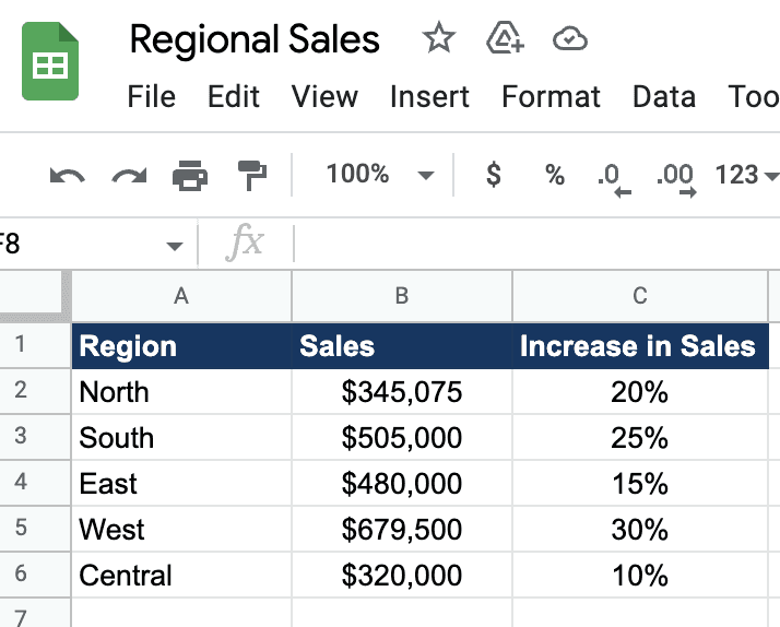
These columns are the building blocks of the pie chart. They communicate to the program what information needs to go inside the pie chart.
For instance, in our dataset, we have placed the data labels we desire in each slice of the pie in column A.
And then, in columns B and C, we added the numeric values we wanted to represent through the pie chart.
Step 2: Create a Pie Chart from Your Database
Now that we have a dataset let's learn how to insert a pie chart in Google Sheets.
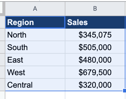
To get started, select the dataset (columns) you want to visualize.
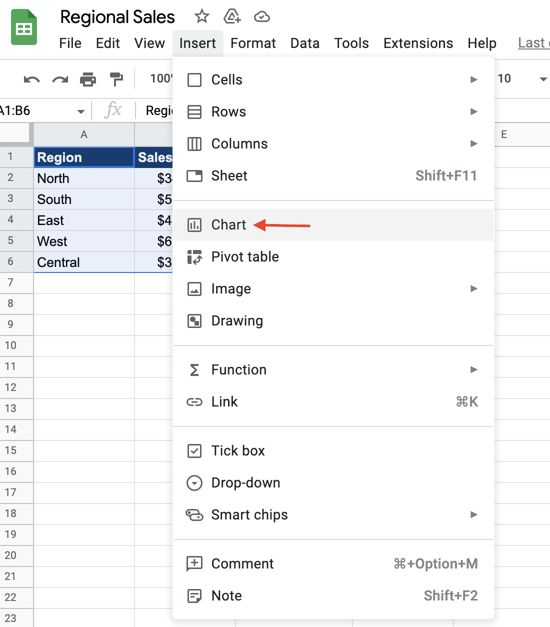
Then click on Insert in the menu bar.
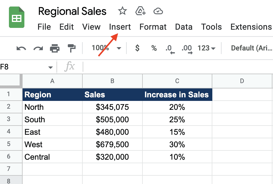
A drop-down appears with a list of customization. Click on Chart to visualize your dataset.
Google Sheets presents you with a default chart type to visualize your data as it did for our dataset 👇🏻
However, you can always change the chart type as you desire. To do so, click on three vertical dots in the top right corner of your default chart.
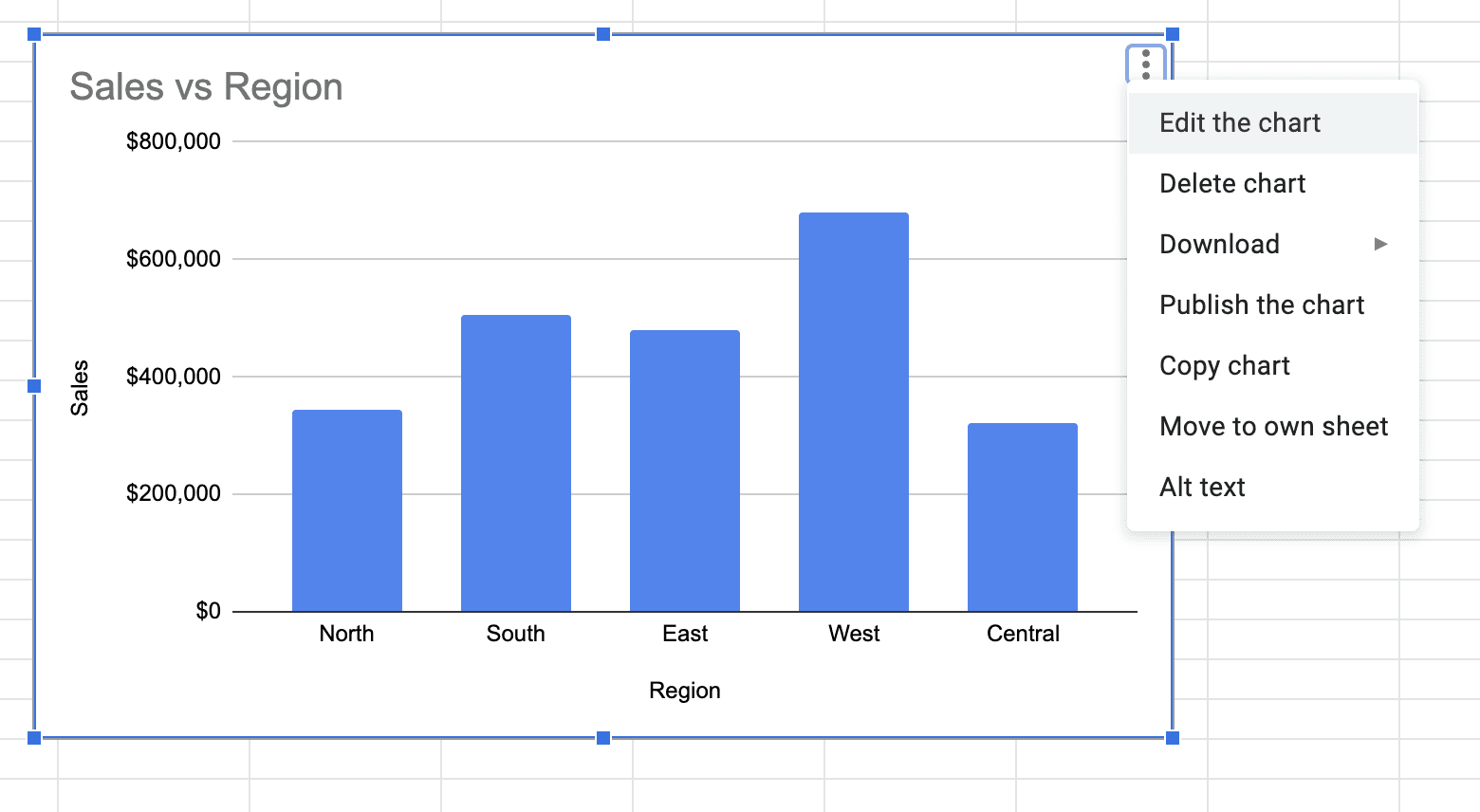
The Google Sheets in-built chart editor opens up on the right side of your sheet.
Pro Tip: You can also double-click on the chart to open the editor directly.
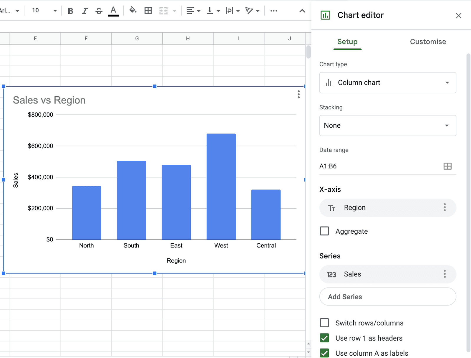
Now, using the chart editor’s customize tab, you get access to plenty of ways to set up and customize your default chart type.
Let's first change the default chart type to a pie chart.
To do so, click on the Chart Type drop-down, scroll down a gallery of pre-built chart types, and halt near the Pie Chart section.
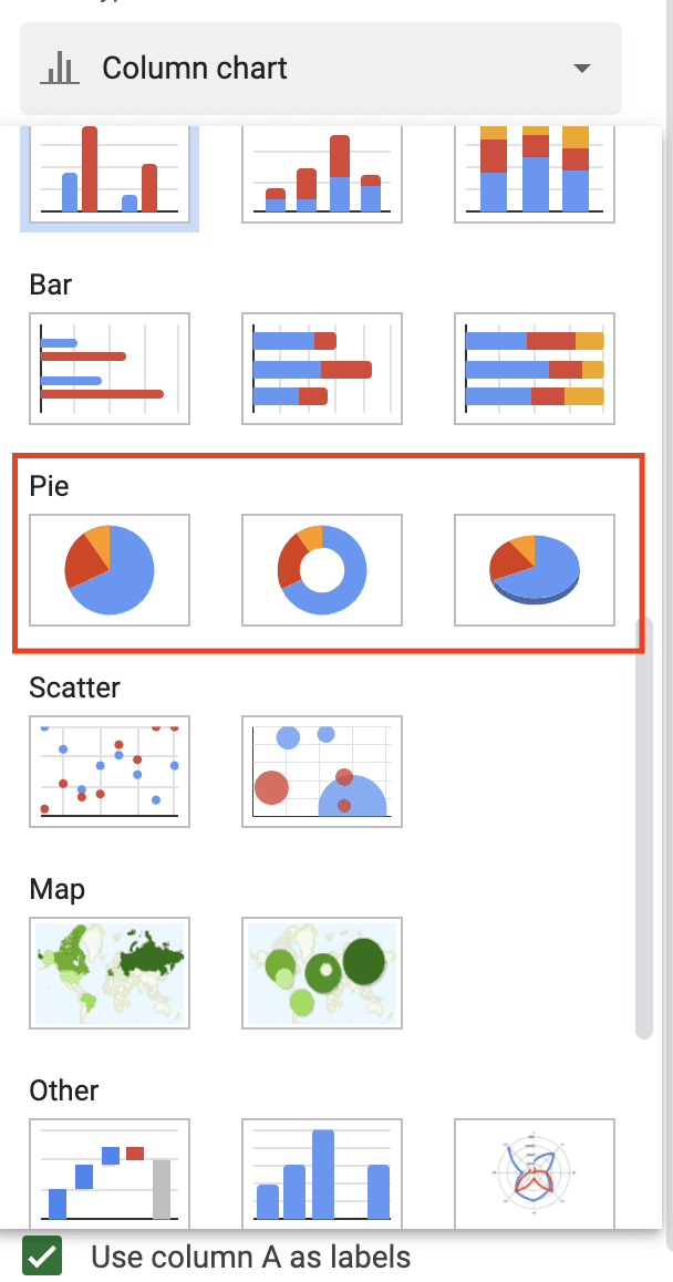
Here you're offered three pie chart options:
-
General Pie Chart: A simple pie chart divided into slices with labels and values
-
Doughnut Pie Chart: Similar to a pie chart, but can contain more than one data series
-
3D Pie Chart: A 3-dimensional illustration of a pie chart
Click on your preferred chart type, and there you go!
Now that you know how to insert a pie chart in Google Sheets, let's now understand how to set up a pie chart on Google Sheets.
Step 3: Set up Your Charts As per Your Preference
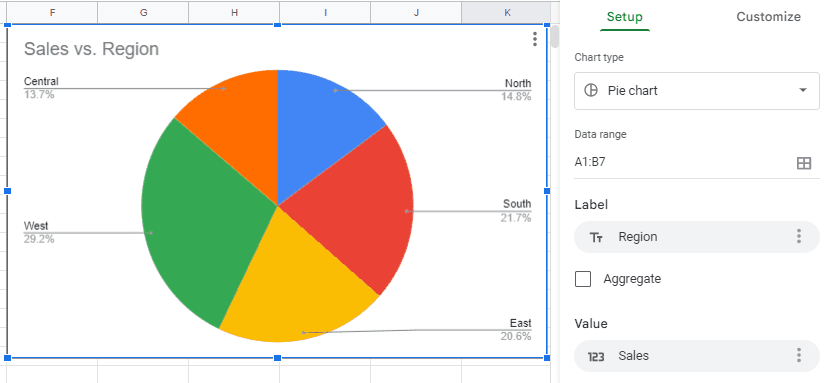
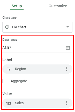
In the same section of the chart editor, right below the chart type drop-down, you will see setup elements like data range, labels, and values.
Let's explore how each one serves the purpose.
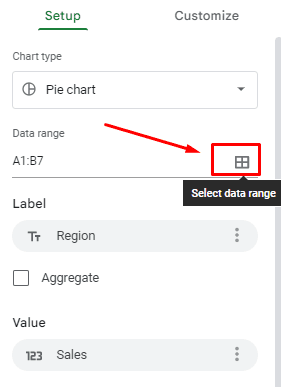
#1. Date Range
Google Sheets is a dear friend of its novice users.
So even if you have visualized the wrong cells by mistake, you don't need to redo the whole process.
You can simply click on the select data range icon and change the existing data range or add another for visualization.
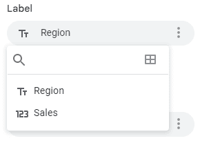
#2. Labels
Using this section, you can change the labels of your pie chart. For example, in our pie chart, we have used Region as a label to present data on the chart.
However, you can choose to represent your pie chart using Sales numbers or other data categories (if any).
#3. Values
Values, here, mean the values you want to display on a pie slice.
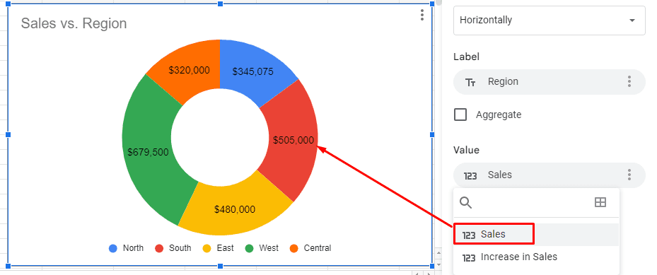
If we want to display another value on the slices, let's say we want to show % increase in sales as values on every slice. We'll click on the below title, and here's how it will go👇🏻
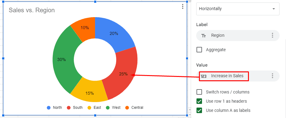
Note: You must have another column with values in your dataset to get this option.
So until now, we saw how to create and set up a pie chart. In the next section, we’ll explore how to edit pie chart in Google Sheets.
Step 4: Customize Your Pie Chart to Make It Look Better
In the chart editor, there's a Customize option beside the Setup menu. Right here👇🏻
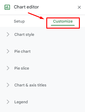
From here, you can customize every neck of the woods of your chart. Let's drill down the elements in the customizer one by one.
#1. Chart Style
Use the chart style section to custom format your pie chart's font style, background color, and borderline colors.
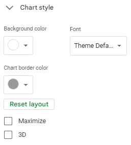
Furthermore, you can also change the look and dimensions of your pie chart by ticking Maximize and 3D check boxes.
#2. Pie Chart
This section offers some outlandish customizations. Like, you can put a doughnut hole in your pie chart. Yup, we're damn serious! 😮
Even though you opted for a general pie chart type, Gsheets still allow you to transform your chart into a doughnut pie chart.
Click on the Donut Hole drop-down and choose the percentage (area) of the hole.
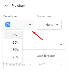
For instance, in our pie chart, we opted for 50%, and here's how it looks.
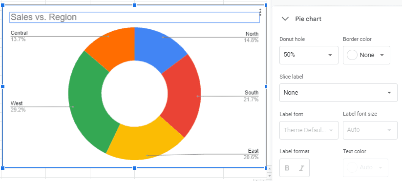
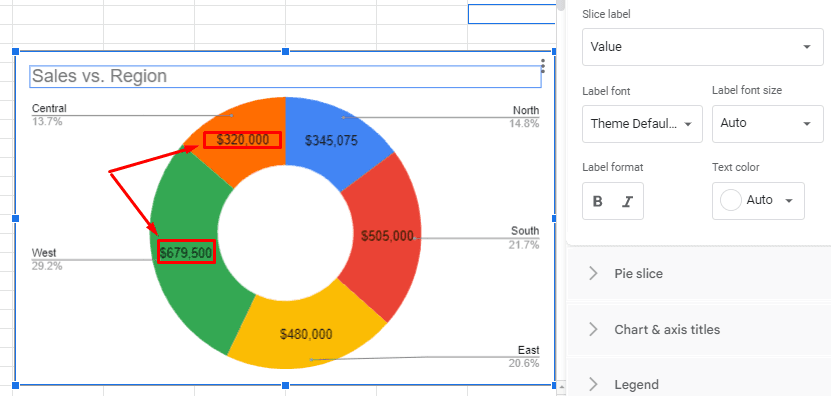
Additionally, you can use the Slice Label drop-down to add labels/values/percentages to every pie chart slice. For example, we added Value to every slice, and here's what we got.
💭Food for thought: Isn't the pie chart getting better with every step?
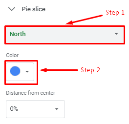
#3. Pie Slice
From this section, you change the color of every slice in the pie chart.
Simply select a Slice > Pick a color, and it'll be displayed in real-time.
Now let's understand how to change title of a pie chart in Google Sheets.
#4. Chart & Axis Titles
This section is all about it! From here, you can edit the chart titles and subtitles. Plus, you can even customize the font style, size, format, and colors.
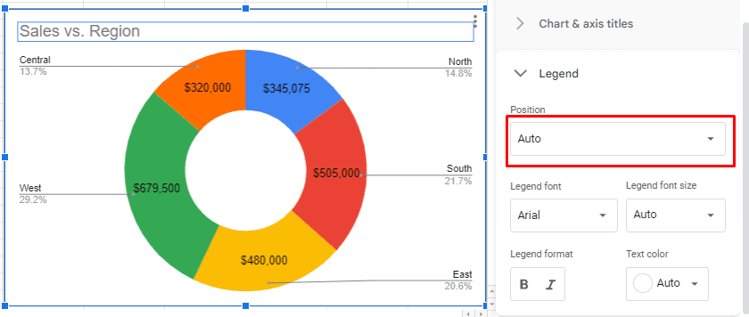
#5. Legend
A legend helps you add meaning to your chart.
Let's be real, what's the purpose of creating a pie chart if we add too much text to explain it?
Let's take an example.
Previously our chart legend positioning was set on Auto or Labeled, and the chart looked like this.
Then we changed the positioning to the Bottom, and you can see the difference.
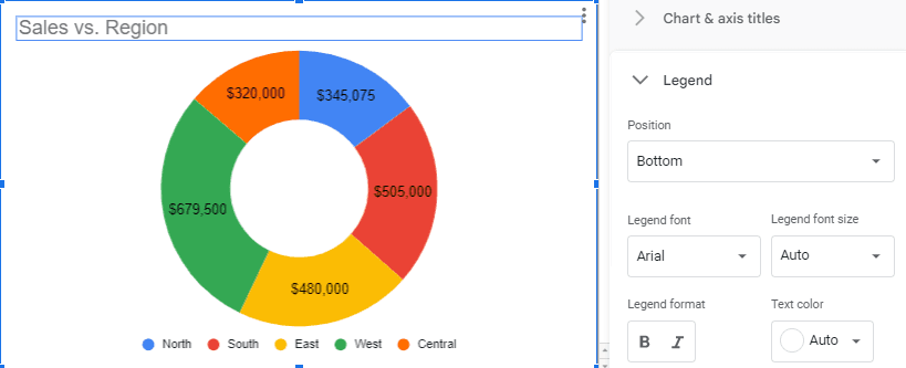
Moving forward, you can also change the legend font style, size, format, and color.
And that's the end of the ladder. You have successfully learned how do you make a pie chart on Google Sheets.
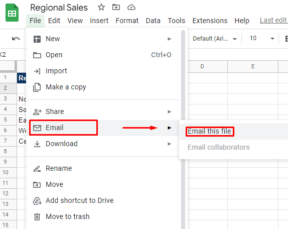
Bonus Step: Export/Share a Pie Chart
You can share/export your pie chart in two ways:Online and Offline.
To share it offline, click on File in the top left corner of the menu bar.
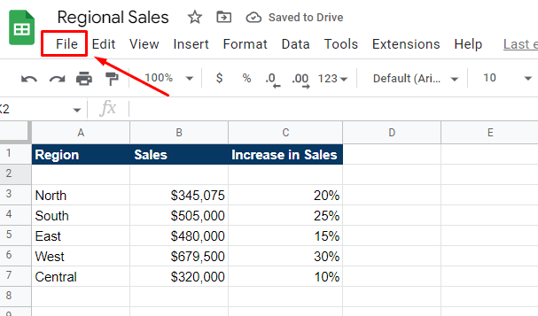
Then hover over Download to explore various downloading formats like Microsoft Excel, PDF, or CSV formats.
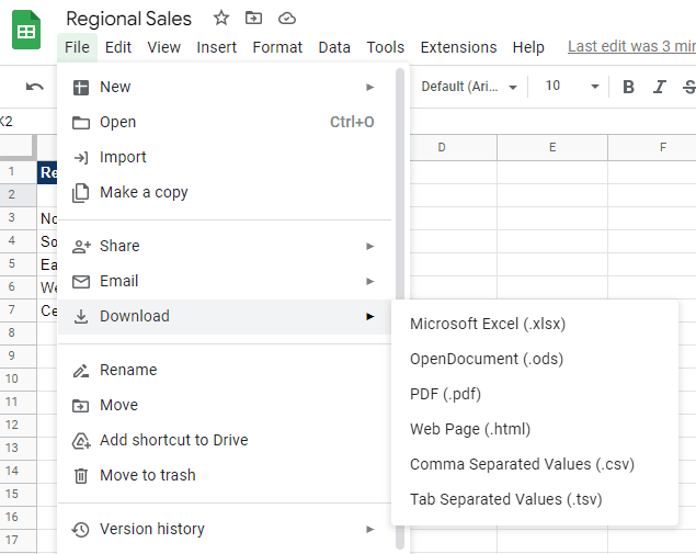
Or, a better way is to Email the sheet to your stakeholders or team members directly.
Drawbacks of Creating Pie Charts with Sheets
Although creating pie charts with Sheets is no rocket science, the process does involve certain limitations, such as:
#1. Hard to Create on the Go
With Sheets, the process of creating pie charts gets complicated as the screen size reduces.
You see, although Gsheets offers a dedicated mobile app for users, doing the same process you just did on a laptop or PC would be difficult.
This is mainly because the UI/UX needs to be better optimized to be used on the go. You might often find it challenging to edit charts or encounter half-volley graphs in your Gsheet mobile app.
#2. Time-Consuming
Unlike Datapad (our tool), Google Sheets offer limited automation. It's evident to you by the 5-step process we have discussed above.
Although the process is easy-to-do, at the same time, it's lengthy and time-consuming.
In fact, in sheets, data validation and preparation is labor-intensive, i.e., you need to manually double-check and re-enter any incorrect information.
P.S. No wonder why it took so long for data analysts and marketers to visualize data via spreadsheets or even Google Sheets.
#3. Isn't Aesthetically Pleasing
Of all the data visualizations provided by Gsheets, no one stands to be called 'stunning' or 'beautiful.'
Harsh but true!
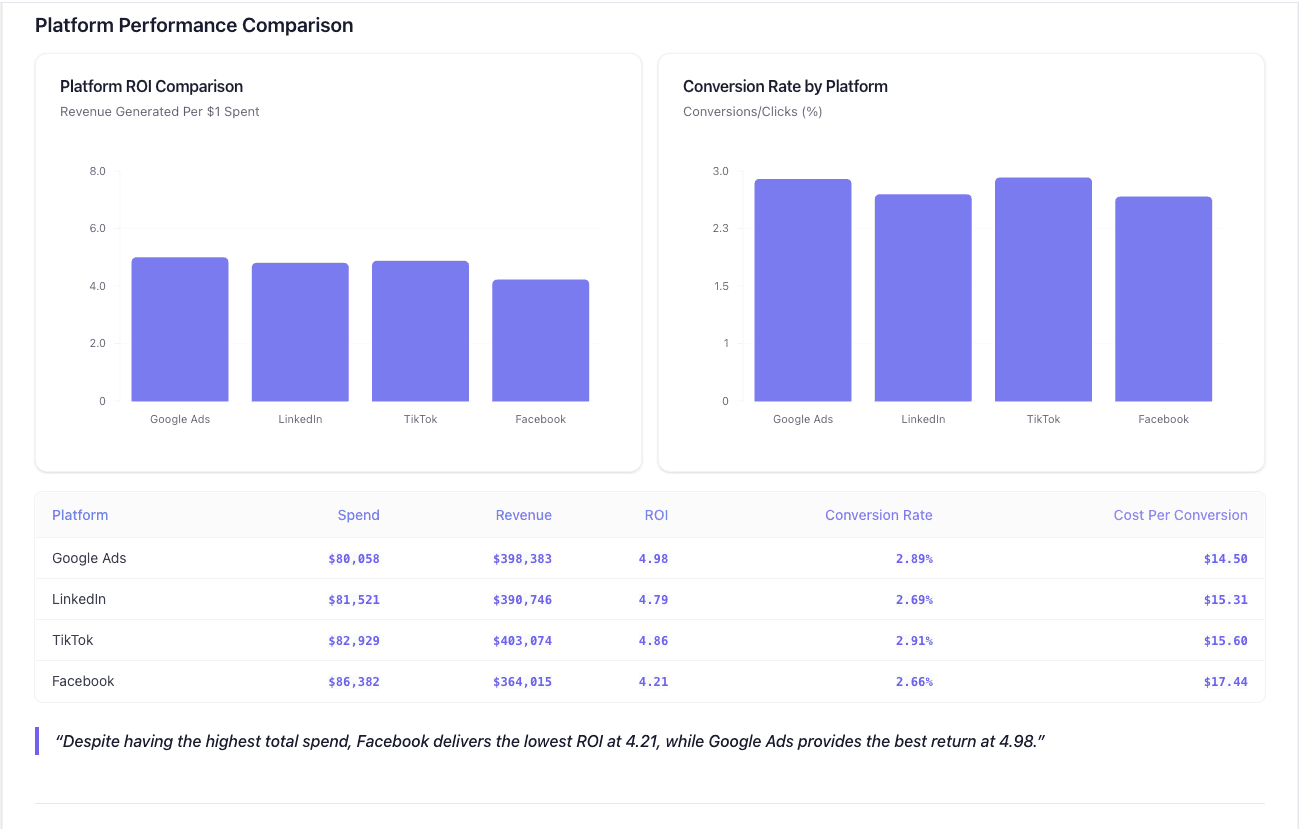
Simply put, pie charts prepared in Gsheets aren't aesthetically pleasing for viewers. Factually, this was a major pain point considering which dashboarding tools like Datapad were created.
Datapad comparably offers much better, stunning, and pixel-perfect data visualization elements. Moreover, you can easily customize the look and feel of your charts using the in-built drag-and-drop builder.
So your chart look typically relies on your design perception.
#4. Database Limitations
Most of us think that Sheets allow unlimited data storage.
Well, we don't disagree entirely. Gsheets offer a sufficient number of cells to collect and store databases of small companies that deal in tens and thousands of data.
However, at the same time, when dealing with millions and trillions of terabytes of data (which is typical for large-sized enterprises in today's data-driven world), Sheets won't be the right fit for you.
As per reports, Google Sheets limits you to 10,000,000 cells for new and converted documents.
Create Stunning Charts with Datapad
Datapad is designed to make data analysis easier, especially for those using Google Sheets. Whether you're creating a dashboard to track sales or a graph to visualize trends, Datapad integrates seamlessly with your Sheets to provide powerful insights.
The beauty of Datapad lies in its simplicity and ease of use. With our tool, anyone in your team with zero technical knowledge can start building reports in mere seconds.
#1. Google Sheets Integration:
Tired of copying and pasting data from your spreadsheets into visualization tools? Or worse, rebuilding your charts every time your data updates? Datapad solves this headache by connecting directly to your Google Sheets, transforming your data into stunning visualizations without the technical complexity.
With Datapad's Google Sheets integration, you can:
-
Connect any Google Sheet with just a few clicks—no coding required
-
Watch as your dashboards update automatically when your spreadsheet changes
-
Visualize complex data in ways Google Sheets alone simply can't handle
-
Create beautiful, presentation-ready charts without fighting with formatting
Say goodbye to spreadsheet limitations and hello to data that works for you, not the other way around.
#2: AI-Driven Analysis
Ever wished you had a data analyst on call 24/7? With Datapad, you basically do. Skip the complex Excel formulas and simply ask questions in plain English like "What's our best-performing ad channel?" or "Show me last quarter's conversion trends." Datapad's AI instantly generates the perfect visualization to answer your question.
With Datapad's AI-powered analysis, you can:
-
Ask questions in everyday language and get immediate visual insights
-
Uncover hidden patterns and relationships in your data automatically
-
Focus on making decisions instead of fighting with chart settings
-
Transform complex data into clear, actionable intelligence in seconds
Your data has stories to tell—Datapad helps you hear them through simple conversation.
#3. Scheduled Reporting
End the monthly reporting grind forever. Datapad automatically delivers fresh insights straight to your inbox or Slack channel on your schedule. Set up your dashboard once and let automation take over—whether you need daily metrics, weekly performance snapshots, or monthly executive summaries. Choose from our library of ready-made templates to get started even faster with industry-specific KPIs and visualizations. Your team stays informed with zero manual effort, while you focus on acting on insights instead of creating reports. Perfect for agencies managing multiple clients or busy teams that need consistent data without the hassle.
Collaboration and KPI dashboards must go hand in hand, that’s how a company excels in KPIs tracking and setting strategic goals.
💭Food For Thought: We wanted to be innovative with our collaboration feature and thus spent hours brainstorming about how to make collaborations easy yet real-time.
So, here we are!
#4. Downloadable Reports
Sharing insights with your team or stakeholders should be straightforward. With Datapad, you can download your reports in PDF or HTML format, making it easy to distribute them. Whether you need to attach a report to an email, share it on a project management tool, or print it for a meeting, Datapad has you covered. No more scrambling to capture screenshots or manually compiling data. Your reports are ready to be shared in a professional format at the click of a button.
#5. Web Search Feature
Sometimes, understanding your data requires context from the wider world. Datapad's Web Search feature allows you to pull in external data for sector benchmarks and trends, enriching your analysis. Whether you're comparing your sales figures to industry averages or looking for the latest market trends, Datapad can help you find the information you need. This feature ensures that your analysis is not just based on internal data but also informed by external factors, giving you a more comprehensive view of your performance.Make Your Excel Dashboards Look Stunning with Datapad.
Table of Key Features and Benefits
| Feature | Description | Benefit |
| Google Sheets Integration | Connects directly to Google Sheets for data analysis. | Seamless workflow, leverages existing data. |
| AI-Powered Analysis | Allows plain English queries, generates graphs and dashboards. | Reduces technical barriers, fast insights. |
| Dashboard and Report Creation | Supports bar graphs, line charts, pie charts, Gantt charts, etc. | Visualizes data effectively for decision-making. |
| Scheduling Reports | Delivers reports via email or Slack at scheduled intervals. | Keeps users informed without manual effort. |
| Download Options | Reports available in PDF or HTML format. | Easy sharing with stakeholders or teams. |
| Web Search Feature | Pulls external data for benchmarks and trends. | Enhances analysis with industry context. |
Datapad is a free kpi dashboard tool that allows you to connect data sources and keep track of all your metrics in one place. We claim that Datapad is the easiest kpi tool out there.
If you are keeping your dashboards on excel or sheets, you can use our integration to take all your data from spreadsheets and build stunning dashboards on Datapad.
Must-read related content
How to create a line chart in Google Sheets?: Learn how to crate a perfect line chart with our in-depth guide.