Some of the best AI tools for data visualization are Datapad, Tableau, Polymer, Power BI, Luzmo, Infogram, ThoughtSpot, Domo, and Akkio.
In this article, we discuss these best AI data visualization tools – their features, pricing, pros, and cons.
But first, let's look at some factors that you should consider when choosing an AI tool for data visualization.
Factors to consider when choosing an AI tool for Data Visualization
Before investing in an AI-integrated data visualization software, consider these factors:
1. Your Data Needs
Identify whether you work with structured, unstructured, numerical, textual, or spatial data. Different tools have varying capabilities in handling different data types.
Next, assess the size and complexity of your datasets. And whether it requires advanced visualization capabilities like heatmaps, sunbursts, or dot plot charts.
2. Rich Visualization Options
Ensure that the tool has a diverse range of visualization elements – charts, graphs, tables, maps, and more, that align with your data analysis needs.
Look for the level of customization and interactivity in visualization. For example, can you click to drill down on the visual? Or can you customize visual elements (colors, labels, interactivity)?
3. The Level of AI Integration
AI tools can integrate AI into the platform at various levels. Some offer AI as a layover, allowing you to interact with your data. Others integrate it deep within the platform to help create AI dashboards and reports and perform ad-hoc analysis.
4. Connectivity with Other Apps and Data Sources
Integration with your existing tech stack and data sources is a must. Look for tools with plug-and-play integrations to popular data sources for easy data import. This will save you time and the hassle of looking for another tool to connect multiple data sources with your tool.
9 Best AI Tools for Data Visualization
Here’s a list of the best AI tools for data visualization 👇
1. Datapad
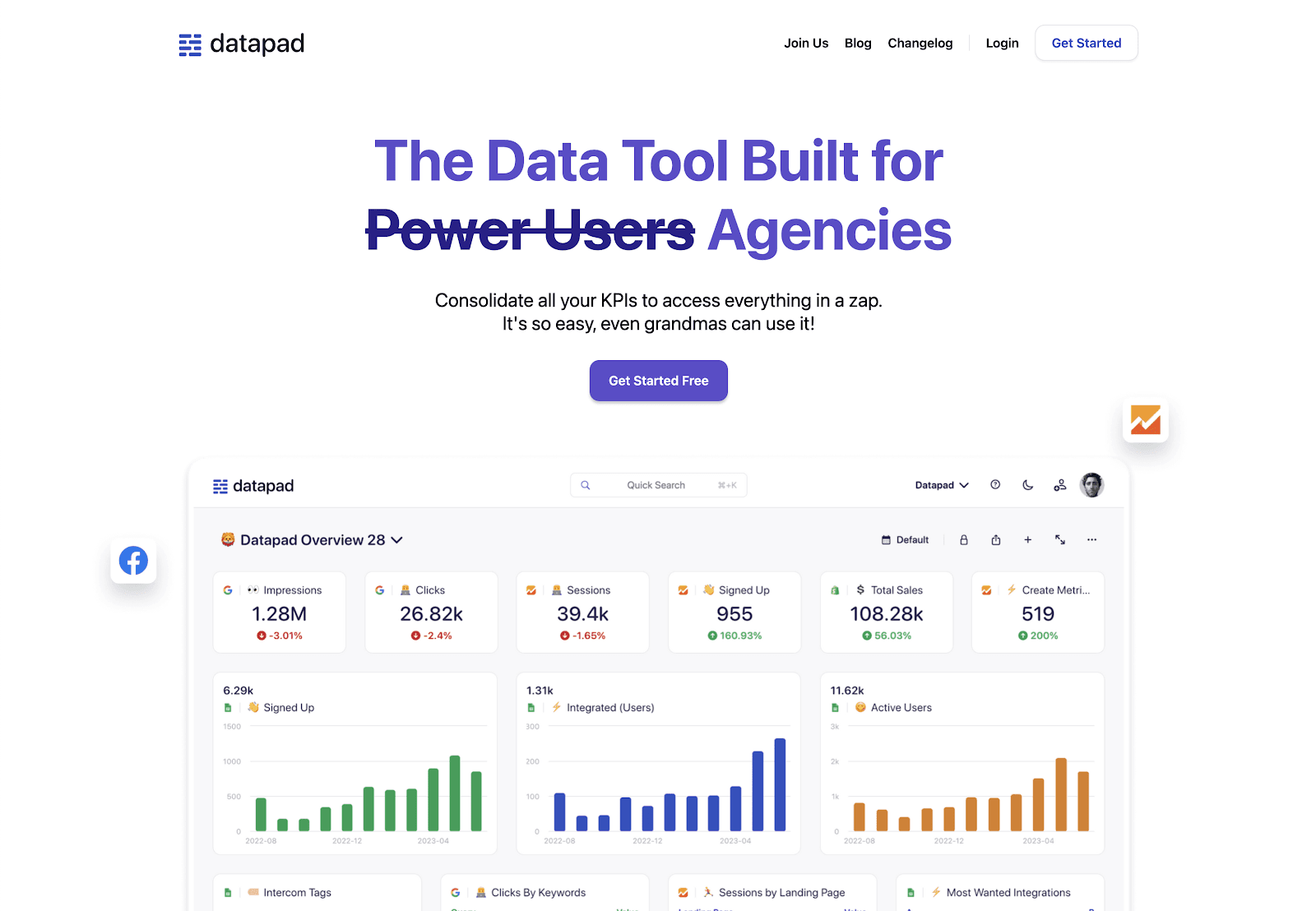
Datapad is an all-in-one data visualization and reporting platform. It lets you visualize any dataset using powerful visual elements, point-and-click customizations, and real-time reports. All while keeping AI by your side.
Its drag-and-drop interface lets you transform data into visuals and multiple visuals into dashboards within minutes without any technical expertise.
Designed specifically for data handling, Datapad simplifies how you visualize and frame your data to reflect business performance.
It has hundreds of visualization elements, plus ready-made metric widgets and dashboard templates for smooth, hassle-free data visualization.
Live data connectors to popular sources like Google Sheets, Shopify, Mailchimp, HubSpot, and more allow for real-time visualizations.
Let's look at some key features that make Datapad #1 for data visualizations.
Key Feature 1. Automated Insights
Datapad AI-powered insights and summaries help detect anomalies in data and provide actionable to-do items to increase performance.
You can drill through any graph or insight AI generates to dive deeper into the metrics.
Key Feature 2. Visualization Capabilities
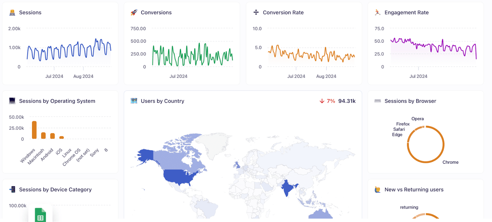
Datapad offers a range of visualization types, including line charts, graphs, geo maps, pie, and more. Plus, the ability to customize visual elements (colors, labels, interactivity) for creating on-brand visualization and dashboards.
Key Feature 3. Integrated AI Assistant
Datapad's AI assistant is like your virtual data analyst. Without much effort, you can:
-
Ask questions about your data in plain English and get instant answers coupled with charts, tables, and visualizations
-
Drag-and-drop AI-generated charts to your dashboard without much hassle
-
Run search queries across your marketing stack or database
Key Feature 4. Real-Time Collaboration
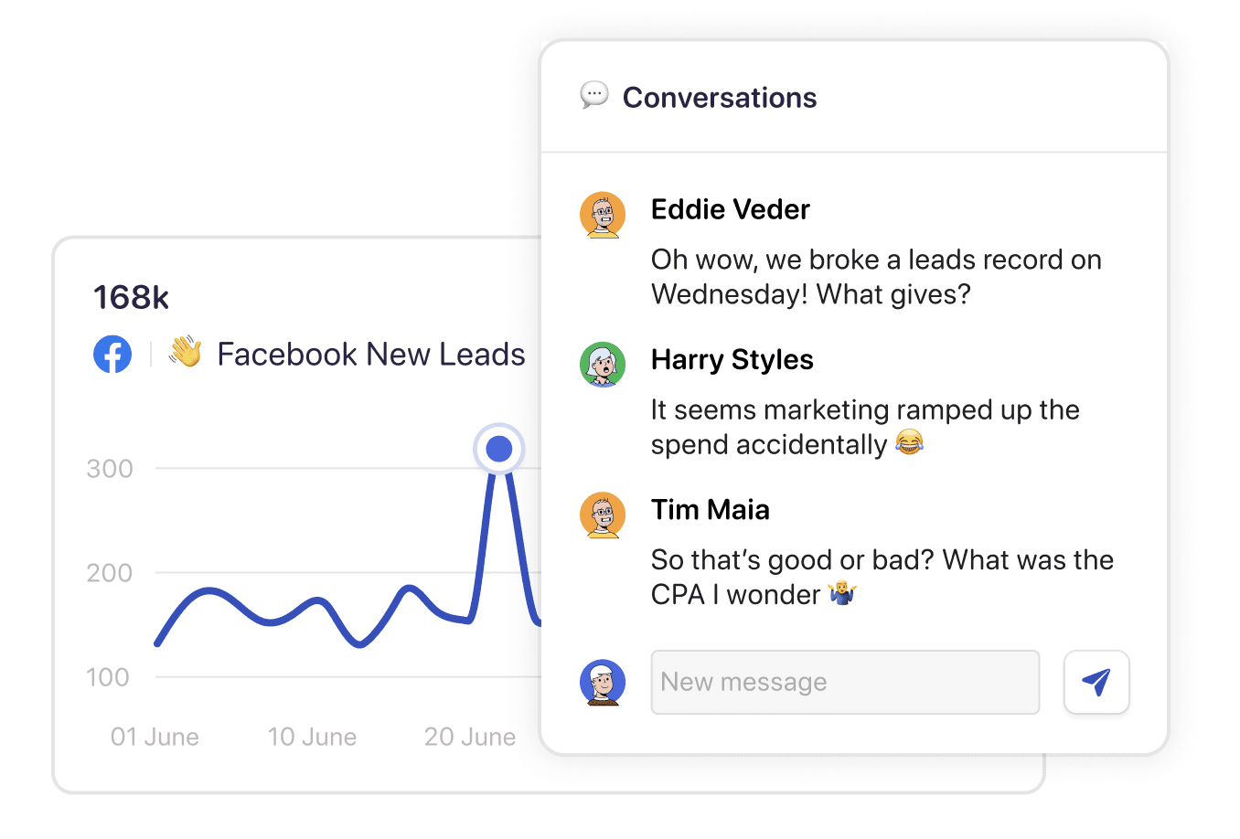
Datapad allows you to collaborate on visuals. For example, if you'd like to annotate a jump or drop in your key metrics, simply click on that particular point in the chart and initiate a discussion with team members.
Moreover, with Datapad's team collaboration feature, you can:
-
Get real-time alters whenever there's a change in any metric or KPI
-
Communicate around your metrics and KPIs without leaving the dashboard
-
Get push notifications on your phone to stay updated with all your KPIs
Key Feature 5. Ad-Hoc Analysis
Ad-hoc analysis lets you interact with any chart or visual on your mission control dashboard.
You can:
-
Select a range of data that you want AI to explain to you
-
Click on a graph or chart to deep-dive into a specific attribute
-
Correlate metrics and making data-driven decisions
Pricing
Datapad has a free plan that lets you build 1 report with unlimited sources, unlimited users, and real-time data sync. But if you want to create more such reports, you can upgrade to one of the paid plans it offers:
-
Standard: $30 per month
-
Business: $200 per month

Pros and Cons
✅ Easy-to-use, with intuitive drag-and-drop functions.
✅ Supports unlimited data sources in the free plan.
❌ Variety of charts and graphs selection can be widened.
2. Tableau
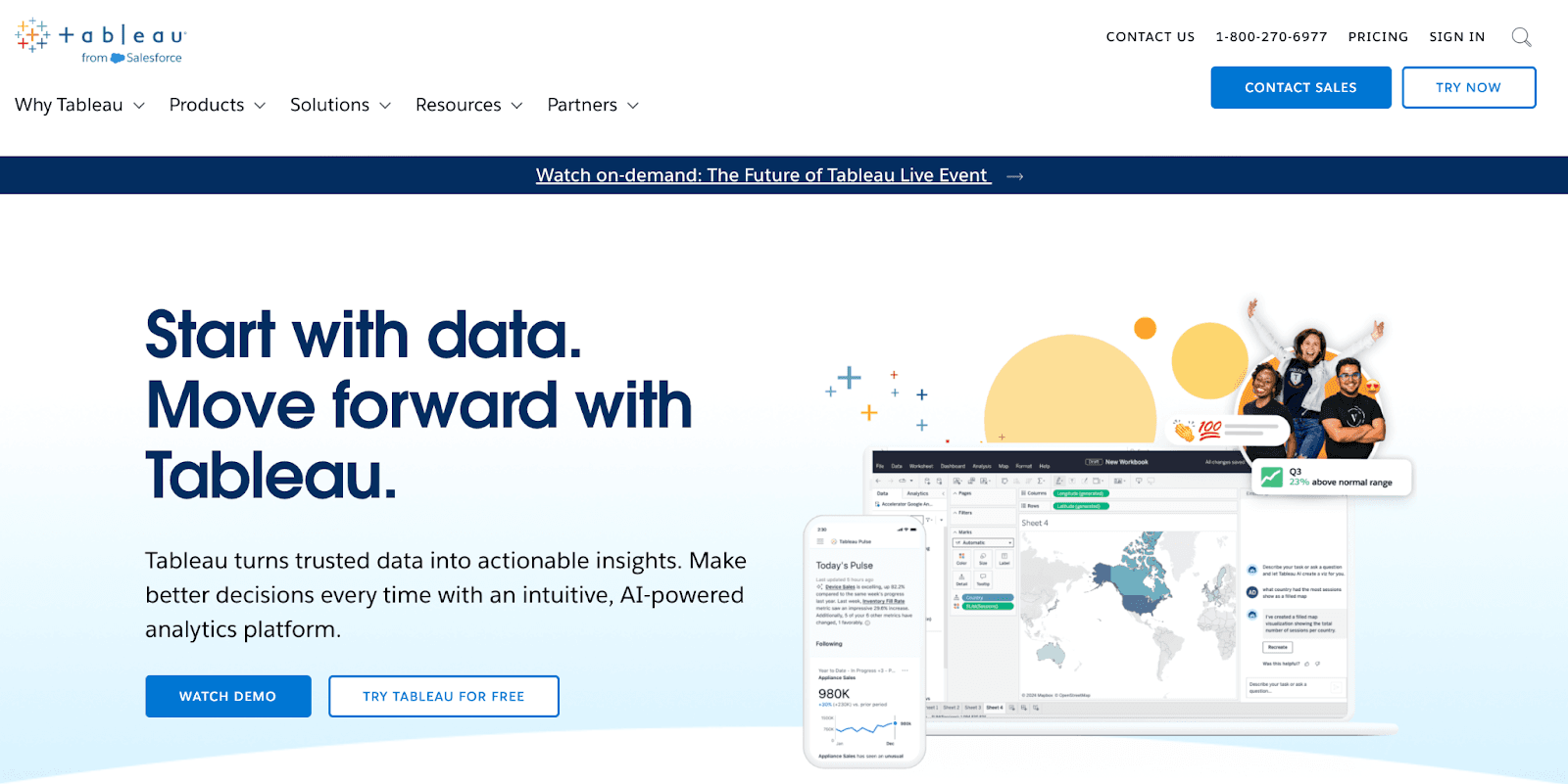
Tableau is a powerful data visualization tool that enables you to create interactive dashboards, charts, and graphs from various data sources. Tableau's visualizations help uncover insights, identify trends, and support data-driven decision-making across organizations.
Features
-
Create dynamic dashboards that combine multiple visualizations, filters, and layouts to present data stories effectively.
-
Connect to a wide array of data sources, including databases, spreadsheets, and cloud applications, to handle large datasets seamlessly.
-
Work with either live data for real-time insights or in-memory data for enhanced performance and speed.
-
Utilize a variety of advanced visualizations, like scatter plots, treemaps, and bullet graphs, to uncover insights and identify trends.
-
Easily collaborate with team members and share visualizations and dashboards securely in real-time.
-
Leverage an intuitive drag-and-drop interface that allows you to create compelling visualizations without needing extensive technical skills.
Pricing
Tableau offers three paid plans to choose from:
-
Tableau Creator: $75 per user per month
-
Tableau Explorer: $42 per user per month
-
Tableau Viewer: $15 per user per month

Pros and Cons
✅ Accessible across all devices.
✅ Excellent at analyzing large datasets.
❌ Has a steep learning curve for new users.
3. Polymer
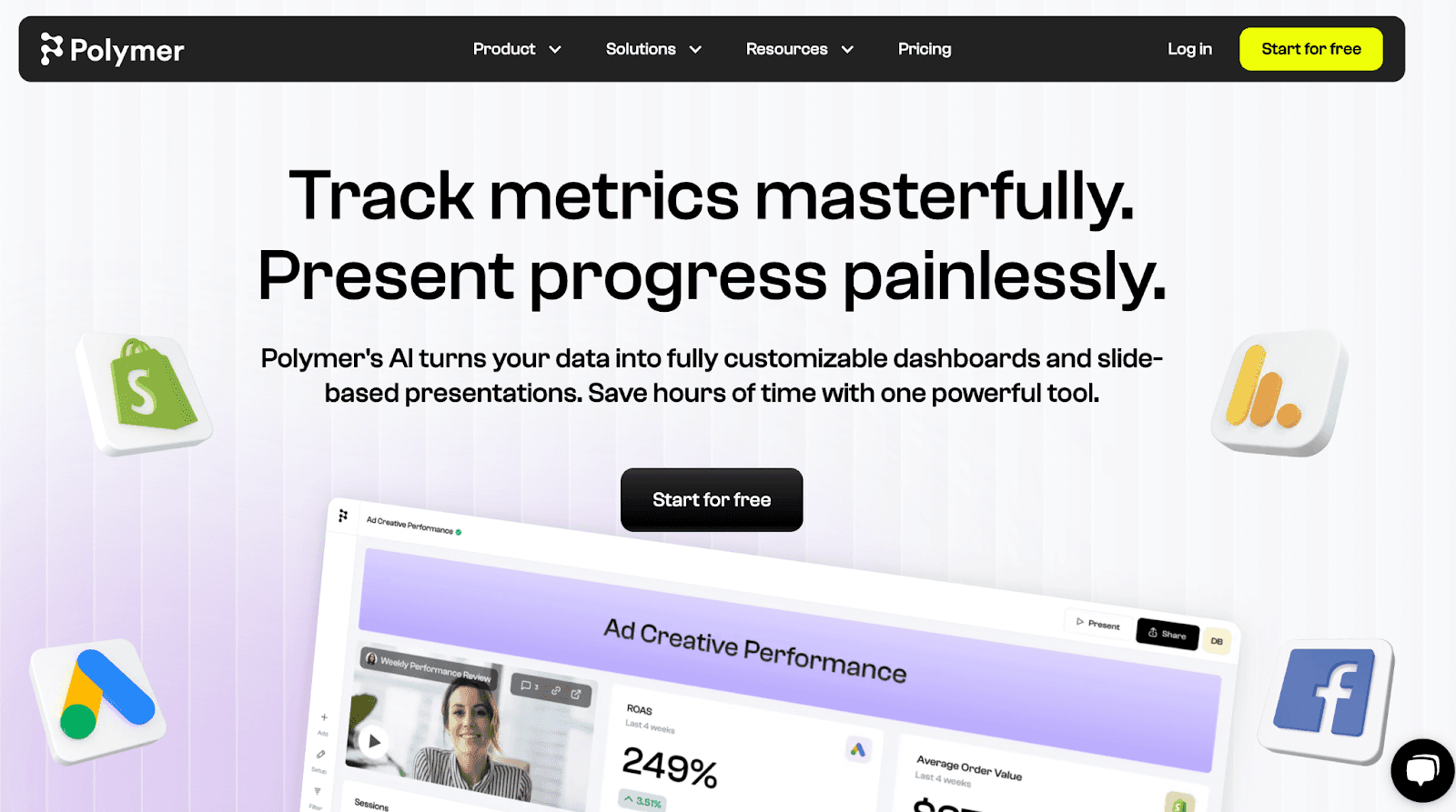
Polymer is an AI-powered BI and data visualization software. It allows you to ingest data from multiple data sources and transform them into stunning dashboards and reports with the power of AI.
Features
-
Has over 20+ one-click connectors to popular data sources and platforms like Google ads, Shopify, Google Analytics, and more.
-
Use Poly AI, a conversational AI chatbot, to ask your data plain English questions and get answered with explanations and visualizations.
-
Select a date range and let Polymer's AI suggest beautiful visualizations or even create an entire dashboard based on your command.
-
Point-and-click on any visualization to get a description and explanation instantly so you can build confidence and drive action.
-
PolyAI automatically analyzes your data to reveal patterns, trends, insights, and opportunities depicted via visuals with the highest accuracy.
Pricing
Polymer offers a seven-day free trial of all features along with four paid plans:
-
Starter: $50 per month
-
Pro: $100 per month
-
Teams: $250 per month
-
Enterprise: Custom Pricing

Pros and Cons
✅ Offers extensive dashboard templates and visualization options.
✅ Polymer embedded analytics allows you to embed data visualization into your product or website.
❌ Lacks in-app collaboration feature for teams (you may have to use a third-party communication tool).
4. Power BI
Built strictly as a data analytics and visualization tool, Microsoft Power BI is a go-to AI tool for advanced data visualization needs. It integrates AI capabilities to the core and allows teams to visualize and interpret data using instant, powerful visuals.
Features
-
The Decomposition Tree visual is an AI visualization from Power BI used for Ad Hoc exploration and conducting root cause analysis.
-
The Q&A visual allows you to query data using natural language and receive answers in a visual form.
-
Using the Key Influencers feature, you can identify and visualize factors influencing data changes.
-
AI-powered anomaly detection helps quickly detect and visualize anomalies to identify patterns within your dataset.
Pricing
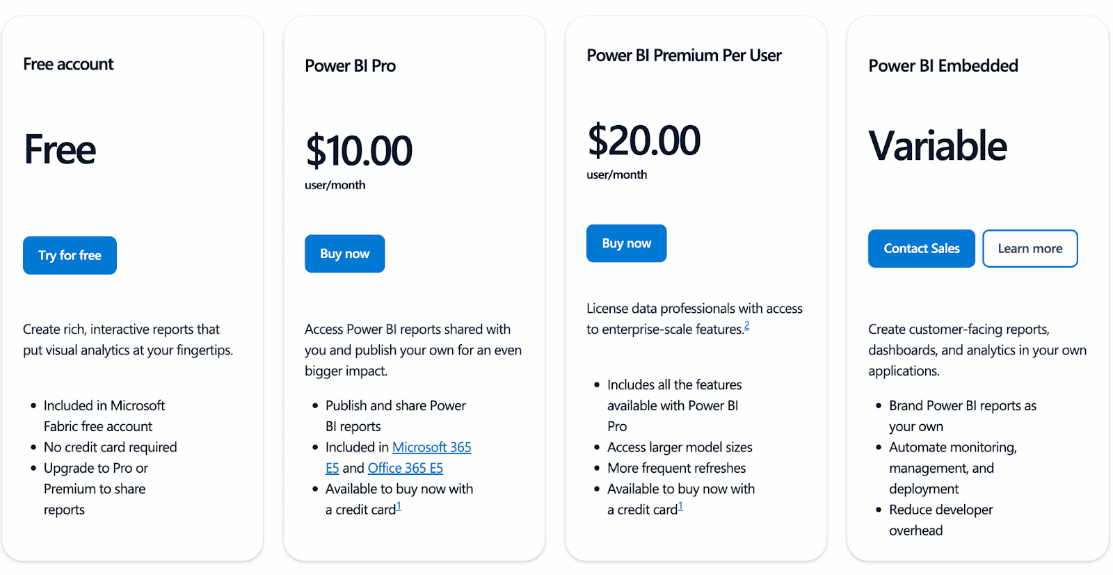
Power BI offers a free plan that is basic but good enough to test the waters. But for powerful visualization features, you must upgrade to a paid plan it offers:
-
Pro: $10 per user per month
-
Premium: $20 per user per month
-
Embedded: Custom pricing
Pros and Cons
✅ Offers advanced data visualization options.
✅ Power BI can visualize much larger and more complex datasets, making it popular among enterprises and data scientists.
❌ An old-school UI design and sophisticated features give it a steep learning curve for new users.
5. Luzmo
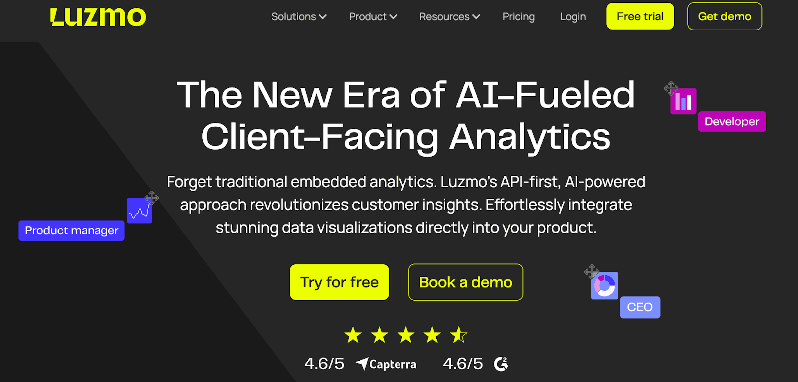
Luzmo is AI-powered embeddable self-analysis software. Its API-first approach allows you to visualize incoming data from any platform and integrate it seamlessly within your product.
Features
-
Options to integrate your preferred AI solutions – OpenAI GPT4, Cohere, Gemini, and MISTRAL AI for data handling and visualization.
-
Leverage Lumzo’s AI chart generator to transform data into stunning charts, graphs, and visuals via a simple text prompt.
-
Use Instachart to turn screenshots, hand-drawn sketches, or design mockups into fully functional dashboards.
-
Import data from 20+ popular data sources such as Oracle, My SQL, Snowflake, and more, and use AI to cleanse and prepare data for visualization.
-
Has an intuitive dashboard editor that lets you drag and drop interactive charts, tables, and widgets to create dashboards and reports.
Pricing
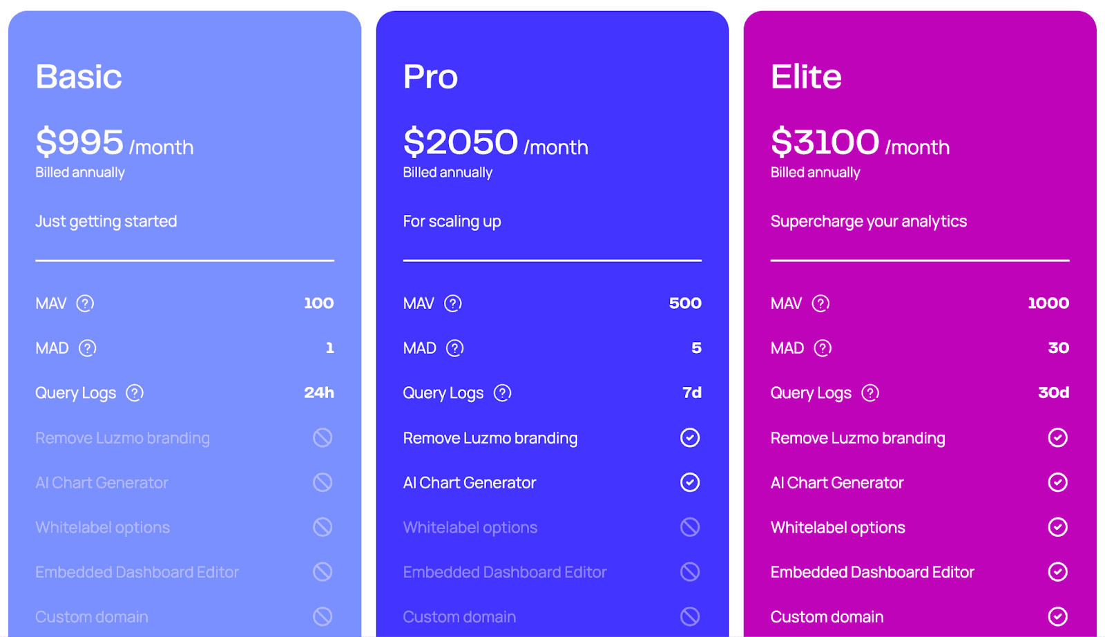
Luzmo has a 10-day risk-free trial followed by three premium pricing plans:
-
Basic: $995 per month
-
Pro: $2050 per month
-
Elite: $3100 per month
Pros and Cons
✅ Offers white-label functionality to keep visualization on brand.
✅ You can train Luzmo AI to understand your project context and surface insights and answers accurately.
❌ Relies heavily on SQL knowledge.
6. Infogram
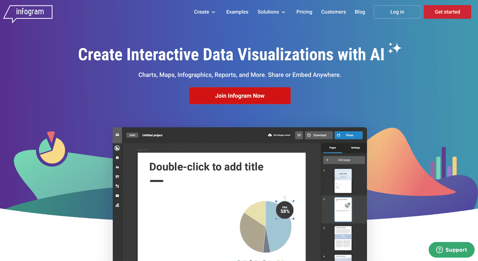
Infogram is like Canva for data analysts. It offers interactive tools and visual elements to create infographics, reports, dashboards, and maps that are easily downloadable and shareable across the web and offline.
Features
-
Choose from over 35 interactive charts and 550+ maps to visualize data, including pie charts, bar graphs, column tables, and word clouds.
-
Enhance storytelling and communication with annotations, royalty-free stock photos, icons, GIFs, and flags for context, alongside interactive features for exploration.
-
Has over 20 ready-made design themes or creates a customized brand theme with your logo, colors, and fonts.
-
Interactive visuals and maps offer clickable legends for toggling between different data sets and a zoomable interface for exploring the data in detail.
Pricing
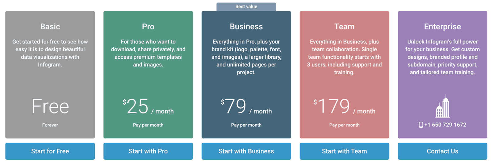
Infogram offers a free plan with all essential chart types, animations, and sharing and distribution across the web. Other than that, it has four paid plans:
-
Pro: $25 per month
-
Business: $79 per month
-
Team: $179 per month
-
Enterprise: Custom pricing
Pros and Cons
✅ Simple and clean interface for creating attractive data visualizations with little to no software experience.
✅ It offers a wide range of templates and the ability to customize colors and themes to stay on-brand.
❌ Inforgram lacks advanced data visualization options, especially when visualizing complex datasets.
7. ThoughtSpot
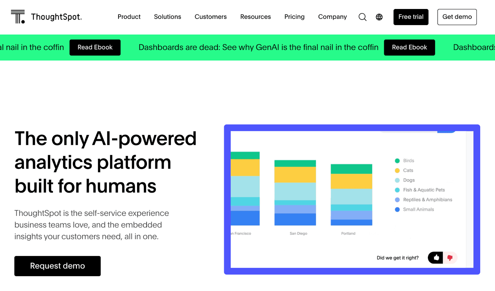
ThoughtSpot is an AI-powered BI and analytics platform used by teams at Version, Snowflake, and Doordash. It's an innovative analytics platform for C-suite and frontline teams – to visualize data and get immediate, actionable insights visible at their forefront.
Features
-
Offers live dashboards that depict real-time data from multiple sources via interactive visuals and widgets.
-
SpotIQ's AI-driven algorithm lets you spot anomalies and drill down on charts and graphs for granular details without needing pre-defined drill paths.
-
Choose from dozens of chart types and advanced chart configuration options to group axes, add labels, and customize your data story.
-
ThoughSpot lets you teach the AI model to deliver accurate, business-specific answers with industry-leading precision and oversight.
-
Leverage Sage to ask questions in natural language and get automated insights, forecasts, and ad-hoc analysis with automated visuals.
-
Receive proactive alerts on Slack, email, or mobile when key Liveboard metrics and trends change.
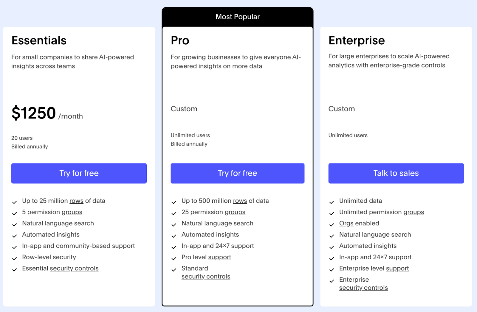
Pricing
ThoughtSpot offers a 14-day free trial and three paid pricing plans:
-
Essential: $1250 per month
-
Pro: Custom pricing
-
Enterprise: Custom pricing
Pros and Cons
✅ Has a dedicated mobile app.
✅ Standard security controls add single sign-on via SAML/OAuth and row-level security.
❌ The choice of visualization is pretty basic and akin to what you get in Excel.
8. Domo
Domo is a cloud-based business intelligence platform specializing in data visualization and analytics. It allows you to collect data from thousands of data sources and create interactive dashboards and reports, empowering data-driven decision-making within the organization.
Features
-
Has over 150 chart types and more than 7,000 custom maps, including advanced charting options such as Trellis and data science charts.
-
Use Domo Stories to design customized visualization with ultimate flexibility in colors and to guide data analysis – with no need for custom work or coding.
-
Offers Domo Bricks that work similarly to ready-made design blocks for new design components, interactive triggers, and visualizations, making data visualization more dynamic and digestible.
-
Ask questions to Domo's NLP-powered for intelligent suggestions, beautiful charts, deeper insights, and next-step recommendations.
-
Options to visualize data using different AI models, including Open AI, Hugging Face, Gemini, Amazon Bedrock, and more.
Pricing
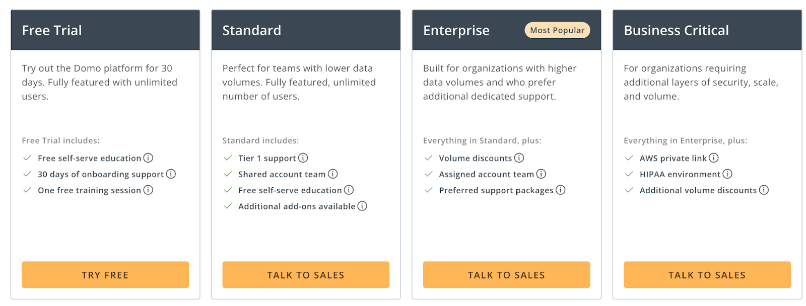
Domo offers a generous 30-day free trial. Other than that, it offers three paid plans:
-
Standard: Custom pricing
-
Enterprise: Custom pricing
-
Business Critical: Custom pricing
Pros and Cons
✅ Built-in usage analytics and governance capabilities give you transparency and control for deploying responsible AI and making its use visible.
✅ Domo hosts pre-built Universal Models for forecasting, sentiment analysis, and PII detection.
❌ The pricing isn't transparent (pricing quotes are fairly high for small businesses), and the platform requires extensive training to master.
9. Akkio
Akkio is an AI-powered data analytics tool designed to help you quickly visualize and analyze your data without requiring extensive technical expertise.
Features
-
Use Akkio's predictive AI engine to expose anomalies and hidden opportunities in the data so you can not only predict the future but actually visualize it.
-
Leverage Generative Reports to automatically create real-time reports by simply describing the problem or project in plain text.
-
Connect generative reports to live data sources such as GA4, Salesforce, and Airtable, and auto-refresh visuals for real-time numbers, eliminating last-minute visualizations.
-
Akkio's GPT-4 powered Chat Explore lets you chat with live data and get instant answers through insights, charts, and graphs.
Pricing
Akkio offers a free plan with live reporting and visualization capabilities. Other than that, it has three pricing categories:User Plans
-
Basic: $49 per user per month
-
Pro: $99 per user per month
-
Build-on Package: $999 per month
-
Enterprise: Custom pricing

Pros and Cons
✅ Provides an intuitive, no-code platform.
✅ Akkio allows for quick deployment of machine learning models, enhancing productivity and efficiency.
❌ Akkio lacks advanced customization options.
Wrapping Up
Visualizing data is an important aspect of data analysis. Without proper visualization, there’s just no way to make the right data-driven decision.
All the tools mentioned above are top AI data visualization tools in the market.
If you or your team don’t have the time to try every product on our list, sign up for Datapad, import your KPIs, and create stunning dashboards for you and your team.
