
Some of the best free dashboard tools for visualizing your metrics and KPIs are Datapad, Grafana, Databox, Dasheroo, FineReport, Metabase, Google Data Studio, Matomo, Tableau, and Inetsoft.
In this guide, you will find a detailed review of all the above-mentioned free dashboard tools and know why they’re the best in the market.
What is a Dashboarding Tool?

A dashboarding tool is a simplified data-management software that collects, monitors, and displays complex data via interactive and customizable dashboards and reports.
In simpler terms, dashboarding tools help you monitor and visualize your business health and accompany you with data-driven insights.
Now the question you might have is whether your business really needs a centralized dashboarding tool. 🤔
We would’ve said NO 🙅♂️ if it had been the 1990s, but as of today, every enterprise, despite the size, is surfing around tons of data - some are visible while most remain hidden.
And so, to easily squeeze, analyze, and monitor data from every place, dashboarding tools are a perfect solution.
Apart from saving your resources, these tools are a great help when it comes to KPI measurements. They hold the capability to present the worst form of data in an easy-to-understand format.
Thereby helping the c-suites make timely and better data-driven decisions.
If you don't want to read whole article, you can watch the video below to find out about the best free dashboard softwares.
Datapad helps you track all essential metrics from stunning dashboards.
The beauty of Datapad lies in its simplicity and ease of use. With our tool, anyone in your team with zero technical knowledge can start building reports in mere seconds.
As a go-to solution for Agencies, Datapad makes it easy to onboard new customers with 1-click templates and share performance reports with read-only links.
Datapad also makes it easy to collaborate as a team with the ability to drop comments on KPI cards.
The AI insights tool lets anyone detect anomalies in their data and provides actionable to-do items to increase performance.
Key Feature #1. Powerful AI Assistant
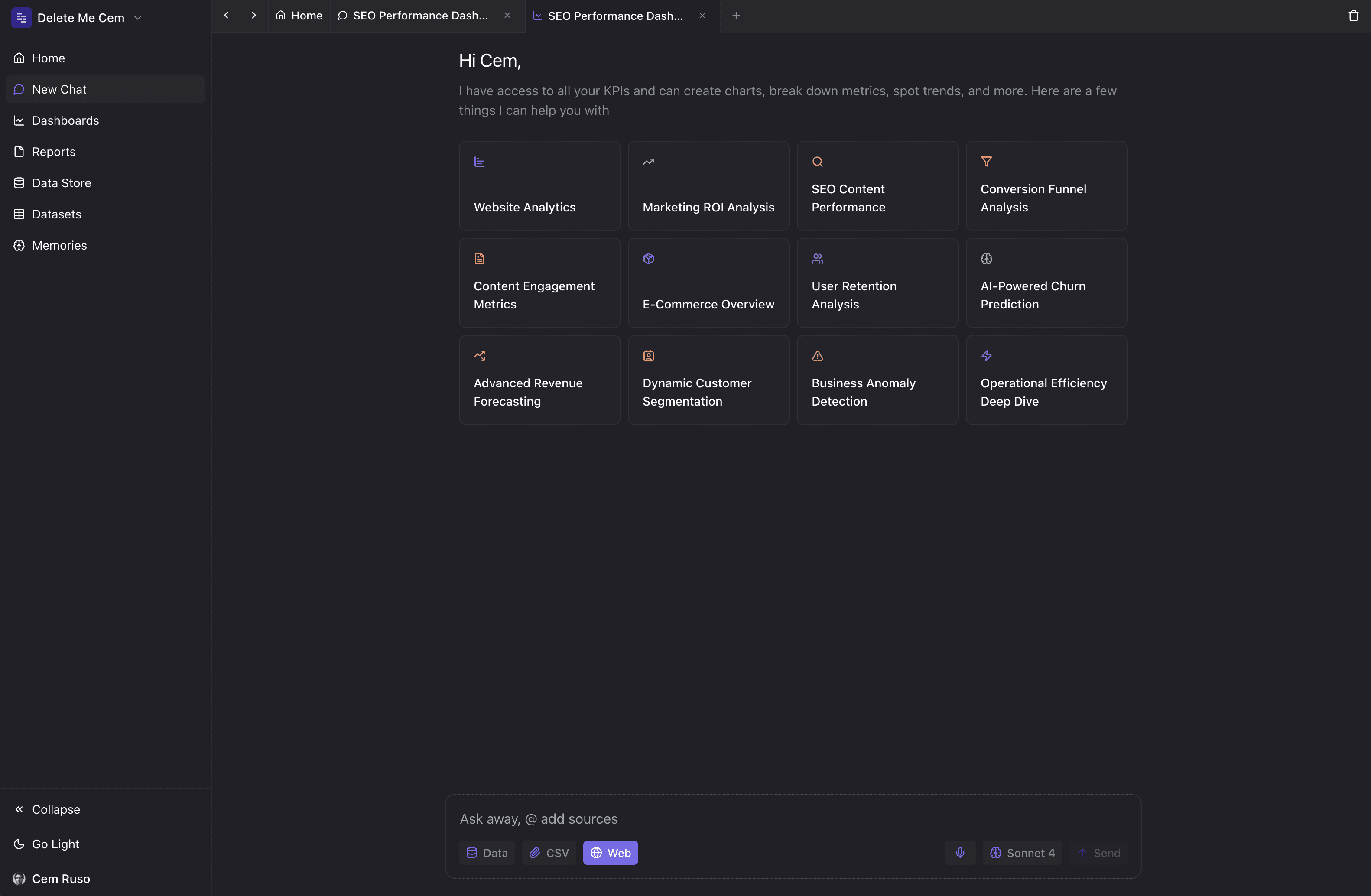
Creating reports for your business is no easy task. You have to determine a lot, from which metrics to choose to design the right charts.
If you are an agency and want to create the same reports for multiple clients, then this hassle becomes even more burdensome.
Guess what? Datapad lets you do all this with just a few prompts.
With Datapad's autonomous agent you can:
-
Ask any business question in plain English, get a deep-dive answer in seconds
-
Build custom dashboards based on your insights
-
Talk to the agent from anywhere (E-Mail, Slack, App)
Key Feature #3. AI-Generated Dashboards
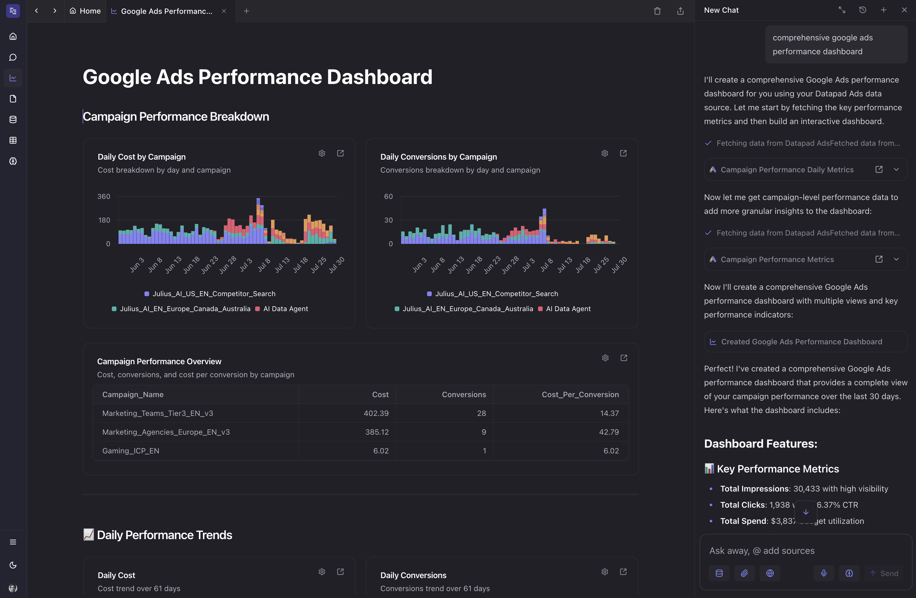
Building dashboards is a tedious process. You generally have 2 options:
1- Build something basic with templates
2- Dive deeper but spend hours in the process
Not anymore.
Datapad let's you generate incredibly sophisticated results - with just prompting - in mere seconds.
Moreover, you can leverage data-science tools like Python based analysis or SQL without knowing a single line of code.
In short, you get data-super powers without a data team.
With Datapad's agentic dashboards you can:
-
Work with the agent to build the dashboard of your dreams
-
Share / embed anywhere
-
Let the agent analyze the dashboards periodically and tell you wha'ts working
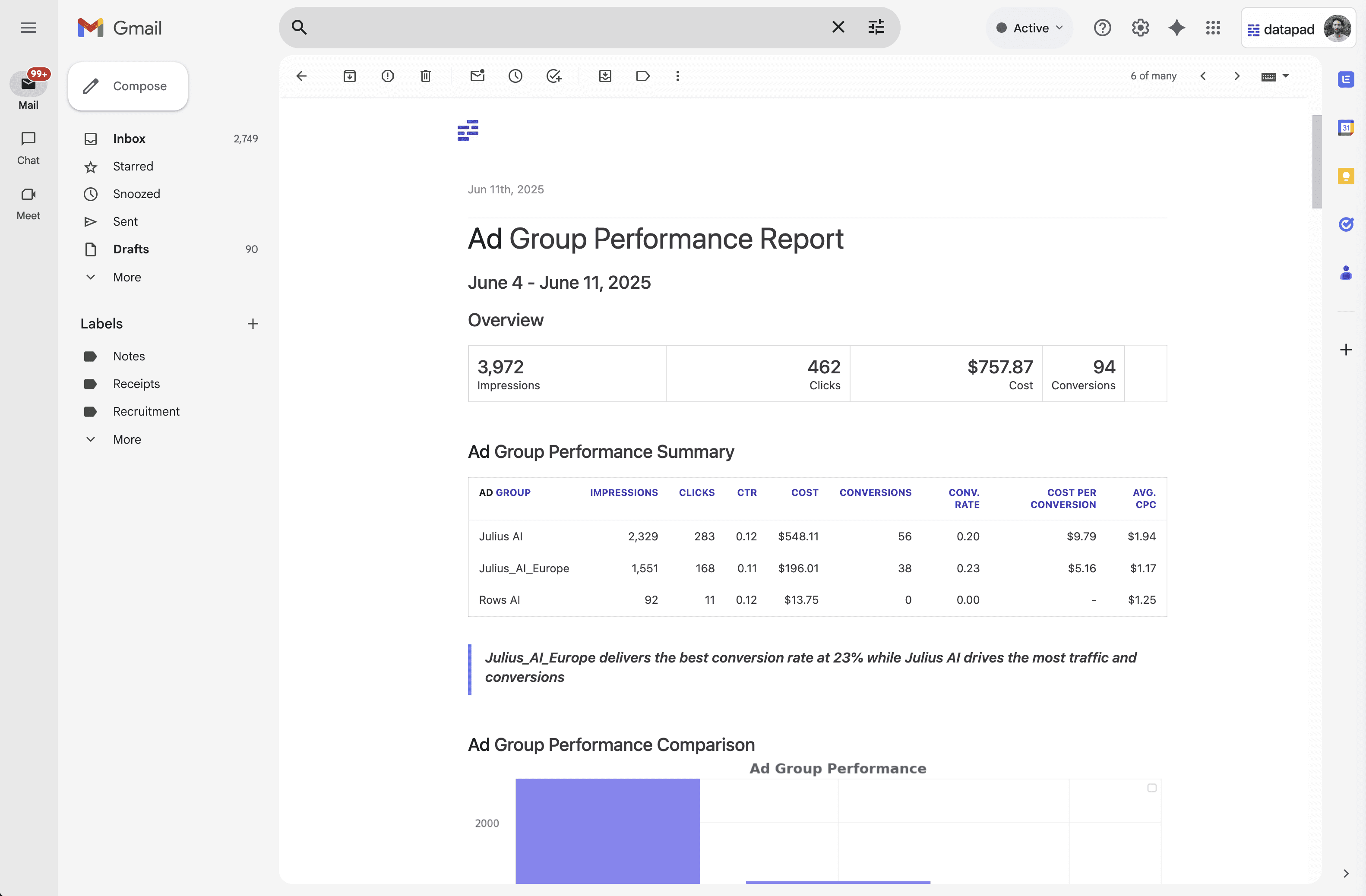
Key Feature #3. Automated Reports & Insights
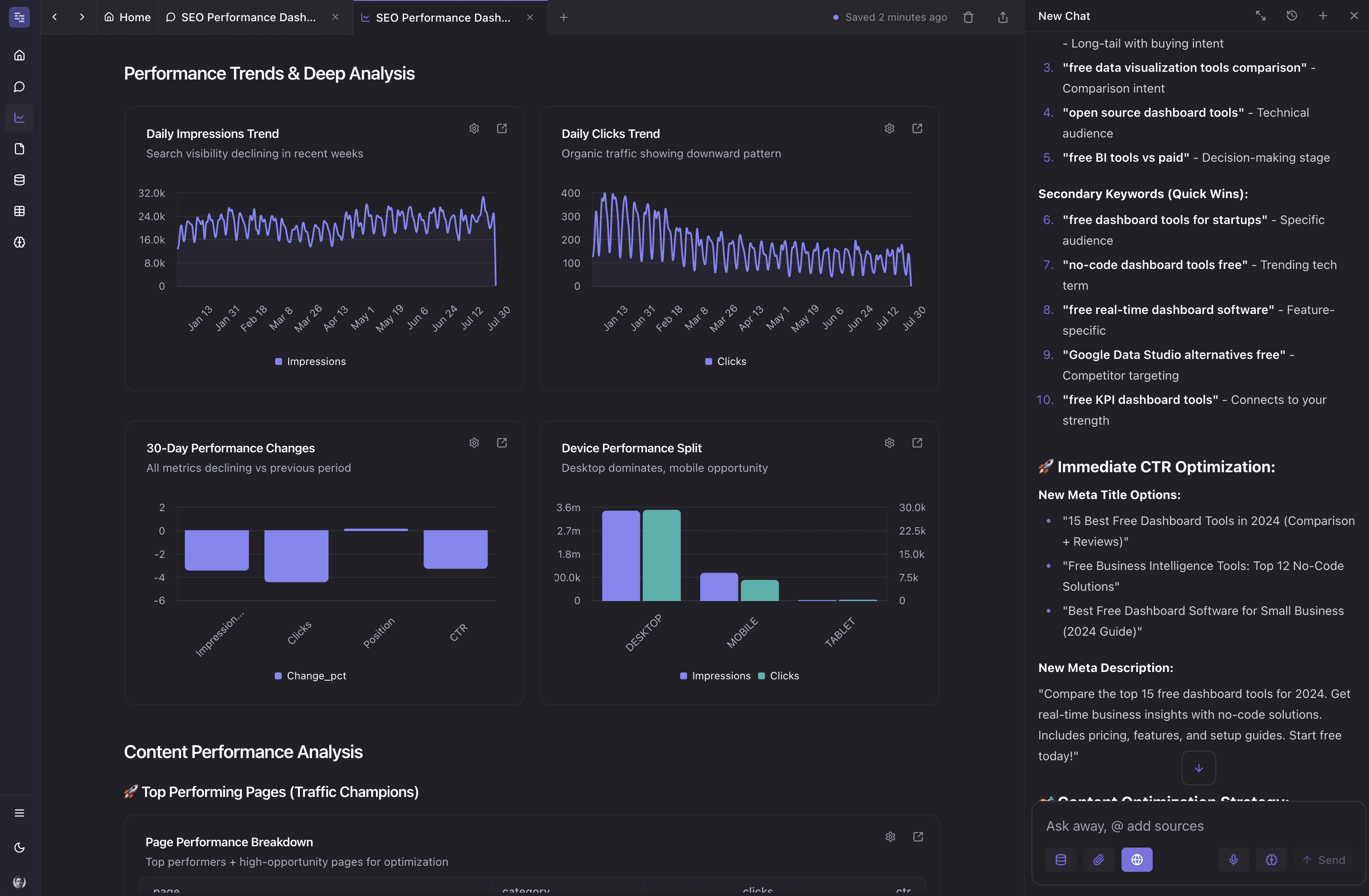
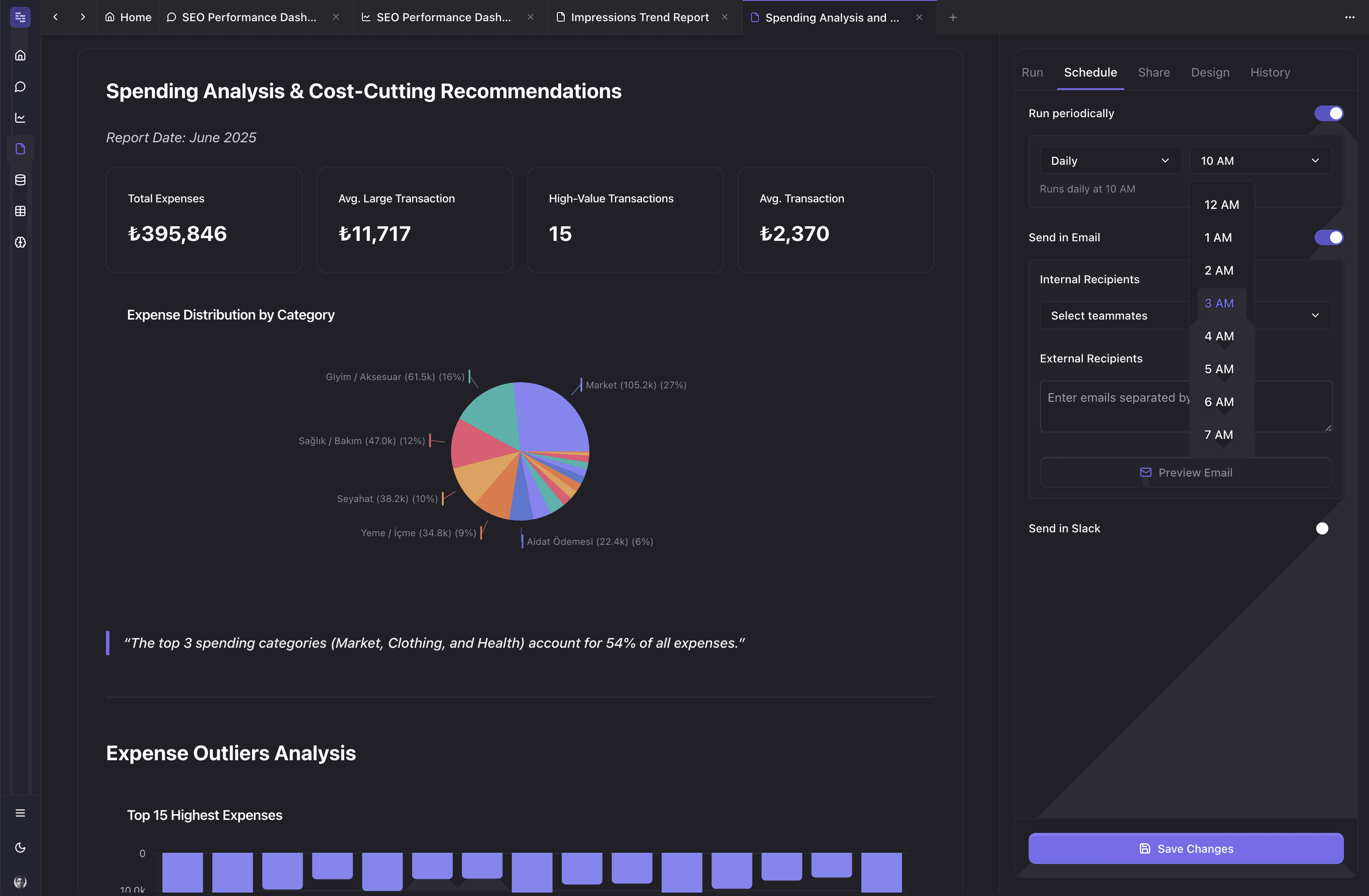
Wouldn't it be great if you could check your business KPIs first thing in the morning, straight from your inbox?
With our dashboard software, you can subscribe to any dashboard and receive daily email updates.
All you have to do is build a dashboard, click the subscribe button, and set your email preferences.
The best part is you can share reports with anyone, even emails outside of your organization or workspace.
Step 1: Subscribe to a report
Step 2: Check your inbox
With Datapad’s report and scorecard automation, you can:
-
Subscribe to any dashboard
-
Receive daily highlights around all KPIs
-
Send reports to users in and outside of your organization
-
Customize the date range, calculation, and styling of KPIs
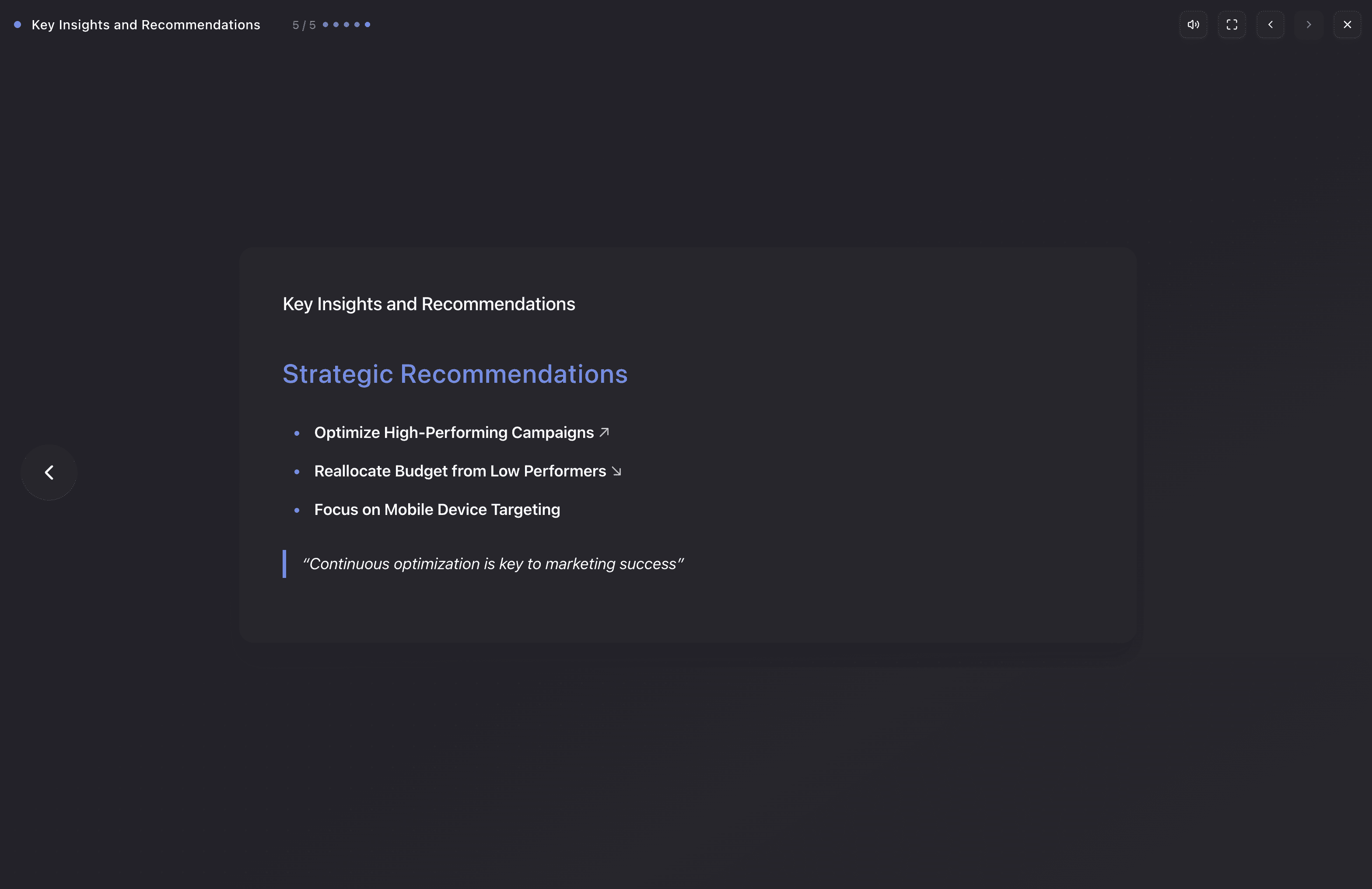
Key Feature #4. Get AI to Present Your Data with Voice-Over
Let's face it: You just want to know "What's working?" + "What to do next"
Even if you have an AI assistant that builds the best dashboard, it's your job to sift through and evaluate the data.
No more. You can now get Datapad to pre-analyze your data and give you a complete presentation in real-time!
Even better: You can share these reports with anyone with embeddable links.
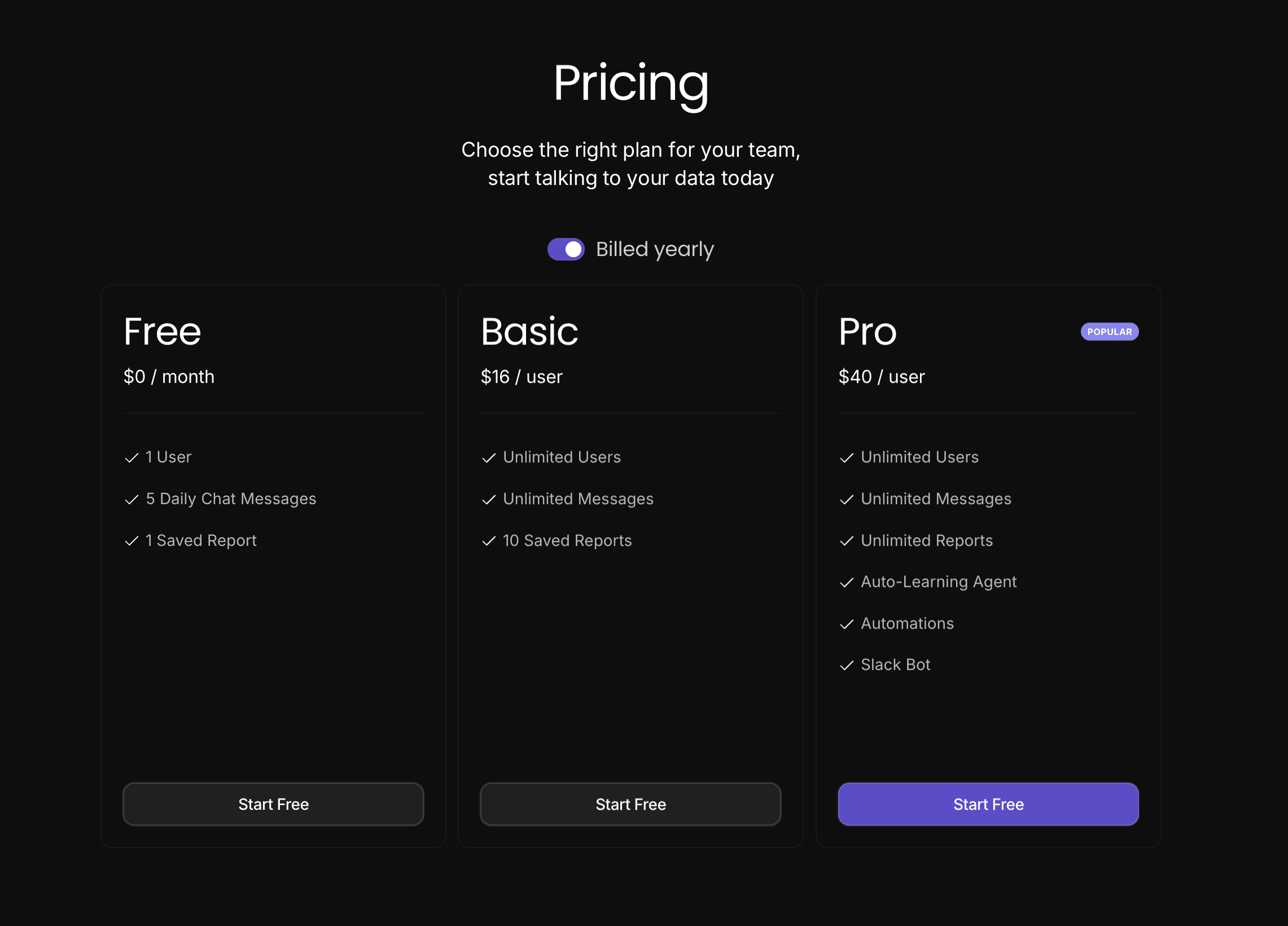
Pricing
Datapad has a free tier that includes 5 daily chats to get some basic work done. For more, you need to upgrade to either the Basic or Pro plans. Compares to competitors, Datapad packs a ton of features with 1/4 of the price.
Pros and Cons
Pros
✅ Completely AI-Native
✅ Complex reports and insights with minimum intervention
✅ Set up alerts and notifications to stay on top of your business
✅ Very affordable
Cons
❌ UI is not as powerful for deep-diving
❌ Not many integrations right now (20+)
#2. Databox
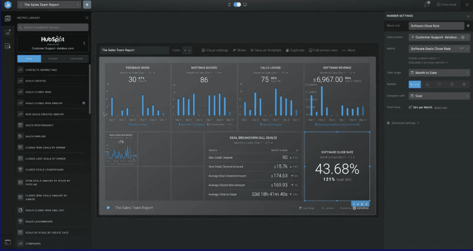
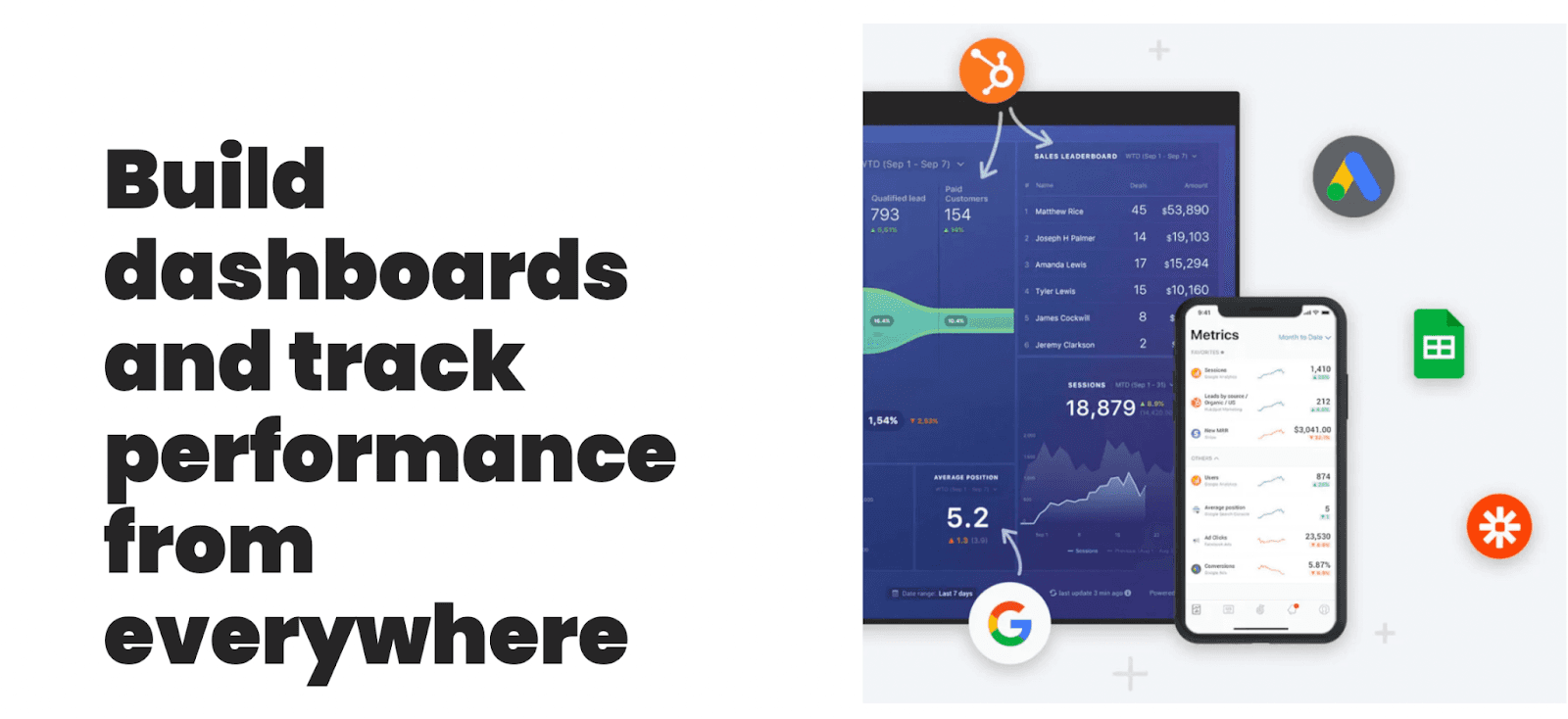
Databox is a leading business analytics dashboard that helps you connect data from any tool and track business performance from anywhere.
Over 20,000+ businesses use Databox to track and visualize their business data and make better data-driven decisions.
Who Is It For?
Databox is for data-driven marketers, CEOs, analysts, and decision-makers. Being a versatile platform, it’s suitable for small to large businesses.
Features
-
Over 60+ one-click integrations to connect your data easily; integrate custom data via SQL database, Google Sheets, APIs, or Zapier
-
A rich gallery of 200+ proven dashboard and report templates for specific departments built by professionals
-
Use the drag-and-drop interface builder to easily calculate new metrics or create custom business metrics from multiple data sources
-
Intuitive dashboard designer to customize and visualize key performance indicators the way you want - no coding or design skills required
-
Set up automated alerts when specific metrics trend up or down from your set threshold point; schedule performance reports via email, Slack, and more
Pros and Cons
Pros
✅ Has a user-friendly interface
✅ Satisfying number of integrations and pre-built templates
✅ Quick and easy to set up
Cons
❌ Limited data source connection and dashboard for free plan (one each)
❌ Can be confusing for beginners
#3. Grafana
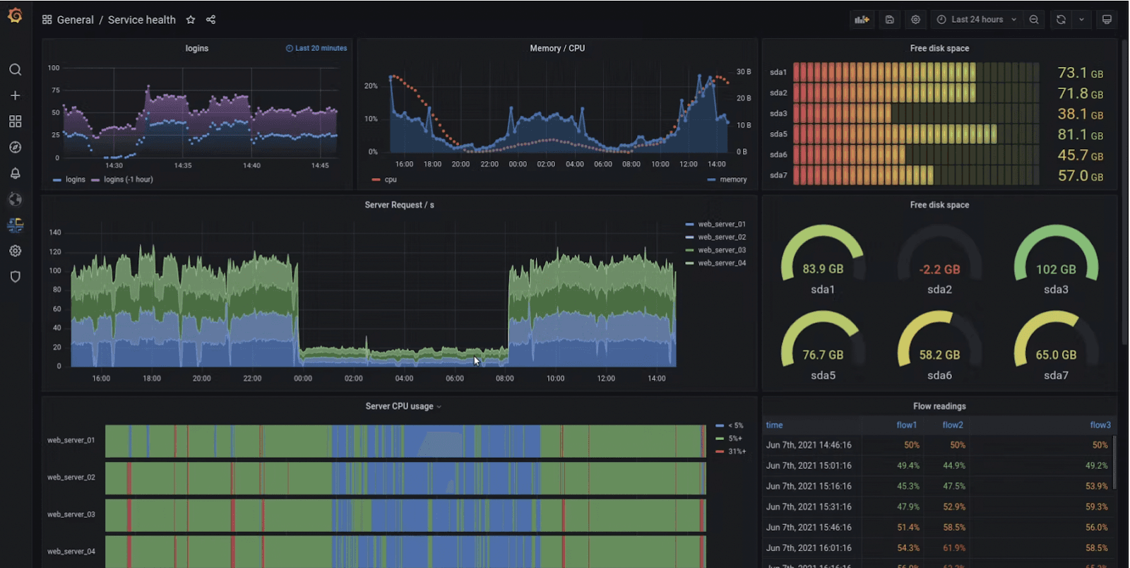
Grafana is an open-source analytical and dashboarding solution that allows businesses to ingest, query, and display data via interactive visualizations.
The platform allows you to create unified dashboards that combine data from multiple sources to foster a data-driven culture within your team.
Who Is It For?
Grafana has millions of business users, including many top companies like eBay, PayPal, Intel, and more. It's an excellent data visualization tool for anyone, ranging from startups to large-sized enterprises.
Features
-
Has pre-built data visualization options ranging from heatmaps to histograms and graphs to geo maps for faster and flexible data visualization
-
Easily import data via 40+ data source plugins and robust APIs from popular platforms such as Google Analytics, Github, and more
-
Use transformations to edit, combine, and perform calculations across different queries from multiple data sources
-
Setup Grafana alerting to easily manage, create, and get alerts from a centralized system
-
Use panel editor to quickly configure, customize, and visualize all your dashboards within a consistent UI
Pros and Cons
Pros
✅ Easily collaborate on dashboards with your teammates
✅ Great community support
✅ Set up custom alerts and notifications
✅ Allows to setup threshold limits on graphs
Cons
❌ Limited data visualization options
❌ Higher learning curve (best for coders and developers)
❌ Occasionally laggy (could be a data source issue)
#4. Dasheroo
Dasheroo is a cloud-based BI and analytics platform that helps you easily keep track of your messy business data via beautiful dashboards and stunning visualizations.
Who Is It For?
Dasheroo is a good fit for all, from small businesses to startup teams to enterprise companies.
Features
-
Comment and discuss in real-time from within Dasheroo to stay connected at all times and concentrate the team on results
-
Get alerted via instant group notifications when a specific metric trends up or down a certain threshold
-
Blend data from different platforms to create unique custom metrics and spot hidden correlations and trends
-
Setup and schedule recurring emails to share dashboards with teams; export dashboards in PDF or PNG formats
-
Easily import data from internal or custom data sources with JSON and Push API Webhooks
Pros and Cons
Pros
✅ Simple to use & easy to set up
✅ Great visual appeal and customizations
✅ Admirable collaboration features for teams
Cons
❌ Not much of a business intelligence dashboard (popularly a visualization tool)
❌ Limited integrations to popular platforms
#5. FineReport
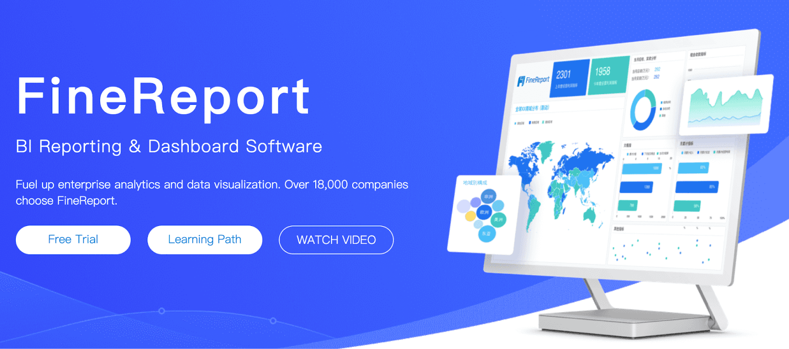
FineReport is a business intelligence software developed by Java. It addresses your need for data integration, management, and visualization across the organization.
Who Is It For?
FineReport holds the top spot in the Chinese BI market. It's best for SI's and ISVs, product managers and owners, CTO, etc. in the healthcare, manufacturing, finance & banking, real estate, and IT sectors.
It's also a popular voice among individual marketers because it's free for personal use.
Features
-
Easy-to-use designer that offers intuitive drag-and-drop functionality to create interactive reports within minutes
-
One-click integrations with mainstream databases, including direct connection to the database via JDBC
-
Has a stream-to-TV feature allowing you to track KPIs on large screens and TV dashboards easily
-
Over 19 categories and 50+ styles of pre-built HTML5 charts, with cool 3D and dynamic effects for quick data visualization
-
Has dedicated mobile app with newly adopted ReactNative technology for a seamless mobile dashboarding experience
Pros and Cons
Pros
✅ Intuitive and easy design mode
✅ Open source library (to add more functionalities)
✅ Excellent data connectivity
✅ Dedicated mobile app
Cons
❌ Being a product of Java, the tool has a technical touch
#6. Metabase

Metabase is an open-source BI and data visualization tool that allows you to weave impactful stories from your data.
Its interactive dashboards present data in an easy-to-understand format to business owners and stakeholders, allowing them to make better data-driven decisions.
Who Is It For?
Metabase best suits small teams, growing businesses, and large enterprises. Or, if you only want to use the free plan, it's best for small teams and startups.
Features
-
Has a user-friendly interface with an embedded visual query builder for advanced users to drill-down data and extract hidden insights
-
Over 20+ integrated data sources and 15+ built-in visualizations to easily create beautiful live charts and dashboards
-
Easily share dashboards via smart links or schedule automated reports via email or Slack for timely alerts; embed dashboards in web pages, presentations, and more
-
Enable role-based management to keep control of when and how someone can view dashboards
Pros and Cons
Pros
✅ Unlimited charts and dashboards
✅ Access to friendly forums
✅ Easy to set up (just takes 5 mins)
Cons
❌ Highly reliant on SQL
❌ No formatting flexibility
#7. Google Data Studio (Looker)
Google Data Studio lets you effortlessly collect raw data from everywhere and transform them into interactive, beautiful reports and dashboards. The dashboards built with data studio are fully customizable and easy to share with your teams and stakeholders.
Who Is It For?
Google Data Studio is for anyone who wants to make better use of their data without incurring any cost or taking the risk of data mishandling.
Related: Google Data Studio Alternatives
Features
-
Has an extensive gallery of pre-built reports and dashboard templates to create stunning data visuals easily and quickly
-
Over 800+ data sources and 650 connectors to effortlessly collect or import data from multiples sources with a click
-
Choose from an array of visualization tools such as Gantt chart, Gauge, Waterfall, or create custom visualization
-
Easily share reports and dashboards with individuals or teams; collaborate in real-time and embed reports on any web page with a simple code
Pros and Cons
Pros
✅ Strong integration with Google's ecosystem (eases most of your work)
✅ Granular access control and sharing mechanisms
✅ Completely free
Cons
❌ Lacks real-time updates
❌ No support for Excel
❌ Might find it difficult to perform complex visualizations
#8. Matomo

Matomo is an all-in-one platform that collects data and presents it through easy-to-understand visuals through a unified dashboard.
The best part is that Matomo gives you 100% data ownership, which means you're in control of where your data is stored and what's happening to it.
Who Is It For?
Over 1 million websites trust Matomo in 190 countries. Its prominent customers include the United Nations, Ahrefs, and NASA. The platform serves all industries ranging from commercial stores to IT and aeronautics.
Features
-
Easily import historical Google Analytics data directly to Matomo with its built-in Google Analytics importer
-
Avoids data sampling to give you 100% accurate and actionable insights; offers unlimited websites, users, and data storage
-
Has a user-friendly interface allowing easy setup and training for teams
-
Has a dedicated marketplace with over 75 free plugins to easily customize analytical reports and dashboards
-
Offers ample visualization tools like heatmaps, session recording, and cohorts to quickly and effectively present complex data via simplified visuals
Pros and Cons
Pros
✅ Frequent updates help to prevent the platform from bugs and glitches
✅ Self-hosting is very simple and comfortable
✅ Offers 100% data control
Cons
❌ Poor UI/UX design
❌ Comes with a steep learning curve (best for advanced users)
#9. Tableau
Tableau Public is offered as a totally free platform to organize, visualize, and publicly share significant data. It comes with an extensive library of data visualization tools; anyone can use them to structure unorganized datasets.
Who Is It For?
Tableau public is for data professionals, business teams, and even tech teams to make sense of raw data, seek guidance from the open-source community, and contribute valuable data.
Features
-
Explore a wide array of public topics, maybe anything from business, sports, investing, or economy
-
Visualize faster than any other tool in the market with presets and representation libraries made to accommodate the smallest to largest of data heaps
-
An active global community to foster knowledge exchange and ways to interpret data, totally free to join, participate and promote among
-
Create flawless interactive graphs, charts, and other representations without a bit of coding or plotting know-how
-
Easily export and share dashboards in multiple formats like Excel, CSV, and spreadsheets
Pros and Cons
Pros
✅ Truly free to use and access libraries
✅ Supports all kinds of data sources, including online and locally stored data sets.
✅ A platform with mobile friendliness and ease of use for the layman
Cons
❌ Lack of personal security when the data is stored publicly
❌ Only 10 million records per data source and 10 GB of overall content per account.
#10. Inetsoft
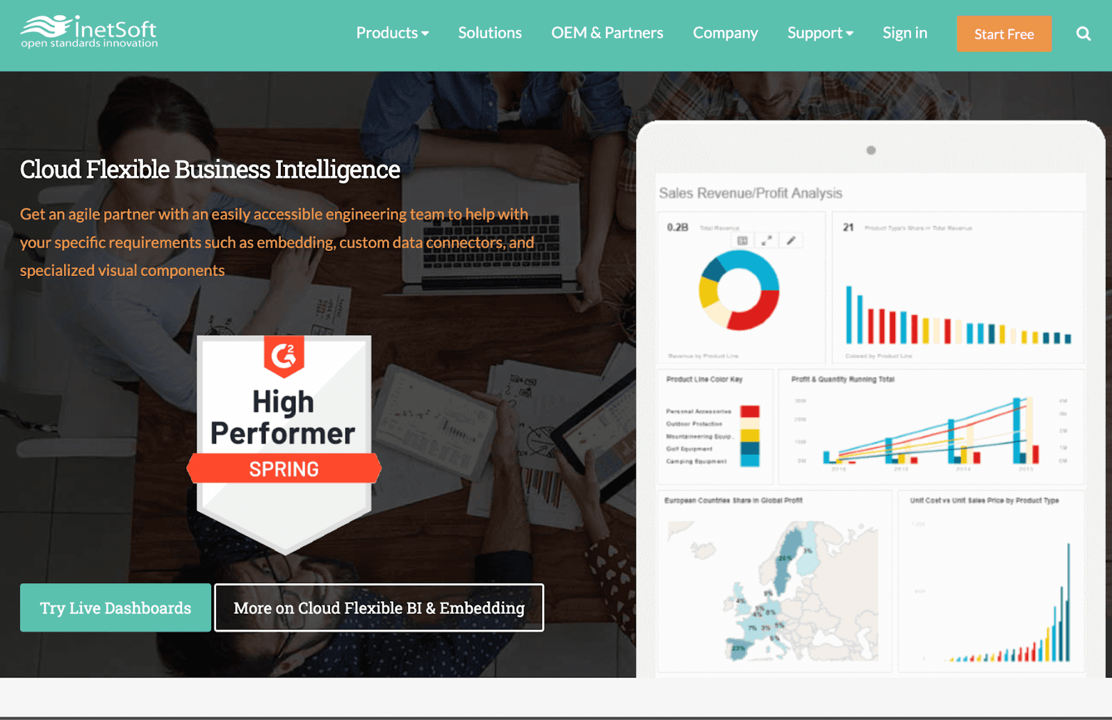
Inetsoft is a leading analytics and dashboard reporting tool empowering businesses with reliable data insight in the cloud computing & SaaS era.
Inetsoft blends data from multiple platforms and allows you to report, analyze, and visualize complex data in real time.
Who Is It For?
Inetsoft is best suited for the Information Technology and Services industry. Or, more specifically, best fit for businesses in the computer software industry.
Features
-
Has built-in fine-grained, self-service customization and ad hoc reporting to present intuitive views of business data
-
Offers an extensive range of visualization options such as customizable charts, tables, and other visual components
-
Easily access dashboards and reports with the help of a highly-responsive web-based app (compatible with all devices and screen sizes)
-
Quickly import data from SaaS data sources, including Google Sheets; manually upload data via excel or CSV files
-
Publicly shareable dashboards via URL link or securely to a client, investor, or team
Pros and Cons
Pros
✅ Easy to setup and use
✅ Quality support and assistance
✅ Ease data import and a crystal-clear UI
Cons
❌ Involves a certain extent of technical jargon
Have All Your Dashboards in Your Pocket with Datapad
Datapad is a free dashboard software that sets the bar high in the dashboarding tool category. Its user-friendly and allow you to access your KPIs instantly from anywhere.
Do you remember we talked about how ease of setup is an essential feature for any dashboarding tool? Well, our tool just takes a minute to set up and get you rolling. Here's how to do that:Step 1: Choose a title for your dashboard
Step 2: Set a goal for your KPI
Step 3: Choose from a gallery of charts and visual components
Sign up now to start tracking your KPIs with your team
Read more: How to Build a KPI Dashboard in Excel?