![The Best 11 Klipfolio Alternatives in 2024 [In Depth Comparison]](/_next/image?url=https%3A%2F%2Fframerusercontent.com%2Fimages%2FEZ8Z8bGazynUcRtquldd9skNAGc.png&w=3840&q=75)
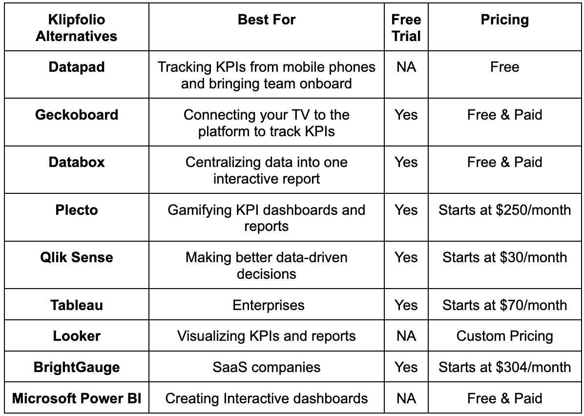
Best Klipfolio alternatives are Datapad, Geckoboard, Databox, Plecto, Qlik Sense, Tableau, Looker, BrightGauge, Microsoft Power BI, Sisense, and KPI Fire.
In this guide, you will find a full comparison between these Klipfolio alternatives and why you might need an alternative in the first place.
Disclaimer: The information below is accurate as of Feb 12, 2024.
3 Reasons Why You Might Need a Klipfolio Alternative? 11 Best Klipfolio Alternatives to Try this Year Keep All Your KPIs In Your Pocket?
But before comparing these Klipfolio alternatives straight off the bat, let's first discuss why you might need one in the first place.
3 Reasons Why You Might Need a Klipfolio Alternative?
Klipfolio is a popular tool; however, it does have some disadvantages. Let's quickly get through some of the significant disadvantages of using Klipfolio.
Reason #1. Technical Jargon Required
Unlike other BI and KPI tracking software like Datapad and DashThis, Klipfolio has a higher learning curve. You might think, why?
Klipfolio comes with a suite of advanced features. As some of its users reported, these features are hard to understand, let alone used for non-technical members of their team.
No matter how easy-to-use Klipfolio is, you might interact with technical know-how or coding stuff at certain stages. Plus, the software in itself is a bit complicated, and users need to spend time on it to become experts.
Developers enjoy these technicalities, but non-technical guys suffer. And how many tech people have you known whose daily task is to track KPIs?
For example, we came across a few reviews where users faced trouble framing the backend of their dashboard. The technicalities were beyond their control until they hired a developer for the same.

Moreover, the syntax for formulas and names of functions varies a bit from excel or google sheets. Taking you a while to equate and customize formulas.
Evidently, the technicalities involved with Klipfolio makes it a try-fail-learn software.
So, why use a trial-and-error process when you can enjoy error-free analytics with Klipfolio's alternatives?
Reason #2. Overwhelming Limitations
Klipfolio struggles with minor and major limitations in its software. Although the software is regularly updated, the limitations are not yet considered.
Let's get through a few of its limitations that frustrate users.
Firstly, Klipfolio has API connectors, but their functionality is limited; it has no database to pipe in data from multiple sources. Meaning, you can't pull all the business data from some platforms (none of the connectors let you pull 100% data off).

Secondly, Klipfolio has certain .csv file size limitations that become challenging for users to stick through.
It also has some design limitations that make it hard to adjust complex KPIs under one unified dashboard.
And lastly, dashboards do not refresh on their own. Although this should be among the free features, with Klipfolio, you need to pay the price to enjoy automatic updates.
Reason #3. Poor Loading Time
Suppose you paid for a software to speed up your work and are suddenly encountering poor loading time. We understand that feeling, so we're bound to share some better alternatives with you.
With Klipfolio, business dashboards and reports can sometimes take a while to load. Moreover, Some of the easier tasks take a little longer than you thought.
This slow-down might be due to complex KPIs and multiple databases. But, on the second note, why would you be looking for software to perform the complex tasks for you if it were that simple?
Now that you know why you might need a Klipfolio alternative, it’s time to explore your options.
11 Best Klipfolio Alternatives to Try this Year
#1. Datapad

Datapad helps you track all essential metrics from stunning dashboards.
The beauty of Datapad lies in its simplicity and ease of use. With our tool, anyone in your team with zero technical knowledge can start building reports in mere seconds.
As a go-to solution for Agencies, Datapad makes it easy to onboard new customers with 1-click templates and share performance reports with read-only links.
Datapad also makes it easy to collaborate as a team with the ability to drop comments on KPI cards.
The AI insights tool lets anyone detect anomalies in their data and provides actionable to-do items to increase performance.
Key Feature #1. Templates

Creating reports for your business is no easy task. You have to determine a lot, from which metrics to choose to design the right charts.
If you are an agency and want to create the same reports for multiple clients, then this hassle becomes even more burdensome.
Guess what? Datapad lets you do all this with just a few clicks.
With Datapad's templating features, you can:
-
Choose from a gallery of pre-designed templates and apply them with 1-click
-
Build a custom dashboard and re-use it as a template by changing it's sources
-
Share all connected data sources in the workspace with your teammates
Key Feature #2. Team Collaboration

Tracking KPIs isn't a one-person job when you have a lot of them; you need a team. But not all KPI dashboard tools let you bring your team on board.
Guess what? Datapad lets you do it quickly and easily.
Moreover, you can assign individual team members tasks to handle, goals to achieve, and metrics to measure.
With Datapad's team collaboration feature, you can:
-
Get notified whenever there’s an update for any metrics and KPIs you track
-
Communicate around your metrics and KPIs with your team members
-
Get push notifications on your phone to stay updated with all your KPIs
Key Feature #3. Automated Reports & Scorecards
Wouldn't it be great if you could check your business KPIs first thing in the morning, straight from your inbox?
With our dashboard software, you can subscribe to any dashboard and receive daily email updates.
All you have to do is build a dashboard, click the subscribe button, and set your email preferences.
The best part is you can share reports with anyone, even emails outside of your organization or workspace.
Step 1: Subscribe to a dashboard

Step 2: Check your inbox

With Datapad’s report and scorecard automation, you can:
-
Subscribe to any dashboard
-
Receive daily highlights around all KPIs
-
Send reports to users in and outside of your organization
-
Customize the date range, calculation, and styling of KPIs
Pricing
Datapad has a free tier that includes 1 dashboard. If you want more, you can upgrade to the $30 Standard Plan, which includes 3 dashboards and scales with your usage. Datapad also offers a Business Plan tailored for agencies and includes dedicated customer support.
We are now offering an earlybird discount to all users, so it's a great time to sign up and give Datapad a spin.
#2. Geckoboard
Geckoboard is a cloud-based dashboarding software that enables small and medium enterprises to create professional KPI dashboards easily.

It provides dashboarding solutions for every team. From investor and product dashboards to sales and marketing dashboards, the platform has everything you need to create stunning visualization of your data.
Features
-
Supports 80+ integrations to connect your data easily; allows you to add new integrations on request
-
Easily import additional data using spreadsheets, databases, Zapier integrations, and custom APIs
-
Use advanced filtering to extract the metrics, range, or KPIs you want to visualize on dashboards
-
Resize, group, rearrange, and add custom widgets to make your data visually appealing
-
Share daily, weekly, or monthly snapshots of your dashboard with teams via emails, Slack, or create links and post it on social media (like Linkedin)
-
Easily add the Geckoboard web app on your Android or iOS mobile home screen to view dashboards anytime and from anywhere
Pricing
Geckoboard offers a 14-day risk-free trial period. Following this, you can avail its free plan. The free version allows you to create a single dashboard using spreadsheet data but is limited to only one user.
Apart from this, Geckoboard has three paid plans, as mentioned below:
-
Essential: $49/month
-
Pro: $99/month
-
Scale: $699/month

#3. Databox
Databox is an award-winning business analytics platform serving over 20,000+ businesses globally.
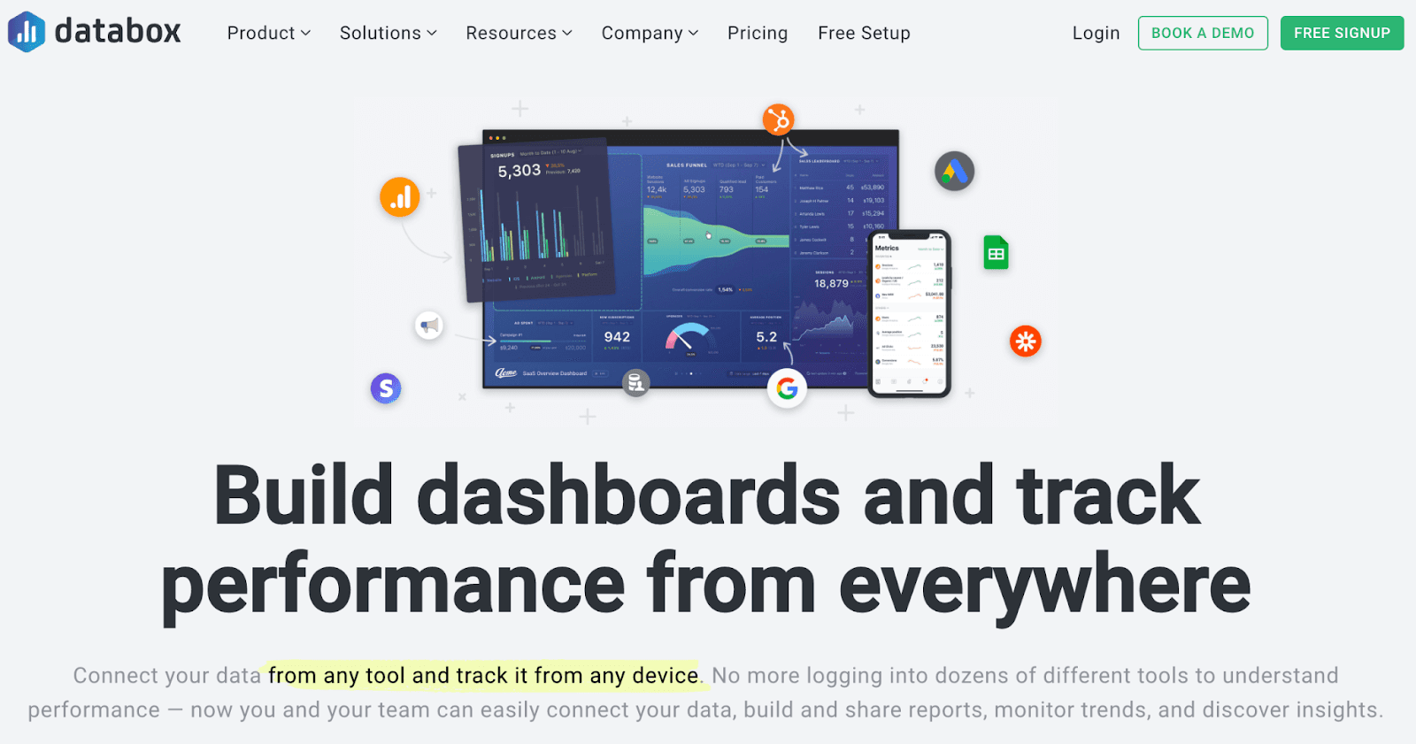
This KPI tracking platform helps users track, discover, and visualize actionable insights from raw data in minutes.
Features
-
Has an in-built dashboard designer to fully customize the look and presentation of your dashboard - no coding required
-
70+ native integrations and integrations with Google Sheets and Zapier allow a smooth inflow of data from various data points
-
Compare your past and present performances with interactive visuals and set strategic goals in real-time
-
Create one comprehensive report by linking multiple dashboards together; use those custom KPIs to analyze performance better
-
Push notifications and alerts via emails for trends and activities happening in the dashboard while you're offline
Pricing
Databox offers a free-forever plan with 3 Data Source Connections, all standard features, and 60+ Databox Integrations. Additionally, the platform has three paid plans, as follows:
-
Starter: $91/month
-
Professional: $169/month
-
Performer: $289/month

#4. Plecto
Plecto is an all-in-one BI and dashboarding software that blends KPI visualizations with gamification to cherish an engaging experience for its users.
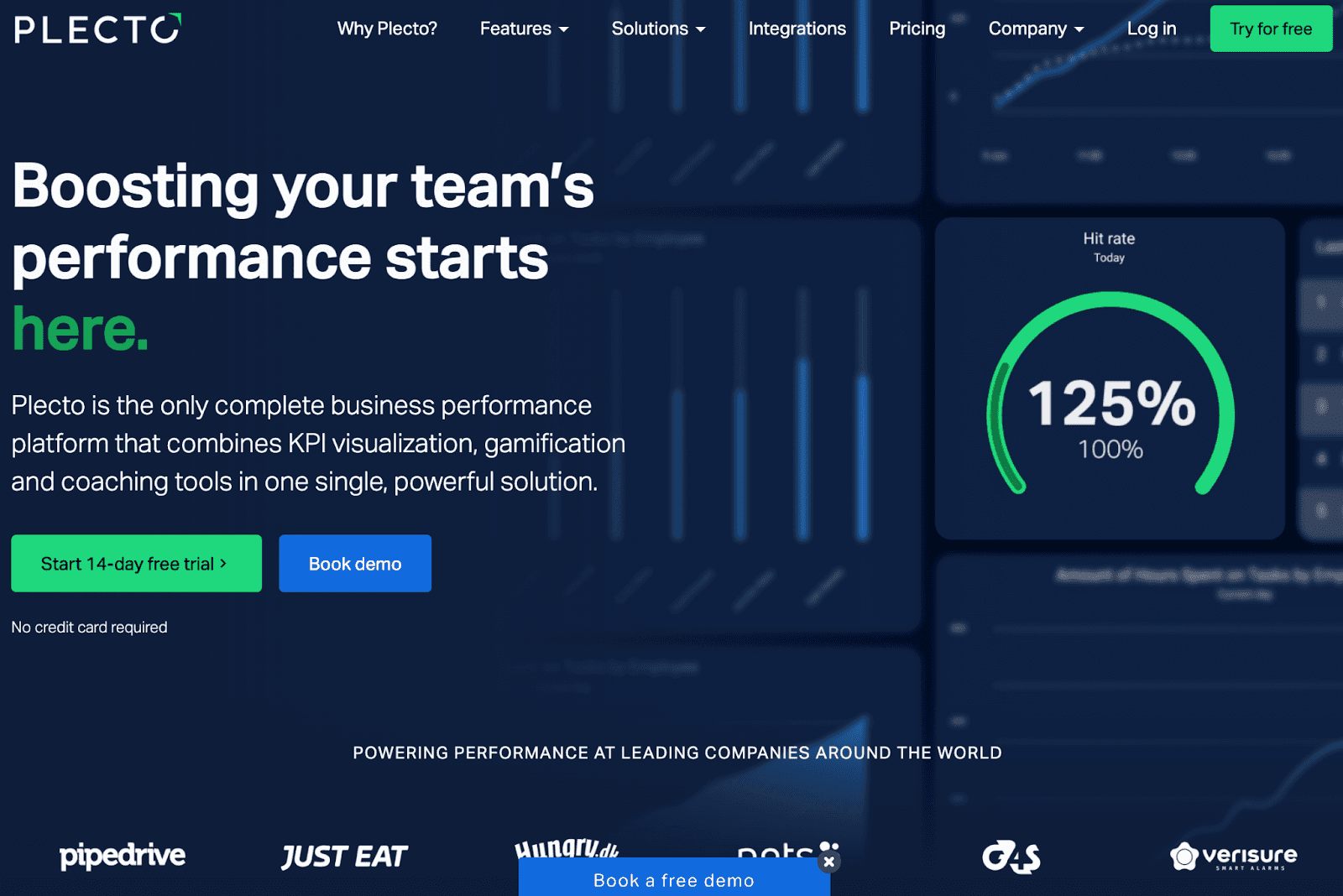
Eventually, it's the only platform providing this unique way of performance measurement.
Feature
-
Create custom dashboards by mixing multiple KPIs; equate your own formulas to visualize and keep track of any particular KPI
-
Choose from an extensive elements library of 200+ pre-built widgets to quickly build your dashboards
-
Broadcast notifications across teams regarding client feedback, top performers, and overall performance to recognize the achievements and the problems
-
Assign KRAs and KPIs to employees over a period of time and monitor their performance towards set goals in real-time
-
Easily gamify your process with contests, friendly competition, and other gamification methods to keep your employees engaged and motivated
-
Has in-built coaching tools to help unleash the true potential of your employees
Pricing
Plecto has a 14-day free trial. Apart from this, it offers two paid plans:
-
Medium: $250/month
-
Large: $390/month

Note: Plecto also provides enterprise-exclusive plans. These plans are budgeted according to your requirements, so you need to contact their executives to get a quote.
#5. Qlik Sense
Qlik Sense is a leading predictive analytics and dashboarding software trusted by over 38,000+ customers globally.
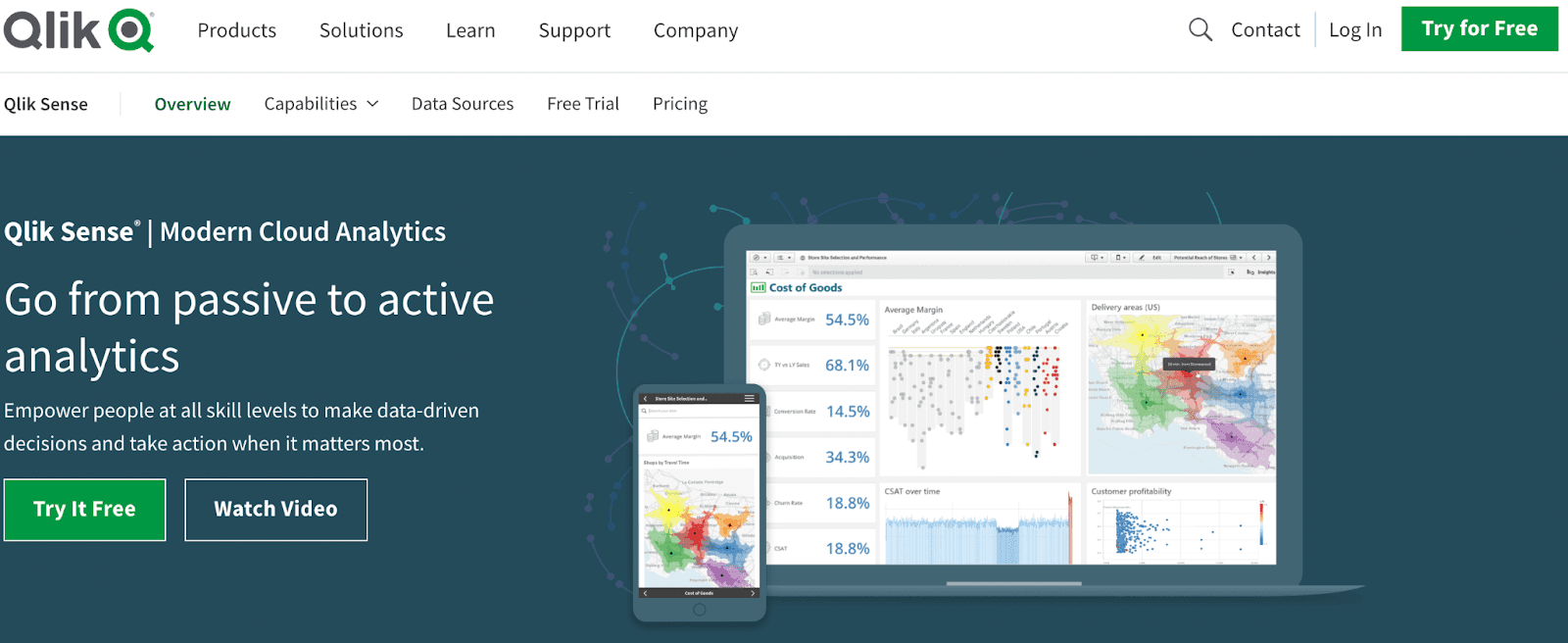
The platform helps individuals and enterprises uncover advanced analytics and make better data-driven decisions.
Features
-
Lightning-fast technology that goes beyond query-based analytics and allows you to combine, load, visualize and explore hidden data
-
Create, share, and distribute powerful dashboards and reports with teams and investors in an easy-to-understand way and in popular formats like MS Office and PDFs
-
Has an in-built advanced search feature with natural language processing (NLP) to get relevant insights with a click
-
Offers highly responsive designs for web and mobile application that is easily compatible with all known devices and screens
-
Get instant alerts and notifications regarding changes in data or trends and take real-time action from available insights
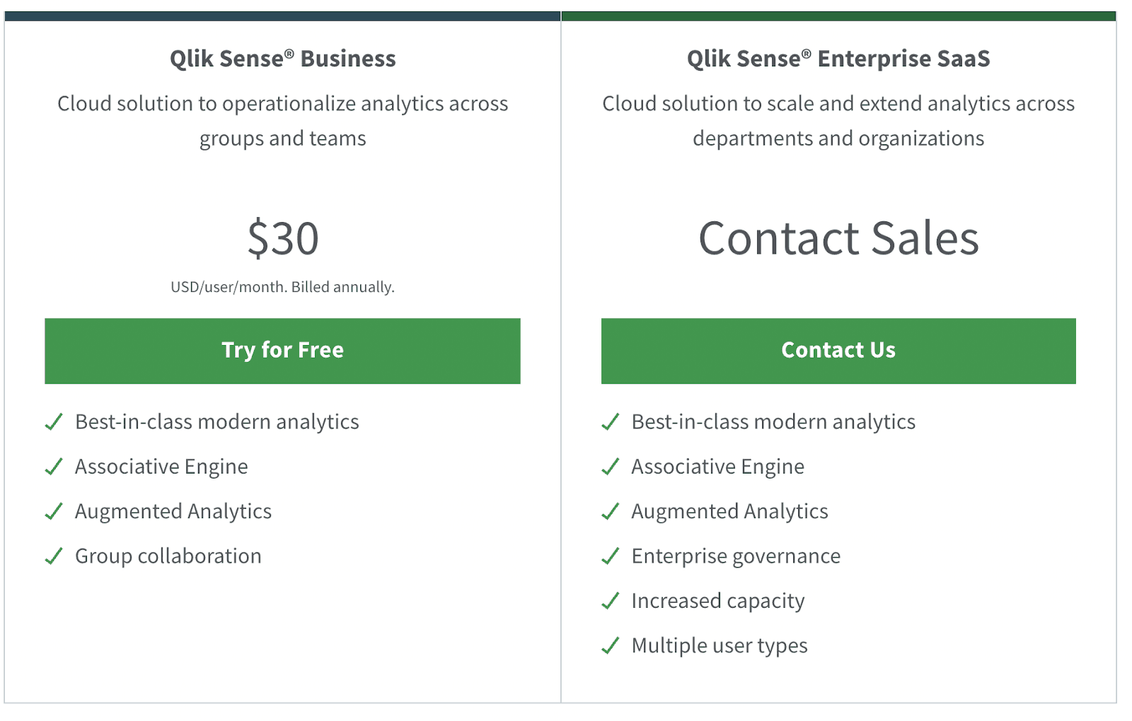
Pricing
Qlik Sense offers a 30-day free trial. Apart from this, it has a Qlik Sense Business plan ($30/month) and Qlik Sense Enterprise plans (Contact sales).
#6. Tableau Analytics by Salesforce
Tableau Analytics, a by-product of Salesforce (acquired in June 2019), is the industry's #1 enterprise-grade analytical and dashboarding platform.
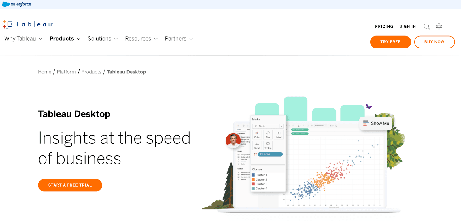
The platform lets anyone create an interactive and visual analysis of their custom data and generate actionable insights with no technical jargon involved.
Features
-
Leverages AI such as augmented analytics, business science, and data science to determine predictive analysis and support better decision making
-
A self-service platform that automatically combines, shapes, and cleans bulky data to prepare it for analysis - no manual extraction is required
-
Get answers to your data questions with Tableau's intuitive search filter and advanced visual exploration (natural language processing)
-
Set balance between control and agility by defining custom policies and procedures to ensure the right data is available to the right people
-
Embedded with Salesforce's powerful Einstein discovery analytics that delivers data-driven predictions and recommendations for smarter decision making
Pricing
Tableau Analytics offers both Tableau cloud and on-premise analytical solutions. The cloud version pricing is as follows:For teams and organizations: Tableau creator ($70/month), Tableau explorer($42/month), Tableau Viewer ($15/month).
For individuals: $70/month.

Note: Students and teachers can avail 1-year free license by subscribing to any of the Tableau paid plans.
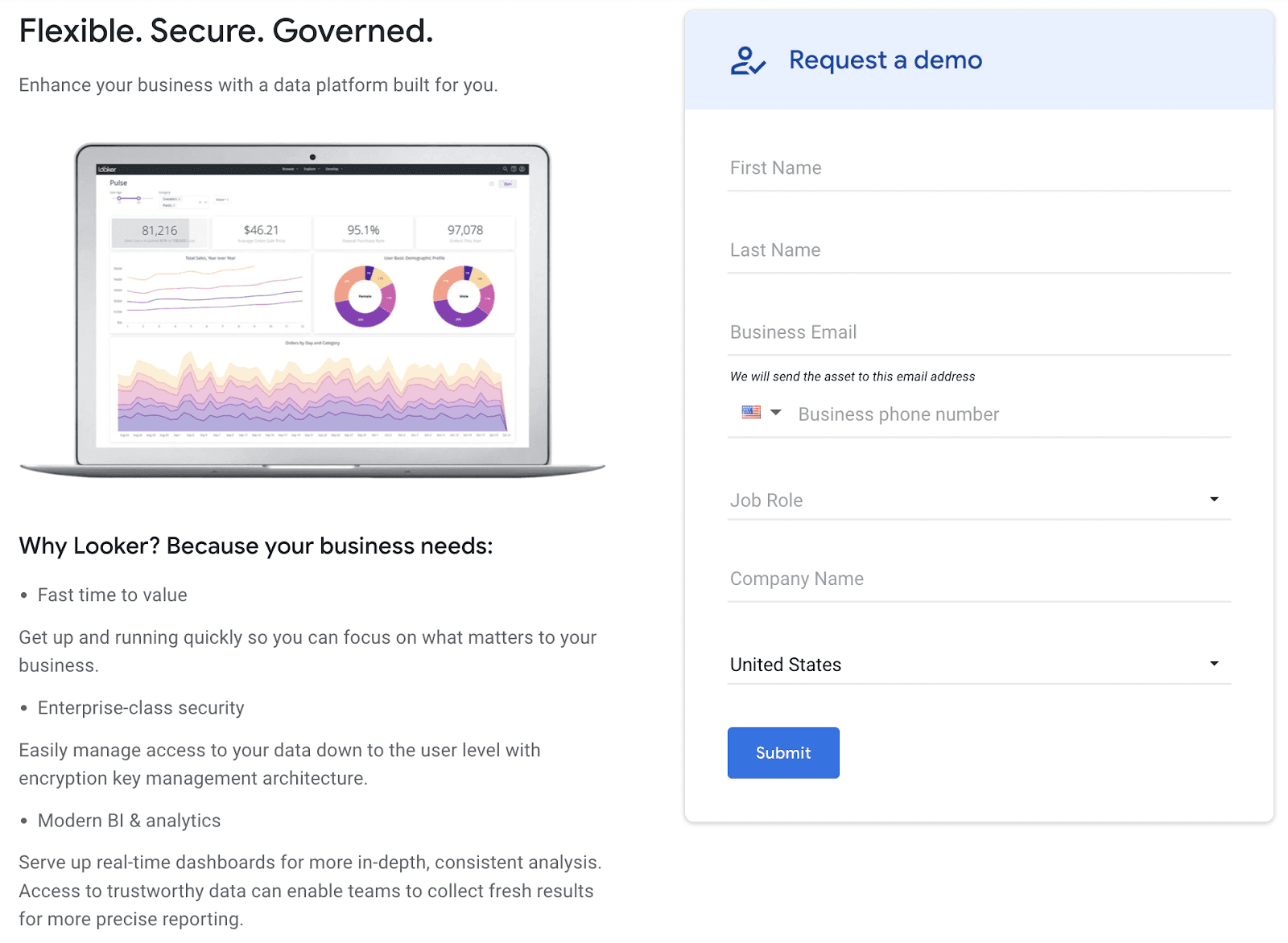
#7. Looker
Looker for Google Cloud Platform is an amazing BI and analytics tool that offers a new approach to tracking KPIs.
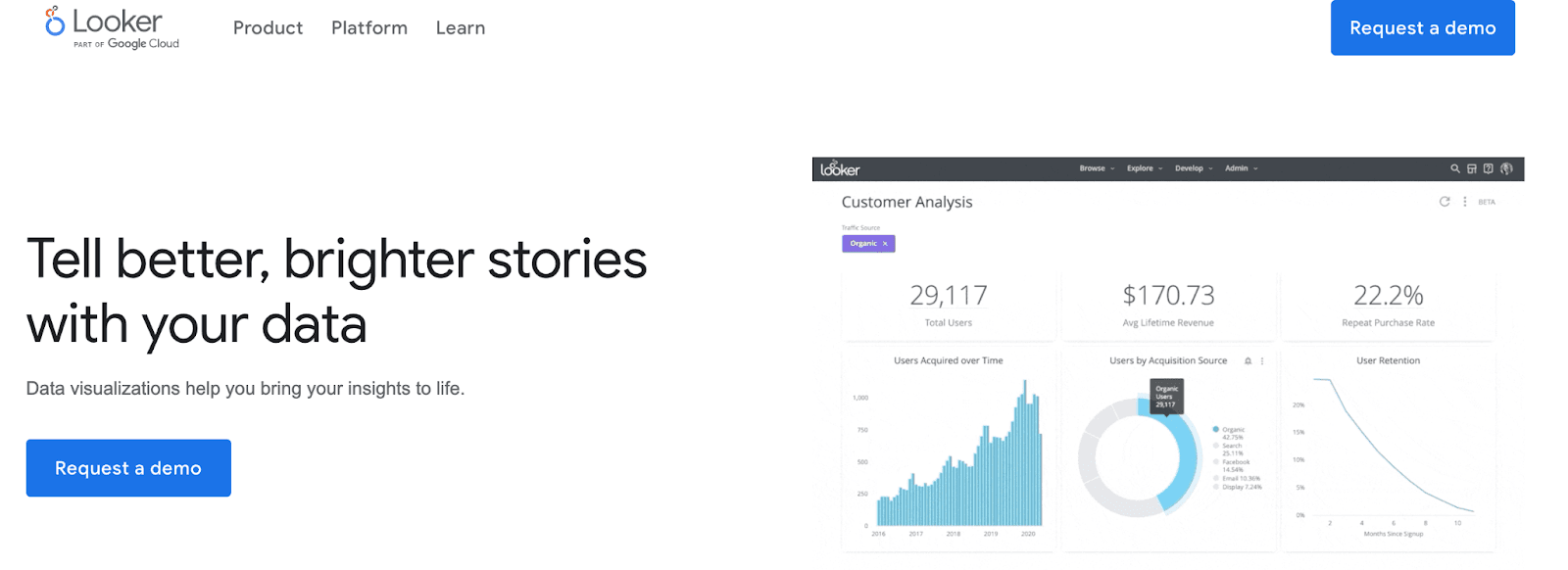
Looker helps enterprises centralize, analyze and gather meaningful insights from multiple databases, thereby making reliable data-driven decisions.
Features
-
Get a 360° view of your data by combining multiple KPIs and expanding your analysis for smarter and more accurate insights
-
Create customized and powerful data-driven experiences with components, modules, and embedded analytics
-
Has a dedicated marketplace that provides powerful apps, blocks, and custom plug-ins to eliminate days, weeks, or even months of development time
-
Offers interactive and dynamic dashboards that give you the flexibility to drill down data and create custom KPIs
-
In-built data visualization tool to present your data in an easy-to-understand format with stunning visuals like graphs, charts, pivots, and more
Pricing
Looker has no set pricing policy for its services. However, you can request quotes on their pricing page based on your business requirements.
#8. BrightGauge
BrightGauge is yet another KPI dashboard software that enables enterprises to eliminate data silos with intuitive real-time dashboards.
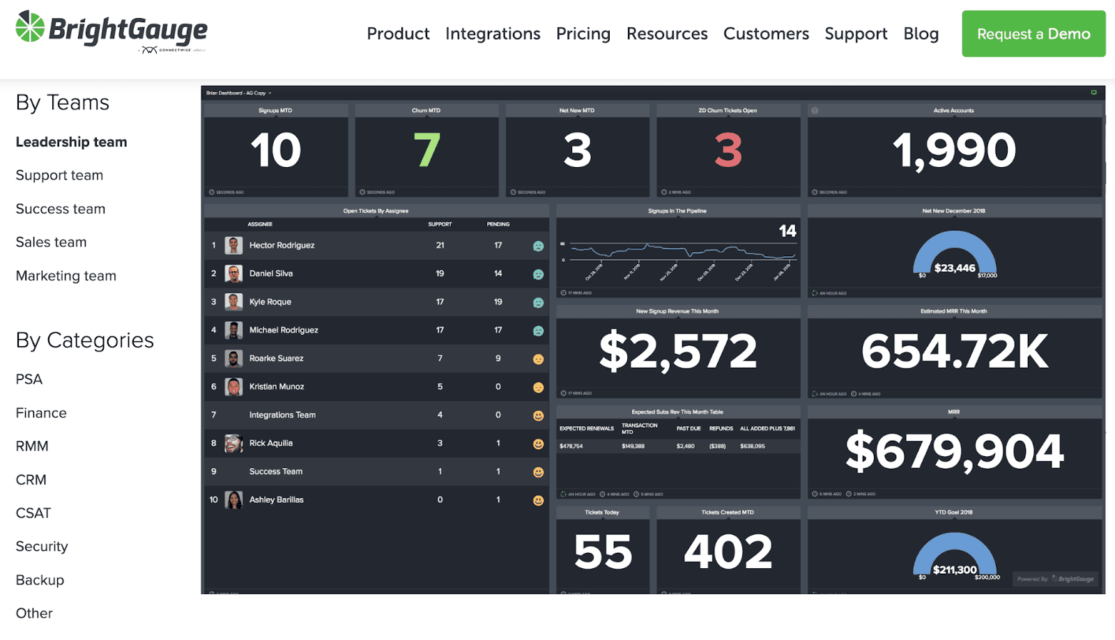
The platform collects data from multiple data points and presents them in a unified dashboard so that you can make faster and well-informed decisions.
Features
-
Create multiple custom dashboards for individual employees or teams
-
Easily switch between teams and departments to view your PSA, financial and other data side-by-side
-
40+ integrations with pre-built templates allow you to get started with tracking and analyzing within minutes
-
Take daily, weekly, or monthly snapshots of your metrics and reports; store them in sheets or charts for future references and performance comparison
-
Automate client reporting by scheduling report snapshots to specific clients on preferred dates
Pricing
Brightgauge offers three paid plans:
-
Standard: $304/month
-
Enterprise: $424/month
-
Enterprise+: $594/month
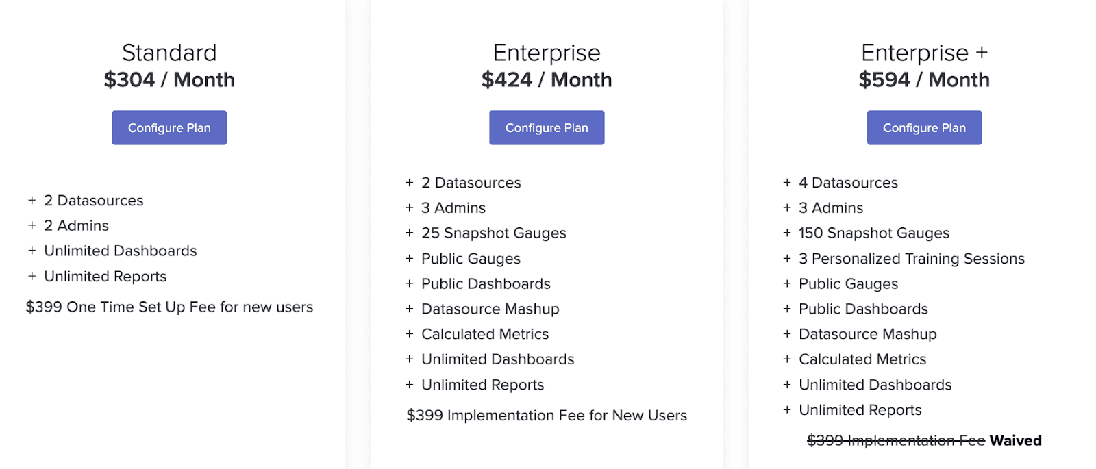
Note: With every paid plan, you get a 30-day money-back guarantee.
#9. Microsoft Power BI
Microsoft Power BI is a great tool for creating a data-driven culture throughout your organization.
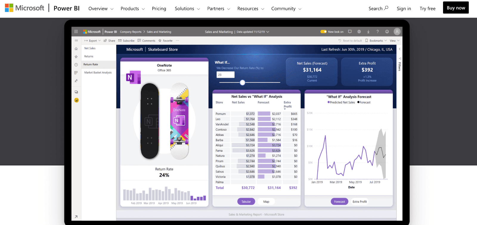
The platform makes it easy to bring your team onboard, track KPIs, and make the right decision effectively.
Features
-
Share rich data visualization with your team that will help them understand the KPI’s nature and make decisions accordingly
-
Has a mobile app that you can access from anywhere and view dashboards on the go
-
Pin your most important KPI dashboard so you don't need to scroll down every time you want to look at them
-
Has row-level security with role-specific data protection features to prevent data loss in any form
-
Has the option to use SQL or Power Query to perform relational database analytics
Pricing
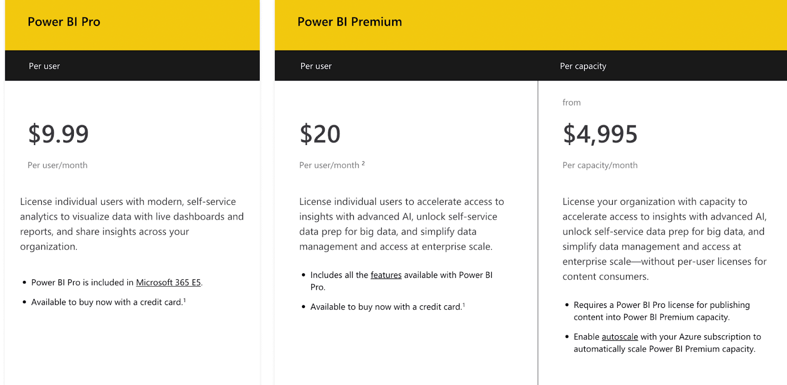
The software comes with a free plan but has limited features. You can try the platform out for free, but if you want to use the platform to its full potential, you can choose the Pro ($9.99 per user per month) or Premium ($20 per user per month).
#10. Sisense
Sisense is a modern business analytics software that adopts infused analytics in both customer and employee applications.
With more than 2000 global giants like Rolls Royce, GE, and Tinder relying on Sisense, it’s one of the disruptors in the traditional business intelligence and KPI tracking market.
Features
-
Sisense Fusion Embed enhances the analytics experience for customers by embedding customized analytics to your application and product
-
Self-service business intelligence software for no-code users empowers everyone to make data-driven decisions based on the tracked KPIs
-
Sisense Fusion Analytics augments data analysis with machine learning to help discover hidden KPIs and opportunities
-
Constantly evolving Sisense Cloud helps to scale up data and users as per demand
Pricing
The company doesn't mention plans or pricing on its official website. You have to fill out the form, and a customer rep will be in touch with you shortly.

#11. KPI Fire
KPI is a business improvement and reporting tool that aligns your improvement projects with strategic objectives and KPIs.
Some world-class companies trust KPI fire to track their business improvement programs.
Features
-
Simplifies strategic business reviews saving unnecessary wastage of time and energy
-
Visual Management System for KPIs evaluates and tracks the success strategy with color-coded metric
-
Bring your team onboard, prioritize projects, and work smart, not hard
-
Let your employees type in ideas about dashboard creations; help to brainstorm when you track new KPIs
Pricing
You can request a demo first, use the tool, and then talk to their sales team about pricing.
Keep All Your KPIs In Your Pocket?
If you ask us which KPI tracking dashboard software you should try out first? We’d have to say Datapad.
Why?
For starters, it lets you track KPIs from your mobile.
Not just this, we’re currently setting your dashboards for you as per your business needs, so you don’t have a difficulty understanding how the app works - it’s for free.
So give our app a try, and track your business KPIs on the go!
Frequently Asked Questions (FAQs)
Q1. What is Klipfolio?
Klipfolio is a KPI tracking software that lets you build dashboards in real-time and track your business KPIs. The platform is trusted by the likes of PwC, Symantec, and many other brands worldwide.
Q2. Is Klipfolio Free?
Klipfolio has both free and paid plans. The free plan lets you create unlimited dashboards and have unlimited viewers on board. But you can only have 2 editors and 4 hr data refresh rate. To unleash the full potential of Klipfolio, you can upgrade to its paid plans.
Q3. What Key KPI Tracking Features Does My Business Need?
-
Drag-and-drop KPI dashboard builder
-
Multiple data connectors to import data
-
Easy team onboarding and permission management
-
Pre-built templates for creating dashboards quickly
-
Customization options to design dashboard as per your business needs
Q4. How Easy is it to Set Up a Dashboarding Tool?
Setting up a dashboarding tool depends on which platform you use and which device you plan to track KPIs on.
A tool like Datapad can help you track KPIs on mobile, but Klipfolio or other alternatives mentioned above can’t. So setting up a dashboard on Datapad is easy.
It truly finally comes down to which software you choose for the task.
Q5. What Are Some Other Tools That You Can Use to Create Dashboards?
-
Datapad: Tracking KPIs via mobile
-
Databox: Centralizing data into one interactive report
-
Geckoboard: Connecting your TV to the platform to track KPIs on a bigger screen
-
DashThis: Best for digital marketing agencies and freelancers
-
Plecto: Gamify KPI dashboards and reports
-
Cyfe: All in one business dashboard tool
-
Google Data Studio: marketing dashboarding tool
Read more: How to Build a KPI Dashboard in Excel?
Read more: 12 Best Dashboard Tools in 2023 [In Depth Guide]