![The Best 9 Databox Alternatives in 2024 [In Depth Comparison]](/_next/image?url=https%3A%2F%2Fframerusercontent.com%2Fimages%2FFlvBl1Jh8JuBKxE0d5S8xdM2eU.png&w=3840&q=75)
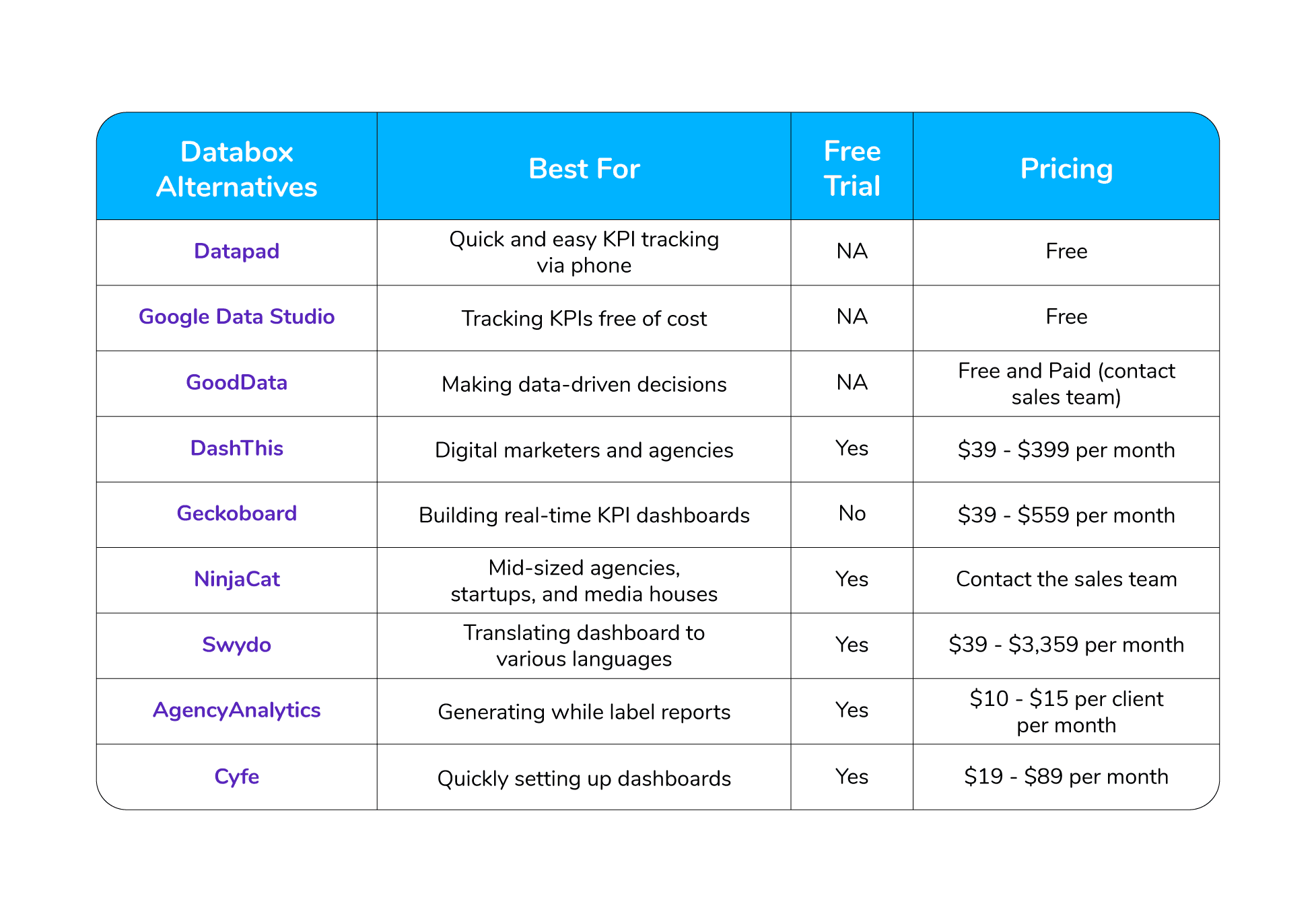
Some of the best Databox alternatives we've tested this year are Datapad, Google Data Studio, GoodData, DashThis, Geckoboard, NinjaCat, Swydo, AgencyAnalytics, and Cyfe.
In this article, you will discover the top Databox alternatives that will help you create dashboards and track KPIs better.
But before we start!
Here’s a tl;dr to save your time.
But before we deep-dive into the above-mentioned tools, let us tell you three primary reasons why you should look for a Databox alternative.
Why Might You Look for a Databox Alternative?
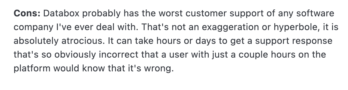
Reason #1. Poor Customer Support
For any SaaS platform, customer support is one of the best ways to retain clients.
If you help your customers when they need you the most, your customer retention rate could be through the roof, but, at the same time, if you fail to put your customers’ needs before yours, your business will crumble.
According to HubSpot, 90% of customers in America use customer service as a factor when deciding to spend on a product/service.
Databox doesn’t have a great customer service department. The users are quite angry with the time Databox’s customer reps take to reply to them.
Here’s one such example:
Reason #2. Problematic Date Range Feature
When we tested out Databox, we found out that the platform lacks the date range selection feature, meaning you can’t select a specific date range and track KPIs.
Let us explain to you what we mean by that.
Suppose you're tracking a KPI - retention rate, and you want to know the retention rate from 3rd February to 10rd May 2022.
Databox simply doesn’t let you filter data that way. The only options you get to filter data are - daily, weekly, monthly, or yearly.
Date range feature is essential for tracking as you might need to know your growth in a specific time period.
Reason #3. Lacks Complex Report Creation
With Databox, you can create a simple dashboard for data analysis, but when you have complex and long data, it fails to convert them into a dashboard.
Also, sometimes its data sources cannot connect your historical data to the platform, which might lead to data loss. This can be a major issue, as you could lose thousands of dollars worth of data in seconds.
Now that you know why you might need to switch from Databox to some other KPIs tracking dashboard software, it’s time to see your potential options.
9 Best Databox Alternatives to Try Out in 2024
#1. Datapad

Datapad helps you track all essential metrics from stunning dashboards.
The beauty of Datapad lies in its simplicity and ease of use. With our tool, anyone in your team with zero technical knowledge can start building reports in mere seconds.
As a go-to solution for Agencies, Datapad makes it easy to onboard new customers with 1-click templates and share performance reports with read-only links.
Datapad also makes it easy to collaborate as a team with the ability to drop comments on KPI cards.
The AI insights tool lets anyone detect anomalies in their data and provides actionable to-do items to increase performance.
Key Feature #1. Templates

Creating reports for your business is no easy task. You have to determine a lot, from which metrics to choose to design the right charts.
If you are an agency and want to create the same reports for multiple clients, then this hassle becomes even more burdensome.
Guess what? Datapad lets you do all this with just a few clicks.
With Datapad's templating features, you can:
-
Choose from a gallery of pre-designed templates and apply them with 1-click
-
Build a custom dashboard and re-use it as a template by changing it's sources
-
Share all connected data sources in the workspace with your teammates
Key Feature #2. Team Collaboration

Tracking KPIs isn't a one-person job when you have a lot of them; you need a team. But not all KPI dashboard tools let you bring your team on board.
Guess what? Datapad lets you do it quickly and easily.
Moreover, you can assign individual team members tasks to handle, goals to achieve, and metrics to measure.
With Datapad's team collaboration feature, you can:
-
Get notified whenever there’s an update for any metrics and KPIs you track
-
Communicate around your metrics and KPIs with your team members
-
Get push notifications on your phone to stay updated with all your KPIs
Key Feature #3. Automated Reports & Scorecards
Wouldn't it be great if you could check your business KPIs first thing in the morning, straight from your inbox?
With our dashboard software, you can subscribe to any dashboard and receive daily email updates.
All you have to do is build a dashboard, click the subscribe button, and set your email preferences.
The best part is you can share reports with anyone, even emails outside of your organization or workspace.
Step 1: Subscribe to a dashboard

Step 2: Check your inbox

With Datapad’s report and scorecard automation, you can:
-
Subscribe to any dashboard
-
Receive daily highlights around all KPIs
-
Send reports to users in and outside of your organization
-
Customize the date range, calculation, and styling of KPIs
Pricing
Datapad has a free tier that includes 1 dashboard. If you want more, you can upgrade to the $30 Standard Plan, which includes 3 dashboards and scales with your usage. Datapad also offers a Business Plan tailored for agencies and includes dedicated customer support.
We are now offering an earlybird discount to all users, so it's a great time to sign up and give Datapad a spin.
#2. Google Data Studio
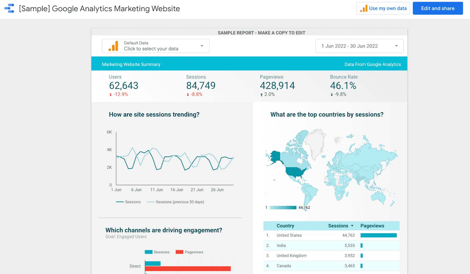
Google Data Studio is a free yet powerful BI dashboard tool. It was introduced in 2016 as part of the Google Analytics 360 suite.
The platform empowers businesses to turn complex data into detailed reports and easy-to-understand dashboards.
Features
-
Streamline your data collection process with built-in connectors for specific data points and create purpose-driven dashboards for every data source
-
Transform data into meaningful insights without running SQL queries
-
Use Data Studio's web-based reporting tool to present your data with stunning visualizations
-
Easily customize dashboard and reports with the drag-and-drop editor, template library, and pre-built templates
-
Decide who gets to view or edit your data by enabling role-based management
-
Enjoy real-time collaborations within or outside your team
Pricing
Google Data Studio is a forever-free platform and part of the Google Cloud platform offering.
Read more: We Reviewed Top 9 Google Data Studio Alternatives, and Here is Our Review [2022]
#3. GoodData
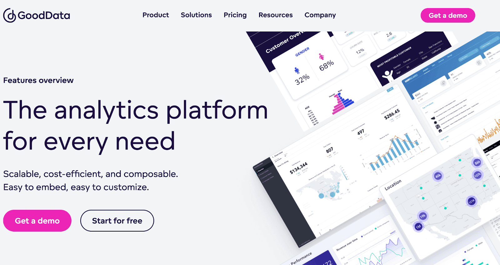
GoodData is a leading business intelligence software that helps businesses curate rich analytical dashboards to track KPIs and make better data-driven business decisions.
Features
-
Seamless data integration with multiple data warehouses and storage services to bring all available data to the dashboard with ease
-
Create stunning data visualization or modify the templates with GoodData's simple drag-and-drop functionality
-
Unique multi-tenant architecture to scale your business efficiently without compromising performance
-
A low to no-code interface allows you to customize analytical reports and dashboards easily
-
Use GoodData's AI and machine learning capabilities to dive deep into your insights and perform reliable predictive data analytics and advanced data modeling
Pricing
GoodData is free to get started with. The free plan includes 5 workspaces and 100 MB/workspace. Moreover, it also offers Growth and Enterprise plans with unlimited workspace, storage, and other advanced features.
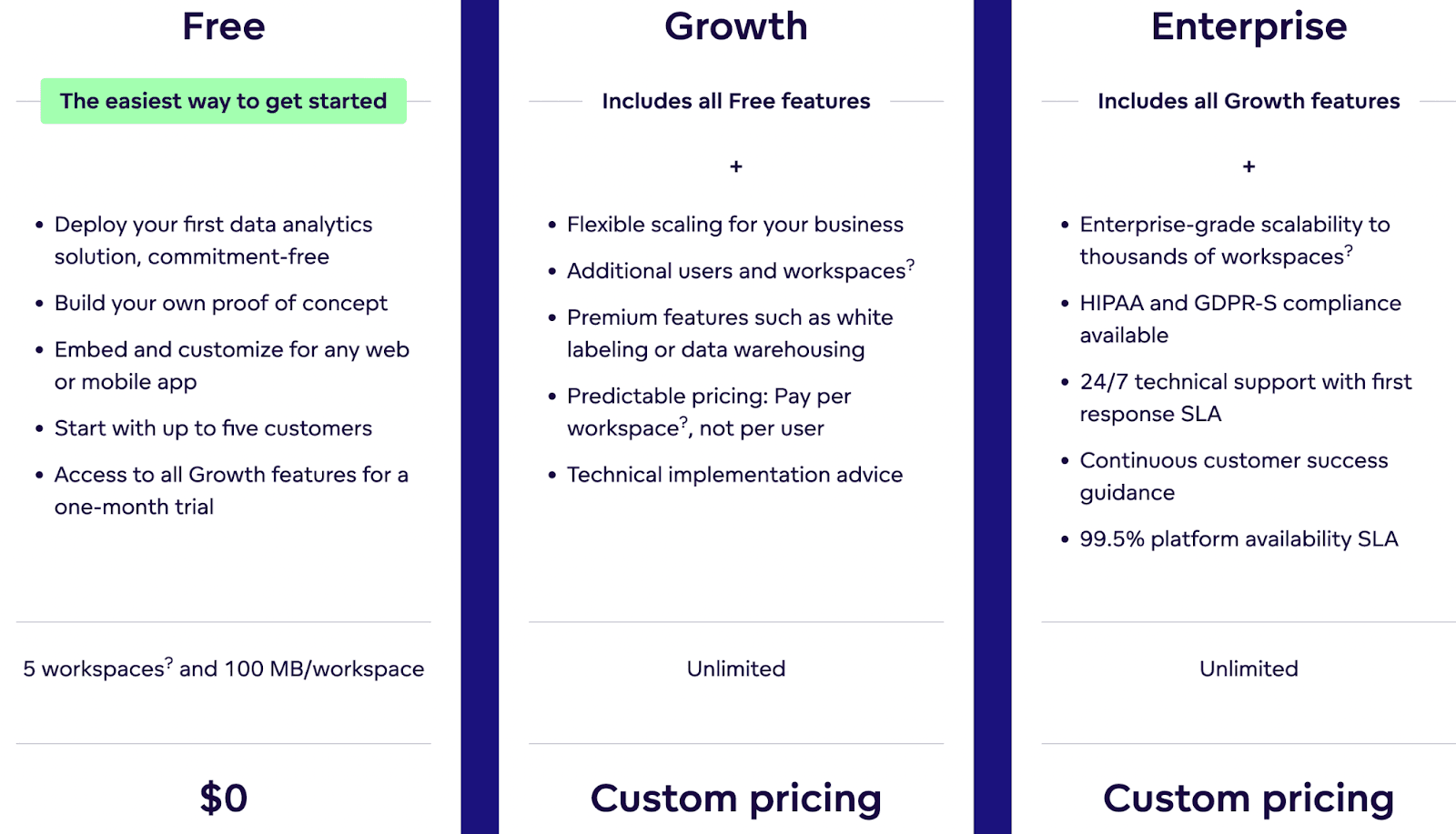
These plans have custom pricing, so you need to connect to GoodData's sales executive to get the best deal for your business.
#4. DashThis
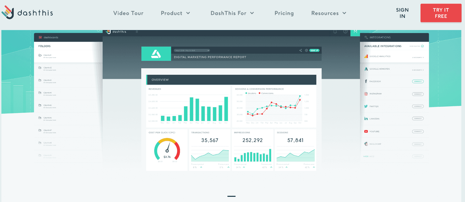
DashThis is a robust business intelligence platform that lets digital marketers and agencies track KPIs via easy-to-understand dashboards.
Features
-
Has a CSV file manager that allows you to quickly import all kinds of data to your dashboard
-
Build custom dashboards with a combination of data from multiple data-points
-
DashThis offers ‘Unlimited of Everything’ with all its plans - unlimited data sources, access to 34+ native integrations, and unlimited users
-
Choose from an extensive library of pre-built report templates and dashboards, and save time by adding custom widgets along with cloning options
-
Quickly share reports and analytics with the team via emails, social media, or PDFs with a click
-
Has personalization options allowing you to create custom domains, customized dashboards, and embed your company's branding on reports (white labeling)
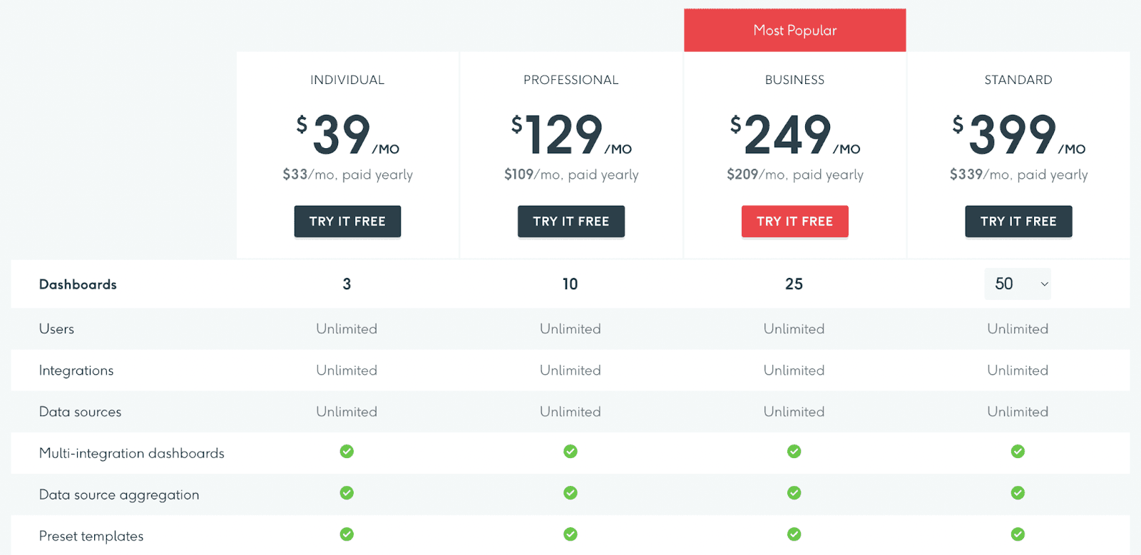
Pricing
DashThis comes with a 15-day free trial. After that, the platform offers a variety of paid plans.
Note: DashThis is a decent dashboard tool, but when we tried it out, we found some issues. For starters, it has a poor user interface, limited customization options, and a steep learning curve. So here are some DashThis alternatives we discovered and tested.
#5. Geckoboard

Geckoboard is premium business analytics software that assists individuals and enterprises build real-time professional KPI dashboards hassle-free.
The platform integrates with 80+ data sources, allowing you to escape the tedious data collection process.
Features
-
Has advanced filtering to extract meaningful data and focus on the metrics that matter the most
-
Transform raw excel data into stunning visualizations with graphs, charts, tables, and other elements to make it understandable
-
Offers complete customization of dashboards; you can resize, rearrange, highlight key changes, and add widgets to your KPI dashboard with ease
-
Create public and private dashboards, and easily collaborate and share the file via smart links, emails, Slack, and other channels
Pricing
Geckoboard has a free plan for a single spreadsheet-powered dashboard. Apart from this, it has three premium plans - Essential, Professional, and Scale.

Note: Geckoboard has great visualization features, but we found some issues when we tested it out. For example, the platform can get expensive when you want to scale your business and create 30+ dashboards. So here are some affordable Geckoboard alternatives you can use instead.
#6. NinjaCat
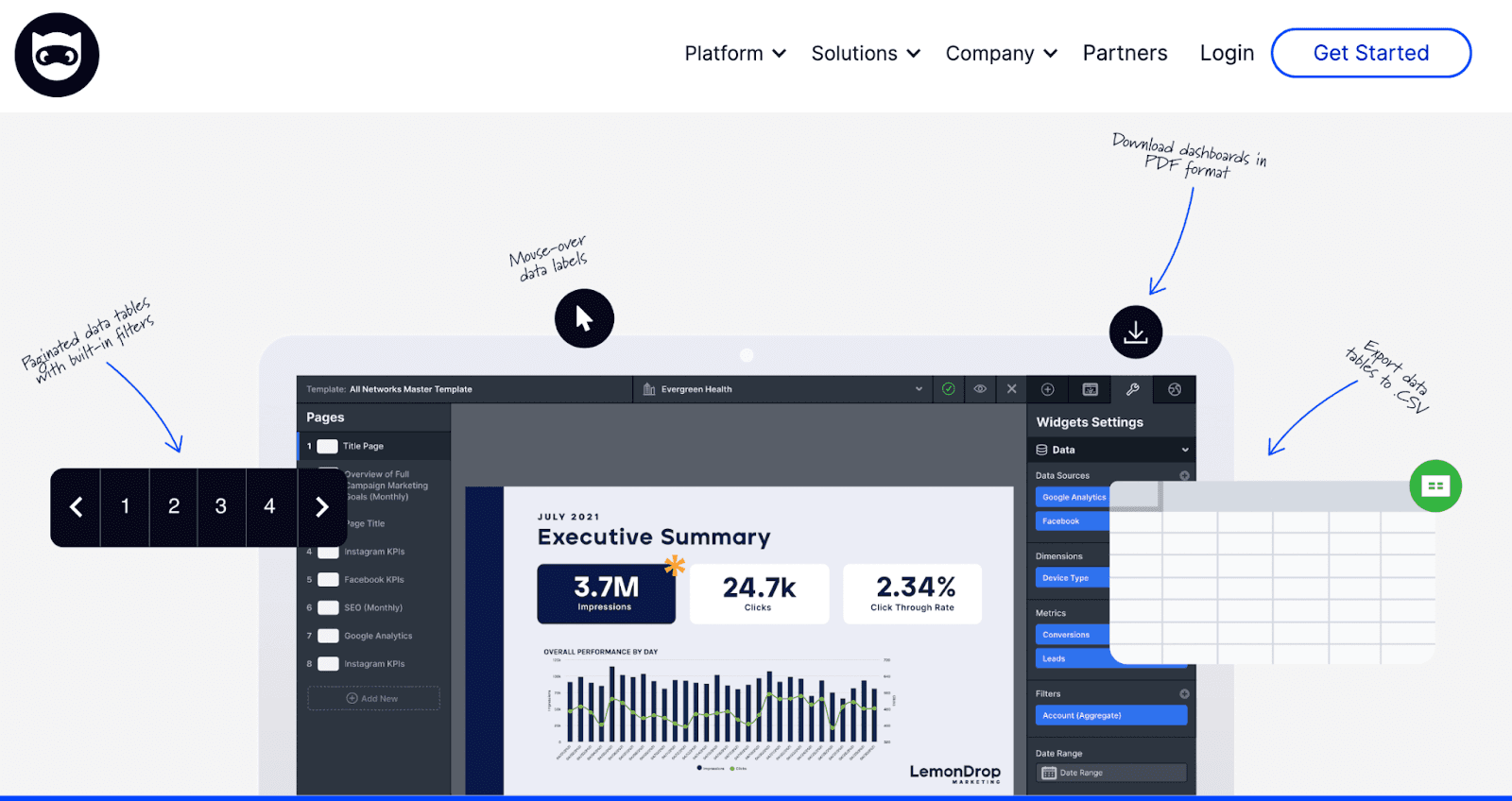
NinjaCat is a marketing analytics software specially designed for agencies, media houses, and brands. This software helps you create interactive dashboards and reports that aggregate data across multiple accounts and present you with actionable insights.
Features
-
Generate multiple client reports with a pre-build NinjaCat template, white label them, and send them to your clients
-
Get ample visualization elements and templates from NinjaCat's elements library
-
Use campaign monitoring to track budgets and KPIs with real-time updates and alerts
-
Integration with 150+ marketing channels to create a unified dashboard
-
Has powerful data visualization tools to effortlessly transform complex data into easy-to-understand visuals
-
Get reliable customer support at every step while utilizing NinjaCat's software to its fullest
Pricing
NinjaCat doesn’t reveal its pricing information, but it does have a free trial to kick things off. You can fill out and submit a form with your basic requirements, and a customer rep will get on a call with you to discuss further.
#7. Swydo
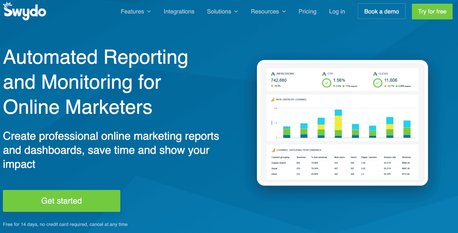
Swydo is a cloud-based automated reporting and monitoring software that helps businesses build professional marketing reports and dashboards effortlessly. It's among the best pocket-friendly software in the data and analytics industry.
Features
-
Has an easy-to-use interface and tons of pre-built templates, widgets, and KPIs to create fully customizable reports in minutes
-
No matter whether you have 10 or 1000s of clients, Swydo's robust API framework allows you to manage clients and automate the reporting process simultaneously
-
Keep track of activities on your client's websites with a centralized dashboard by real-time monitoring of CTRs, costs, and other such KPIs
-
Quickly combine two metrics from the same data source to calculate an entirely new custom metric for your reports and dashboards
-
Has an in-built translation tool allowing you to create and convert reports in 14 different languages
Pricing
Swydo comes with a 14-day risk-free trial. After that, it has a straightforward pricing policy starting from $39/month. The pricing increases with the increase in the number of data sources.

#8. AgencyAnalytics
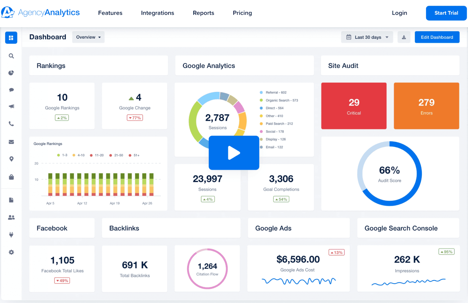
AgencyAnalytics is a no-code reporting software specially designed for marketing agencies, small businesses, and freelancers to save time and build interactive reports and dashboards. It helps agencies easily track and manage multiple clients from a centralized dashboard.
Features
-
Quickly build custom marketing reports with dozens of pre-built templates and an intuitive drag-and-drop builder
-
No need to switch between platforms, get all your data under one centralized dashboard with over 70+ platform integrations (new integrations released every month)
-
Give a personalized experience to your clients by providing unique insights into custom KPIs for individual client campaigns
-
Has a suite of customizable widgets, drag-and-drop functionality, and white label capabilities to fully customize your SEO, PPC, and email marketing reports
-
Gain control of how, when, and who can access the reports by enabling user permissions options
Pricing
AgencyAnalytics provides a 14-day risk-free trial. In addition, it has a cost-effective pricing model with three major paid plans - Freelancer, Agency, and Enterprise.
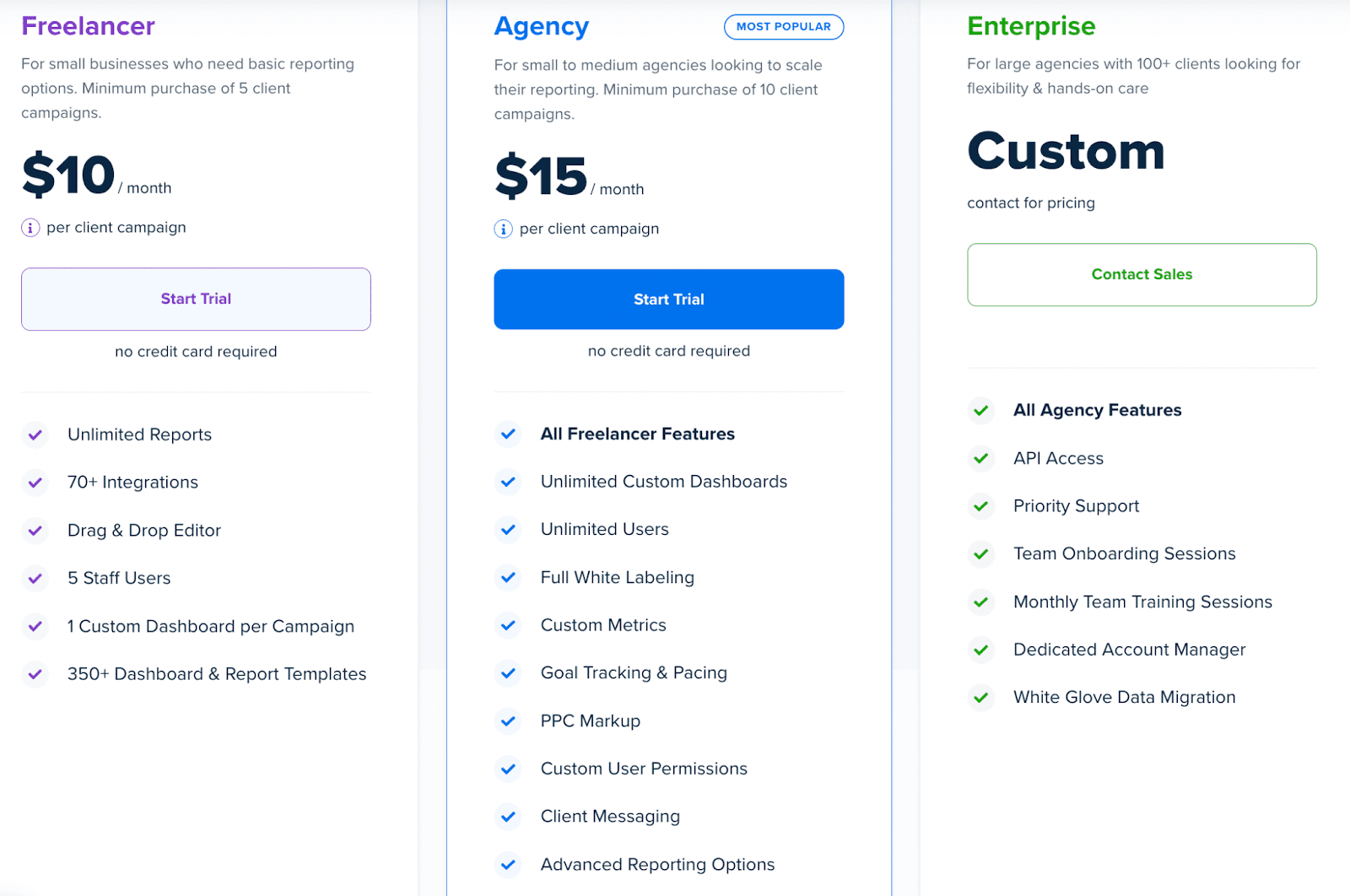
Note: If you want to manage over 100+ clients, you can opt for its Enterprise plan. You can discuss your requirements with the AgencyAnalytics sales team, and they will let you know the pricing.
#9. Cyfe
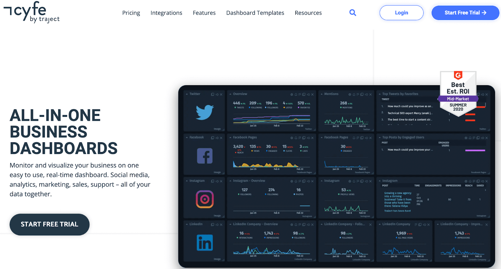
Cyfe is a cloud-based analytics platform that allows businesses to track, manage, and analyze crucial KPIs and nurture business growth. Its all-in-one dashboard enables you to monitor and visualize data collected from multiple sources easily.
Features
-
No need to build dashboards from scratch; save time and choose from a collection of pre-built online dashboard templates
-
Download or schedule automatic email reports of your data in multiple formats
-
Get alerts of your dashboard activities via email or SMS
-
Extract data from popular services like Google and Salesforce with over 100 integrations and 250+ metrics
-
In-built language translator to quickly translate your dashboard's language into 15+ other languages with a click
Pricing
Cyfe offers a 14-day free trial plan, after which you can choose from four distinct pricing solutions. You can see the image below to learn about them.

#10. Plecto
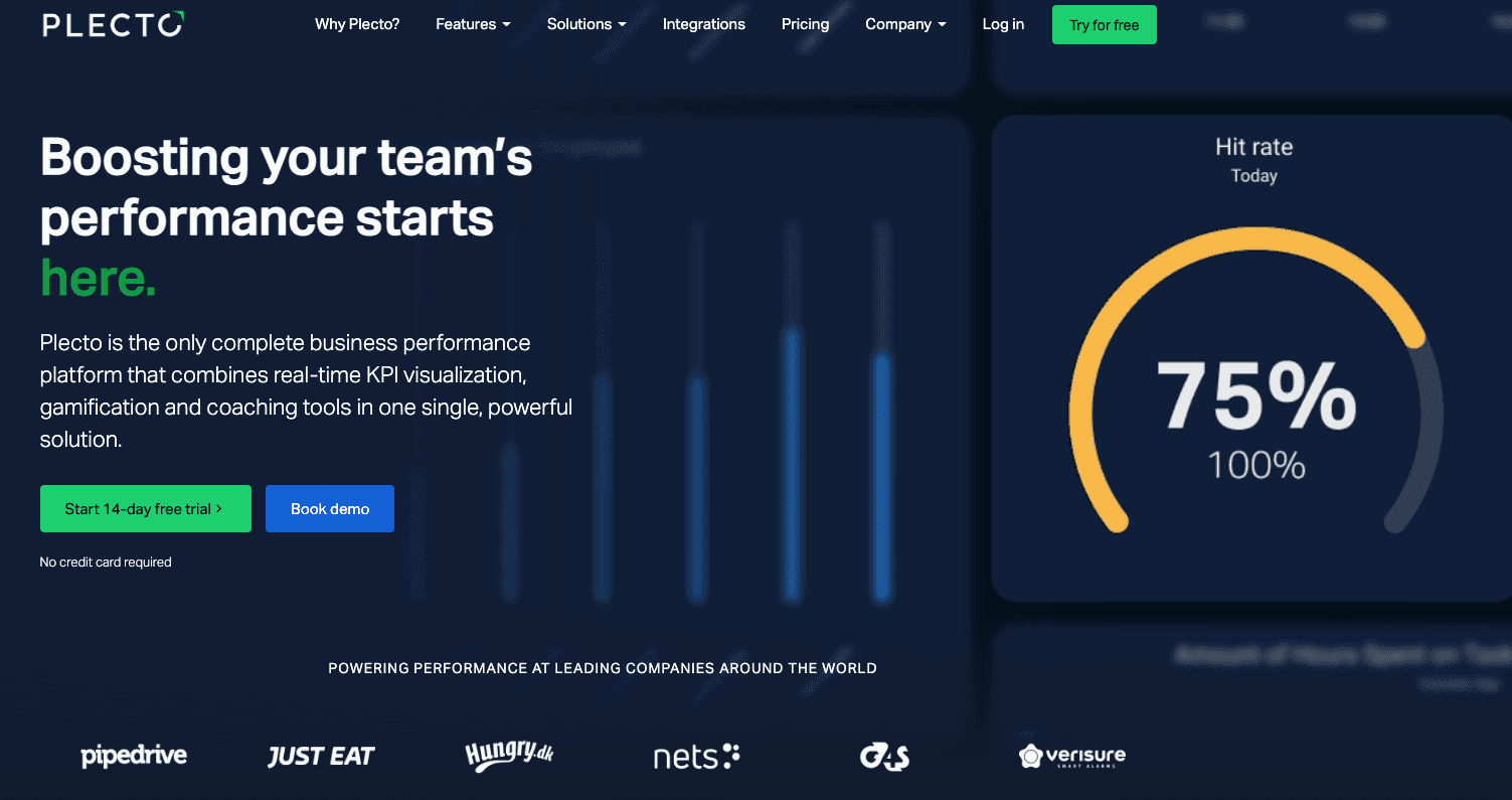
Plecto is a fun way for you and your team to collect data and visualize KPIs. With stunning reviews on sites like Capterra and G2, the platform is trusted by the likes of Pipedrive, Just Eat, and many more brands worldwide.
Features
-
Has the option to build, visualize, and stay on top of all your business KPIs with real-time dashboards
-
Collect data from multiple departments in your company and track it all in one place with Plecto
-
Save time on weekly and monthly updates; display your KPIs dashboard on TV in real-time, so everyone can see it 24/7
-
Trigger push notifications on TV, desktops, or tables and notify about KPIs to your team members
-
Comes with 200+ pre-built widgets; connect your data source and choose the widget you like
-
Comes with personalization features to edit the logo, color scheme, and styling of the dashboards to match your brand identity
Pricing
Pecto is on a high-end dashboarding platform that’s not cheap. Small businesses and pre-revenue startups can find it challenging to buy a monthly subscription. The platform has three plans to choose from:
-
Medium: $275/month
-
Large: $430/month
-
Enterprise: Custom pricing

#11. Klipfolio

Klipfolio is one of the best Databox alternatives for teams to track KPIs easily and quickly. The platform can help you centralize data and gives you the power to make decisions with confidence.
Features
-
Klipfolio’s Klips platform lets you connect from 130+ data sources and also has the option to connect via REST/URL option
-
Lets you use formulas similar to excel sheets to calculate and make data-driven decisions
-
Has multiple functions like filtering, grouping, aggregating, and sorting for data refinement
-
Comes with 30+ chart types to choose from; there’s a visualization for every need - pie chart, bar graph, pictographs, and much more
-
Customize the look and feel of the dashboard using HTML, CSS, and Javascript
-
Share PDF reports with your team with just a few clicks
Pricing
For business, Klipfolio has three plans to choose from:
-
Grow: $142/month
-
Team: $284/month
-
Team +: $570/month
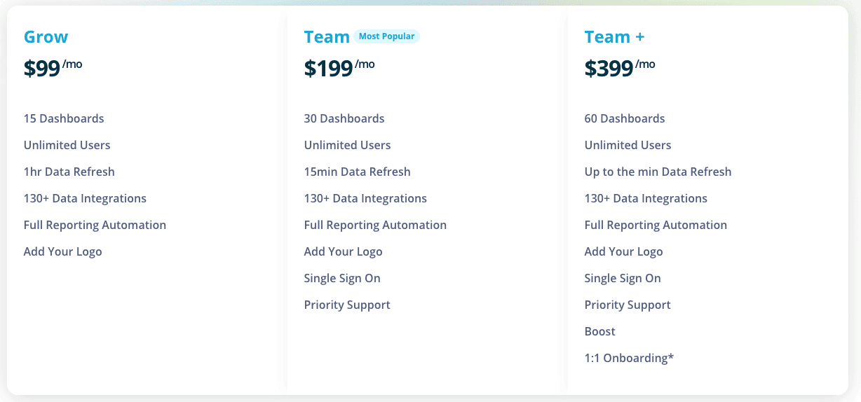
Note: If you want a completely customized plan, you can go with the enterprise plan, that’d cost you $499/month.
Wrapping Up
A good KPI dashboard software has extraordinary visualization features, lets you track KPIs from your phone, helps in automation, and most importantly, should let you set alerts as per your requirements.
No doubt, Databox has all these features, but they're all for basic or, in some cases, intermediate KPI tracking. The platform lacks advanced tracking and integration features.
If you are looking for a Databox alternative and to switch to a different dashboard tool, you can try Datapad for free. Fill out the form, join our waitlist, and we will reach out to you immediately.
If you are looking for more reviews, check out the articles below:
Databox vs Klipfolio vs Datapad
Operational Dashboards: 11 Tools to Stay on Top of Your Operations
How to Make Google Sheets Dashboard in 3 Steps [2022]
12 Best Dashboard Tools in 2022 [In Depth Guide]