![How to Make Google Sheets Dashboard in 3 Steps [2025]](/_next/image?url=https%3A%2F%2Fframerusercontent.com%2Fimages%2F4xOd8ZOgBsT5YSPBKiDENfo7yRE.png&w=3840&q=75)
How to Make Google Sheets Dashboard in 3 Steps
In this guide, we are going to show you how to build a Google Sheets dashboard in 3 easy steps and also talk about the drawbacks of using Google Sheets for creating dashboards.

But before we do that, let's answer a simple question.
What is a Google Sheets Dashboard?
A Google Sheets dashboard is nothing but live and dynamic charts that you can edit in real-time.
With GSheets, you can create multiple dashboards for free. But there's a catch; it's not primarily a KPI dashboard software - which means it doesn’t have dashboard-specific features to track KPIs.
You have to do a lot of things manually (which you will see later in this article) and give a lot of time to create a single dashboard, let alone multiple.
But if you're a small business that doesn't have the funds to spend a dime on KPI tracking software, you might as well use Google Sheets.
Let’s walk you through the process of dashboard creation on Google Sheets.
How to Create a Dashboard in Google Sheets?
Step 1: Database Creation
To track any KPI, the first thing you need is a database. When it comes to Google Sheet, you have two data sources to extract data from:
-
Google Forms: You might've asked your customers to fill a Google Form; if so, you'd have a ready-made Google Sheet with all the data. This comes in handy when you might want to track KPIs like net promoter score or a demographic-related KPI.
-
Export CSV: Maybe you have all your data on a CRM like HubSpot; you can just export the data as a CSV file and open it in Google Sheets.
Whatever method you use, automating database creation isn’t the strong suit of Google Sheet - there are limited options.
For this article, we will take 'Monthly lead conversion' as an example database.
Note: The list of values you see in the image below are just for example consideration.
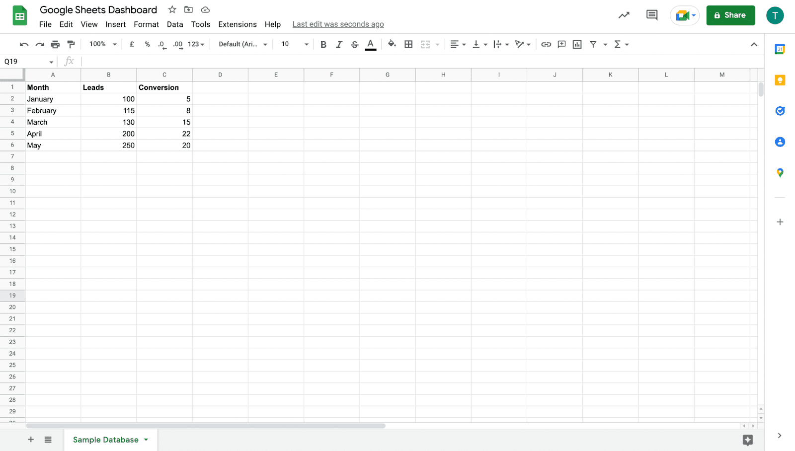
The data you see above is quite simple and straightforward, but if you're dealing with complex data, maybe from Google Analytics and have thousands of rows, you can use the following Google Sheets features to sort and quickly analyze it.
-
Conditional Formatting: Set colors, conditions, and much more to sort your data
-
Data Validation: Limits the type of input you can enter
-
Filters: Lets you sort data in increasing and decreasing order
-
Vlookup: Find and sort data vertically
-
Hlookup: Find and sort data horizontally
-
Pivot Table: Helps sort and isolate data efficiently
So you have your database ready, now is the time to get to the main part.
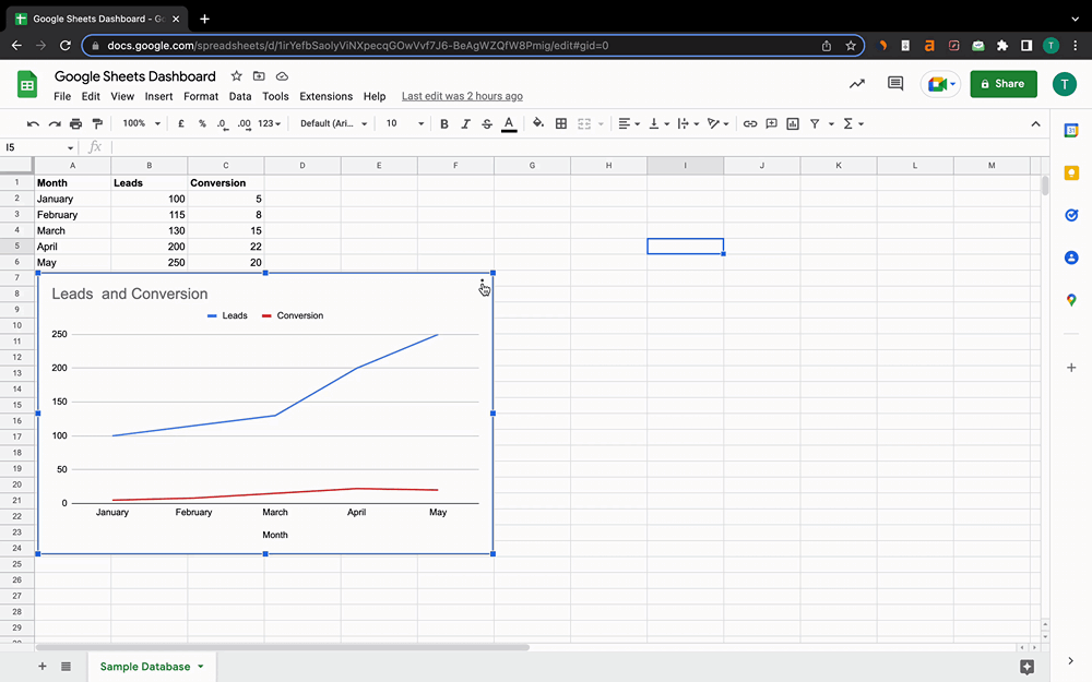
Step 2: Generate a Chart
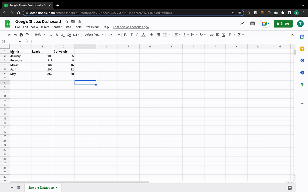
Creating charts in Google Sheets is easy. Just select the range of values (or range of cells) you want to make the chart of. Go to Insert and click on Chart.
With GSheets, you can customize your chart via chart editor. You can:
-
Select Chart Type: Column charts, pie charts, bar charts, and much more
-
Personalize graphs by adding titles
-
Customize charts by adding background color, changing fonts, and more
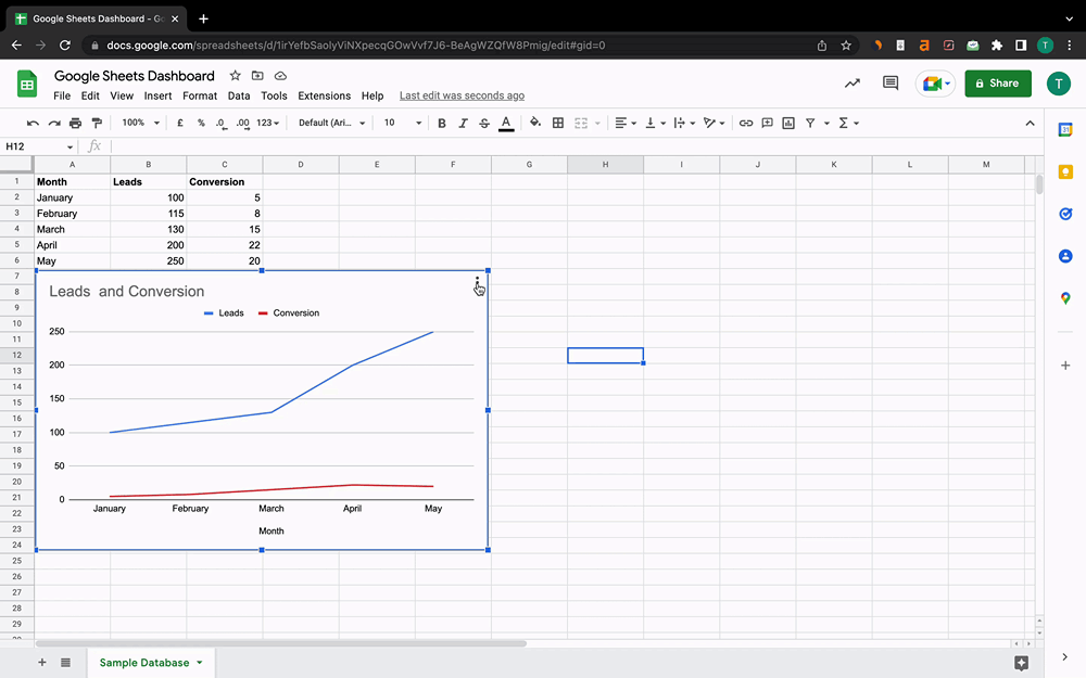
Step 3: Convert the Chart into a Dashboard
It's time to bring raw data to life - we mean converting the graph you just created into a custom dashboard.
There are two ways you can convert your chart into a dashboard on Google Sheets.
#1. Publish It
When you go for this method, Google Sheets generates a sharable link and publishes your chart on the web. You can share this link with your team members. This also allows you to manage permission of who can edit and view the dashboard.
But there's a major drawback with the publishing method. When you edit your raw data, the dashboard will take forever to reflect those changes.
To solve this problem, the best way to make a Google Sheets dashboard is by using another method. Let's tell you what that is.
#2. Move to Own Sheet Option
Although you will have to keep toggling between tabs time and again, this method reflects changes in real-time.
You can simply click the three dots you see on the top right-hand corner of the chat and select the 'Move to own sheet' option. What this will do is create a new tab in the same sheet and move your charge there.
You can then see how quickly it reflects changes when you change values in raw data.
Congratulations, you have created a dashboard successfully.
But wait, there’s more!
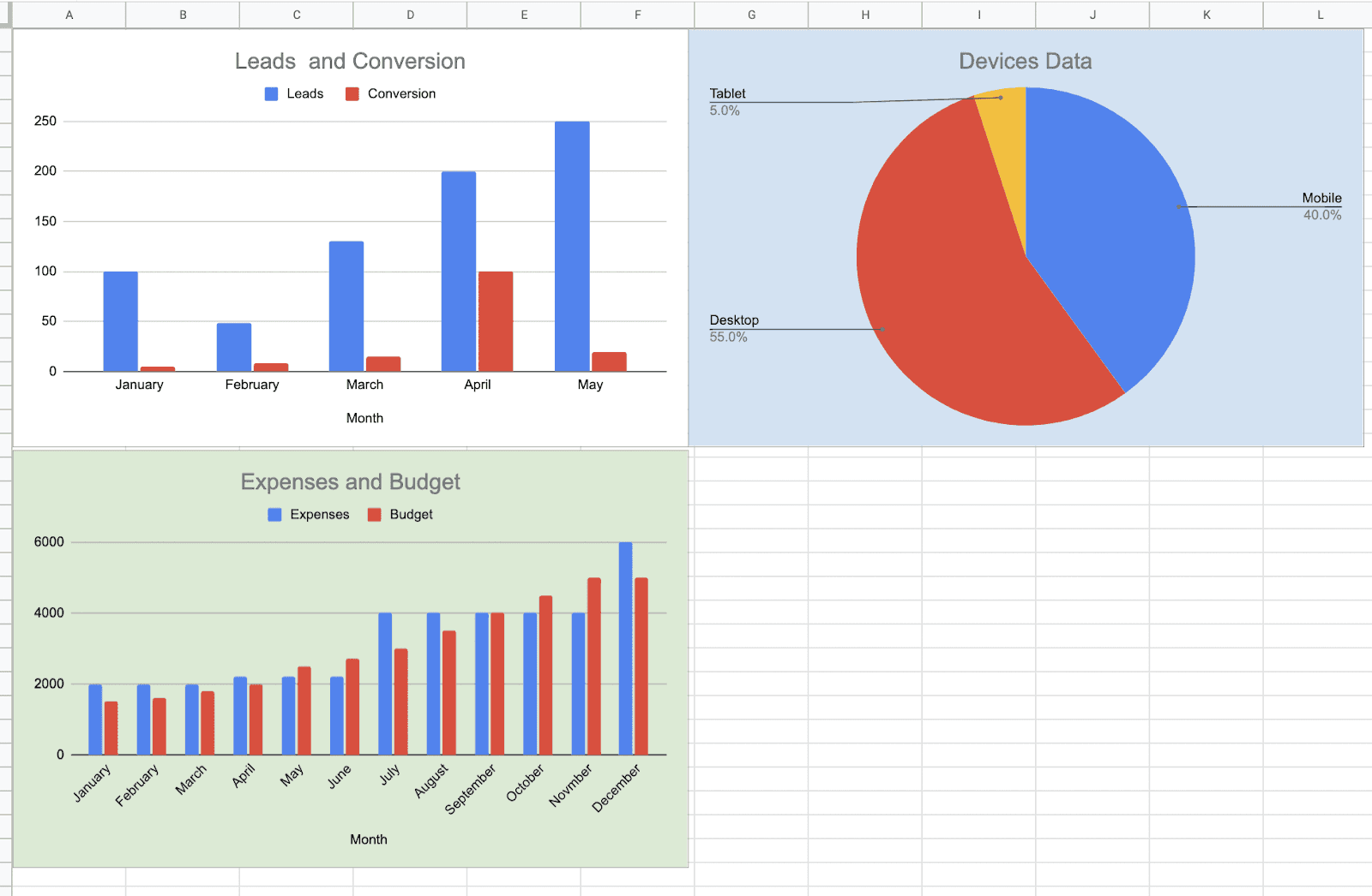
#Bonus: Creating Multiple Dashboards
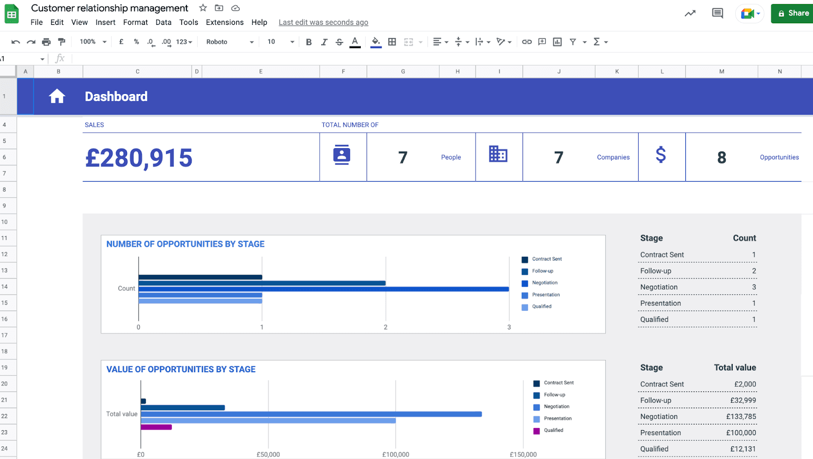
For any business, tracking 1 KPI isn't enough. So to track multiple KPIs on Google Sheets, you need to repeat the procedure above and keep creating charts and making a dashboard, as shown in step 3.
We know this is labor work, but there's no way around it. After spending 30-40 mins, here’s a dashboard we created.
Here’s the final version of what our dashboard on Google Sheets looks like.
Drawbacks of Creating a Dashboard in Google Sheets
#1 Next to No-Automation
You might think that being one of Google’s hardcore services, Google Sheets must have some sought-after features. But here’s the biggest drawback.
Google Sheets provides next to no automation. For example, if you plan to automate your data extraction and management process, Google Sheets won't help you with any automation to support the cause.
It requires you to manually input and edit every piece of data to your Google Sheet dashboard. However, you can create custom automation by writing a script (some code) or using add-ons such as Zapier to keep your data live.
But again, too much extra work just to import data to your dashboard.
#2 Hard to Onboard Your Whole Team
Are you creating this dashboard just for your convenience? Or, do you want your team to collaborate with you on crucial metrics and KPIs?
You might wish to add people from different departments to gather constructive feedback or share performance with stakeholders. But here’s the thing.
While Google Sheets is an excellent collaborative tool that allows your team to add data quickly, it slows down once many collaborators are on board. Unfortunate but true!
Google Sheets has a comparably poor interface for managing team activities. It puts you in a blind spot when it comes to project management.
Even some of the day-to-day functions like task management, time tracking, communication, and cataloging of the internal database cannot be achieved with Google Sheets dashboards.
Thus, while creating dashboards with Google Sheets, you must maintain complete documentation of your team activities.
#3 Poor Mobile-Interface
Unlike other pocket-friendly dashboarding software in the market, Google Sheets is far from the competition.
Google Sheets dashboards are poorly optimized for mobile devices. That means the features available on its mobile version are comparably lesser than what its desktop version offers.

On another note, since Google Sheets lacks automation, managing tons of data under your fingertips gets you prone to errors.
#4 No Scaling Option
As an organization grows, so does its database. Hence, it’s expected for any data management software to scale as your business grows.
However, the number of rows and columns in Google Sheets is limited to 10 Million cells.
The number might sound friendly for small teams, but for large organizations that collect millions of data daily, the scarcity of cells might cause a halt in their overall process.
Thus, it can be difficult for large organizations to continue using Google Sheets for data visualization and analysis.
#5. Few Integration Options
Another drawback of Google Sheets is its integrations with third-party platforms.
Google Sheets works best within Google’s workspace - Google Docs, Google Drive, etc.
However, if you are already set up with other applications, you might notice it takes extra time and effort to transfer or export data to Google Sheets.
Till now, you might have understood how hard it is to build a dashboard on Google Sheets. Lucky for you, we have an easy, quick, and hassle-free solution for it.
Creating Dashboard Easily with Datapad
Datapad is a pocket-friendly KPI tracking dashboard and analytics tool that helps entrepreneurs track, analyze, and manage critical business KPIs.
Datapad is designed to make data analysis easier, especially for those using Google Sheets. Whether you're creating a dashboard to track sales or a graph to visualize trends, Datapad integrates seamlessly with your Sheets to provide powerful insights.
The beauty of Datapad lies in its simplicity and ease of use. With our tool, anyone in your team with zero technical knowledge can start building reports in mere seconds.
#1. Google Sheets Integration:
Tired of copying and pasting data from your spreadsheets into visualization tools? Or worse, rebuilding your charts every time your data updates? Datapad solves this headache by connecting directly to your Google Sheets, transforming your data into stunning visualizations without the technical complexity.
With Datapad's Google Sheets integration, you can:
-
Connect any Google Sheet with just a few clicks—no coding required
-
Watch as your dashboards update automatically when your spreadsheet changes
-
Visualize complex data in ways Google Sheets alone simply can't handle
-
Create beautiful, presentation-ready charts without fighting with formatting
Say goodbye to spreadsheet limitations and hello to data that works for you, not the other way around.
#2. AI-Driven Analysis
Ever wished you had a data analyst on call 24/7? With Datapad, you basically do. Skip the complex Excel formulas and simply ask questions in plain English like "What's our best-performing ad channel?" or "Show me last quarter's conversion trends." Datapad's AI instantly generates the perfect visualization to answer your question.
With Datapad's AI-powered analysis, you can:
-
Ask questions in everyday language and get immediate visual insights
-
Uncover hidden patterns and relationships in your data automatically
-
Focus on making decisions instead of fighting with chart settings
-
Transform complex data into clear, actionable intelligence in seconds
Your data has stories to tell—Datapad helps you hear them through simple conversation.
#3. Scheduled Reporting
End the monthly reporting grind forever. Datapad automatically delivers fresh insights straight to your inbox or Slack channel on your schedule. Set up your dashboard once and let automation take over—whether you need daily metrics, weekly performance snapshots, or monthly executive summaries. Choose from our library of ready-made templates to get started even faster with industry-specific KPIs and visualizations. Your team stays informed with zero manual effort, while you focus on acting on insights instead of creating reports. Perfect for agencies managing multiple clients or busy teams that need consistent data without the hassle.
#4. Downloadable Reports
Sharing insights with your team or stakeholders should be straightforward. With Datapad, you can download your reports in PDF or HTML format, making it easy to distribute them. Whether you need to attach a report to an email, share it on a project management tool, or print it for a meeting, Datapad has you covered. No more scrambling to capture screenshots or manually compiling data. Your reports are ready to be shared in a professional format at the click of a button.
#5. Web Search Feature
Sometimes, understanding your data requires context from the wider world. Datapad's Web Search feature allows you to pull in external data for sector benchmarks and trends, enriching your analysis. Whether you're comparing your sales figures to industry averages or looking for the latest market trends, Datapad can help you find the information you need. This feature ensures that your analysis is not just based on internal data but also informed by external factors, giving you a more comprehensive view of your performance.Make Your Excel Dashboards Look Stunning with Datapad.
Table of Key Features and Benefits
| Feature | Description | Benefit |
| Google Sheets Integration | Connects directly to Google Sheets for data analysis. | Seamless workflow, leverages existing data. |
| AI-Powered Analysis | Allows plain English queries, generates graphs and dashboards. | Reduces technical barriers, fast insights. |
| Dashboard and Report Creation | Supports bar graphs, line charts, pie charts, Gantt charts, etc. | Visualizes data effectively for decision-making. |
| Scheduling Reports | Delivers reports via email or Slack at scheduled intervals. | Keeps users informed without manual effort. |
| Download Options | Reports available in PDF or HTML format. | Easy sharing with stakeholders or teams. |
| Web Search Feature | Pulls external data for benchmarks and trends. | Enhances analysis with industry context. |
Wrapping Up
Undoubtedly Google Sheets is an excellent dashboarding platform for small businesses and business owners with a micro team.
You can create a simple budget tracking dashboard to a complex activity dashboard. But, as you scale up the ladder, Google Sheets can be a headache.
Besides being a free database management tool, Google Sheets has some must-know limitations.
So if you’re looking for something similar yet better than Google Sheets for creating stunning dashboards, Datapad is your go-to KPI tool.
Recommended reading: KPIs vs Metrics: Learn the Difference with Examples From 2022
Recommended reading: Best 16 Free Google Sheets Dashboard Templates [2022]
Frequently Asked Questions (FAQs)
Q1. How do I create a dynamic dashboard in Google Sheets?
You can quickly create dynamic dashboards in Google Sheets with three easy steps:Step 1: Import/collect data from all available data sources
Step 2: Create tables/charts/ for every item you want to visualize
Step 3: Publish it to the web or use the move to own sheet option to track KPI
Q2. Does Google have a dashboard tool?
Yes, Google Data Studio is one of the dashboarding and visualization tools of Google that allows you to create interactive reports and dashboards for free.
Q3. Can Google Sheets be used as a database?
Yes, Google Sheets can be utilized as a database for websites or small applications. Due to certain limitations, the cell limit (which is 10 Million) might not be adequate for large organizations.