![We Tested 11 Plecto Alternatives and Here is our Review [2024]](/_next/image?url=https%3A%2F%2Fframerusercontent.com%2Fimages%2FZyj1rbvgMnUFQuJX9mrTM7mXqA.png&w=3840&q=75)
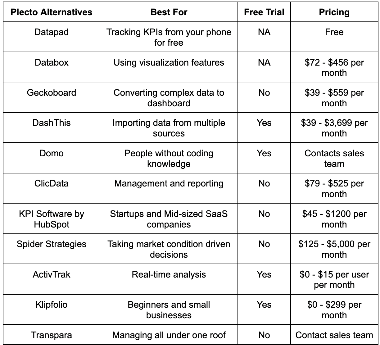
Some of the best Plecto alternatives we came across in recent years are Datapad, Databox, Geckoboard, DashThis, Domo, ClicData, KPI software by HubSpot, Spider Strategies, ActivTrak, Klipfolio, and Transpara.
In this article, we will list down the top Plecto alternatives to consider if you’re on a sticky budget but want something better than Plecto.
But before we start!
Let’s give you an overview real quick.
Before reviewing the above-mentioned KPI dashboards, let’s answer the main question - Why do you need a Plecto alternative?
Reasons Why You Might Need A Plecto Alternative?
Reason #1. Plecto is Expensive
Let’s talk about Plecto’s pricing for a moment. Plecto has 3 paid plans.
The first is its Medium plan, priced at $250/month. This is for 10 licenses. If we compare this with its competitors, they charge half of this for 10 users (some even less) with more or less the same features.
And its second paid plan is Large for $390 per month for 10 users.
The third plan is Enterprise, for which you will have to contact their sales department.
Our point here is that spending so much on a KPI dashboard tool is only a good decision when you know this will make your business a fortune; otherwise, it's money down the drain.
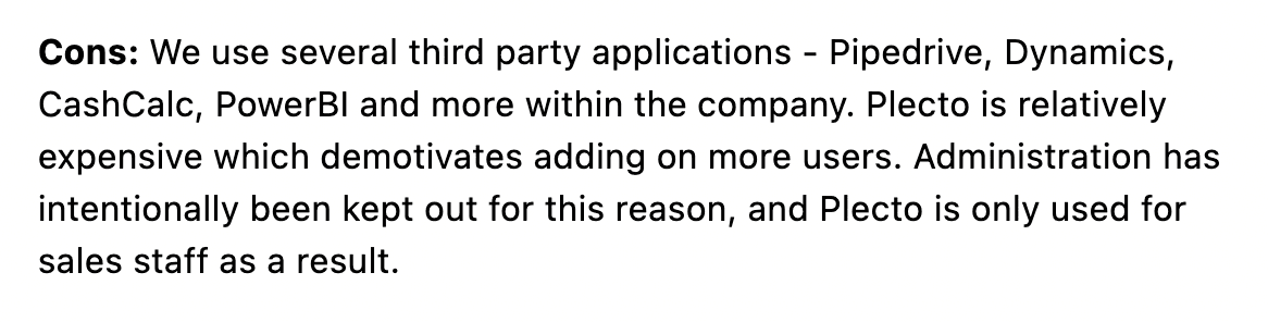
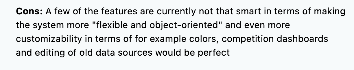
When prices are so high, people will obviously expect more from the tool, and as a result, Plecto has got many reviews with complaints of high price. Here’s one such from Capterra.
Reason #2. Doesn’t Have Several Customization Features
A KPI dashboard tool without premium customization options is a waste.
It might sound a bit harsh, but that's the bitter truth. If you want to track KPIs in-depth, you should be able to customize each and every aspect of your dashboard.
Plecto has some decent customization options like creating charts, filters, etc. but you can’t customize everything. And that’s where the customers aren’t satisfied with the tool.
Reason #3. No Real-Time Google Analytics Integration
So the tool portrays itself as a real-time Google Analytics integration, but that’s not really true.
The tool isn’t capable of pulling out real-time data from Google Analytics. It takes 30 minutes to an hour for it to refresh.
This can prove to be a serious issue whose business depends on day-to-day traffic.
Now that you know some prominent reasons for switching from Plecto to other KPI dashboard software, here’s a list of alternatives you can try out.
11 Best Plecto Alternatives You Must Try
#1. Datapad

Datapad helps you track all essential metrics from stunning dashboards.
The beauty of Datapad lies in its simplicity and ease of use. With our tool, anyone in your team with zero technical knowledge can start building reports in mere seconds.
As a go-to solution for Agencies, Datapad makes it easy to onboard new customers with 1-click templates and share performance reports with read-only links.
Datapad also makes it easy to collaborate as a team with the ability to drop comments on KPI cards.
The AI insights tool lets anyone detect anomalies in their data and provides actionable to-do items to increase performance.
Key Feature #1. Templates

Creating reports for your business is no easy task. You have to determine a lot, from which metrics to choose to design the right charts.
If you are an agency and want to create the same reports for multiple clients, then this hassle becomes even more burdensome.
Guess what? Datapad lets you do all this with just a few clicks.
With Datapad's templating features, you can:
-
Choose from a gallery of pre-designed templates and apply them with 1-click
-
Build a custom dashboard and re-use it as a template by changing it's sources
-
Share all connected data sources in the workspace with your teammates
Key Feature #2. Team Collaboration

Tracking KPIs isn't a one-person job when you have a lot of them; you need a team. But not all KPI dashboard tools let you bring your team on board.
Guess what? Datapad lets you do it quickly and easily.
Moreover, you can assign individual team members tasks to handle, goals to achieve, and metrics to measure.
With Datapad's team collaboration feature, you can:
-
Get notified whenever there’s an update for any metrics and KPIs you track
-
Communicate around your metrics and KPIs with your team members
-
Get push notifications on your phone to stay updated with all your KPIs
Key Feature #3. Automated Reports & Scorecards
Wouldn't it be great if you could check your business KPIs first thing in the morning, straight from your inbox?
With our dashboard software, you can subscribe to any dashboard and receive daily email updates.
All you have to do is build a dashboard, click the subscribe button, and set your email preferences.
The best part is you can share reports with anyone, even emails outside of your organization or workspace.
Step 1: Subscribe to a dashboard

Step 2: Check your inbox

With Datapad’s report and scorecard automation, you can:
-
Subscribe to any dashboard
-
Receive daily highlights around all KPIs
-
Send reports to users in and outside of your organization
-
Customize the date range, calculation, and styling of KPIs
Pricing
Datapad has a free tier that includes 1 dashboard. If you want more, you can upgrade to the $30 Standard Plan, which includes 3 dashboards and scales with your usage. Datapad also offers a Business Plan tailored for agencies and includes dedicated customer support.
We are now offering an earlybird discount to all users, so it's a great time to sign up and give Datapad a spin.
#2. Databox
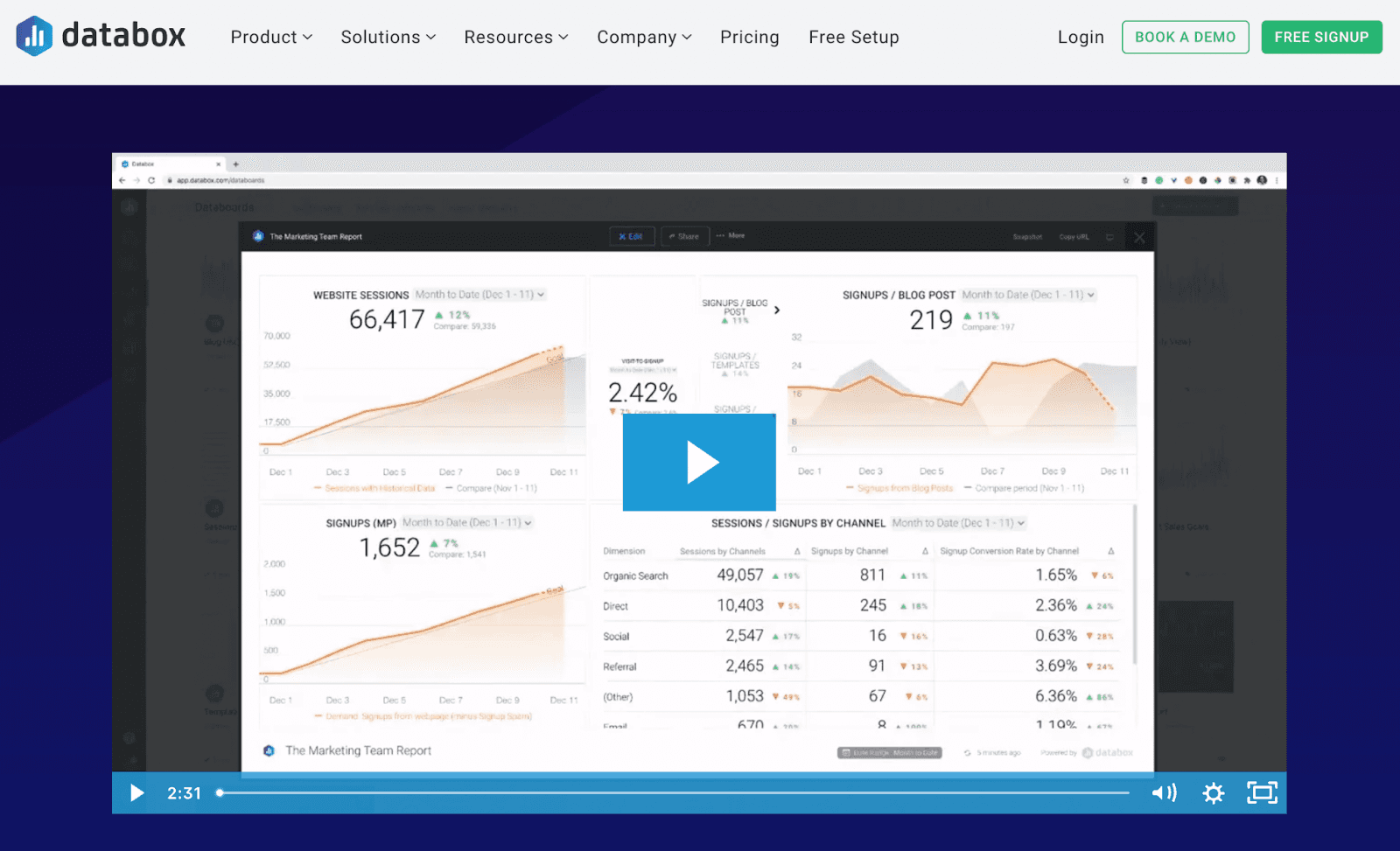
Databox is a data visualization software and business intelligence tool empowering 20,000+ businesses to collect, visualize and analyze their data under a unified dashboard.
Considering its global outreach and quality service, the platform has recently been awarded as the 2022 leader on the G2 Grid for Data Visualization.
Features
-
A powerful designer tool to build stunning dashboards with multiple customization options to enhance personalization
-
Has a stream-to-TV feature that allows you to make your performance more accessible and visible to teams and departments
-
Enables you to create custom formulas, white labels, and a blend of multiple data to create custom KPIs
-
70+ connectors to easily import data from multiple channels; export data to sheets, Excel, or CSV files and quickly share them via shareable links
-
Helps in performance management by sending automated daily, weekly, or monthly performance alerts via Slack, email notifications, and more
Pricing
Databox offers a free-forever plan with 3 Data source connections, all standard features, and 60+ Databox integrations. Additionally, it has three paid plans:
-
Starter: $91/month
-
Professional: $169/month
-
Performer: $289/month

Not satisfied with Databox’s features, try out some Databox alternatives we’ve tested recently.
#3. Geckoboard

Geckoboard is a smart KPI dashboarding software that helps businesses present complex data in the most vivid way possible. Its services have gained the trust of over 3,600 customers, including Airbnb, Marketo, Slack, and many more.
Features
-
Has 80+ built-in integrations, including Google Analytics, Zendesk, and Google Spreadsheets, to import data from all sources and third-party tools
-
Allows you to create stunning data visualization by adding status indicators, comparison charts, funnels, widgets, and more
-
The platform also helps in gamification to increase employee engagement and track KPIs better
-
Intuitive drag-and-drop feature to resize or rearrange widgets and elements in your dashboard
-
Get shareable links to your dashboard and share daily dashboard snapshots with team members automatically via Slack
-
Provides granular access control to dashboard and features with IP restrictions
Pricing
Geckoboard has a free plan with a single spread-sheet-powered dashboard. Apart from this, it has three premium plans as follows:
-
Essential: $49/month
-
Pro: $99/month
-
Scale: $699/month

Geckoboard is a good tool, but an expensive one, right? Check out some of the best Geckoboard alternatives you can try out this year.
#4. DashThis
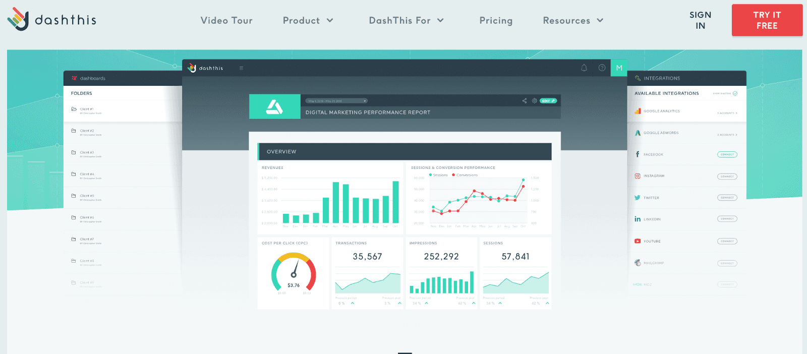
DashThis is a cloud-based marketing reporting software that allows digital marketers to create custom dashboards for digital marketing activities.
The platform assists marketers in importing data from multiple sources in any combination. It allows them to use custom metrics to define crucial marketing data under a unified dashboard.
Features
-
Has 34+ pre-integrated tools and platforms to pull in all the crucial data and custom KPIs under one dashboard with few clicks
-
Gives you a gallery of highly customizable templates for SEO, SEM, PPC, email, and much more
-
Supports cross-channel reporting and white-labeling to create the perfect blend of KPIs for a custom dashboard
-
Powerful APIs that allow you to view and analyze long-gone historical data and past KPIs with a few clicks
-
Easily share your work with automatic report distribution via email to give clients real-time access to your dashboard and KPIs
Pricing
DashThis gives you ten free dashboards with its 15-free risk-free trial period. Following this, you can choose among four different paid plans, including:
-
Individual: $39/month
-
Professional: $129/month
-
Business: $249/month
-
Standard: $399/month
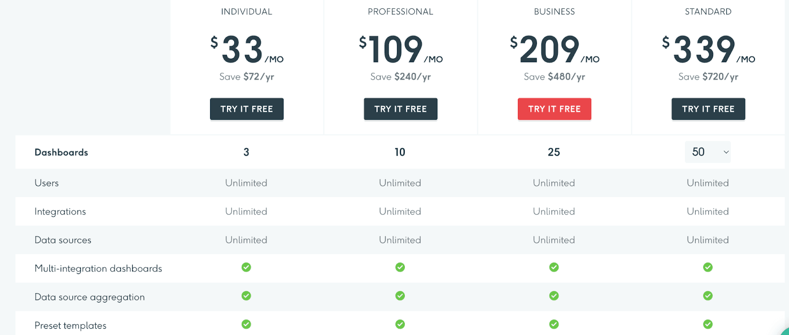
DashThis is an affordable tool but has a poor user interface. If CX is your priority, check out some DashThis alternatives that work like DashThis but have stunning CX.
#5. Domo
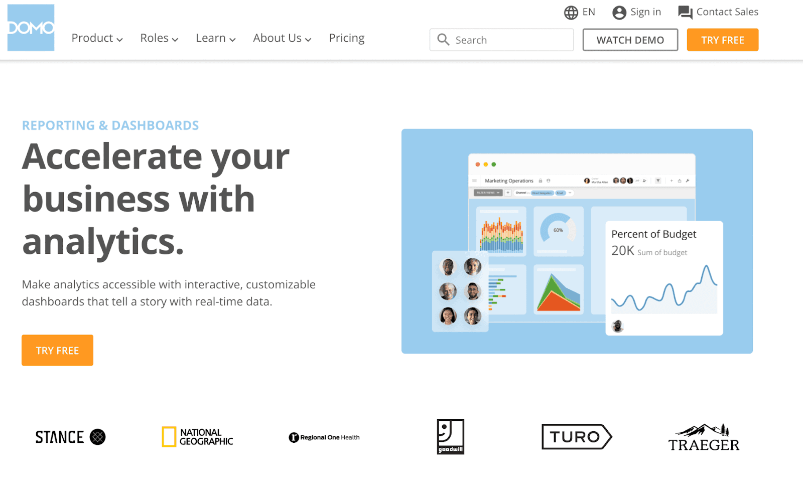
Domo is a cloud-based self-service software specializing in business intelligence and data visualisation tools.
Its low-code data app transforms complex and large data into stunning visualizations, allowing users to do forecasting and make data-driven decisions.
Features
-
Get real-time access to crucial business KPIs and insights to make better data-driven decisions
-
Receive custom alerts about data changes or actions taken
-
Tailor your dashboards with important metrics or add custom filters to segment data as per your requirements
-
Easily customize your dashboard and reports with Domo’s drag-and-drop functionality with absolutely no technical or coding knowledge
-
1000+ pre-integrated cloud connectors to collect data with few clicks instead of switching between multiple platforms manually
-
Allows smooth collaboration between teams with an in-built chat system
Pricing
Domo offers a risk-free trial period to test its services. However, their pricing policy is not publicly available. You can connect with their sales team to get a quote.

#6. ClicData

ClicData is an all-in-one data management and reporting platform that allows businesses to connect, automate, and visualize data quickly.
Its BI dashboard solution helps small to medium-sized businesses create interactive and easy-to-understand dashboards and reports.
Features
-
Quickly dive deep into your data with Clicdata's drill-down tables, pivot widgets, and heatmaps
-
Add navigation between dashboards and external applications via menus, buttons, indicators, and images
-
Enable role-based management to assign individual teams to monitor specific or different segments within a single dashboard
-
Create impactful presentation and data visualizations with ClicData's robust dashboard designer
-
Has an extensive library of elements, widgets, and templates to create stunning visualizations of your boring data
-
Easily access your dashboard and reports from anywhere with ClicData's fast and lightweight mobile application
Pricing
ClicData offers a 15-day free trial. After which, you can choose from the three paid subscription plans it offers:
-
Personal: $79/month
-
Team: $269/month
-
Business: $525/month
Note: ClicData also offers enterprise-specific plans. You can connect to their sales team to get your business the best deal.

#7. KPI Software by HubSpot

Many of you might know HubSpot for its world-class CRM, but not many know that it also offers KPI software to create a dashboard and track KPIs from your desktop and to take your project management to the next level.
Let’s look at what it has to offer.
Features
-
With HubSpot's KPI software, you can visualize all your data in one place and save time
-
The KPI tool of HubSpot integrates flawlessly with its CRM, giving you accurate data about every KPI you track
-
Comes with compelling and customizable chart creation options for you to create KPI charts and use them in your dashboard
-
Set permissions on every individual dashboard and share them with your team privately or in group
-
Integrates with Excel, Google Drive, and Powerpoint to import data and much more
-
Get a shareable link to send across to your teammates on social media channels like Linkedin, Facebook, etc.
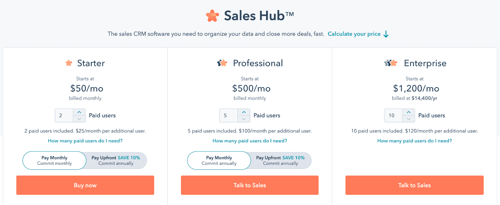
Pricing
HubSpot’s KPI software is available in the Sales Hub plans. You can choose from:
-
Starter: $50/mo for 2 users ($25/mo/additional member)
-
Professional: $500/mo for 5 users ($100/mo/additional member)
-
Enterprise: $1200/mo for 10 users ($120/mo/additional member)
#8. Spider Strategies
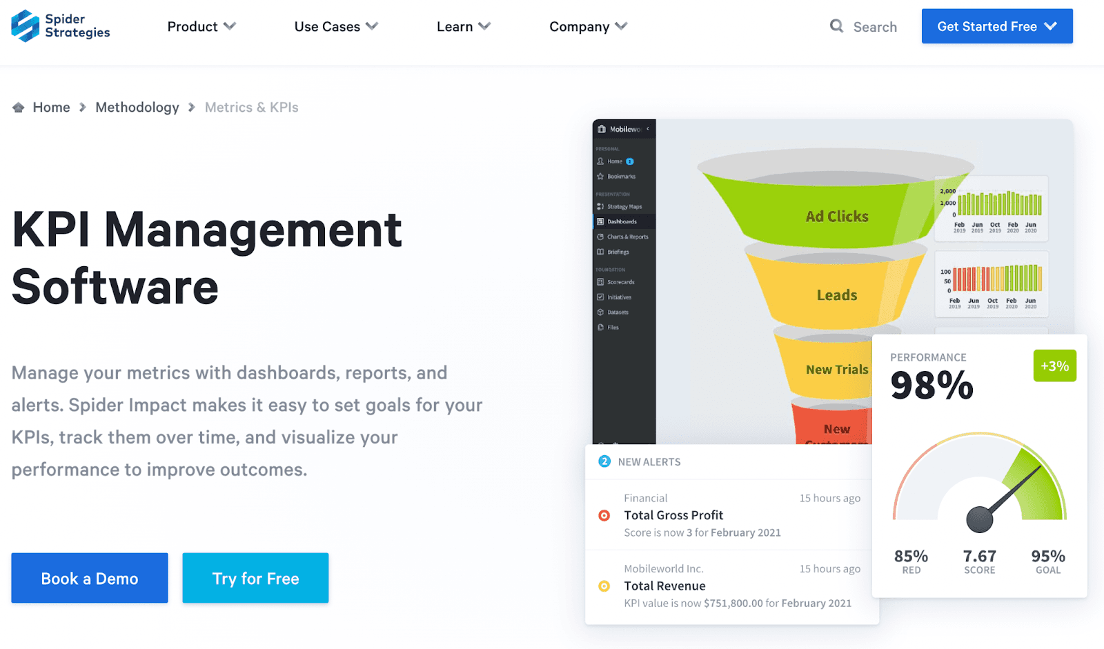
Spider Strategies help you track and adapt to market conditions as and when they change. Many know brands like Careteam, ADIA, RGA. etc. have shown faith in this platform.
Features
-
Set goals and keep track of them for every metric you plan to track for your business
-
View data in real-time, keep a tab of historical trends, and look for problem areas
-
Every data point on the software has a drill-down option by clicking on which you can look at all the nitty-gritty details carefully
-
Add charts, gauges, text, images, and many more elements to your dashboards and keep them up to date
-
Lets you create a briefing (live data presentation) to present to your boss, teammates, or clients
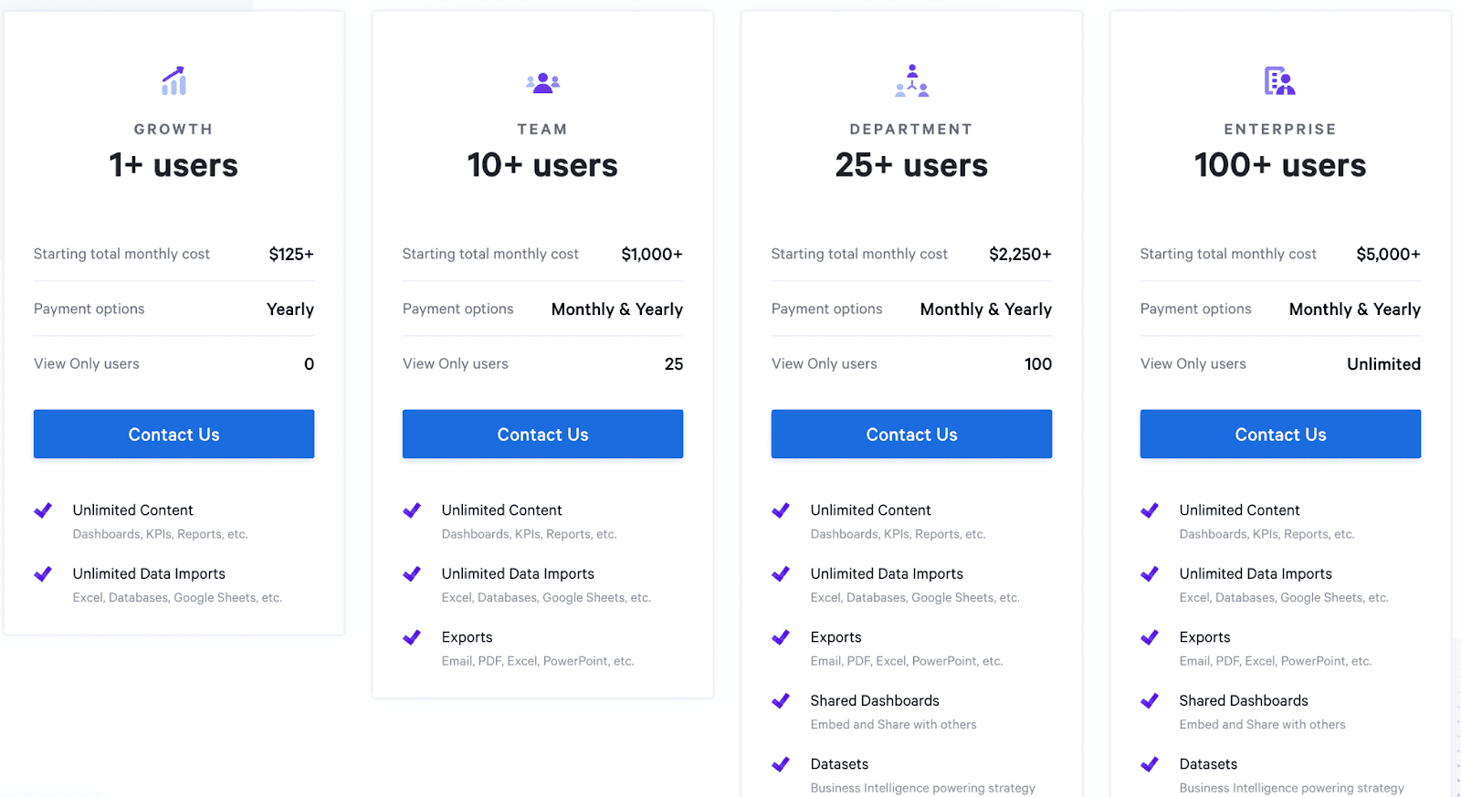
Pricing
Spider Strategies has four paid plans to choose from:
-
Growth: $125+ per month
-
Team: $1000+ per month
-
Department: $2,250+ per month
-
Enterprise: $5,000+ per month
#9. ActivTrak
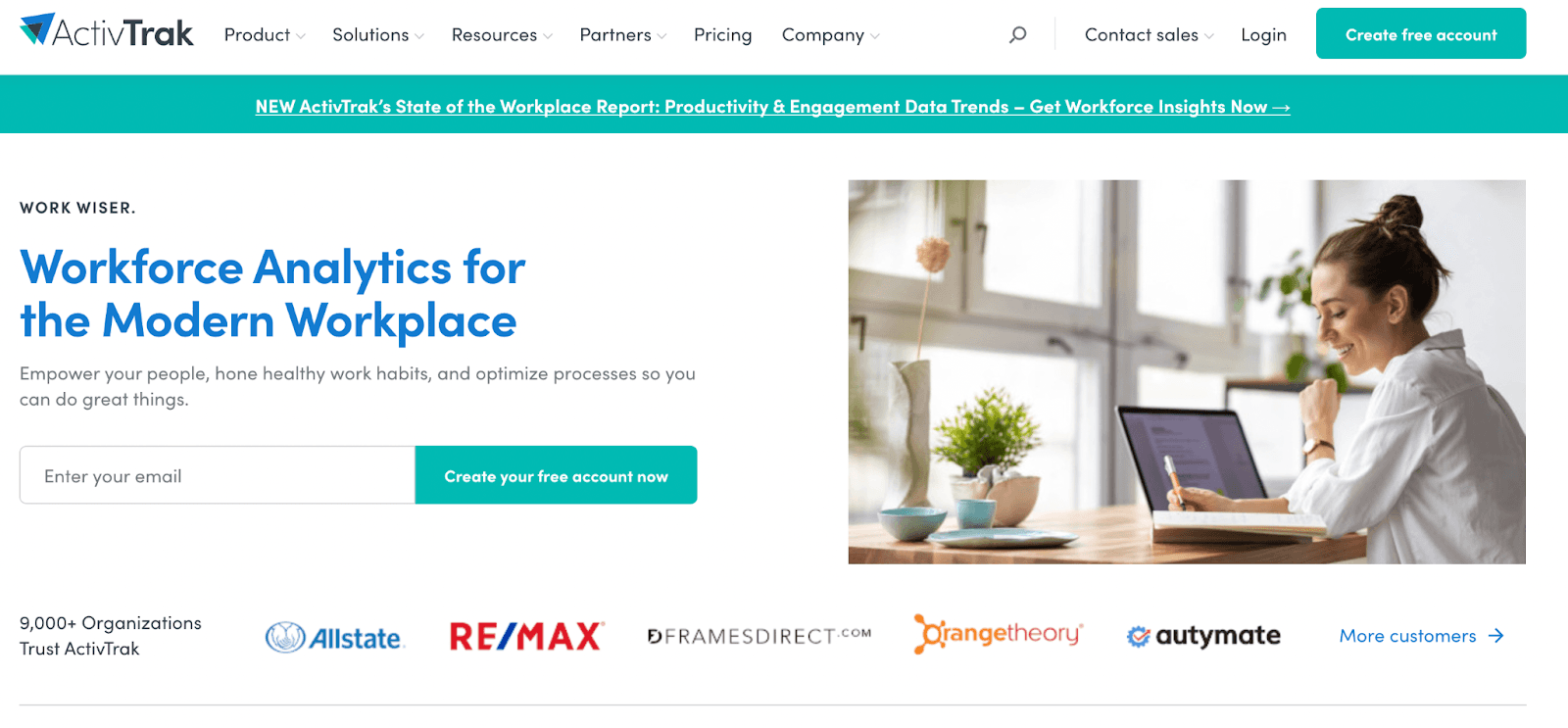
ActivTrak is an award-winning data analytics software that enhances team productivity with real-time analytics and reporting.
Features
-
Get a unified dashboard to assess the productivity of individuals, teams, or departments in real-time
-
Automate taking high-resolution screenshots of the device screen to see visual evidence of unprecedented spikes in your data
-
Keep track of time spent on each activity, project, or task to drill down what employees are working on and for how long
-
Schedule monitoring of devices only during work hours to offer privacy to employees
-
In-built website blocker to block websites causing distractions to make employees more focused on their jobs
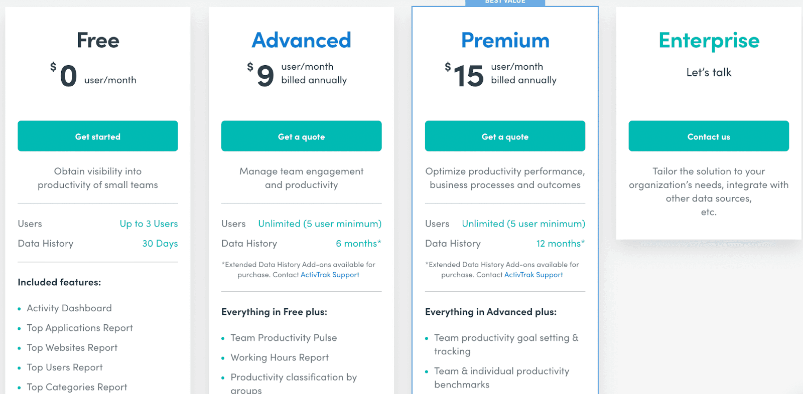
Pricing
ActivTrak has a free-forever plan allowing 3 users and 30-day data history. Apart from this, the platform offers two paid plans:
-
Advanced: $9 user/month
-
Premium: $15 user/month
Note: ActiveTrak offers tailor-made plans as per your business needs. You can contact their sales team to know more.
#10. Klipfolio
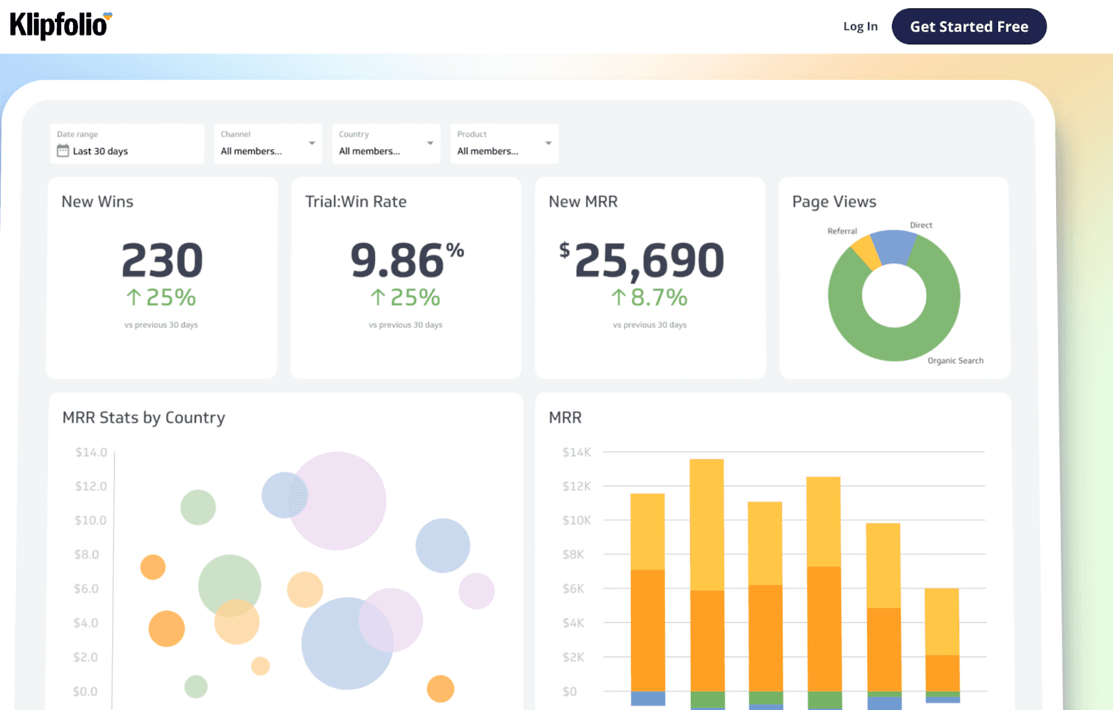
Klipfolio is a cloud-based dashboarding and BI software that helps businesses succeed with data.
The platform uses a metrics-first approach and a user-friendly interface to help businesses visualize complex databases and make reliable data-driven decisions.
Features
-
Experience faster and better data-driven decision-making with a centralized dashboard that shows meaningful KPIs first
-
Quickly upload and analyze your data interactively in dashboards with a simple architecture on the back-end - no coding required
-
Easily create reports and visualize your data by integrating top enterprise BI tools like Tableau, Qlik, Microsoft Power BI, and more
-
Gain visibility into business data and analyze hidden insights to figure out where your business stands via real-time dashboards and reports
-
Unlike on-premise solution, Klipfolio enables you to retrieve data from the cloud-based architecture at any time
-
You can access the platform via a native app for iOS and Android mobile devices and web browsers
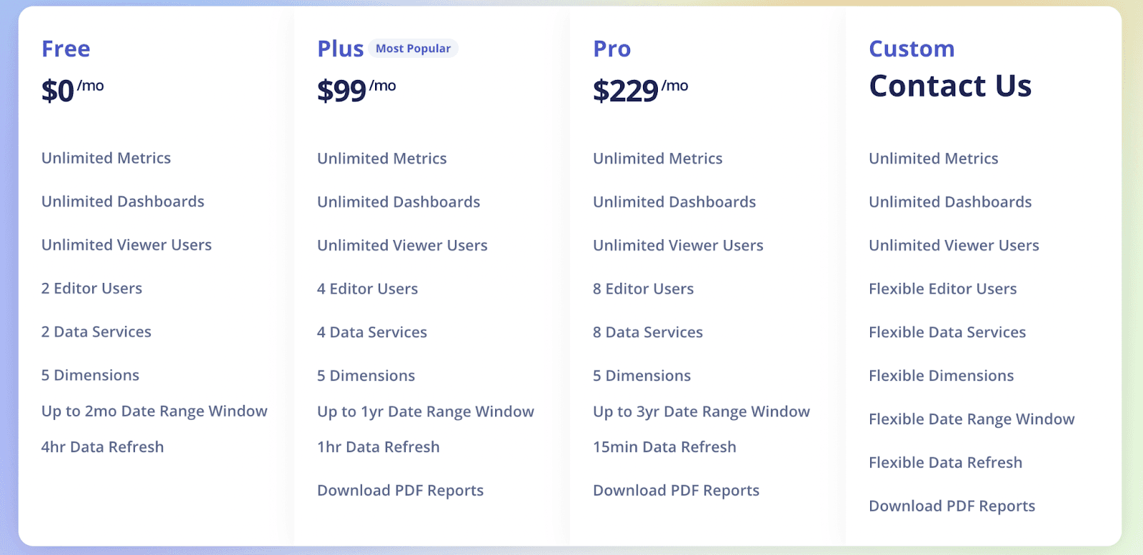
Pricing
Like ActiveTrak, Klipfolio offers a free-forever plan with unlimited metrics and dashboards. However, for a feature-rich experience, it has two paid plans:
-
Plus: $139/month
-
Pro: $299/month
Note: You can also avail Klipfolio's custom plan for large teams. Connect with their executives to learn about the pricing for the same.
#11. Transpara
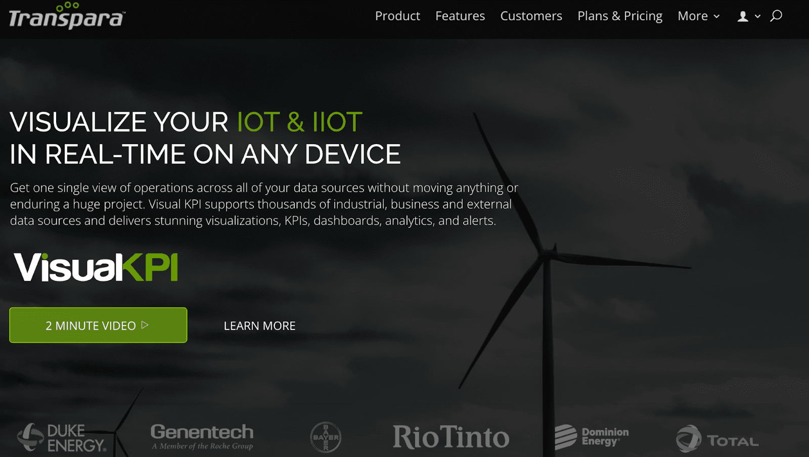
Transpara's Visual KPI software offers an all-in-one dashboard to view, analyze, and manage all your operations under one roof in real-time.
Features
-
Get real-time updates for any changes or activities in your dashboard - escaping the task of refreshing your dashboard every time
-
Has a highly-responsive interface compatible across all known devices and screens
-
Dynamic dashboard with simple drag-and-drop functionality to ease customizations
-
Easily embed your content like forms, video feeds, and more to third-party apps with Transpara's Bi-Directional Embedding
-
Enjoy software updates and new releases about every 10 days without any additional costs (valid with paid plans)
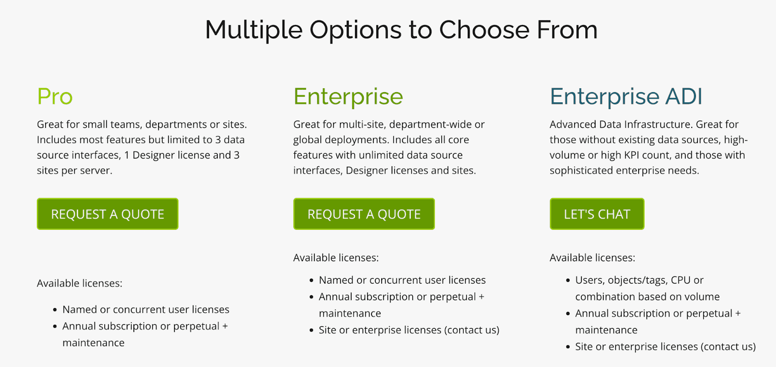
Pricing
Transpara has three paid plans: Pro, Enterprise, and Enterprise ADI. All you need to do is choose a plan and request a quote. Following this, you will be contacted by Transpara's executives.
Wrapping Up
Plecto is an expensive tool with basic and intermediate features. If you ask us, the tool isn’t worth its price if you have a small budget and if you are looking for a budget option, check out our review of best kpi dashboard software for small businesses.
You will know why we’re saying this after trying out the above-mentioned Plecto alternatives to track KPIs for your business.
If you don’t want to spend time testing each and every Plecto alternative, try out Datapad for free!
Read More: Cyfe Alternatives
Read More: Metabase Alternatives
Read More: Power BI Alternatives