Domo is a data experience platform that comes with features like AI-driven insights, intuitive dashboards, and real-time data integration. These features help you with decision-making and automate business processes.
However, when it comes to analyzing large datasets, visualization capabilities, and affordability, Domo falls short.
In this article, I will tell you why you should try an alternative to Domo and discuss the best ones in the market.
Why Do You Need a Domo Alternative?
Although Domo is a popular tool for dealing with numbers, users often look for alternatives to Domo for one of the following reasons:
-
Performance issues with large datasets
-
Lacks visualization capabilities
-
High, unaffordable pricing for SMBs
Let's have a closer look at these.
Reason 1. Reliance on Extract, Transform, Load (ETL) Causes Performance Issues with Large Datasets
For those unaware, ETL (Extract, Transform, Load) allows data to be transformed on a separate processing server before transferring it to the data warehouse.
Domo's Magic ETL allows users to build out complex transformations with an intuitive drag-and-drop toolkit. However, ETL is an older method ideal for complex transformations of smaller data sets.
If you've terabytes of data, Domo will struggle with data cleaning and preparations, leaving you on your own.
Reason 2. Limited Visualization Capabilities
Although you will find all basic visualization options like charts, graphs, and tables, there are no advanced visualization elements for complex datasets. Also, there’s little customization you can do with default visualizations.

Reason 3. Lacks Data Management
Some users found it hard to understand data paths and how they link with different datasets. It would help to see the schema like in other software such as Sisense or Salesforce.
On top of that, users feared renaming a field in a dataset would cause issues and might even break everything that was built. Users desired better tables and pivot tables with basic Excel functionality.

What are the Best Domo Alternatives and Competitors?
Some of the best alternatives to Domo are:
-
Datapad: Track all your essential business metrics with stunning dashboards.
-
Tableau: A powerful BI and data visualization tool that enables you to automate data insights.
-
Looker Studio: Cloud-based free-to-use data reporting tool from Google.
-
Cyfe: Allows you to monitor, analyze, and visualize data from various data sources in real time.
-
ThoughtSpot: AI-powered BI and analytics platform that helps teams visualize data and get immediate, actionable insights.
-
Power BI: Powerful BI and dashboarding tool developed by Microsoft.
-
Qlik Sense: AI-powered data visualization and analytics platform designed for users at all skill levels.
-
Knowi: Provides teams with a unified platform, delivering a comprehensive view across all sales and marketing data silos.
-
Polymer: Helps you track metrics with its AI-powered features and present them flawlessly.
1. Datapad

Datapad is an easy-to-use data analysis and visualization software. It's by far the quickest and easiest reporting solution in the market. It's a go-to solution for agencies as it works on a multi-tenant architecture and makes onboarding new customers hassle-free.
Alongside, you've read-made templates, scorecards, and tons of visualizations to reflect your business performance. Sharing performance reports is even easier with automated email reports and read-only links.
With Datapad AI, you get accurate, actionable insights in a blink. Want next-best action steps or ad-hoc analysis of a spike or drop in sales? Datapad AI insights allow anyone on your team to detect anomalies in data instantly.
Key Feature 1. Tons of Integrations
Datapad offers pre-built integrations to popular data platforms and cloud sources. Once you select a data source, your data is always fetched in real-time, so you don't have to worry about setting up or scheduling.
So far, we've rolled out one-click connectors to:
-
Social media platforms like Instagram, YouTube, Meta, TikTok, and X
-
E-commerce majors such as Shopify and payment platforms like Stripe
-
Marketing tools and CRMs such as HubSpot, MailChimp, Zendesk
And more…

Key Feature 2. Real-Time Collaboration
Data-driven decision-making is not a one-person job. Two heads are always better than one.
With Datapad, you can add any number of team members to your dashboard, and they can then help you track KPIs better.
✨ Bonus: Datapad allows adding unlimited members with all plans, including the free plan.
What's more, you can assign tasks, goals, and metrics for each team member to track.
Datapad's team collaboration feature lets you:
-
Get notified whenever there's a skip or drop in any metrics you track
-
Communicate around metrics and KPIs with your team members
-
Get push notifications to stay updated with all your KPIs

Key Features 3. Data visualization
Datapad doubles as a data visualization tool. It offers charts, graphs, geo-maps, and more data visualization options. Plus, you can choose from a gallery of preset scorecards for metrics and avoid the hassle.
You can customize any visual for color, integrated data sources, and visualization type so the metric looks exactly how you imagined.
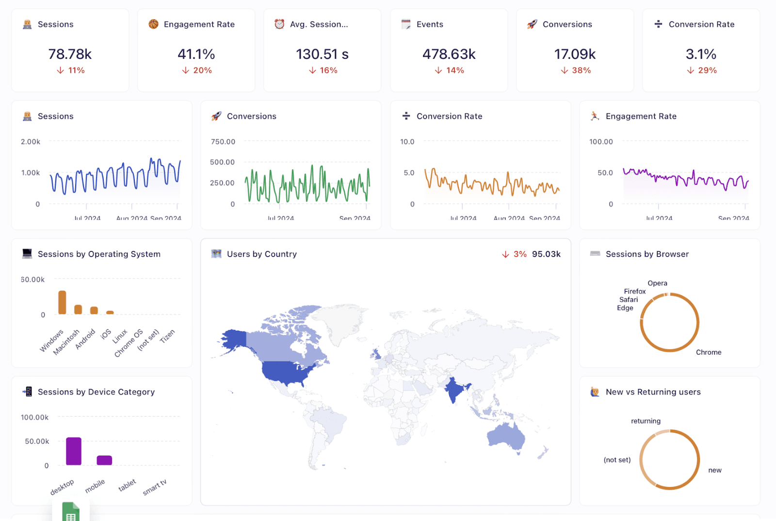
If you're an agency and want to create the same reports for multiple clients, Datapad features 100+ ready-made templates for multiple use cases. That's right, no double work!
Even better, our dashboard builder tool lets you drag and drop multiple visualizations and adjust them into one centralized dashboard.
Key Feature 4. Automated Reports & Scorecards
78% of people check their inbox before they go to work.
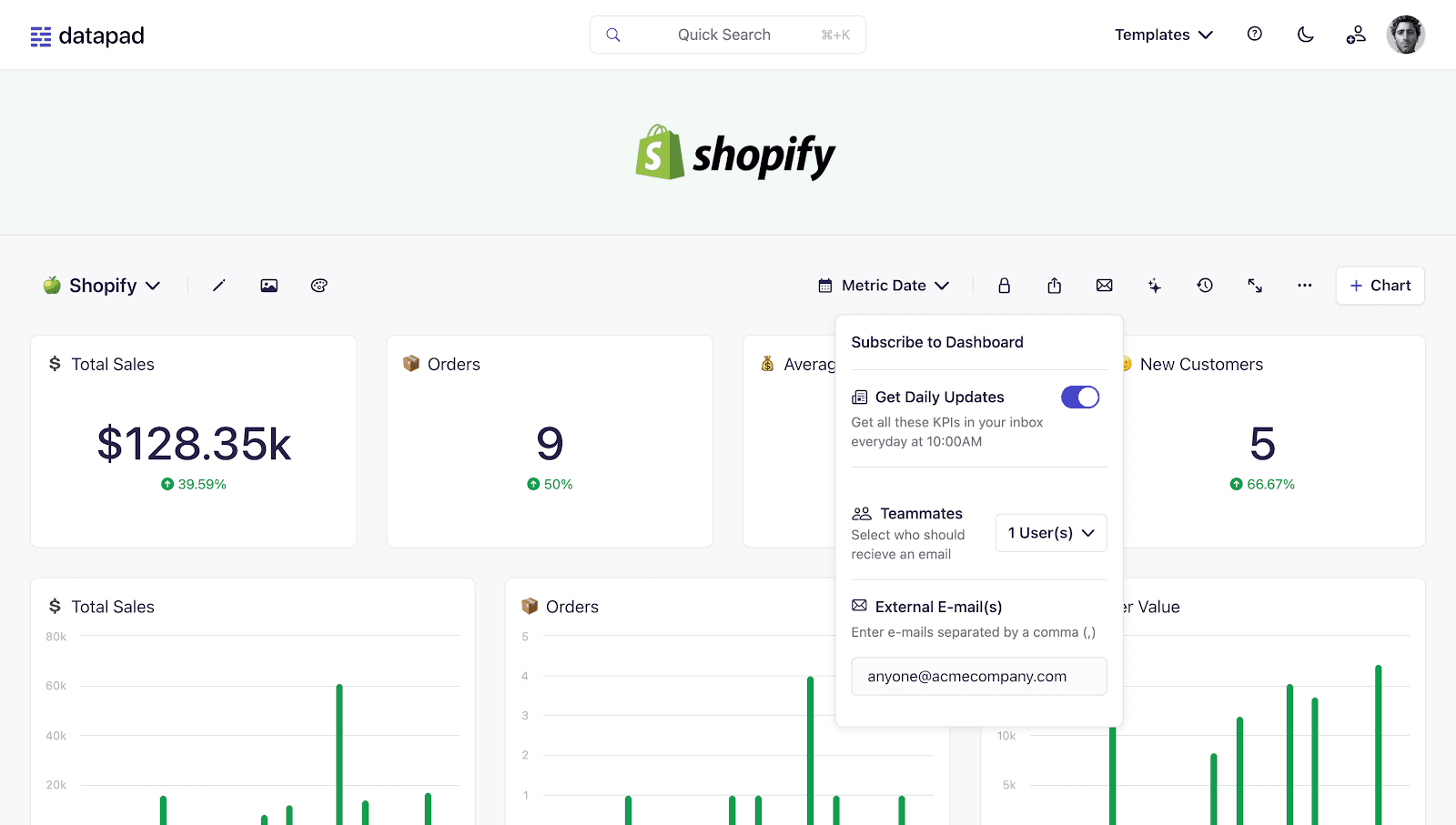
We chose to build a software where you can subscribe to any dashboard of your interest and receive daily updates via email.
With Datapad's report and scorecard automation, you can:
-
Receive daily updates highlighting the highs and lows around KPIs
-
Send reports to internal and external stakeholders via read-only links
-
Customize the dashboard for a date range, calculation, and styling of KPIs
Here's a quick
Step 1: Subscribe to a dashboard
Step 2: Check your inbox

Pricing
Datapad has a free plan that lets you build 1 report with unlimited data points, users, and real-time data sync. But if you want to create more such reports, you can upgrade to one of the paid plans it offers:
-
Standard: $30 per month
-
Business: $200 per month

Pros and Cons
✅ Let's you import KPIs from unlimited data sources in the free plan.
✅ Lets you subscribe to dashboards to get daily highlights.
❌ Variety of charts and graphs selection can be widened.
2. Tableau

Tableau is a powerful BI and data visualization tool that enables you to automate data insights and create interactive dashboards, charts, and graphs from various data sources. Powered by AI, Tableau has unlocked new capabilities for data analysts and marketing teams.
Features
-
Choose from a variety of advanced visualizations like scatter plots, treemaps, and bullet graphs, and create dynamic dashboards that combine multiple visualizations.
-
Use Einstein Copilot to help with data preparation, calculations, and visualizations using plain text prompts.
-
Work with either live data for real-time insights or in-memory data for enhanced performance and speed.
-
Has a catalog of 100+ naive connectors to databases and files — from spreadsheets and PDFs to big data, relational databases, and even application data or data on the web.
- Tableau Pulse automatically detects data trends, contributors, and outliers and generates digestible text-based summaries with supporting visual explanations.
- Easily collaborate with team members and share visualizations and dashboards securely in real-time.
Pricing
Tableau offers three paid plans to choose from:
-
Tableau Creator: $75 per user per month
-
Tableau Explorer: $42 per user per month
-
Tableau Viewer: $15 per user per month

Pros and Cons
✅ Supports numerous data sources, including SQL databases and Excel files.
✅ Tableau offers extensive data visualization options, and the dashboards created are wisely accessible across all devices.
❌ Lacks customizability at both fronts – platform flexibility and visualizations.
3. Looker Studio

Looker Studio is a cloud-based data reporting tool from Google. It's simple, intuitive, and has a minimal learning curve compared to other tools on the list. On top of that, when it comes to integration and visualization capabilities, Looker is an excellent alternative to Domo.
Features
-
Looker features a visual canvas where you can drag and drop data and visuals together to create enticing dashboards and reports from scratch.
-
It has an extensive gallery of 50+ ready-made reporting templates for Google Ads, Google Analytics, Display Ads, YouTube, and more.
-
Choose from a gallery of 50+ pre-built visualizations and widgets, or create custom visuals for your data using Looker Studio community visualizations.
-
Connect dashboards and reports with live data from 1000+ data sources via native and partner connectors.
-
Get shareable reports, invite collaborators with controlled access, schedule email reports, share reports via public links, or download them as PDFs.
Pricing
Looker Studio is free to start with; all you need is an active Google account.
Pros and Cons
✅ Well-integrated with Google's app ecosystem, including Google console and analytics platforms.
✅ Supports a wide range of templates and visualization elements.
❌ Lacks data harmonization and analysis capabilities.
4. Cyfe
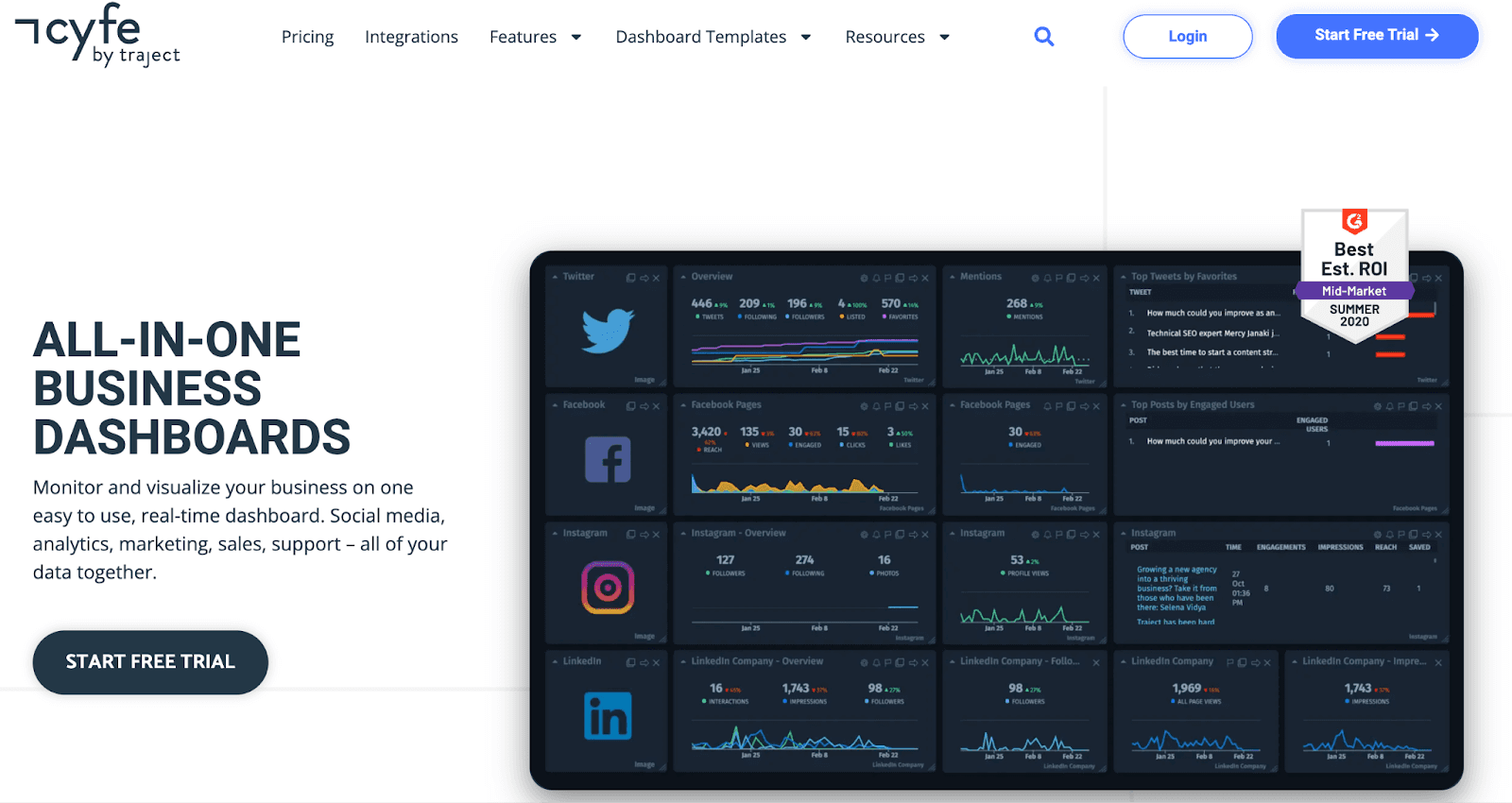
Cyfe allows you to monitor, analyze, and visualize data from various data sources in real-time. It's an excellent Domo alternative for small to midsize businesses looking for an affordable way to monitor their marketing, sales, analytics, and other business data in one place.
Features
-
Pull data from 100+ data sources, including popular services like Google and Salesforce, and visualize them instantly via 250+ preset metrics.
-
Use custom data widgets to import data from any source via .CSV, Google Sheets, SQL, private URL, or push API.
-
Choose from a variety of chart types to display your data, such as multi-chart, cohort, Gantt, funnel, pie/donut, gauge, and more.
-
Offers ready-made dashboard and reporting templates for PPC or organic campaigns, so you never have to start from scratch.
-
Customize reports with brand colors, logos, and even custom domains to stay on-brand.
Pricing
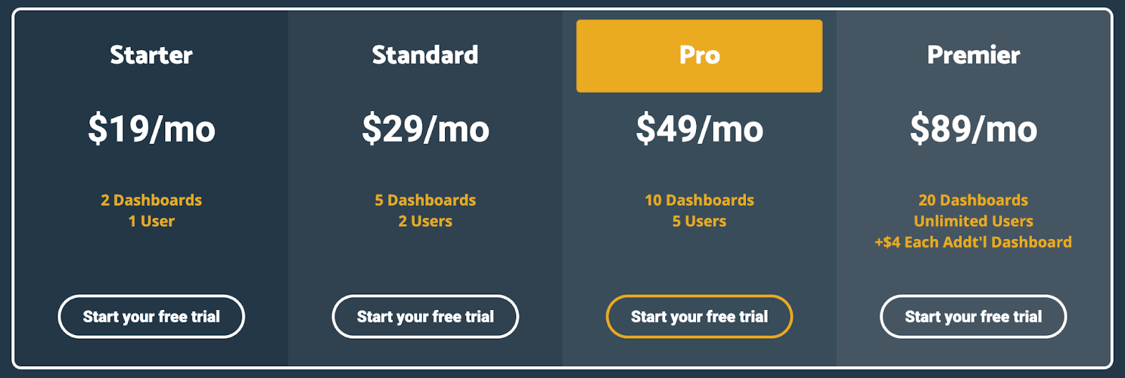
Cyfe offers a 14-day free trial and four paid plans:
-
Starter: $19 per month
-
Standard: $29 per month
-
Pro: $49 per month
-
Premium: $89 per month
Pros and Cons
✅ Easy-to-use, no-fuss data visualization options for SMBs.
✅ Provides fully customizable dashboards that fit your branding needs.
❌ Lacks certain advanced features and functionality compared to enterprise-level BI tools.
5. ThoughtSpot
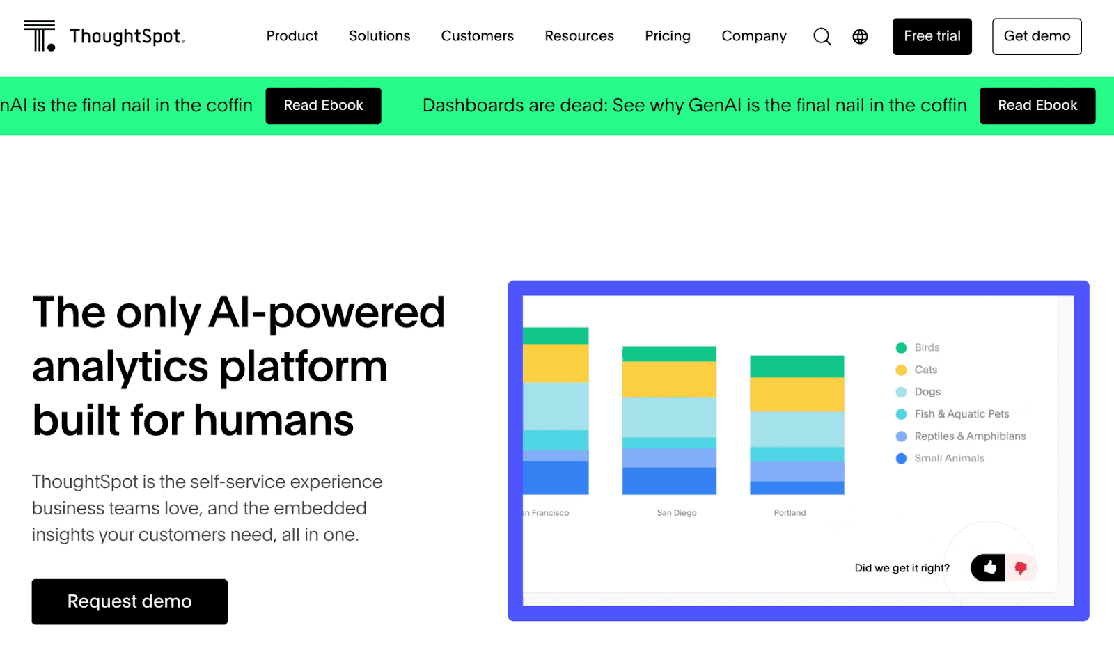
ThoughtSpot is an AI-powered BI and analytics platform. It helps teams visualize data and get immediate, actionable insights visible at their forefront.
Features
-
ThoughtSpot provides an intuitive, drag-and-drop interface to place and rearrange interactive widgets, visuals, and tables to create compelling Liveboards.
-
Add context using notes, annotation, and tabs to highlight technicalities or explain volatility to stakeholders for easy understanding.
-
Spot anomalies and drill down on charts and graphs for granular details using SpotIQ's AI-driven algorithm.
-
Pick from dozens of chart types and use advanced customization options to group axes, add labels, and change the look and feel according to your company branding.
-
ThoughtSpot Sage lets you ask questions in plain English and generate automated insights, forecasts, and ad-hoc analysis with visuals and with industry-leading precision.
Pricing
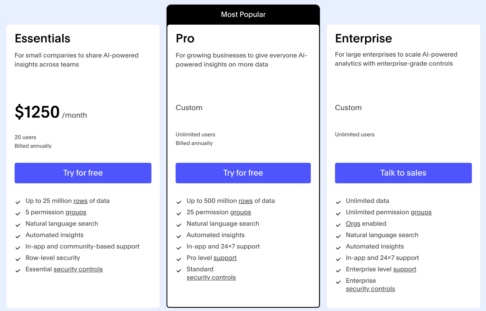
ThoughtSpot offers a 14-day free trial.
-
Essential: $1250 per month
-
Pro: Custom pricing
-
Enterprise: Custom pricing
Pros and Cons
✅ ThoughtSpot offers a versatile ML engine that learns as you go.
✅ Standard security controls add single sign-on via SAML/OAuth and row-level security.
❌ The choice of visualization is fairly basic and akin to what you get in Excel.
6. Power BI

Power BI is a powerful BI and dashboarding tool developed by Microsoft. It enables users to connect to various data sources, transform and analyze data, and create interactive reports and dashboards.
Features
-
Power BI allows you to connect to 500+ data sources, including Excel, SQL databases, cloud-based services, and more.
-
Use Power Query to clean, combine, and harmonize data from multiple sources.
-
Power BI provides a wide variety of interactive charts, graphs, and maps, including advanced visualizations like decomposition trees and more, to help you explore and analyze your data.
-
Power BI's Q&A feature allows you to ask questions about your data using plain English and get answers in the form of visualizations.
Pricing
Power BI offers a free forever plan. Other than that, it has three paid subscriptions to choose from:
-
Power BI Pro: $10 per user per month
-
Power BI Premium: $20 per user per month
-
Power BI Embedded: Custom pricing

Pros and Cons
✅ Offers a dedicated mobile app that allows you to view and interact with your reports and dashboards on the go from any device.
✅ Extensive catalog of data connectors.
❌ An outdated UX/UI interface gives Power BI a steep learning curve.
7. Qlik Sense
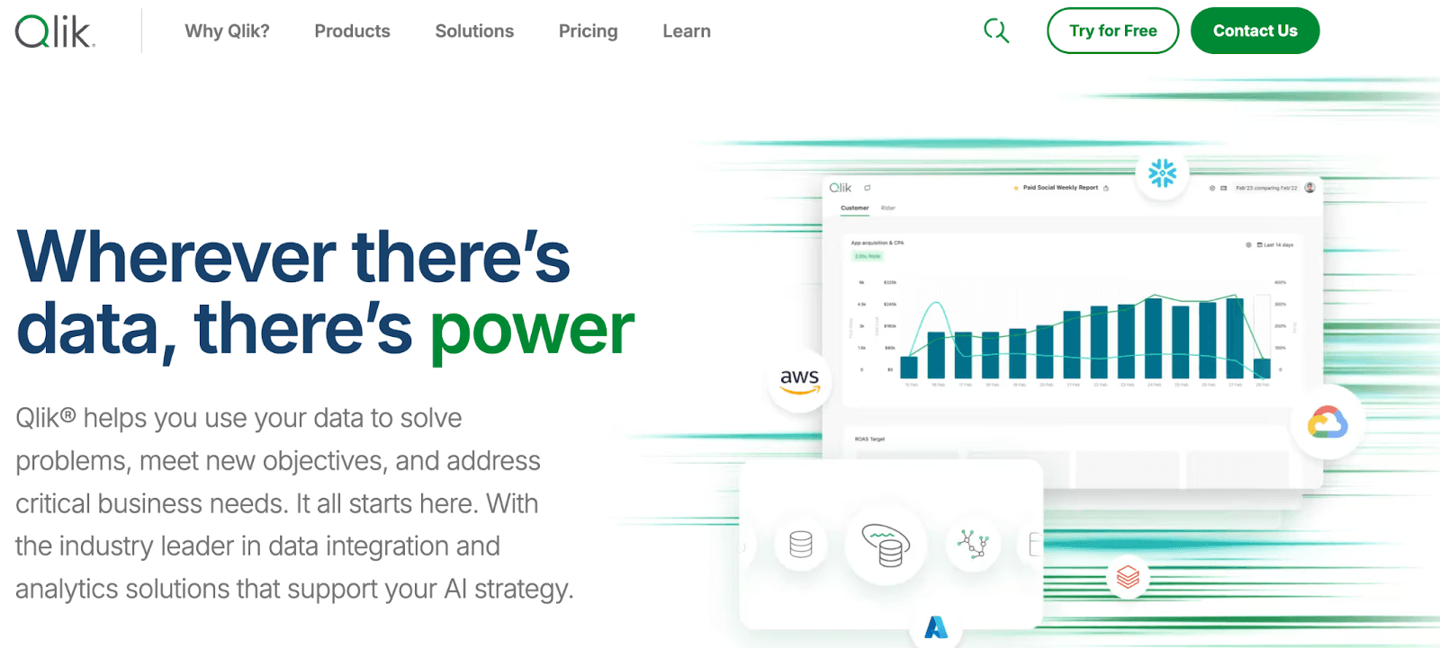
Qlik Sense is an AI-powered data visualization and analytics platform designed for users at all skill levels. Top brands like Samsung, Lenovo, Deloitte, and PayPal trust its powerful AL and ML capabilities.
Features
-
Has a library of 160+ native and partner connectors to popular data sources such as Snowflake, SAP, Oracle, Salesforce, and more.
-
Easily distribute branded reports with internal or external stakeholders with dedicated distribution list management and powerful task or user-level data filtering options.
-
Use Qlik Answers, an AI-powered Knowledge Assistant, to get personalized, contextually relevant answers to questions sourced from carefully curated unstructured content.
-
Use Insight Advisor to generate relevant visualizations and analyses using natural language questions automatically.
-
Qlik's Associative Engine allows you to create ML models, make predictions, and test what-if scenarios with complete explainability using a simple visual explorer for any range of data.
Pricing
Qlik Sense Cloud Analytics has three pricing points:
-
Standard: $825 per month
-
Premium: $2500 per month
-
Enterprise: Custom pricing

Pros and Cons
✅ Designed for scalability, it can handle large datasets and support multi-node deployments.
✅ Qlik Sense's Associative Engine enables fast selections, filtering, and recalculation of charts and aggregations.
❌ There is some learning curve involved, especially when setting up custom data sources and widgets.
8. Knowi

Knowi provides teams with a unified platform, delivering a comprehensive view across all sales and marketing data silos.
Features
-
Choose from over 40 visualization types, ranging from simple spreadsheets to sophisticated charts and custom visualizations.
-
Knowi's powerful Cloud9QL, a proprietary SQL-like syntax, lets you aggregate, manipulate, and harmonize new data without leaving your dashboard.
-
Use Knowi to explore the data by asking questions in plain English, detecting anomalies and trends, and getting actionable insights instantly.
-
Knowi natively integrates a wide range of structured and unstructured data sources, including SQL, NoSQL, APIs, and files.
Pricing
Knowi offers customized pricing plans tailored to your business needs. You can contact their sales team to get a quote.

Pros and Cons
✅ Built on Small Language Models, Knowi AI guarantees data privacy and ensures your data works internally.
✅ Has supporting connectors for both SQL and NoSQL databases.
❌ Knowi's reporting features are basic, with limited options for exporting data or creating advanced reports.
9. Polymer

Polymer is an AI-powered data visualization tool. I was thrilled by the level of customizability and ease of use this BI tool offers.
Features
-
Has an intuitive dashboard editor that allows you to drag, drop, and combine data connectors, visuals, and widgets to create out-of-the-box dashboards and reports.
-
Polymer has over 20 different visualization types, including charts, graphs, tables, funnels, and more widgets.
-
Offers 20+ connectors to popular marketing, sales, and other data sources such as Google Ads, Shopify, Google Sheets, and more.
-
Use Poly AI to ask your data plain English questions and get clear answers coupled with explanatory visuals in seconds.
-
Leverage AI-powered insight explanations within dashboards to drill down on visuals and understand the reason behind a spike or dip in metrics.
Pricing
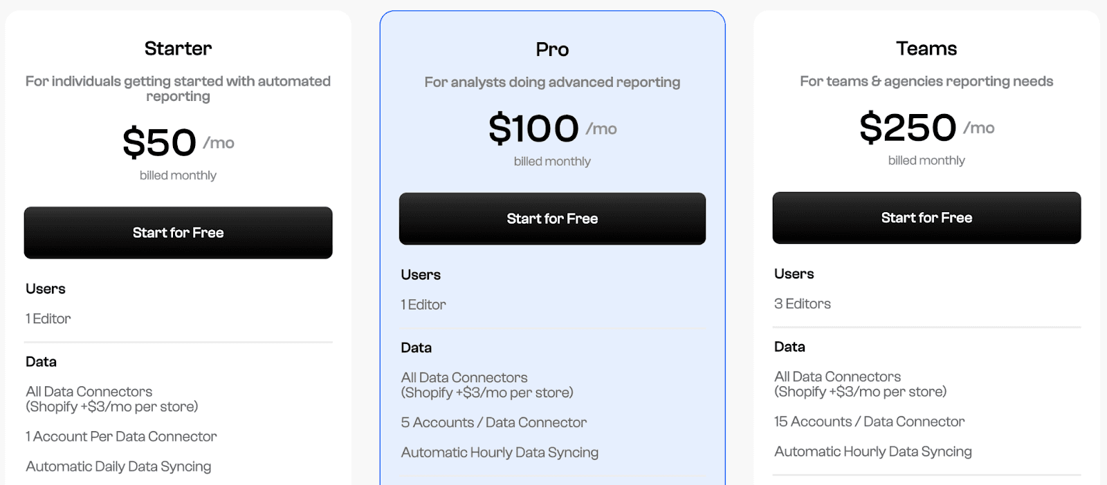
Polymer offers three premium plans:
-
Starter: $50 per month
-
Pro: $100 per month
-
Teams: $250 per month
Pros and Cons
✅ Easy to use and visualize.
✅ Great choice of visualization assets (graphs, diagrams, charts, etc.) to choose from.
❌ Lacks team collaboration features such as in-app chat or comments.
Wrapping Up
All the tools mentioned above are great alternatives to Domo and successfully alleviate its drawbacks.
Analyzing and visualizing data is part of any business in any category because, without doing so, you can make the right decisions.
Unfortunately, Domo isn’t of great help with large datasets, falls shy in visualization capabilities, and is a tad bit expensive, which are the main reasons people opt for an alternative.
But how do you find out which Domo alternative is right for you?
Well, there’s no better way than signing up for free trials and judging products for yourself.
If you or your team don’t have the time to try every product on our list, sign up for Datapad, import your KPIs, and create stunning dashboards for you and your team.
