Reports suggest that there are ~2 billion Google Sheets users in the world. 🤯
Before the advent of technology, Google Sheets were extensively used by businesses to visualize hefty datasets and make sense out of it.
To date, Gsheets still hold its ground and is a popular choice among marketers to perform data visualizations.
But how do you make a chart in Google Sheets and visualize your data the easy way? 🤔
Well! This is the perfect place and time to learn it 💪🏻
In this article, we’ll help you learn how to make a chart in Google Sheets, and uncover a more robust tool that can help you perform data visualizations within minutes.
But before we get started, let’s understand what are the types of charts you can use to visualize data in Google Sheets.
Here’s a TL;DR, if you’re in a hurry:
-
7 types of chart options Google Sheets has for users.
-
Creating a chart on Google Sheets is a 4-step process, but has a lot of manual work to be done.
-
When you decide to create a chart in Google Sheets, you might face some drawbacks like, difficulty in creating a chart via its mobile app, might get slow over time, has limited customization options, and limited data import option.
-
Instead of creating charts in Google Sheets, use a dashboard software like Datapad to do it as it's fast, mobile-friendly, comes with team-collaboration feature, and has multiple data sources to import data from.
What are the Types of Charts You Can Create in Google Sheets?
Google Sheets offers a gallery of various chart types for data visualization. Below we have curated a detailed list of all the available chart styles and types and also laid emphasis on how to use chart in Google sheets in the best possible way.
#1. Line Chart
Line charts in google sheets are typically used to show changes in trends over time. These chart types are created by plotting several points on the chart and then connecting dots via singular lines.
Best Use Case of Line Chart
Ideal for showing trends in sales or profit margin over a month, quarter, or year. For example, annual home loans, monthly subscription revenue, etc.
#2. Combo Chart
As the name suggests, a combo or combination chart is a mix of line charts and bar graphs used to visualize contrast datasets.This allows users to display different types of data in a single chart, such as a line chart and a column chart, to compare different sets of data more effectively.
Best Use Case of Combo Charts
Combo charts are best to use when you want to highlight each data series with a different marker within the same chart.
For example, a combination chart is an excellent choice if you want to showcase the monthly revenue and % increase in profit margins on the same graph.
#3. Area Chart
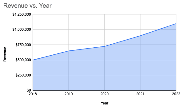
Like line charts, area charts help you compare one or more data series graphically. They allow you to determine the change in trends over different data categories.
The difference is that the area chart uses shades below the line to showcase the magnitude of trends.
Best Use Case of Area Chart
It's best used to showcase data that depict a time-series relationship, for example:
-
Compare revenue and expenses over time
-
Compare the volume of imports and exports every month
#4. Column Chart
A column chart helps you display different categories or groups of data using rectangular or vertical bar charts. Moreover, it helps you easily compare values of different data series over time.
Google Sheets provide two types of column charts
-
Stacked column chart: To showcase a part-to-whole relationship
-
100% Stacked column chart: To show relationships and trends when the cumulative total isn't important
Best Use of Column Charts
Marketers and data analysts widely use column charts to perform comparative analyses. Ideally, a column chart is a good fit for tracking, measuring, and comparing 10-12 datasets at once.
#5. Bar Graph
A bar graph is a graphical representation of data using vertical or horizontal bars or strips to compare the difference between two or more data points or groups.
Best Use Case of Bar Graph
Bar graphs are typically used to compare individual items. Some of its use cases include:
-
Compare ticket sales by location
-
Breakdown of employees by job titles
-
Compare % of website traffic from different sources
#6. Pie Chart
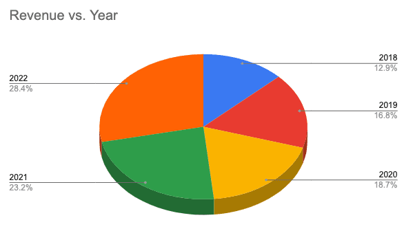
Pie chart is a type of chart in which a full-drawn circle is divided into several slices or portions, each representing a part-to-the-whole.
Best Use of Pie Chart
A pie chart can only be used if the cumulative total of individual slices adds to a meaningful total. Some of its use cases include:
-
Showing percentages of types of customers
-
Percentage of revenue from different products
-
Region-wise sales of a particular product
#7. Scatter Chart
A scatter chart shows numeric coordinates along the horizontal (X-axis) and vertical (Y-axis) axes and helps viewers easily understand the relationship between two variables.
Best Use of Scatter Chart
Scatter charts are best to use when you want to find out how one variable is affecting another. For example:
-
Salary of employees vs. years of experience
-
Ice cream sales vs. temperature
-
Revenue vs. expenses
How to Create a Chart in Google Sheets?
To those who always ask us, “how do I create a chart in Google sheets?”
Peeps, we’ve finally come up with the easiest step-by-step guide on how to make a data chart in Google Sheets.
So without further delay; Let’s dive in 😄
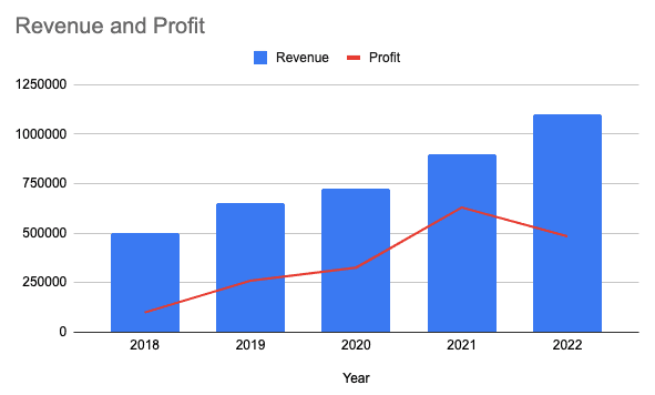
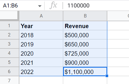
For this article, we've created a simple dataset to help you quickly understand how to chart data in Google Sheets.

Here, column A depicts the time series, while column B represents the values corresponding to specific time periods, and C represents the profit each year.
Note: To create a chart, you must have at least two primary columns. The first one has a timeframe, and the second column has the values you want to visualize.You can also have three or more columns for combination chart types.
Step #2. Create a Chart From Your Dataset
Now that we have a dataset, let's learn how to add a chart in Google Sheets.
For initials, select the dataset (columns) you want to present via chart.
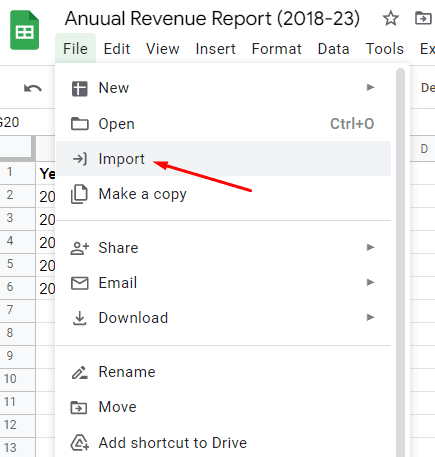
To insert chart in Sheets, click on Insert in the menu bar.
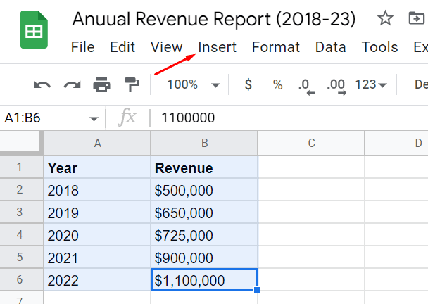
A drop-down appears with a list of elements. Click on Chart and that’s it.

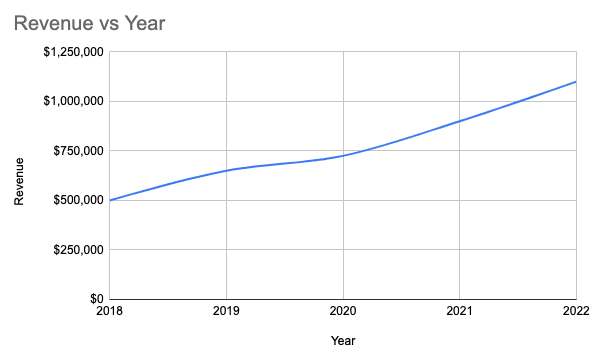
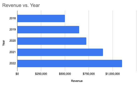
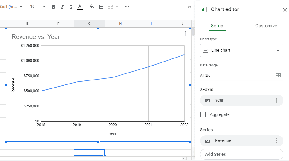
Google Spreadsheets automatically presents you with a default chart type to visualize your data as it did for our dataset with a line chart 👇🏻
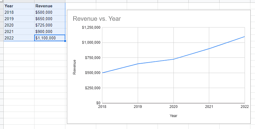
So, this was how to add a chart in Google sheets. Moving forward, we'll learn how you can change the default chart type and visualize your dataset as you desire.
Step #3. Change the Default Chart Type
We feel this is the best part of creating charts on Sheets. You can instantly change the chart type as per your preference.
To do so, Click on the chart and then click on the Three vertical dots in the top right corner.
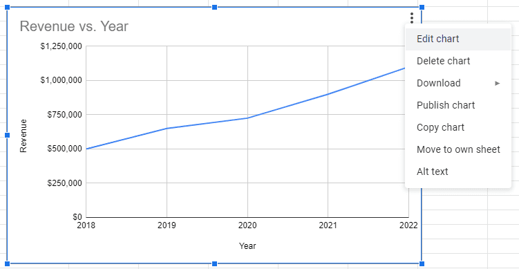
Then click on Edit Chart to open Gsheet's in-built Chart Editor on the right sidebar.
Pro Tip: You can also double-click on the chart to open the editor directly.
In the chart editor, click on the Chart Type drop-down to access a gallery of pre-built templates and charts from Sheets.
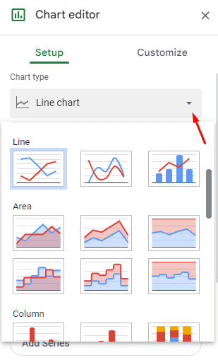
Here, the first section comprises chart suggestions from Gsheets. You can choose a chart type from there or a completely different one from the gallery. Your call! 🤙🏻
When you have made a choice, simply click on the chart icon, and your existing chart will be replaced with your chosen one in real time.
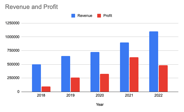
As an example, we tried representing our dataset using a column graph. So, we scrolled down the gallery and clicked on the Column Chart icon 👇🏻
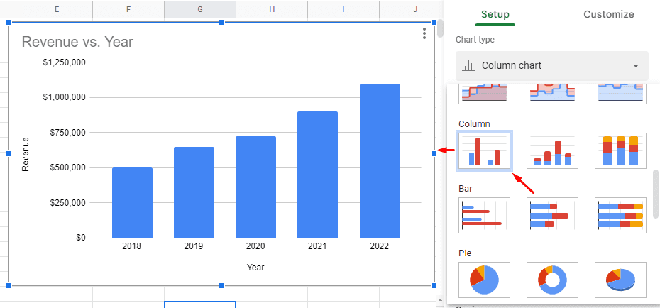
So this is how to add chart in Google sheets. In the next step, we’ll discuss how you can edit or customize a chart in the app.
Step #4. Custom Format Chart As Per Your Preference
To customize your bar graph, click on the Customize menu in the chart editor.

Here’s what you can do with the customization option:
-
Change data range
-
Change axis labels, axis titles, and sub-headers
-
Include / exclude gridlines
-
Interchange horizontal axis and vertical axis
And that's it!
You now know how to make chart on Google Sheets. However, when you perform the practice in real life, you may encounter certain drawbacks of using Gsheets.
Drawbacks of Creating Charts with Sheets
#1. Not a Mobile Friendly Platform
As part of the superior services provided by Google, we expect Google sheets to stand tall on all grounds. 🏆
However, when it comes to using Gsheets on your mobile devices, you can find it uncomfortable.
You see, creating charts on Gsheets desktop version vs. mobile version can trigger completely different experiences for users.
Although the platform has a dedicated mobile app, users may still find it challenging to create charts on the go. You may ask why?
The Google Sheets mobile app isn't well-optimized to function perfectly on small screen devices.
In fact, within seconds into the app, and you’ll likely encounter one of these:
-
Difficult to scroll through the sheet
-
Half-volley graphs
-
Complications in managing and visualizing data
#2. Might Get Slow When Processing Huge Datasets
Another noticeable drawback of Gsheets is its inability to process heft databases.
Although Gsheets offer 10,000,000 cells to collect and organize data, it won't take you that long to figure out that your application has already slowed down. 🐌
And this becomes problematic for large companies that generally deal with terabytes of user data.
When such companies use Gsheets, they are constantly under threat of data security and integrity.
#3. Limited Number of Customizations
Google Sheets offer a countable number of customization options. Unlike the modern-day chart creation tools, Sheets allows you to perform basic customization to your charts.
On the other hand, Datapad (our tool) provides tons of pre-built charts, tables, graphs, and widgets for hassle-free data visualization (more on this later).
#4. Limited Data Import Options
Sheets offer next to no integration options. This means you can import data in just two ways:
-
By importing another spreadsheet that has data
-
By manually entering the data labels and values
While modern-day dashboard and chart creation tools like Datapad allow you to import data from various data sources and platforms with a click.
You might be wondering what’s the buzz around Datapad. 🐝
Well! See for yourself in the next section. 😉
Create Stunning Charts with Datapad
Datapad is designed to make data analysis easier, especially for those using Google Sheets. Whether you're creating a dashboard to track sales or a graph to visualize trends, Datapad integrates seamlessly with your Sheets to provide powerful insights.
The beauty of Datapad lies in its simplicity and ease of use. With our tool, anyone in your team with zero technical knowledge can start building reports in mere seconds.
#1. Google Sheets Integration:
Tired of copying and pasting data from your spreadsheets into visualization tools? Or worse, rebuilding your charts every time your data updates? Datapad solves this headache by connecting directly to your Google Sheets, transforming your data into stunning visualizations without the technical complexity.
With Datapad's Google Sheets integration, you can:
-
Connect any Google Sheet with just a few clicks—no coding required
-
Watch as your dashboards update automatically when your spreadsheet changes
-
Visualize complex data in ways Google Sheets alone simply can't handle
-
Create beautiful, presentation-ready charts without fighting with formatting
Say goodbye to spreadsheet limitations and hello to data that works for you, not the other way around.
#2: AI-Driven Analysis
Ever wished you had a data analyst on call 24/7? With Datapad, you basically do. Skip the complex Excel formulas and simply ask questions in plain English like "What's our best-performing ad channel?" or "Show me last quarter's conversion trends." Datapad's AI instantly generates the perfect visualization to answer your question.
With Datapad's AI-powered analysis, you can:
-
Ask questions in everyday language and get immediate visual insights
-
Uncover hidden patterns and relationships in your data automatically
-
Focus on making decisions instead of fighting with chart settings
-
Transform complex data into clear, actionable intelligence in seconds
Your data has stories to tell—Datapad helps you hear them through simple conversation.
#3. Scheduled Reporting
End the monthly reporting grind forever. Datapad automatically delivers fresh insights straight to your inbox or Slack channel on your schedule. Set up your dashboard once and let automation take over—whether you need daily metrics, weekly performance snapshots, or monthly executive summaries. Choose from our library of ready-made templates to get started even faster with industry-specific KPIs and visualizations. Your team stays informed with zero manual effort, while you focus on acting on insights instead of creating reports. Perfect for agencies managing multiple clients or busy teams that need consistent data without the hassle.
Collaboration and KPI dashboards must go hand in hand, that’s how a company excels in KPIs tracking and setting strategic goals.
💭Food For Thought: We wanted to be innovative with our collaboration feature and thus spent hours brainstorming about how to make collaborations easy yet real-time.
So, here we are!
#4. Downloadable Reports
Sharing insights with your team or stakeholders should be straightforward. With Datapad, you can download your reports in PDF or HTML format, making it easy to distribute them. Whether you need to attach a report to an email, share it on a project management tool, or print it for a meeting, Datapad has you covered. No more scrambling to capture screenshots or manually compiling data. Your reports are ready to be shared in a professional format at the click of a button.
#5. Web Search Feature
Sometimes, understanding your data requires context from the wider world. Datapad's Web Search feature allows you to pull in external data for sector benchmarks and trends, enriching your analysis. Whether you're comparing your sales figures to industry averages or looking for the latest market trends, Datapad can help you find the information you need. This feature ensures that your analysis is not just based on internal data but also informed by external factors, giving you a more comprehensive view of your performance.Make Your Excel Dashboards Look Stunning with Datapad.
Table of Key Features and Benefits
| Feature | Description | Benefit |
| Google Sheets Integration | Connects directly to Google Sheets for data analysis. | Seamless workflow, leverages existing data. |
| AI-Powered Analysis | Allows plain English queries, generates graphs and dashboards. | Reduces technical barriers, fast insights. |
| Dashboard and Report Creation | Supports bar graphs, line charts, pie charts, Gantt charts, etc. | Visualizes data effectively for decision-making. |
| Scheduling Reports | Delivers reports via email or Slack at scheduled intervals. | Keeps users informed without manual effort. |
| Download Options | Reports available in PDF or HTML format. | Easy sharing with stakeholders or teams. |
| Web Search Feature | Pulls external data for benchmarks and trends. | Enhances analysis with industry context. |
Datapad is a free kpi dashboard tool that allows you to connect data sources and keep track of all your metrics in one place. We claim that Datapad is the easiest kpi tool out there.
If you are keeping your dashboards on excel or sheets, you can use our integration to take all your data from spreadsheets and build stunning dashboards on Datapad.
Food for thought: Doesn't this make working easier than ever?
💭Think about it: Isn't it easy to use Datapad for creating charts rather than learning how to create a chart on Google Sheets?
If you think so, scan the QR code below, sign up to the platform, and start creating charts in no time.