
Bar graphs in Google Sheets ain’t old school. Yes, someone has to say it! 🤷♂️
They are the most fundamental chart type used by business owners and financial analysts to display complicated data in an easy-to-read format.
Besides, they are a convenient way to visualize information quickly and effectively.
In this article, we will walk you through on how to make bar graphs in Google Sheets.
Let’s start with answering the most basic question.
What are Bar Graphs in Google Sheets?
A bar graph is a graphical representation that uses a combination of bars and numeric values to present complex data in an easy-to-understand manner.
Simply put, a bar graph (aka bar charts or column graphs) plots numeric values against levels of rectangular blocks known as bars.
These levels are plotted on one chart axis (let's say the x-axis) and values on the other axis (y-axis). Each value claims one bar, and the height of each bar corresponds to the value they represent.
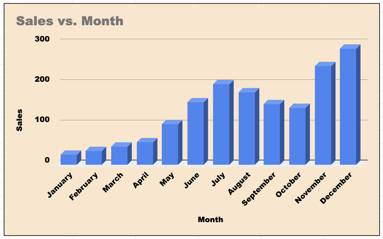
Here's how a typical bar graph looks in Google Sheets.
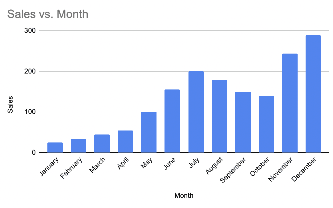
Moreover, as you can see in the image, bars are plotted on a common baseline to allow for easy measurement and comparison of values.
This is just one type of bar graph. Google Sheets, however, offers you an array of bar chart styles to visualize data.
#1. Horizontal Bar Graphs
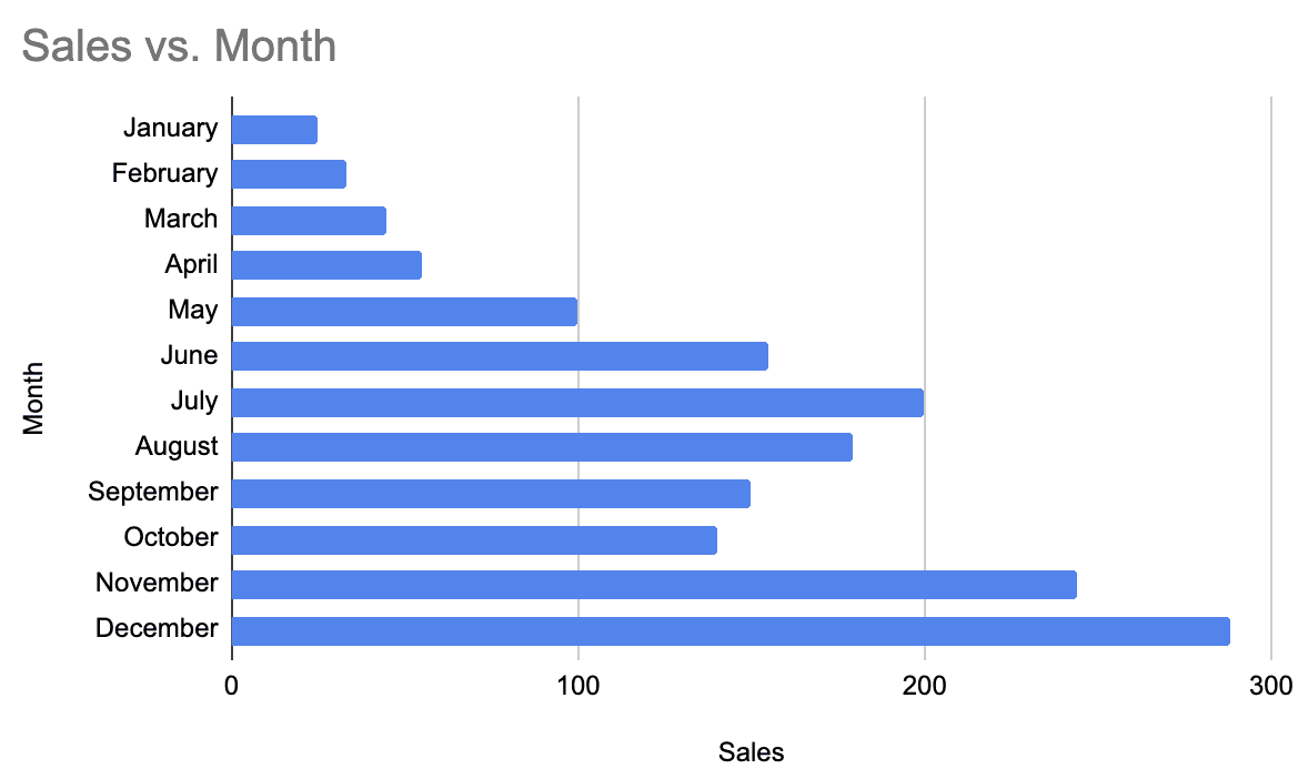
In these types of bar graphs, the rectangular bars are horizontally drawn on the y-axis, and the x-axis shows the value corresponding to each bar.
#2. Vertical Bar Graphs
Unlike horizontal bar graphs, here, the rectangular bars are vertically drawn on the x-axis, and the y-axis shows the value corresponding to each bar.
#3. Stacked Bar Chart
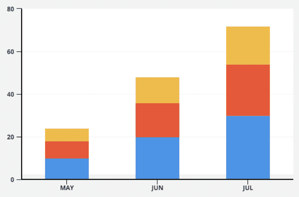
The stacked bar graph (or composite bar graph) divides the whole bar into several segments. Each segment is colored and labeled differently to quickly identify individual categories.
#4. 100% Stacked Bar Graph
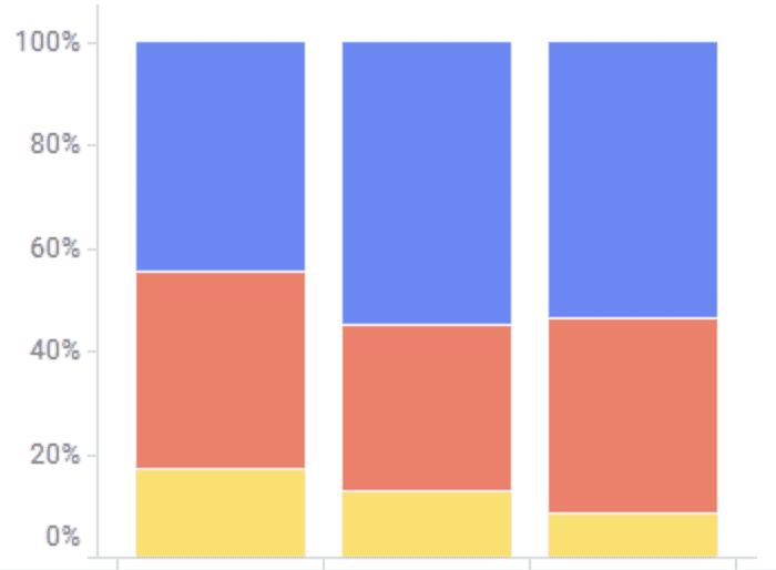
Similar to stacked bar graphs, this graph also splits the bar into colored segments based on different categories. The only difference is, in a 100% stacked bar graph, the stacked bar always equals 100%, i.e., each bar height is always 100%.
Why and When to Use Bar Graphs?
💭 Food For Thought: Bar graphs are the best way of data handling while working on Google Sheets.
It's an excellent tool to represent data that are independent of one another and that don't need to be in any specific order for being represented.
Besides, bar graphs are especially used when you want to show a distribution of data points or compare performance over time.
From a bar chart, we can see which groups are the highest or most common and how the groups compare against each other.
But what makes bar graphs popular among data analysts compared to other charts?
Here are the reasons for it.
#1. They’re Easy to Read and Understand
Because bar graphs are widely used in publishable formats like textbooks, marketing reports, and research papers, many people already know how it works and what it represents.
We mean, it's ok if a higher-secondary school kid tells you the information that a bar graph conveys. It's that common and easy to grasp.
Unlike other types of graphs, such as pie charts, histograms, and area charts, bar graphs are really straightforward. Its simplicity makes it a good choice when you want to make your data understandable to a diversified audience segment.
#2. Perfect for Mapping Changes Overtime
Another prolific advantage of bar graphs is their ability to visualize trends in an easy-to-understand format.
Other graphs, such as pie charts, can only represent one data set (mostly).
For instance, if you’re conducting a yearly survey with 100 people asking them their choice of smartphone and then showing the percentage of people opting for different preferences, you need some form of visual aid to express it.
In such cases, a bar graph could be handy to show how people's choices change over time. Anyone can look at the chart and identify which smartphone is people's choice for the current year.
Furthermore, you can also compare that information to past surveys and analyze trends to map the changes in trends over time.
Until now, you might have figured out why using a bar graph to visualize your data can be a wise choice.
So, let's skip to the good part.
How to Make Bar Graphs in Google Sheets?
Although making a bar graph in Google Sheets is no rocket science, it might be a cumbersome process for newbies. Down the line, we have tried decoding the process of creating bar graphs in an easy step-by-step guide.
You can watch the video below or read the step by step instructions, the choice is up to you ☺️👇
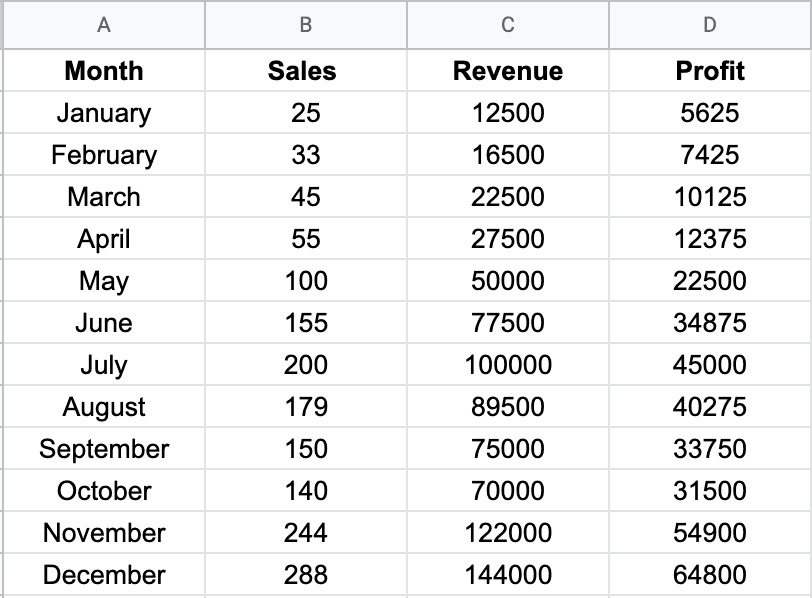
Now, you can visualize this data in 3-simple steps:
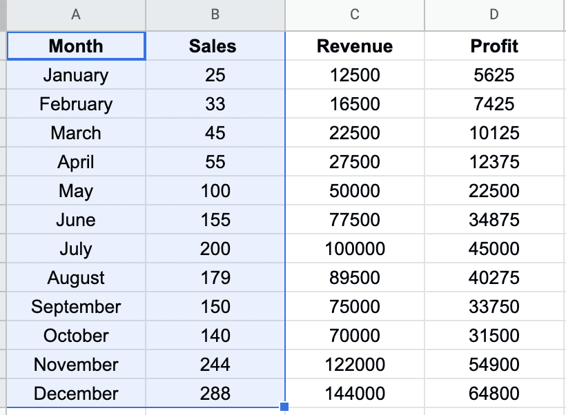
Step 1: Rows and Columns Selection
Select the cells you would like to visualize (including the headers)
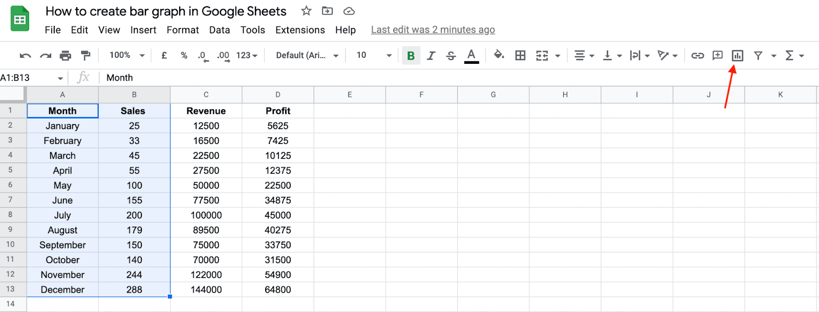
Step 2: Chart Icon In Menu
Click on the 'Chart Icon' on the right side of your toolbar.
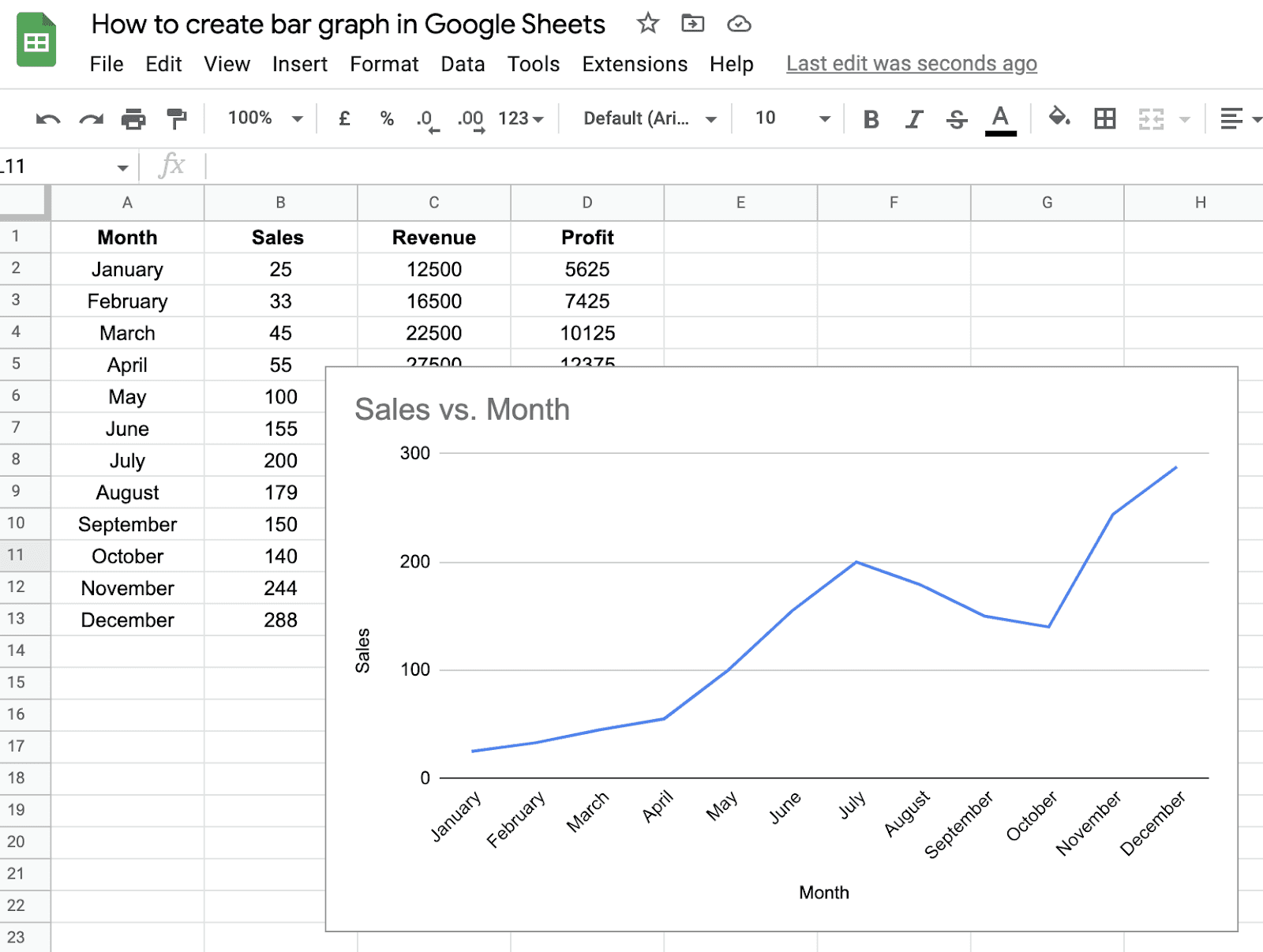
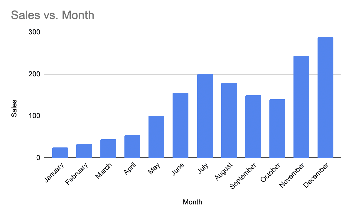
As you click the icon, Google Sheets will automatically present the dataset with a default chart type.
See how it did for our dataset 👇🏻
Next, click on Setup in the chart editor on the right-hand sidebar. Then click on Chart Type dropdown to choose any graph from the Bar or Column section.
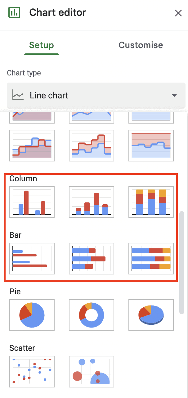
Note: The vertical form of a bar graph is named Columns in Google Sheets to avoid confusion, but both fall under the bar graph category.
Step 3: Bar Graph Selection
Select the type of bar graph. For visualizing a single dataset, select a single bar of column charts.
Once selected, this is how the above data set will be displayed.
That's it! You have successfully made your first bar graph in Google Sheets.
So after you’ve created your bar graph from the steps above, here’s how to customize it further.
Bar Graph Customization
For those aware, the graphs you create in Google sheets offer many customization options, such as editing the graph title and axis titles, changing bar and background colors, placing labels, and even customizing the font style.
Let's see how you can customize each one of them.
To get started, double-click on the graph to open the chart editor sidebar (or it might already be there if you haven't closed it yet).
Then, click on the Customize tab. A drop-down appears with a list of customizable items.
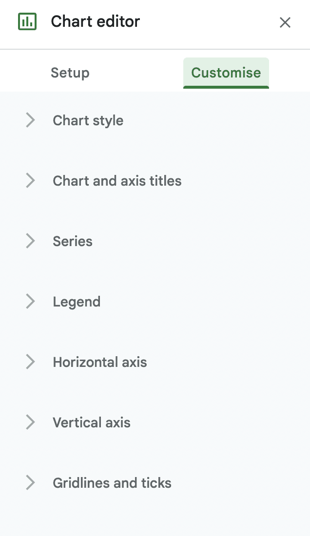
Let's drill down the items in the list one by one.
#1. Chart Type
From here, you can customize the chart's background color, font style, and border color.
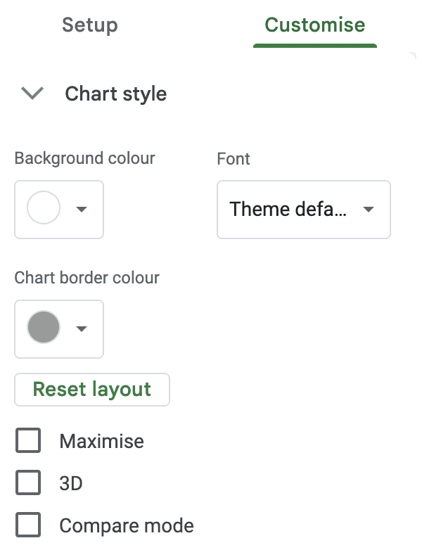
Moreover, you can change how people view your chart by checking the 3 boxes:
-
Maximize: Zoom in on the chart by cutting out the white space
-
3D: To give your bar graph a three-dimensional effect
-
Compare Mode: To lay a comparison between each bar (this isn't required as bar graphs are by default comparable graphs)
Here’s the Chart Type option in action:
#2. Chart and Axis Titles
Next, click on Chart and axis titles to edit the chart title/subtitle or change both axis titles. Besides you can also format the title fonts, size, and color.
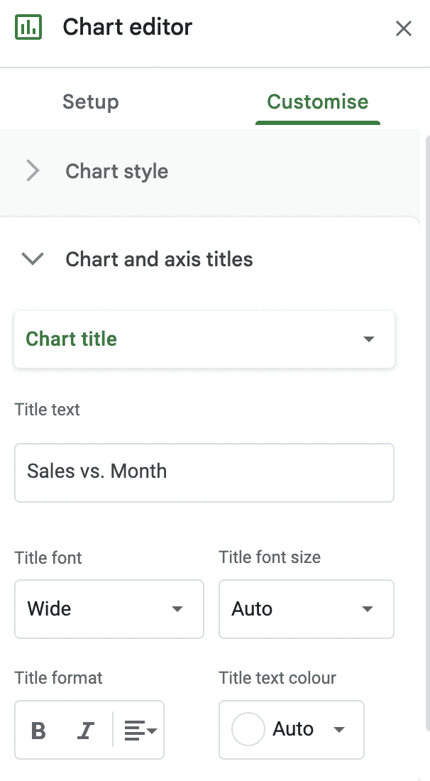
This feature will help you personalize your chart according to your brand and also create white-label charts for your clients.
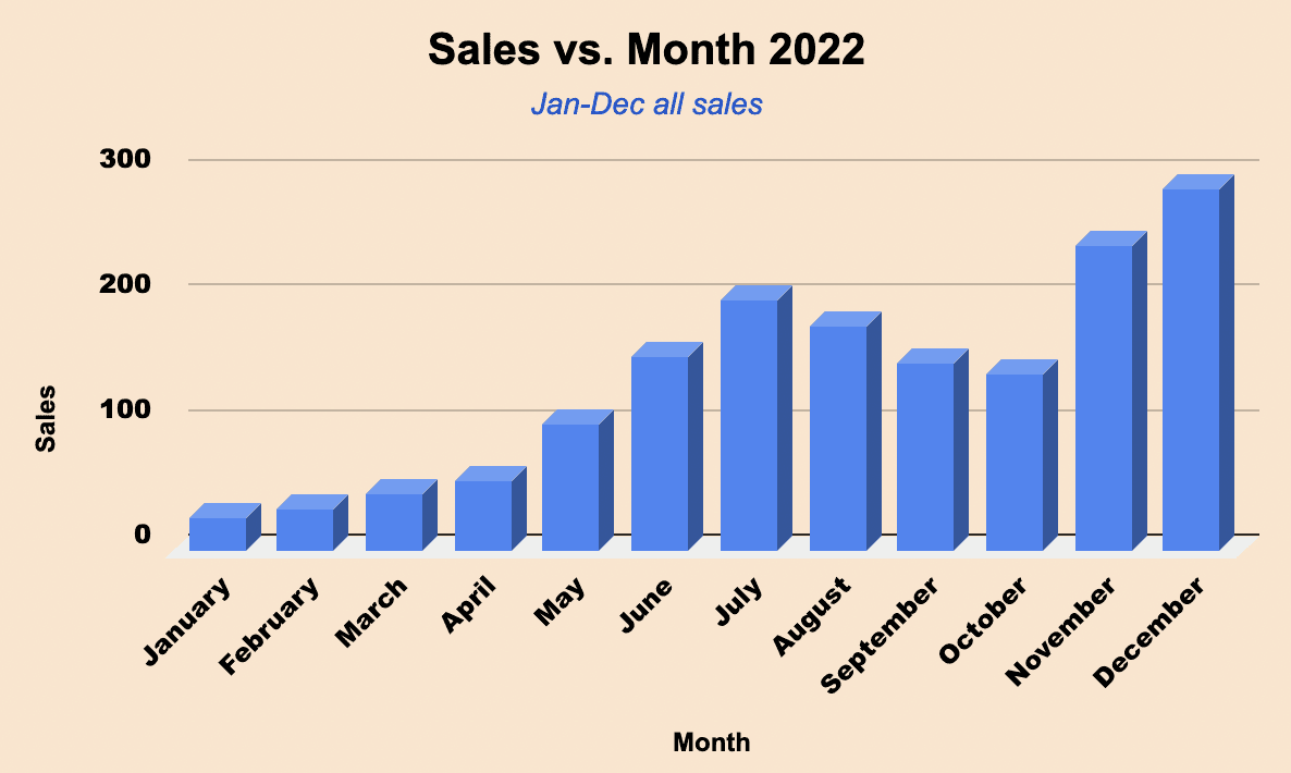
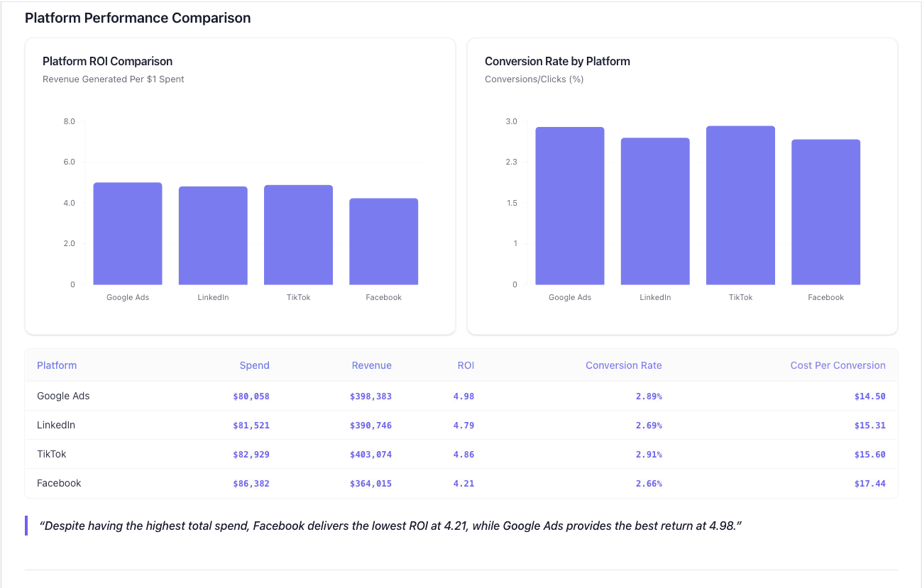
Here’s how creative minds at Datapad use this feature:
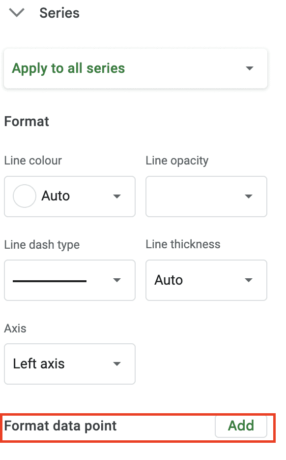
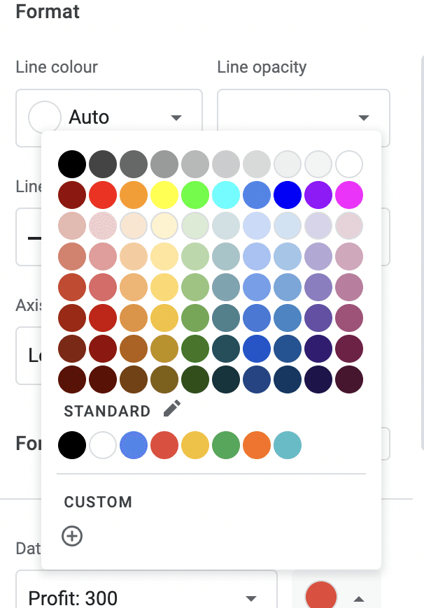
#3. Series
You can change the colors for each of the bars in the graph from the Series section.
To do so, expand the ‘Series’ section in the chart editor sidebar. Then click on Apply To All Series dropdown and select the series you want to customize.

You can then change the fill and line color for the bars and also change the % of the opacity of colors. Moreover, you can choose the line type and thickness.
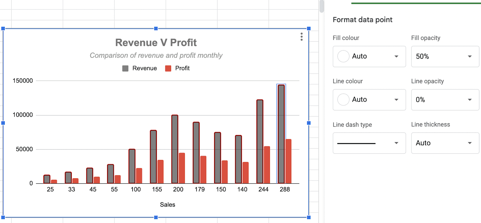
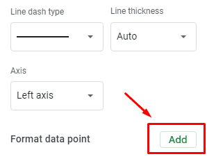
#4. Format Data Points
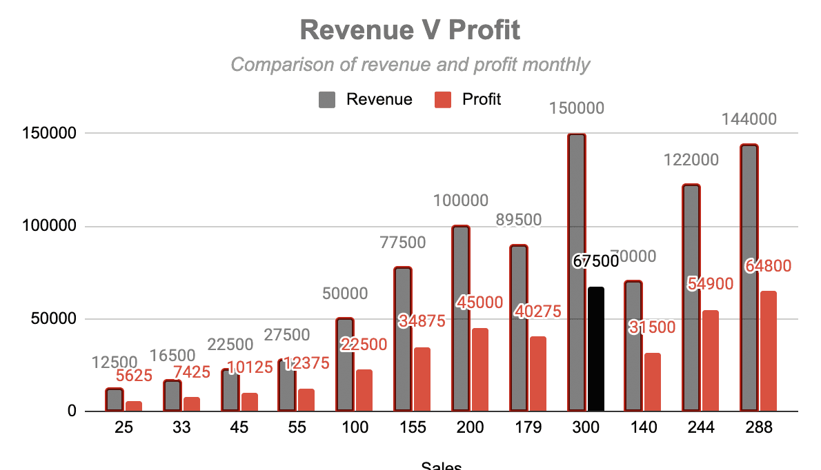
You can find the Format data point option in the same section, Series. This is mainly used to highlight a specific bar on the chart to make it stand out.
For example, if you want your highest profit month to stand out from the other bars in the graph, you can do it via the Format data point option.
Click on the Add button beside the format data point text.
A pop-up appears asking you to select a data point.
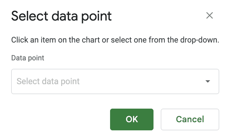
Choose from the dropdown and press OK.
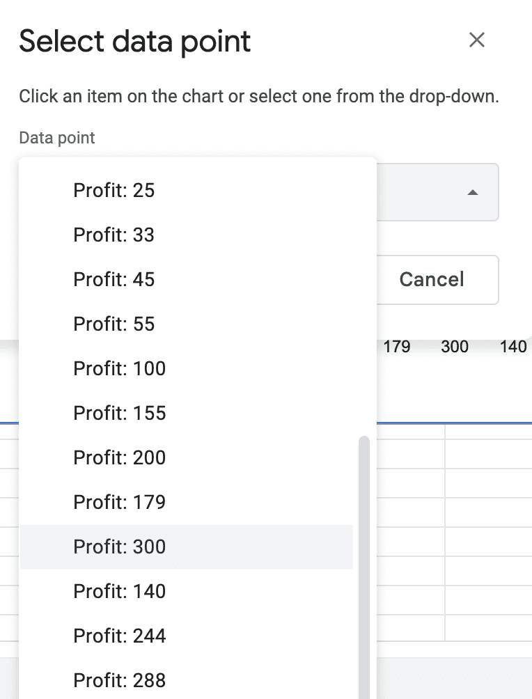
Then, pivot to the chart editor, where you will be provided with several color options to choose from (choose the color you want to use as a highlighter).
Choose a predefined color or create your custom color; totally up to you.
Meanwhile, your selected dataset will change colors in real-time as you click on random colors.
Note: You can always change the data point and color later on.
#5. Data Labels
Click on the Data Labels checkbox to add or customize labels to each bar. You can also change the font type, size, and colors of the labels.
These were all the major customization options that you might need when creating bar graphs in Google Sheets.
There are some more customization options that you can check out on your own, such as:
-
Horizontal axis customization
-
Vertical axis customization
-
Legend axis insertion
-
Gridlines and ticks
-
Axis labels insertion
And that's it! You have customized every section of the bar graph and created a full-fledged bar graph in Google Sheets.
Achievement Unlocked! 🎉
You might have felt there are tons of customizations available on G Sheets for creating data visualizations, but the truth is that Google Sheets is far behind in visualizing KPIs.
Here’s why!
Drawbacks of Monitoring KPIs with Google Sheets
#1. Limited Automation
Despite being a product of Google, it's uncommon to find that G Sheets provide next to no automation.
Even with the data extraction and management process, Google Sheets doesn’t provide any helpful automation. Instead, you are required to manually input and edit data to your Google Sheet dashboard.
That sounds tedious and is actually tiring.
#2. Hard to Onboard Your Whole Team
If you’re tracking metrics with your team, things can get messy because someone can tamper the sheet, or everyone can keep their own version which breaks the single source of truth.
What’s worse, Google Sheets slows down once there are too many collaborators accessing the sheets at the same time. Besides, it has a comparably poor UI for efficiently managing team activities.
Some standard dashboarding features like assigning tasks, real-time communication, time tracking, and accounting for internal databases cannot be achieved with Google Sheets dashboards.
Everything adds up to the fact that Google Sheets is not a team-friendly tool.
#3. Bad Mobile Experience
What if you want to check your metrics on the go? Let's be honest. Google Sheets aren't a great choice for it.
You see, dashboards created on Gsheets are not mobile-friendly. Although you can access them from your mobile, it still requires you to pinch your phone every time to navigate through your dashboard.
There are also chances of unintentionally hampering the data and dashboard layout when working through an unresponsive mobile interface.
So what can you do?
You can try one of the best alternatives to Google Sheets.👇🏻
Creating Charts on Excel is Time-Consuming: Here’s How You Can Do it Better for Free with Datapad
Datapad is designed to make data analysis easier, especially for those using Google Sheets. Whether you're creating a dashboard to track sales or a graph to visualize trends, Datapad integrates seamlessly with your Sheets to provide powerful insights.
The beauty of Datapad lies in its simplicity and ease of use. With our tool, anyone in your team with zero technical knowledge can start building reports in mere seconds.
#1. Google Sheets Integration:
Tired of copying and pasting data from your spreadsheets into visualization tools? Or worse, rebuilding your charts every time your data updates? Datapad solves this headache by connecting directly to your Google Sheets, transforming your data into stunning visualizations without the technical complexity.
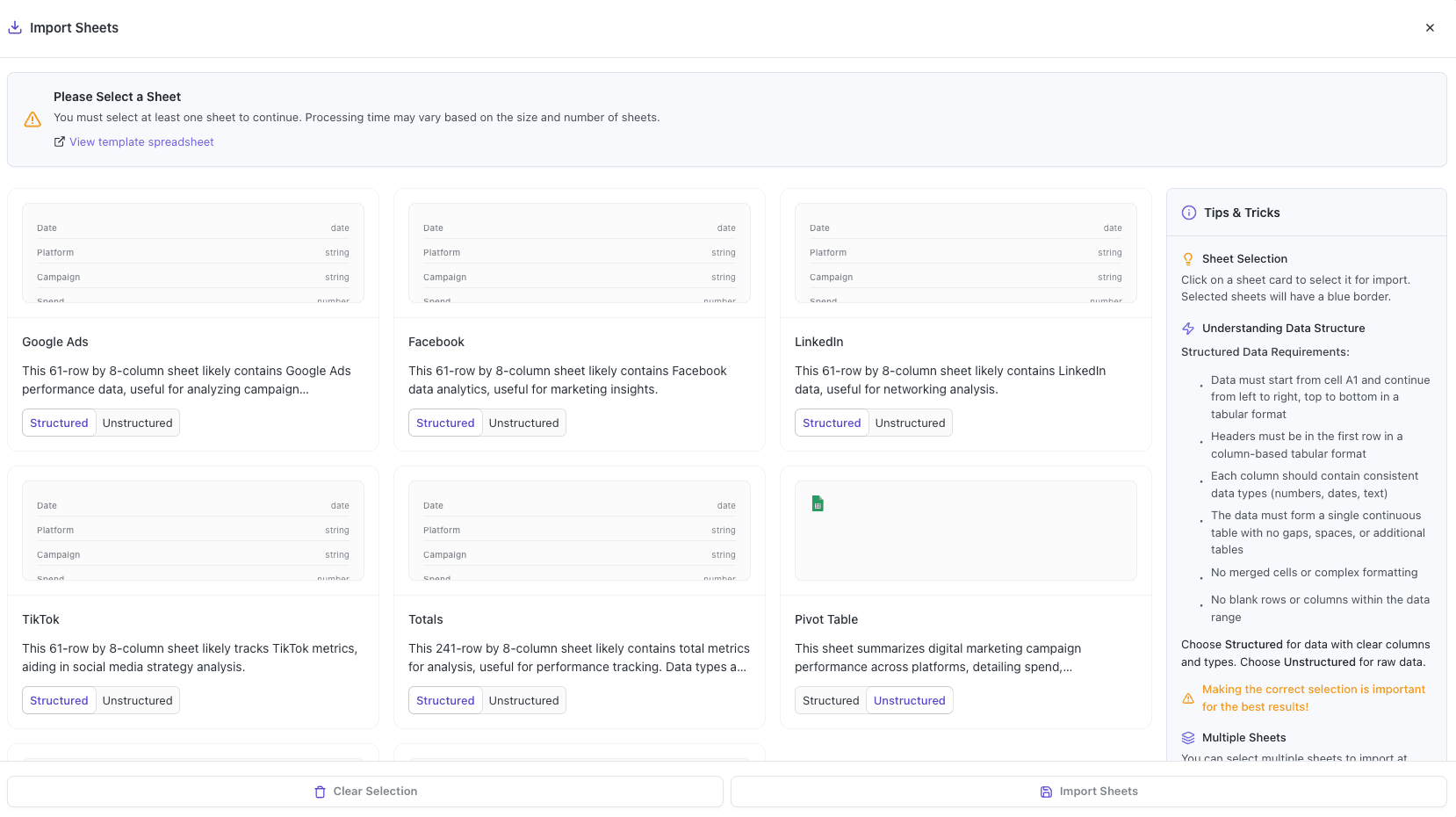
With Datapad's Google Sheets integration, you can:
-
Connect any Google Sheet with just a few clicks—no coding required
-
Watch as your dashboards update automatically when your spreadsheet changes
-
Visualize complex data in ways Google Sheets alone simply can't handle
-
Create beautiful, presentation-ready charts without fighting with formatting
Say goodbye to spreadsheet limitations and hello to data that works for you, not the other way around.
#2: AI-Driven Analysis
Ever wished you had a data analyst on call 24/7? With Datapad, you basically do. Skip the complex Excel formulas and simply ask questions in plain English like "What's our best-performing ad channel?" or "Show me last quarter's conversion trends." Datapad's AI instantly generates the perfect visualization to answer your question.
With Datapad's AI-powered analysis, you can:
-
Ask questions in everyday language and get immediate visual insights
-
Uncover hidden patterns and relationships in your data automatically
-
Focus on making decisions instead of fighting with chart settings
-
Transform complex data into clear, actionable intelligence in seconds
Your data has stories to tell—Datapad helps you hear them through simple conversation.
#3. Scheduled Reporting
End the monthly reporting grind forever. Datapad automatically delivers fresh insights straight to your inbox or Slack channel on your schedule. Set up your dashboard once and let automation take over—whether you need daily metrics, weekly performance snapshots, or monthly executive summaries. Choose from our library of ready-made templates to get started even faster with industry-specific KPIs and visualizations. Your team stays informed with zero manual effort, while you focus on acting on insights instead of creating reports. Perfect for agencies managing multiple clients or busy teams that need consistent data without the hassle.
#4. Downloadable Reports
Sharing insights with your team or stakeholders should be straightforward. With Datapad, you can download your reports in PDF or HTML format, making it easy to distribute them. Whether you need to attach a report to an email, share it on a project management tool, or print it for a meeting, Datapad has you covered. No more scrambling to capture screenshots or manually compiling data. Your reports are ready to be shared in a professional format at the click of a button.
#5. Web Search Feature
Sometimes, understanding your data requires context from the wider world. Datapad's Web Search feature allows you to pull in external data for sector benchmarks and trends, enriching your analysis. Whether you're comparing your sales figures to industry averages or looking for the latest market trends, Datapad can help you find the information you need. This feature ensures that your analysis is not just based on internal data but also informed by external factors, giving you a more comprehensive view of your performance.Make Your Excel Dashboards Look Stunning with Datapad.
Table of Key Features and Benefits
| Feature | Description | Benefit |
| Google Sheets Integration | Connects directly to Google Sheets for data analysis. | Seamless workflow, leverages existing data. |
| AI-Powered Analysis | Allows plain English queries, generates graphs and dashboards. | Reduces technical barriers, fast insights. |
| Dashboard and Report Creation | Supports bar graphs, line charts, pie charts, Gantt charts, etc. | Visualizes data effectively for decision-making. |
| Scheduling Reports | Delivers reports via email or Slack at scheduled intervals. | Keeps users informed without manual effort. |
| Download Options | Reports available in PDF or HTML format. | Easy sharing with stakeholders or teams. |
| Web Search Feature | Pulls external data for benchmarks and trends. | Enhances analysis with industry context. |
Datapad is a free kpi dashboard tool that allows you to connect data sources and keep track of all your metrics in one place. We claim that Datapad is the easiest kpi tool out there.
If you are keeping your dashboards on excel or sheets, you can use our integration to take all your data from spreadsheets and build stunning dashboards on Datapad.
Must-read Posts:
How to Make a Pie Chart in Google Sheets? [Secret of Creating Stunning Charts]: You will learn about how to make a stunning pie chart on sheets and also discover a better alternative for it
How to Make a Chart in Google Sheets: Easiest Method Explained Here: Find out about the easiest method of creating stunning charts on sheets.
How to Make a Line Chart in Google Sheets: You will learn step by step how to create line chart in 5 minutes.