GoodData is a cloud-based business intelligence (BI) and analytics platform that lets you and your business create and share interactive dashboards, reports, and insights.
It offers tools for data integration, visualization, and predictive analytics that help you make data-driven decisions and deliver embedded analytics to customers and teams.
However, GoodData often falls short when it comes to software UI, large datasets, and flexibility.
In this article, I will tell you why you should try an alternative to GoodData and discuss the best ones in the market.
Why Look for GoodData Alternatives?
The learning curve with GoodData stays intact to when it was first launched and poses a significant disadvantage to new and existing users. People seek alternatives to GoodData for several reasons:
-
Lacks of customization options
-
Confusing UI design
-
Expensive and inflexible
Let's dig deeper into these reasons.
Reason 1. Confusing User Interface
Mastering GoodData for data analysis and visualization can be challenging. The app interface is not smooth, and understanding its workings requires extensive training.
Navigating within the platform is also time-consuming and cumbersome. For example, there is no folder management for insights. Finding a previously created insight is nearly impossible, and it's easier to start over (which makes the clutter worse).

Reason 2. Difficulty in Handling Large Datasets
Valentin, a business analyst for a medium-sized business, encountered system slowness when dealing with large datasets.
GoodData’s Data Loading Mechanism (DLM) is not user-friendly, making it quite hectic compared to the more intuitive LDM building in Tableau or PowerBI.
Besides, some basic features are missing, such as:
-
Creating custom charts is very convoluted.
-
Sorting needs to be globally consistent. For example, you can't sort a pivot table by its total sum.
-
You can't hide fields in the data model.
-
You can't use OR filters - everything has to be either an AND filter or made via custom expressions.
-
You can't calculate min/max dates. For example, the MIN date of a sale or something similar.
The lack of nitty-gritty functions, coupled with the system's inability to handle large-scale data analysis, leads users to seek alternatives to GoodData.
"…when used with large data sets, the system slows down when generating reports. Sometimes they have limited our ability to quickly churn out and analyze reports as needed." - Valentin P., Business analyst.
Reason 3. GoodData is Expensive
GoodData does not offer a free plan. For other plans, it charges a hefty $1500 platform fee plus $30 per user per month.
Imagine scaling your data processes with GoodData. The pricing feels over budget and inflexible for startups and SMBs, too.
"...as our data needs grew, the limitations became apparent. Scaling the platform for larger datasets got expensive quickly, and the pricing structure felt inflexible for our evolving requirements". - Jessica W., Senior Marketing Executive
9 Best GoodData Alternatives
Some of the best alternatives to GoodData are:
-
Datapad: Track all your essential business metrics with stunning dashboards.
-
Tableau: Leading data visualization and business intelligence platform.
-
Looker Studio: Cloud-based data visualization tool from Google.
-
Domo: AI-powered analytics and business intelligence platform that supports a low-code/no-code environment.
-
Zoho Analytics: Powerful self-service business intelligence (BI) and data analytics platform.
-
Luzmo: API-first platform that helps you analyze data with AI.
-
Power BI: Robust BI and dashboarding tool developed by Microsoft.
-
Redash: Open-source data management platform.
-
Explo: Features powerful tools to enhance data visualization and exploration.
1. Datapad

Datapad is AI-powered data visualization and reporting software. It's an ideal alternative to GoodData, considering its no-code interface, ease of use, customizability, and data visualization options.
With Datapad, you can access live data connectors to a range of marketing, social media, e-commerce, and payment apps, such as LinkedIn, Instagram, MailChimp, Google Analytics, Shopify, Stripe, HubSpot, and so on.
Choose from hundreds of read-made dashboards and reporting templates fitted with relevant metrics for different use cases. Connect live data to widgets and represent your data your way.
Datapad's drag-and-drop interface makes it easy to organize widgets and build a clean, easily trackable business performance dashboard.
With the interface builder, you can:
-
Drag and drop charts and data sources to create custom dashboards or customize existing templates
-
Change background image to keep dashboards on-brand
-
Add Loom video, custom images, and headers to give contextual relevance to dashboard items
P.S. We've also introduced Dark mode for marketers who like pulling all-nighters. ��

Datapad Features
1. Real-Time Collaboration
Datapad allows you to collaborate on dashboards in real-time. With our real-time collaboration tools, you can:
-
Assign comments around KPIS with interactive commenting
-
Use in-app chat to communicate or discuss metrics with team members in real-time
-
Share live dashboards with internal or external members via public links

2. Automated Reporting
In Datapad, you can subscribe to any dashboard and stay updated with scheduled email reports.
Once you subscribe to a dashboard, you can customize the reports' schedule, time, and frequency.
Here's a quick guide for automated reporting in Datapad.
Step 1: Open any dashboard of your choice and click on the 'email' icon at the top menu bar.
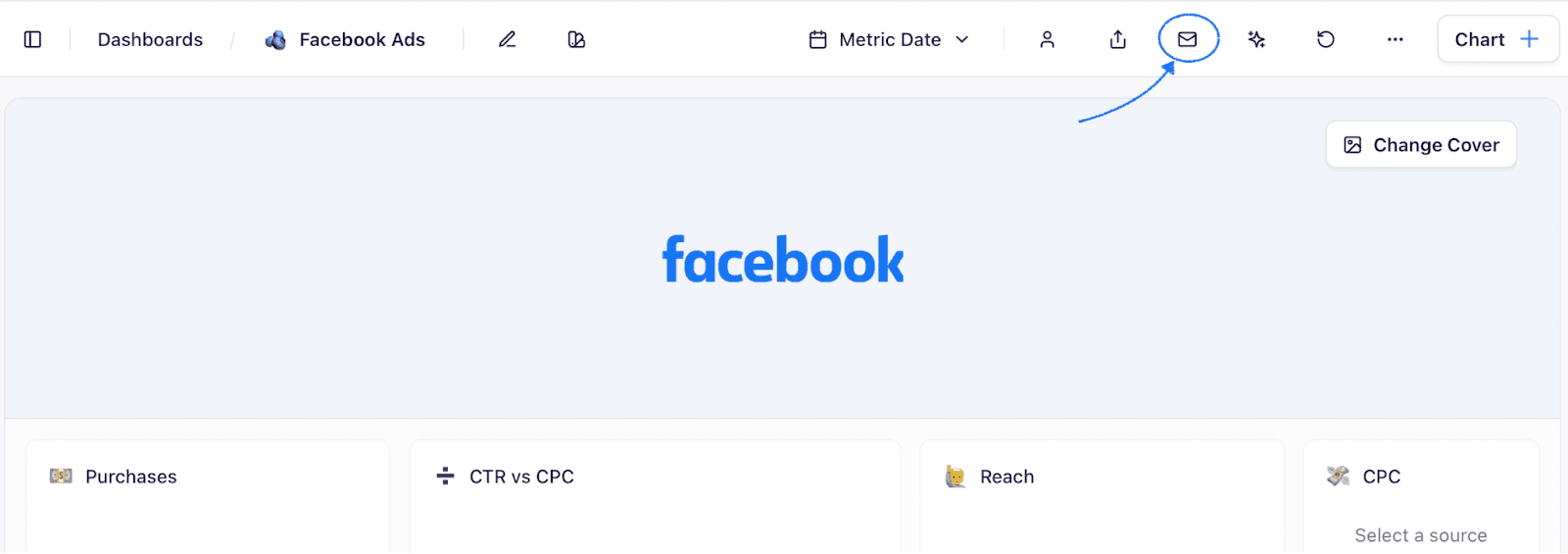
Step 2: Toggle the 'Schedule Reports' button to 'ON.' Then after, set up the following:
-
Email frequency (daily/weekly/monthly)
-
Day and time to receive emails
-
Add internal/external team members who you want to receive emails from you

3. Scalable and Customizable
Datapad is among the most affordable and scalable alternatives to GoodData.
First, Datapad does not charge any platform fees. Second, you can add unlimited collaborators to any pricing plan (including the free plan).
So, as your team grows, you do not need to pay extra to add more brains to your dashboard.
Pricing
Datapad's free plan lets you build 1 full-fledged marketing report with unlimited data points, users, and real-time data sync. To get the most out of our platform, you can upgrade to one of the paid plans:
-
Standard: $30 per month
-
Business: $200 per month

Pros and Cons
✅ Let's you import KPIs from unlimited data sources in the free plan.
✅ Lets you subscribe to dashboards to get daily highlights.
❌ Variety of charts and graphs selection can be widened.
2. Tableau
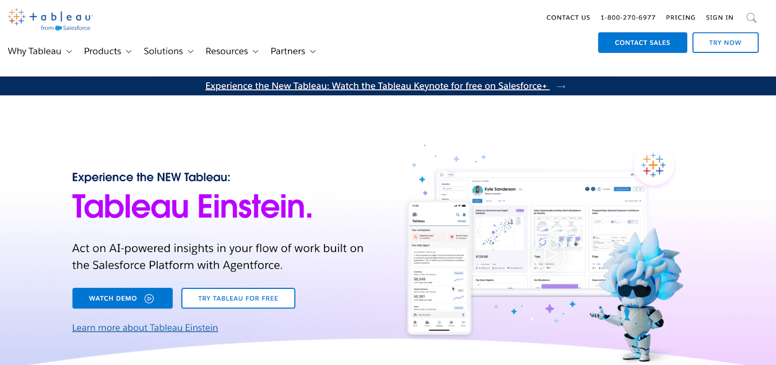
Tableau is a leading data visualization and business intelligence platform that enables users to analyze vast amounts of data through interactive and visually appealing dashboards.
Features
-
Tableau's drag-and-drop functionality allows users to create complex visualizations without needing extensive programming skills.
-
Has a gallery of rich data visualizations, including tables, charts, graphs, and advanced visualizations like scatter plots, treemaps, bullet graphs, and more.
-
Use Einstein Copilot(AI) to help with data preparation, calculations, and visualizations using plain text prompts.
-
Offers 100+ live connectors to databases and files – from spreadsheets and PDFs to big data, relational databases, and even application data or data on the web.
-
For field workers, Tableau Pulse is a handy mobile app that automatically detects data trends, contributors, and outliers and generates digestible text-based summaries with supporting visual explanations.
Pricing
Tableau offers three paid plans to choose from:
-
Tableau Creator: $75 per user per month
-
Tableau Explorer: $42 per user per month
-
Tableau Viewer: $15 per user per month

Pros and Cons
✅ Power BI's integration with Microsoft applications, especially MS Teams, makes it easy to share reports across the organization.
✅ Ability to handle large data sets and scale as your business grows.
❌ Lacks customizability at both fronts – platform flexibility and visualizations.
3. Looker Studio

Looker Studio is a cloud-based data visualization tool from Google. Its ease of use and extensive visualization options make it a compelling alternative to GoodData.
Features
-
Looker offers 50+ ready-made reporting templates for PPC Ads, Google Analytics, YouTube Analytics, and more.
-
Create custom dashboards using a visual canvas where you can drag and drop data sources and visuals together to create dashboards and reports from scratch.
-
Has a gallery of 50+ pre-built visualizations and widgets, including geo maps, sunburst charts, scorecards, Venn diagrams, and more.
-
Looker Studio's built-in and partner connectors allow users to connect to virtually any kind of data from 1000+ data sources.
-
Get shareable reports, invite collaborators with controlled access, schedule email reports, share reports via public links, or download them as PDFs.
Pricing
Looker Studio is free to use; the only prerequisite is an active Google account.
Pros and Cons
✅ A neat platform design facilitates a beginner-friendly interface.
✅ Supports a wide range of templates and visualization elements.
❌ Lacks data harmonization and analysis capabilities.
4. Domo

Domo is an AI-powered analytics and business intelligence platform that supports a low-code/no-code environment, enabling you to create dashboards and reports without extensive technical knowledge.
Features
-
Domo has a catalog of 1000+ live connectors to cloud data sources and bi-directional connections for on-premise databases, files, and systems.
-
Use Domo's MagicETL to visually design data integrations, as well as clean, combine, and transform data sets without knowing SQL.
-
Choose from over 150 chart types and more than 7,000 custom maps, and go beyond static dashboards to create data stories with context and narrative.
-
Domo AI features a chat interface where you can ask questions using natural language and get instant insights and intelligent suggestions with narrative and visual responses.
-
Set up custom alerts and push notifications for certain times or for when a metric reaches a level that requires attention or action.
Pricing
Domo offers a 30-day free trial, followed by three pricing models – Standard, Enterprise, and Business Critical, with customized pricing based on your data load and feature requirements.

Pros and Cons
✅ Offers a range of data visualization elements.
✅ Integrated AI capabilities for data transformation, analysis, and chart suggestions.
❌ Reliance on Extract, Transform, Load (ETL) Causes Performance Issues with Large Datasets.
5. Zoho Analytics

Zoho Analytics is a powerful self-service business intelligence (BI) and data analytics platform designed to help users analyze their data and easily create compelling visualizations.
Features
-
Zoho's drag-and-drop visualization builder lets you create highly visual dashboards and reports using 50+ visualization options, such as charts, widgets, pivots, and tabular views.
-
One-click data import from 500+ sources, including online storage services, relational databases, files and feeds, and business apps.
-
Use a data preparation studio to model, cleanse, transform, and enrich your data with over 250 transform functions without coding.
-
Use predictive AI models for forecasting, trend analysis, anomaly detection & alerting, clustering, what-if analysis, and more.
-
Ask Zia, Zoho's conversational AI assistant, questions about data in natural language, and get contextual and actionable insights such as digestible narratives and visuals.
Pricing
Zoho Analytics offers a 15-day free trial and a range of pricing options:
-
Basic: $30 per month
-
Standard: $60 per month
-
Premium: $145 per month
-
Enterprise: $575 per month
-
Custom: Contact sales

Pros and Cons
✅ Pre-configured predictive AI models help with augmented analysis and anomaly detection.
✅ Zia supports multi-lingual text inputs, including English, Spanish, and French.
❌ Users express difficulty in obtaining timely and effective support from Zoho.
6. Luzmo

Luzmo is yet another compelling alternative to GoodData. Its API-first platform enables you to integrate your preferred AI solutions with Luzmo and use built-in tools to drive your data analysis and visualization needs.
Features
-
Choose between no-code and code-first flexibility that is, create charts using a drag-and-drop editor or customize them programmatically using code.
-
Integrate Luzmo with your preferred AI solution—OpenAI's ChatGPT-4, Cohere, Gemini, and Mistral.
-
Use an AI-powered chart generator to transform raw data into beautiful dashboards and interactive visuals using plain text prompts.
-
Luzmo's Instachart uses OCR technology and AI to turn screenshots, sketches, or design mockups into functional dashboards.
Pricing
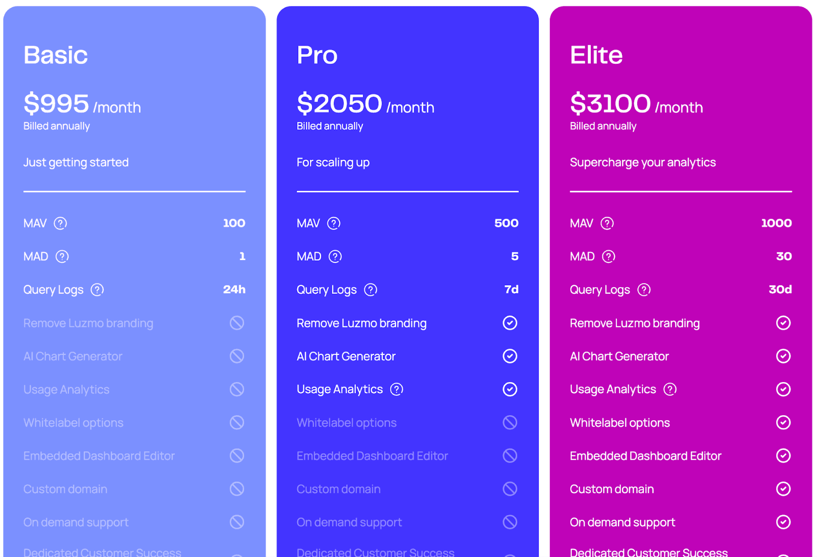
Luzmo offers a 10-day free trial followed by three premium plans:
-
Basic: $995 per month
-
Pro: $2050 per month
-
Elite: $3100 per month
Pros and Cons
✅ Supports integrating the platform with your favorite AI model for preferable outcomes.
✅ API-first approach enables you to connect with a diverse range of apps and services.
❌ Luzmo’s pricing can be expensive for startups and small businesses.
7. Power BI
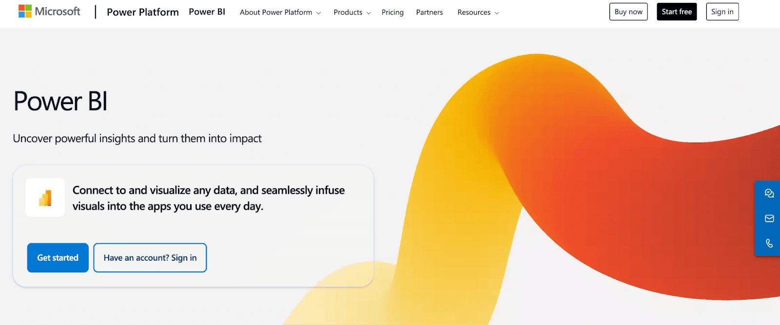
Power BI is a robust BI and dashboarding tool developed by Microsoft. It enables users to connect to various data sources, transform and analyze data, and create interactive reports and dashboards.
Features
-
Power BI features an intuitive drag-and-drop interface that allows users, regardless of their technical expertise, to create reports and dashboards with ease.
-
Connect to a variety of data sources, including spreadsheets, SQL databases, and cloud storage like Azure, Salesforce, and 500+ data sources.
-
Use AI-driven Power Query to automatically clean, combine, and harmonize data from multiple sources.
-
Visualize data using interactive charts, graphs, maps, decomposition trees, geo maps, and more.
-
Use the Q&A feature to ask questions about your data using plain English and get instant responses as narratives and visualizations.
Pricing
Power BI offers a free forever plan. Other than that, it has three paid subscriptions to choose from:
-
Power BI Pro: $10 per user per month
-
Power BI Premium: $20 per user per month
-
Power BI Embedded: Custom pricing

Pros and Cons
✅ Power BI supports real-time data updates.
✅ The platform is designed to handle large datasets, making it suitable for both small businesses and large enterprises.
❌ An outdated UX/UI interface gives Power BI a steep learning curve.
8. Redash

Redash is an open-source data management platform that allows you to connect, query, and visualize data across your organization. Its low-code, open-source model lets you customize and add features, no lock-in, that align with your data needs.
Features
-
Use the built-in powerful online SQL editor to query your database, run transformations, join different databases, schedule auto-update times, and more.
-
Visualize your data using various elements such as a chart, cohort, pivot table, boxplot, map, counter, Sankey, sunburst, and word cloud.
-
Use the drag-and-drop editor to resize visualizations and fit them into one thematic dashboard for centralized access.
-
Integrates with popular databases like SQL, Big Data, Salesforce, and Google Analytics and offers API to extend its functionality as you like.
-
User management features such as SSO and role-based access control for enterprise-friendly workflow.
Pricing
Redash, being open source, is free to use.
Pros and Cons
✅ Allows setting up alerts for certain events like a spike or fall in your data.
✅ Easily share dashboards with a single click on a secret URL with your peers or clients.
❌ A steep learning curve for users unfamiliar with SQL.
9. Explo
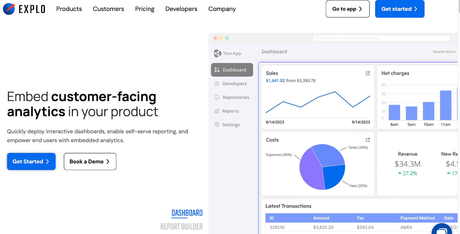
Explo features powerful tools to enhance data visualization and exploration. This AI-powered data platform offers a user-friendly dashboard focused on simplicity and efficiency, allowing you to interactively analyze data, create insightful visualizations, and share findings seamlessly.
Features
-
Explo offers 27 different chart types for visualizing data, including Bubble charts, Candlestick, Histogram, Waterfall, Treemap, and other advanced chart types.
-
Ask questions to Explo’s conversational AI in plain text and get instant responses as insights, narratives, visuals, and even entire data reports.
-
Explo’s advanced filters let you cross-filter data across visualizations and drill into trends.
-
Download reports as CSVs, XLSs, PDFs, or schedule exports via Report Builder's powerful scheduling engine.
Pricing
Explo offers a generous free plan with unlimited dashboards and collaborators. Other than that, it has three premium plans:
-
Growth: $695 per month
-
Pro: $1995 per month
-
Enterprise: Custom pricing

Pros and Cons
✅ Explo supports fully white-labeled dashboards.
✅ Dedicated Slack support channels.
❌ Handling large datasets can be challenging due to strict limits on the number of rows processed and the complexity of SQL queries.
Wrapping Up
All the tools mentioned above are great alternatives to GoodData and successfully alleviate its drawbacks.
Analyzing and visualizing data is part of any business in any category because, without doing so, you can make the right decisions.
Unfortunately, GoodData can’t handle large datasets, has a confusing UI, and lacks flexibility, which are the main reasons people opt for an alternative.
But how do you find out which GoodData alternative is right for you?
Well, there’s no better way than signing up for free trials and judging products for yourself.
If you or your team don’t have the time to try every product on our list, sign up for Datapad, import your KPIs, and create stunning dashboards for you and your team.
